More On Folds
So, in last week’s “Split Title Twist” post I showed you how to “fold” a title in half. But it got a bit long and there is more to the story when it comes to folding a word.
Today I’m going to show you how to enhance the fold so that it looks three dimensional and a bit more realistic. To do this, I’ll be using gradients, shadows the Warp tool and a custom brush.
I’ll be picking up where I left off with the simple fold.
Enhance The Fold Effect

It’s time to add some touches that will enhance the look…
Quick reminder, I use Photoshop Elements (PSE) 2024. If you use a different version, some of my screen shots may not look the same as what you see on your screen.
The single best way to make this fold look more realistic is to add a shadow across the center “fold” using a gradient. If you played with the “More Bi-Color” from two weeks ago, this shouldn’t feel too challenging for you.
Note: If you didn’t read last week’s post, you may want to do that before you finish reading today’s post. It will not only get you “caught up” it may help some things make a bit more sense.
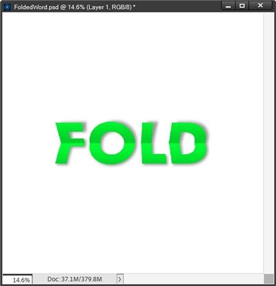
And here’s where we stopped last week:

It ended up looking pretty good if I must say so myself 😉 But, it still looked flat. So let me show you how to fix that.
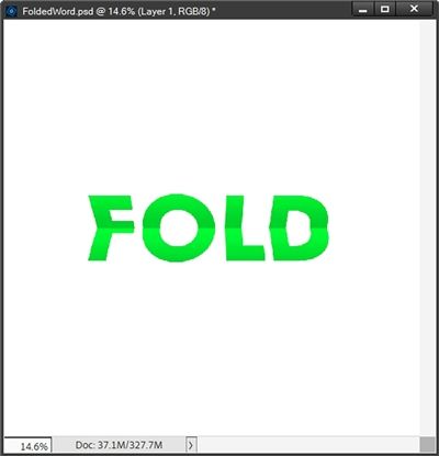
When I finished last week, the word had been centered vertically and horizontally on the document and had been “cut” in half to create the folded look.
The very first thing I need to do is rejoin the top and bottom layers of the word by activating the FOLD Top and FOLD Bottom layers in the Layers Panel and merging them back together. I rename this merged layer Folded Word.
Next, I’m going to add a new blank layer (Layer 2 for me) above the Folded Word layer. This is where my gradient will go.
Create Gradient

With Layer 2 active in the Layers Panel, I select the Gradient tool. Today I’m going to be creating a new gradient. But, since it’s going to be based on basically a center split, I’m going to reload the gradient I created in my “More Bi-Color” post. I can use this as a starting point for my new gradient:

Note: If you’re following along and you didn’t create a gradient like this a couple weeks ago, just select one of the two color gradients in the Default set. This should give you a good starting point.
Next, I click the Edit button beneath the box under the word Gradient and PSE opens the Gradient Editor dialog box:

The first thing I’m going to do is modify the bottom brown Color Stop. I’m going to change the Color to a light grey (#b7b7b7) and set the Location to 0%:

Now I can modify the bottom blue Color stop. I’m going to change the Color to that same light grey (#b7b7b7) and set the Location to 100%:

I know, I know…that doesn’t look like a gradient. Bear with me. I’m going to work on the top Color Stops and I’ll be adding a couple more. This will change the way that gradient looks! I promise!
First, I click somewhere above the grey color strip and PSE will add a new top black Color Stop:

Notice, there’s no color assigned to that new Color Stop, this is absolutely fine. I click on this new Color Stop and set the Opacity to 0% and the Location to 50%:
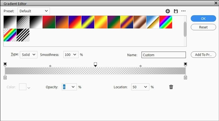
Once again, I click somewhere above the grey color strip a bit to the right of the new Color Stop and PSE adds another new black top Color Stop:

Again, there’s no color assigned to that new Color Stop. Again, this is absolutely fine. I click on this second new Color Stop and set the Opacity to 100% and change the Location to 51%:

Now, I click on the right most black Color Stop and change the Opacity to 0%:

Now, that looks like a proper gradient! That small gap of 1% between each of the two new Color Stops will create a nice smooth transition that will add more realism to the fold effect.
Apply Gradient

With Layer 2 active in the Layers Panel and the Gradient tool selected, I place my cursor near the bottom of my word over the Vertical Guide. Then while holding down the Shift key, I click and drag directly upward to the top of my word:

I know, I know…that gradient doesn’t look centered over the word. It’s that same Visual vs. Mathematical Center issue we encountered two weeks ago creating the gradient bi-color.
Don’t panic. All I have to do is nudge that gradient layer (Layer 2) down until the bottom of the first grey section lines up with the Horizontal Guide:

Then I clip that gradient layer (Layer 2) to the Folded Word Layer, change the Blend Mode to Multiply, set the Opacity to 60% and hide my Guides:
This really makes the word appear to be folded.
The gradient creates a shadow over the top half of the fold that is very subtle. And you should be able to see just a hint of a shadow over the very bottom of the word. I selected the Blend Mode and Opacity value because this word is a bright color. These both can be changed to create different illumination effects based on the color of the word.
As nice as this looks right now, it’s still not quite as realistic as it could be.
Note: This is totally optional but if you even remotely think you might use this fold gradient more than once, it’s a good idea to save it. If you need tips on saving a gradient, please refer back to my “More Bi-Color” post for instructions on saving a gradient.
Add More Realism
I could go into endless retouching hours trying to give some curved perspective to the sides of the word, but eventually it will end up looking anything but realistic.
All I really need to do is add a nice drop shadow (on its own layer) and warp it so it appears lifted off the paper across the top of the word.
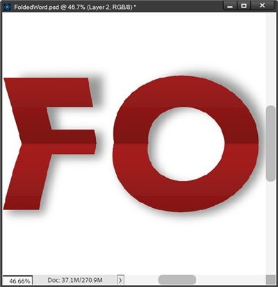
To do this I created a drop shadow to approximate a Lighting Angle of 120 degrees. I used a medium grey (#808080) with a Gaussian Blur of 18 pixels and setting the Opacity level of the shadow layer to 80%:
That helped a lot! Now I really do feel like that looks like a folded word.
Note: If you need pointers on placing a shadow on its own layer and warping it, please refer back to my “Stitching Realism” post from August of 2024.
Add Crease Lines
To enhance the realism effect even further, I can add some wear and tear lines to the folds using a “custom” brush.
This step is totally optional and is most noticeable on darker colors. But it can work on lighter colors, it just won’t be quite as pronounced.
To give you an idea of what these wear lines can look like I am going to change the color of my word to a deep red (#a81010). Then with the gradient layer active in the Layers Panel (Layer 2), I’ll zoom in fairly close:
Then I add a new blank layer above the gradient layer and rename that new layer Wear Lines. This should now be the active layer in the Layers Panel.
Since I recolored my word, my Foreground color chip is already set to that deep red. But my background color chip is still set to white. These are the exact colors I need to use when creating these wear lines. But I need to swap the order because I want the white on top. So, I just press X.
Create Custom Brush
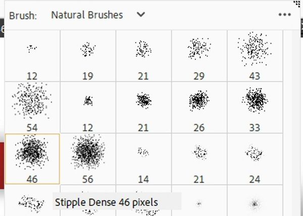
Now to set up my “custom” brush. I select the Brush Tool. I’m going to be using a Stipple brush. These brushes are located in the PSE set of Natural Brushes.
Note: If you’re following along, be sure you don’t select the set titled Natural Brushes 2. That set doesn’t include the Stipple brushes.
With the Brush picker open on the Natural Brushes, I select the Stipple Dense 46 pixels brush:
Then I click the Brush Settings box. PSE opens the setting dialog box and I set the Hue Jitter to 100%, Spacing to 50%, Roundness to 10% and ensure all other settings are at zero:

Note: You can experiment with different Jitter and Spacing settings to achieve varying results. But I highly recommend that you not vary the Roundness setting by more than a few pixels either up or down. The settings I used above are what seem to have worked best for me.
After changing the Brush Settings I can click anywhere on my document to return to the Brush Tool options. Ensuring that the Wear Lines layer is still active in the Layers Panel, I can now start adding my wear lines!
I zoom in really close so I can get a good look at the folded area. I place my cursor at the left edge of the first letter and click once. Then holding the Shift key down, I position my cursor at the right edge of the same letter and click again:
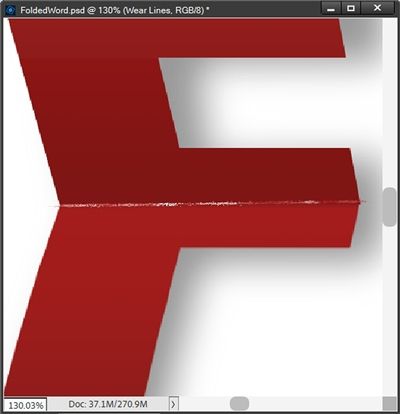
And now there’s some wear and tear on that fold!
You may notice that some of my brush work has extended beyond the edges of the letter. For now, that’s okay. I’ll be able to easily fix this later. So, you don’t have to be too careful when applying these wear lines.
I could also click randomly across the fold, sometimes even changing the brush size, to increase the effect as much as I want. For now, I’m fairly pleased with the way this looks. To keep this short I’m just going to finish the wear lines on the rest of the word and show you a final image:
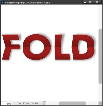
I know they may be hard to see in this smaller image but those wear lines add just the right touch of realism to a word that may have been folded/unfolded multiple times!
Now I can clip the Wear Lines layer to the gradient layer and any of the brush strokes that crossed over the edges will disappear!
If you think you’ll use this brush again, I highly recommend saving it with a unique name like “Wear Lines”. If you need tips on saving a brush please refer back to my “Modern Gesso Post” post from June of 2024. Please note that saving this brush will also save all of the options within the “Brush Settings” area.
Once you’re happy with your folded word you can copy the pertinent layers to your layout or simply crop the file to size, remove the white background and save it as a PNG file. I would highly recommend that you not apply/warp the base shadow at this point. I’m a firm believer in not applying shadows until an element is on the actual layout!
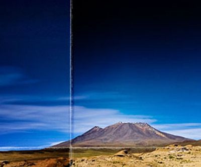
And there you have it! That’s how to add folds and creases to really any image (not just a word). Now that you know how to create a “fold” gradient you can experiment with making a multi-fold gradient to create a look like this:
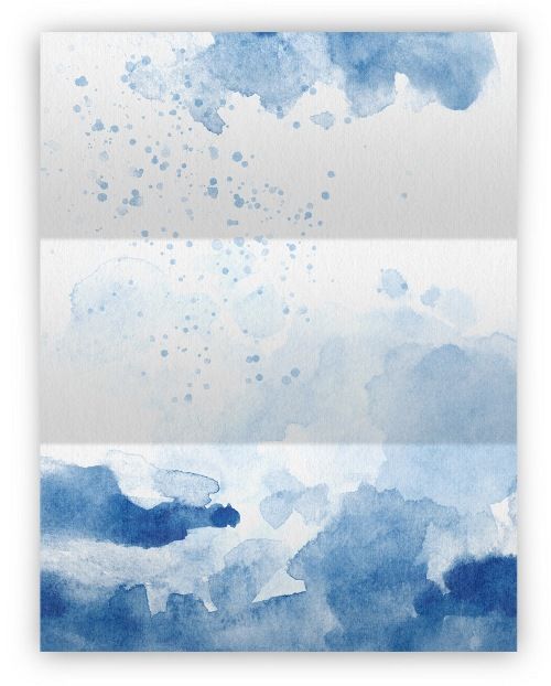
All it takes is adding additional top Color Stops with varying locations based on how many folds you want!
I hope you’ll try making a folded paper just for the fun of it.
Extra Pointers

This is another technique that works best with heavier (wider) serif or sans serif fonts. Fonts that may fall into the “block type” category.
If you’d like your “gradient” fold to look less hard/crisp, you can try adding a Gaussian Blur to the gradient layer. I’d recommend starting with a very soft blur, somewhere around 6-8 pixels.
Depending on the size and darkness of your word you can try applying the Plastic Wrap filter (under the Artistic category) on the gradient layer to make the fold line appear a bit stronger. Try using a Highlight Strength of around 20, Smoothness of 15 and a Detail option at somewhere between 5 and 10. The higher you set the Detail value, the tighter the effect will appear around the fold.
Try changing the Blend Mode on the wear lines layer to increase the intensity of the effect. This is one time when a blend using Dissolve works really well 😉 If you want to decrease the intensity, just lower the Opacity of the layer.
If you create the “custom” brush for the wear lines, the next time you use a different brush after working with this technique, you need to be sure to check/reset your brush settings! As far as I’m aware, PSE does not reset those types of settings back to the default when you switch brushes!
If you save a folded word as a PNG file, I would highly recommend that you not apply/warp the base shadow before saving. That’s best saved until an element is on the actual layout and you can match the Lighting Angle!
Last but by no means least…just have fun playing with folds!
Thanks for reading this week’s Tuesday Tip. Remember, if you have any suggestions or questions please don’t hesitate to “Message Me“. Check back next week for a quick tip about a transparent edge. Click “Follow Me” to stay in touch. I hope you have a wonderful week!