Photo Sketches
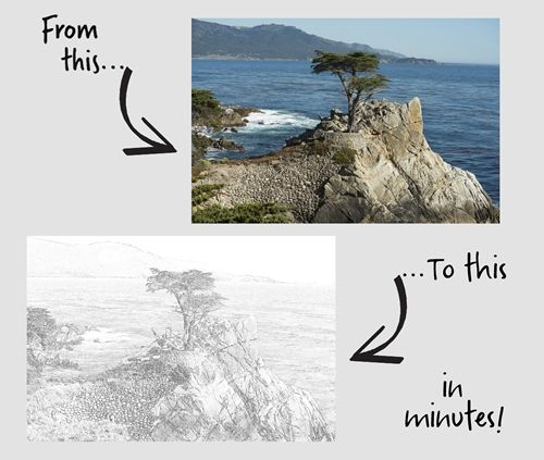
I venture to guess that you’ve likely seen examples of photos being turned into a sketch. Something similar to what you see in the featured image above.
And you may know that Photoshop Elements (PSE) has a Guided Edit (Line Drawing) and a filter (Sketch – Graphic Novel) that will allow you to create the effect fairly quickly.
While either of those options can work, I have found that there aren’t a lot of options for controlling the final result.
Today I’m going to show you two different methods for turning a photo into a sketch. Each of these methods provide better options for controlling the quality of the effect.
Note: The photo in the featured image at the top of this post is one of my own. The sketch was achieved with the first method I’ll be showing you below. And you can see a layout titled “Lone Cypress” in my 2019 Gallery that shows that sketch turned into a watercolor.
Pencil Effects

Quick reminder, I use PSE 2024. If you use a different version, some of my screen shots may look different than what you see on your screen.
Contrary to most people’s thoughts, turning a photo into an artsy sketch isn’t all that difficult. One of the easiest methods is actually to use the little-known Minimum Filter.
And just a bit of a spoiler alert…I’m going to use the sketch I create today in next week’s post about a watercolor effect 😉
Let’s sketch…
Filter Method
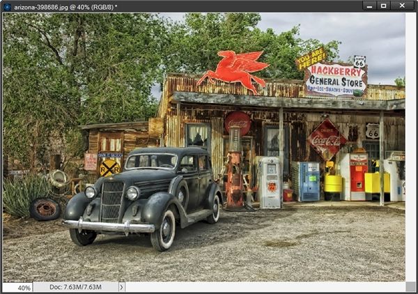
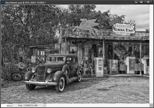
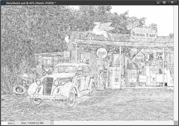
I’m going to be using a fun photo of a very famous general store on old Route 66 in Arizona:

If you want to follow along using this same photo you can find it at Pixabay. Otherwise you can use a photo of your choice.
Before I get too far along, I do want to say that whenever I create sketches, I do something that is very atypical for me. I open the photo directly in PSE. Shocking, right?!? But with this technique it really is the best approach.
Note: Photos that work best typically are high in quality (300 pixels per inch or higher) and with good contrast.
So, let’s get started. Here’s the general store open in PSE:
Since this is an actual photo, I almost always immediately save this as a PSD file with a relevant name such as StoreSketch. I would encourage you to do the same. It is the best way to safeguard your original photo.
Even after saving the file as a PSD, I am still going to duplicate this photo layer (Ctrl+J) and hide the original just as an extra precaution. This way if I make any horrible mistakes, I still have the original in this file and can start again.
In order to create the sketch effect, I need this duplicate layer to be a black and white photo. Before converting the photo, I rename the duplicate layer to B&W.
Now you might be thinking that with the B&W layer active in the Layers Panel I’m going to go to the top tool bar and select Enhance->Convert to Black and White:
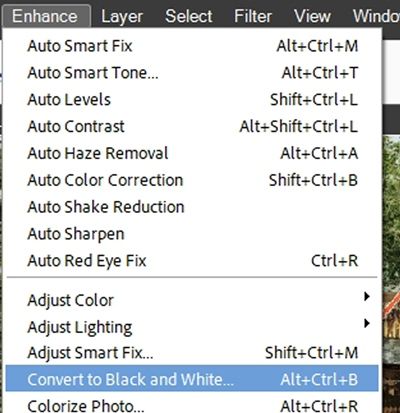
Normally that might be my first choice. But with this technique things turn out better if I instead select Enhance->Adjust Color->Remove Color:
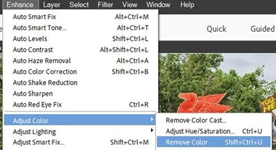
This option uniformly desaturates the image by assigning equal red, green, and blue values to each pixel in an RGB image. The overall brightness of each pixel remains constant. This helps keep the image as close to what would be seen if the photo had originally been captured as a black and white:
Next, I duplicate the B&W layer and rename the duplicate to Sketch. With the Sketch layer active I press Ctrl+I to invert the photo:
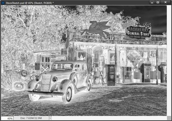
I know this negative of the photo might look a bit scary but bear with me. The next thing I do is change the Blend Mode of the Sketch layer to Color Dodge:
And you thought the negative was scary 😉 But, this nearly white image is exactly what I want at this point. Next, I go to the top tool bar and select Filter->Other->Minimum:
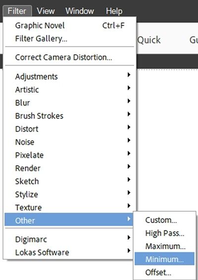
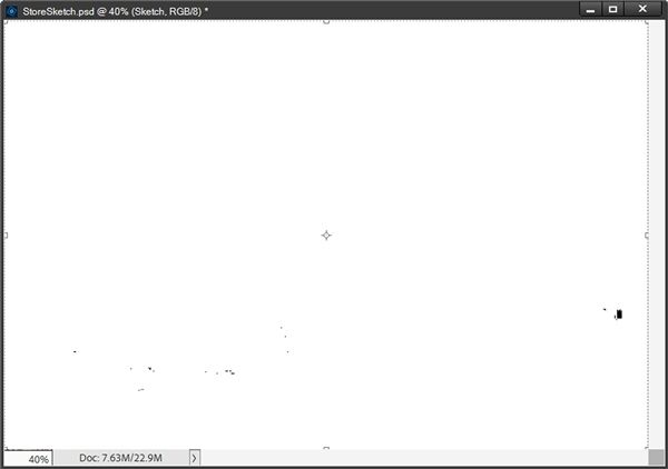
PSE opens the Minimum filter dialog box and I set the Radius to 1:
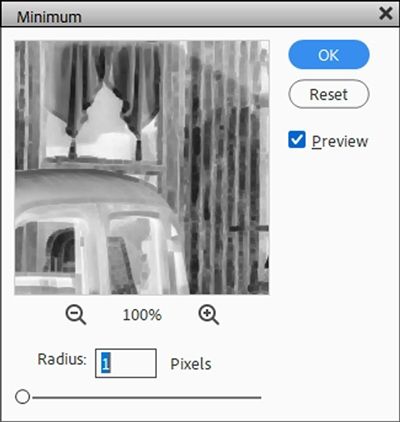
This radius is typically a good starting point, especially if you’re a beginner. And this is a setting that can vary from photo to photo depending on the complexity of the photo and the level of contrast. The goal here is to end up with black sketch lines that aren’t too dark:
This looks pretty good but it does need some fine tuning. So, I go to the top tool bar and select Layer->New Adjustment Layer->Levels:
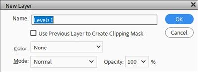
PSE opens the New Adjustment Layer dialog box and I set the Color to None, the Mode to Normal, and the Opacity to 100%. I Click OK to confirm and PSE opens the Levels options box:
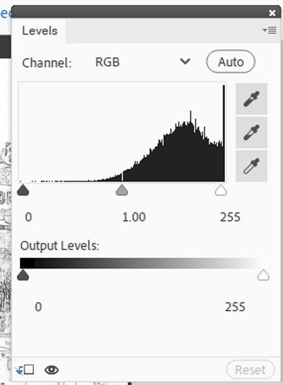
The first thing I want to mention here is that it’s generally not a good idea to ever mess with the Output Levels (just below the Levels Properties panel) unless you’re a professional photographer and feel comfortable making those adjustments.
In the Levels Properties panel there are three triangles (sliders). The far left is for the dark tones, the far right is for the light tones and the middle one is for the (you guessed it 😉) mid-tones. For this particular photo I’m using a dark tone value of 75, a mid-tone value of 2.15 and a light tone value of 240:
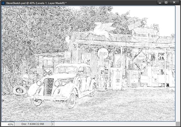
This looks so much nicer than the prior image.
These settings will vary from photo to photo depending on the complexity of the photo and the level of contrast. The goal here is to end up with a bit more white showing through without losing too many of black sketch lines in fine detail areas.
When it comes to the Levels, there’s no real science or hard and fast numbers…sometimes it’s just all about moving those sliders around until you get the desired sketch effect.

Now, I could go in and “erase” and/or lighten parts of the sketch that may still look too dark or even “erase” around the edges giving it a more “sketchy” look.
To do that all I have to do is set my Foreground/Background color chips to the default (press D), swap them so white is on top (press X), grab a soft round brush, size it to whatever is appropriate for the section I want to adjust and set the opacity fairly low to start (around 15% or so):
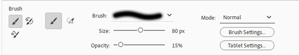
Then with the Sketch layer active all I have to do is brush over the areas I want to erase/lighten. I can alter the brush size and opacity as I brush around until I’m happy with the result. If I get too carried away, all I have to do is swap the color chips again so black is on top and I can restore some areas that got too light. And I can get something like this:
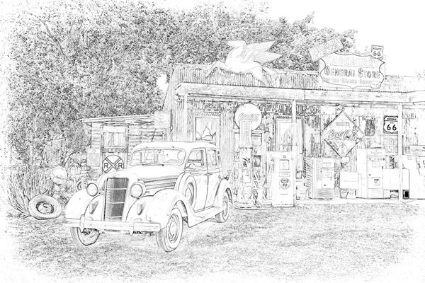
But, with this photo sketch (without the above adjustments) and for this method…I feel pretty good about stopping here. I am going to save this first as a JPG file just in case I ever want to use it as a simple sketch. And since I’m going to be doing more with this next week…I will save it as the PSD file I already created (SketchEffect).
Using this filter method is nice but it is a bit more restrictive than the next method. If you’re following along and are happy enough with the sketch you’ve created you can opt to skip reading about the next method.
One way or the other you can now save your sketch for future use as a JPG file. And if you plan to join me next week to see what else you can do with this sketch, please preserve the layers for later use by saving your sketch as a PSD file with a unique name that will remind you what it is (i.e., PencilSketchFilterMethod).
Smart Blur Method
If you’ve already completed a sketch using the Filter Method above and want to follow along with this method, please save and close that other file. It will be easier for you to follow along if you start fresh.
I’m going to be using the same general store photo from above:
If you haven’t already downloaded it, you can find it at Pixabay. And you are also welcome to use any photo of your choosing.
And just as I did in the Filter Method, I open the photo directly in PSE and immediately save this as a PSD file with a relevant name. I’ll name this one StoreSketch-Blur. I would encourage you to do the same. It is the best way to safeguard your original photo.
Now, I’m going to duplicate the photo twice. I rename the second duplicate (it should be the top layer) to Sketch. And here’s how things look in the Layers Panel:

Note: I won’t be using the first duplicate of the photo (Layer 1) today. But I will need it next week!
With the Sketch layer active, I go up to the top tool bar and select Filter->Blur->Smart Blur:
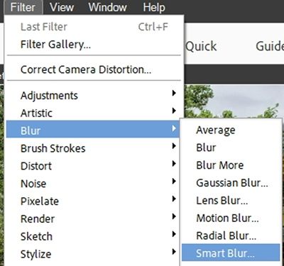
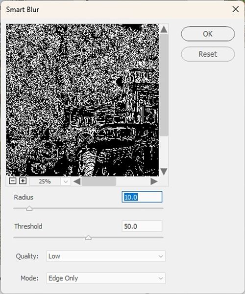
PSE opens the Smart Blur options and I set the view percentage (directly below the photo image) to 25%, Quality to Low and Mode to Edge Only. This turns the photo black with white lines:
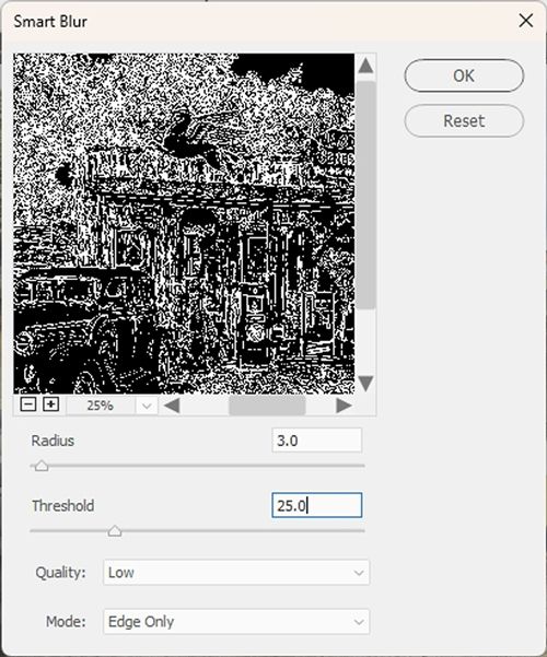
Clearly, I want the sketch to be black on white so this looks like a mistake. Don’t panic I’ll fix that in a bit.
I’m going to play around with the Threshold and Radius settings to fine tune the sketch effect. The Threshold default is 25.0. I’m just going to move the slider to the right until I start to see some of those white lines disappear. I stopped at 50.0:
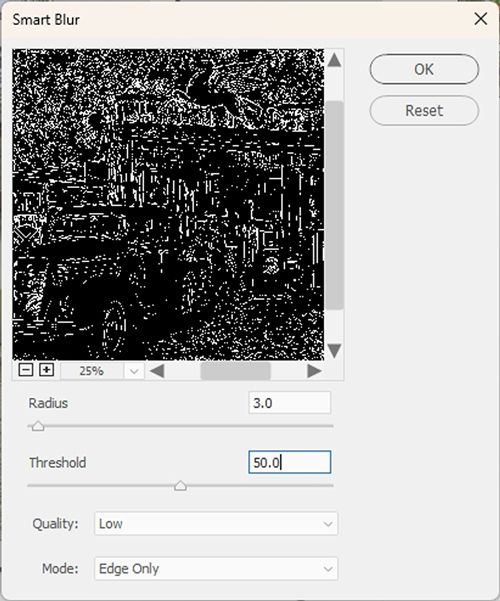
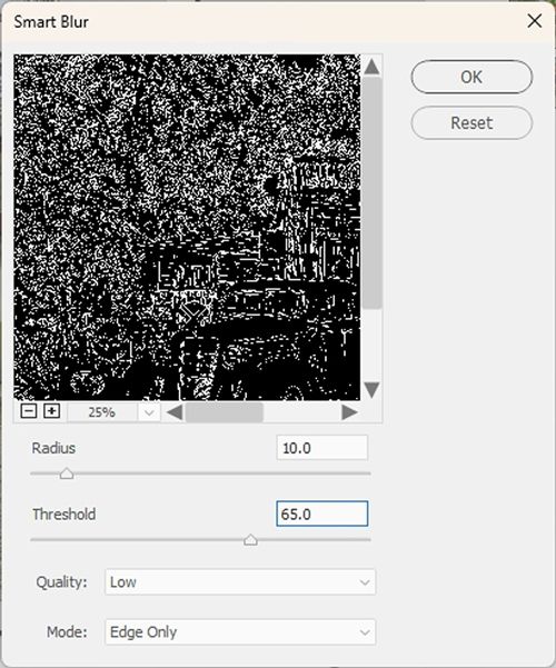
I know this looks like an awful lot of black at this point. And yes, there’s a lot of fine detail in this photo and I don’t want to lose all of that!
So, I need to adjust the Radius (the default is 3.0.). Raising the Radius will make the lines thicker and easier for me to decide how many I need to keep. I ended up with a Radius at 10.0:
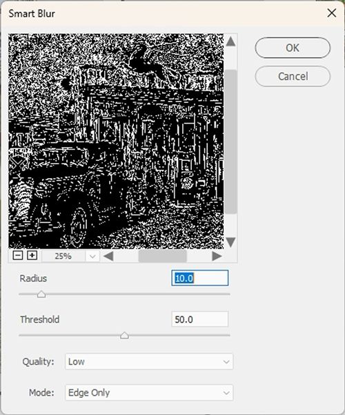
Now, I’m going to change the view size to 100%. I then move the preview to the right so I can see the large diamond-shaped “Coca-Cola” sign. I want to be sure that the words are outlined nicely:
Now I can go back to a 25% view and take a good look at the trees. There’s an awful lot of white in there:
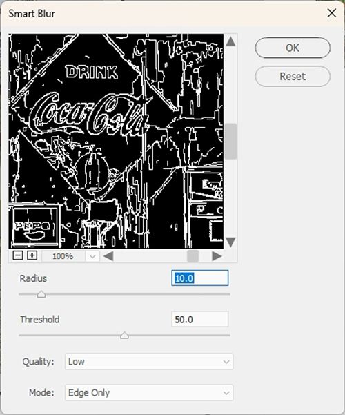
I’m going to go back down to the Threshold and move that slider until I see less white in there. I don’t want to lose all of it but there definitely was too much. I got to a Threshold of about 65.0:
That looks much better. I set the view back to 100% so I can inspect that Coca-Cola sign again:
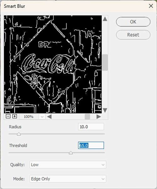
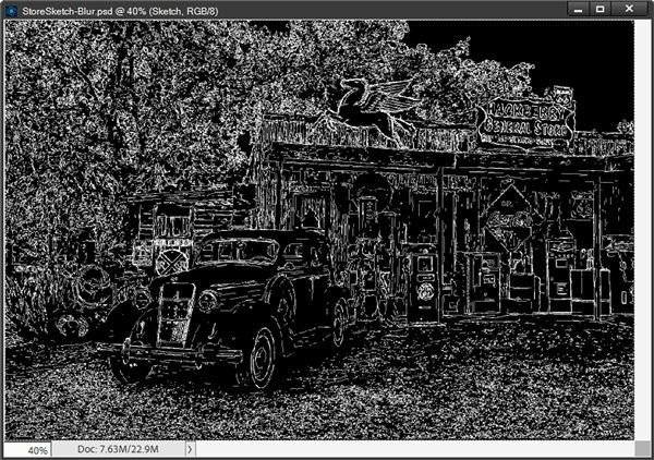
I think this is going to work. Then I click OK to confirm. And here’s the full photo:
With this particular photo I ended up using a Radius of 10.0 and Threshold of 65.0. Those settings will vary from photo to photo depending on multiple factors. Such as the size of the image, the amount of contrast within the image (those fine details I mentioned) and the depth of color.
As you’re setting the radius and threshold just think about the white lines eventually becoming the outlines of the sketch!
As we know, I want this to be white with black lines so I press Ctrl+I to invert the image:
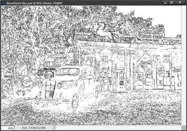
The photo looks more like a sketch now. And this looks a lot different than the result using the Filter Method above:
In some ways the Blur Method version shows a lot more detail, but at the same time in some areas there seems to be a bit less detail. I don’t think you can go wrong with either method. It really comes down to how much control you want to have over the sketch lines.
There is one drawback to the Blur Method. Remember in the Filter Method, I showed you how you could go in and “erase” and/or lighten parts of the sketch? There’s no easy way that I’ve found to do this when using the Blur Method. So, if you want that kind of flexibility, the Filter Method is the way to go.
And remember…every photo is different. If it’s not as complicated a photo as the one I used today…the Filter Method may be the way to go. That method is definitely quicker!
I am going to save this second sketch as a JPG file just in case I ever want to use it as a simple sketch. And since I’m going to be doing more with this next week…I will also save it as the PSD file I already created (StoreSketch-Blur).
Whichever method you may have used, if you plan to follow along again next week, please be sure to save your PSD file so you can pick up where you left off.
I hope you enjoyed learning how to create a sketch effect…
More Tips
Remember, this technique typically works best with photos that are of high quality and have good contrast.
To achieve a convincing sketch effect, try using filters, levels adjustment, or smart blur for linework.
When using the Filter Method, remember to use the Remove Color option rather than simply converting a photo to black and white. This option uniformly desaturates the image and keeps its tones as close to what you’d see if the photo had been taken as a black and white.
When using the Levels adjustment layer in the Filter method, be sure to only adjust the dark, light and midtone values. It’s not a good idea to adjust the Output Levels unless you’re a professional photographer.
With the Filter Method, you could go in and “erase” and/or lighten parts of the sketch or even remove the edges. This is not possible when using the Blur Method.
When using the Blur Method, remember not to get too heavy handed with the Radius and Threshold. As you’re working with those settings it’s important to concentrate on the fact that the white lines eventually become the outlines of the sketch! If the Radius is too high, those lines will be too thick and the sketch will be more black than white. If the Radius is too low, you will lose detail. If the Threshold is too high you will also lose detail. And if the Threshold is too low, you will also end up with a sketch that is more black than white. Trial and error is often the best way to figure out what works for any given photo. That’s why we have the “undo” option 😉
Regardless of which method you use to create a sketch, settings will vary from photo to photo depending on multiple factors. Such as the size of the image, the amount of contrast within the image, the complexity of the “background” and even personal choice.
Above all else…don’t be afraid to experiment. Experimentation can be a powerful catalyst for creativity!
Thanks for reading this week’s Tuesday Tip. Remember, if you have any suggestions or questions please don’t hesitate to “Message Me“. Check back next week when this sketch becomes a watercolor painting. Click “Follow Me” to stay in touch. I hope you have a wonderful week!
