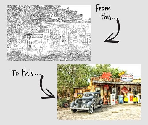
Watercolor Painting
So, in last week’s “Photo Sketches” post I told you that this week I’d show you how to turn that sketch into a watercolor.
Before I get into that I want to give you some examples of options available in Photoshop Elements (PSE) that can be used on an actual photo without first creating a sketch.
You may already know that PSE has a Guided Edit (Watercolor Effect). And there are a series of filters, that when used in combination with adjustment layers and textures, can create a watercolor effect of sorts.

The guided edit offers a very simplified approach with three different watercolor effects and options for watercolor paper and canvas texture. In my experience, the only effect that is even close to a nice effect is the first one. You can see an example in the image immediately above.
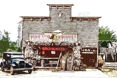
Alternatively, you can combine filters like Dry Brush, Cutout, Smart Blur, and Find Edges, along with adjustments like Curves and watercolor paper textures, to achieve a more nuanced and customized watercolor effect similar to this:
But it’s actually a much more complicated process than what I’m going to explain today.
Note: The watercolor examples directly above were created using another “general store” photo from Pixabay.
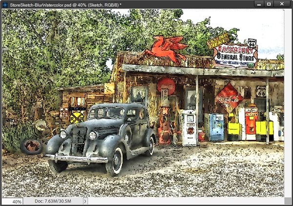
If you look at the featured image at the top of this post, you’ll see what my sketch from last week should look like when I’m finished!
Using A Sketch
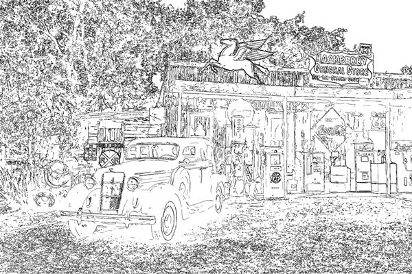
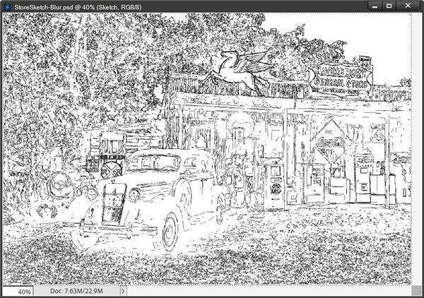
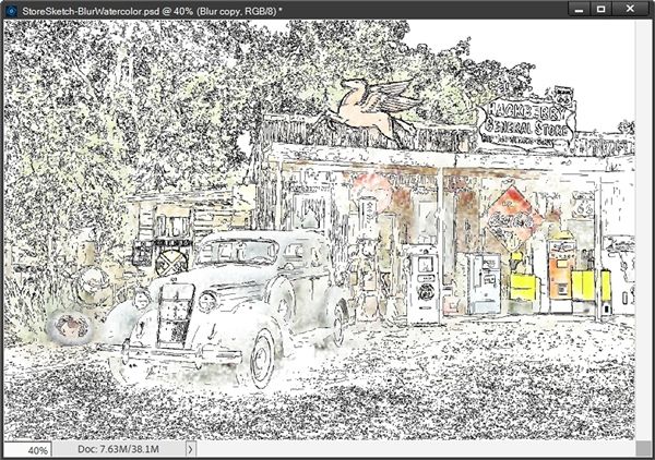
I’ll be picking up where I left off last week with the general store sketch that I created using the Blur Method (shown directly above).
Quick reminder, I use PSE 2024. If you use a different version, some of my screen shots may look different than what you see on your screen.
If you didn’t read last week’s “Photo Sketches” post and create a sketch, you may want to do that before you finish reading today’s post. Without a sketch created using one of last week’s methods (and the associated PSD file) you will not be able to follow the steps below to create a watercolor today.
Let’s paint…
Open Sketch

A sketch created using either one of the methods from last week will work just fine. But if the sketch (and all its layers) has not been saved as a PSD file, the remainder of the steps will not work!
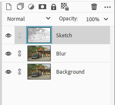
Note: If you’re following along and have created your sketch using the Blur Method, you can now skip down to the Blur Method Prep step.

If I were going to use the sketch I created using the Filter Method, I would open the PSD file I saved for that sketch (StoreSketch). First, I would activate the B&W layer, the Sketch layer and Levels 1 layer (Layer 1) in the Layers Panel:
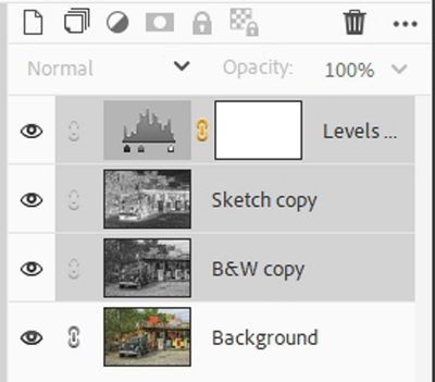
I would then merge these three layers into a single layer (now named Level 1) and rename that layer to Sketch.
Next, I would duplicate the original photo (Background) and rename it Blur. It should be below the Sketch layer at this point. As a precaution, I would immediately save this file as a new PSD named StoreSketch-Watercolor:
Note: If you’re following along and have finished the Filter Method Prep, you can now skip down to the “Watercolor Effect” section.

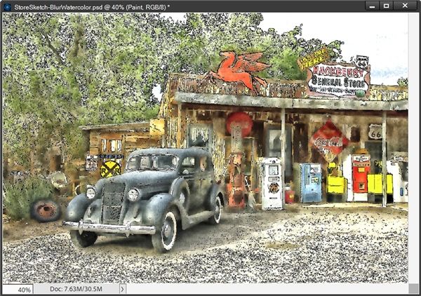
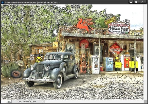
I am actually going to start by opening the PSD file I ended with last week (StoreSketch-Blur) when using the Blur Method:
The first thing I need to do is rename the duplicate photo below the Sketch layer in the Layers Panel to Blur:
Then as a precaution, I immediately save this file as a new PSD named StoreSketch-BlurWatercolor.
Now, let’s get painting…
Watercolor Effect
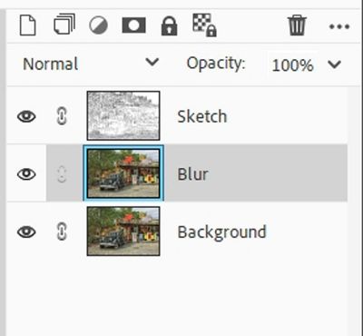
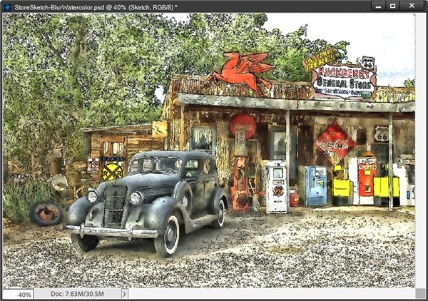
With my “sketch” file open (either method), I hide the Sketch Layer and activate the Blur layer in the Layers Panel:
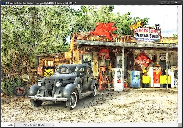
I need to soften/blur the photo. This is going to help make the watercolor effect look more “real”. So, I go to the top tool bar and select Filter->Blur->Smart Blur. PSE opens the Smart Blur options:
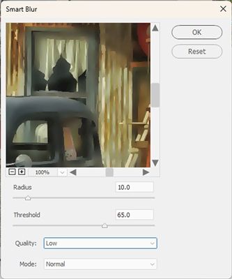
I set the view to 25% and change the Quality to High and the Mode to Normal. For me the Radius is already set to 10.0 and the Threshold is at 65.0. These are the same settings I used when creating the sketch using the Blur Method last week:
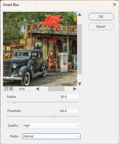
Note: These settings should work out just fine even if you used the Filter Method.
Then, I click OK to confirm:

Note: If you created your sketch using the Blur Method, PSE may “remember” the Smart Blur settings that you used. The majority of the time, those settings should work out just fine at this point. If you’ve closed PSE and restarted since creating the sketch, those settings may not be saved. If you’re not using the same photo as I, you can use whatever settings work for your photo. Just keep in mind that you don’t want the photo to be too blurry. Try to use the amount of blur you see in my example as a guide.
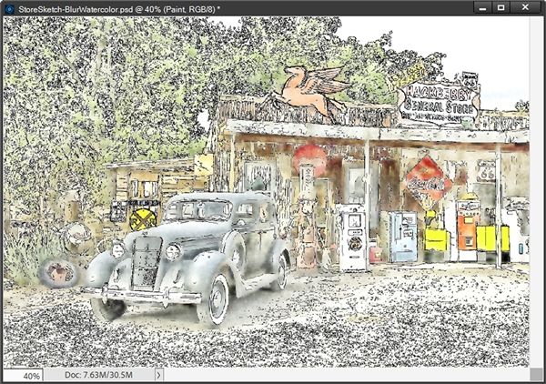
Now I’m going to duplicate this Blur layer and rename the duplicate to Paint. With the Paint layer active I press Ctrl+I to invert the image:
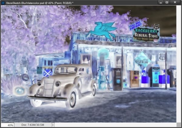
Note: If you’re following along and created your sketch using the Filter Method, this “negative” should look familiar to you 😉
The photo now looks like a color negative. I know you’re wondering what I’m going to do with a negative! Bear with me. I change the Blend Mode to Color Dodge:
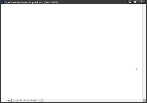
Now all but that one spot of black seems to have disappeared. And you thought the color negative was scary. Again, don’t panic that photo is still there.
Note: If you’re following along and created your sketch using the Filter Method, this “white” image should also look a bit familiar to you 😉
Next, I unhide the Sketch layer and I’m going to change the Blend mode so I can see through this layer when I start “painting”. I can use any one of the modes between Darken & Darker Color:
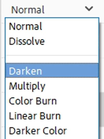
I’ll explain more about this later. For right now, I’m going to use Darken.
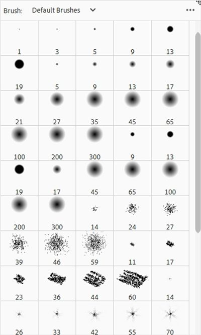
I ensure that my Foreground/Background color chips are set to the defaults (press D) and make the Paint layer active in the Layers Panel. I then open the Brush Tool and select the PSE Default brush set (should be all the way at the top of the drop down):
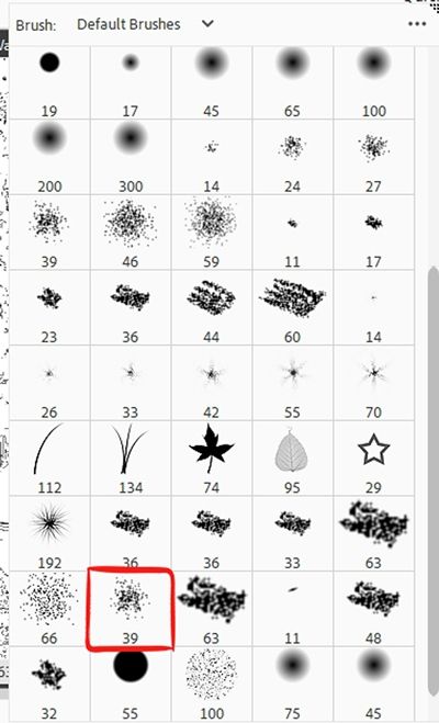
Then I scroll all the way to the bottom until I see dry brush 39 pixels:
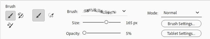
Now I change the Opacity to 5% and the size to 165px:
Then I just start brushing over the Paint layer which reveals the colors on the Sketch Layer:
Don’t forget, the Opacity of the brush right now is set to 5%. So, it’s just bringing through a very light portion of the underlying photo. I can either simply click in certain areas or I can click and drag the brush around. But for now, I’m just going to lay down some paint over the majority of the sketch:
You can see there are some spots where the color may be darker than in others. Those just happen to be areas where I may have brushed over multiple times. And that’s fine for now.
Now I’m going to change the Opacity of the brush to 20% so I can get a bit more color to show through in certain places. I’ll zoom in closer so I can better see some of the parts that need more depth/darkness:
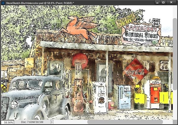
You can now see the effect the dry brush is having. Specifically in the area where the Coca-Cola sign is under the overhang. I’m going to zoom back out and do some more brushing around other spots with the higher Opacity setting:
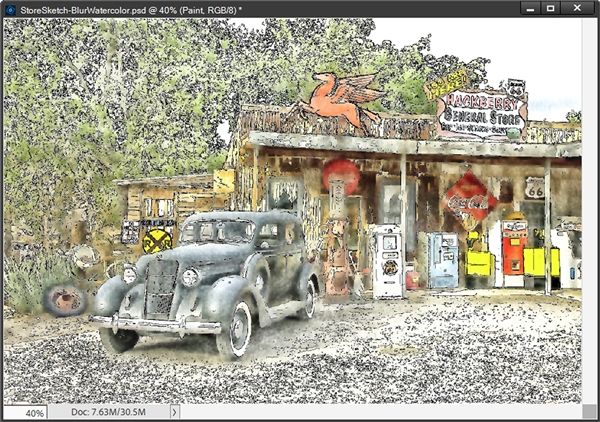
That’s starting to look nice. But I do think I want to raise the Opacity a bit more…to around 50% and the brush Size down to about 80px. Now I can try to bring out a bit more detail. I just brushed around, sometimes changing the size of both the brush and the Opacity until I was happy with the result:
This looks pretty good. But some of the yellow spots, like the railroad sign, seem a bit too pronounced compared to the other colors. I do think I want to back that down a bit. So, I swap my chip colors so white is on top (press X).
Then using brush settings of Opacity at 70% and Size at 40px, I can brush away some of those bright tones:
The changes may not be as noticeable at this small size but I like the softer tones I was able to achieve.
Note: Any time you want to soften/lighten any part of the watercolor, all you have to do is exactly what I did above with the yellow.
Now I’m going to make the Sketch layer active. Remember earlier when I said I can use any one of the Blend Modes between Darken & Darker Color on this layer. This is the time to experiment with those. Remember I started out with Darken. Changing the blend to Multiply had this result:
That made a lot of the outlines darker. Let’s see what Color Burn does:
That seemed to soften the outlines and brighten the colors. Let’s see what Linear Burn does:
That made a lot of the outlines even darker than the Multiply blend did. I then tried Darker Color and it really didn’t look any different than with the Darken blend.
As much as I liked how things looked with Color Burn, I think I’d be sacrificing some detail. I did like the effect with Linear Burn but the outlines looked too dark. So, I compromised and went with Linear Burn but I set the Opacity to 50%:
Now, I can add a bit of texture so it looks like it’s painted on a canvas. And this is totally optional! If you don’t want to add any texture, feel free to skip down to the “More Tips” section.
To add the texture, in the Layers Panel I’m going to select the Sketch, Paint and Blur layers and duplicate the set (Ctrl+J).
With the duplicate set active I right-click somewhere within the set. From the drop down I select the Merge Layers option. I then name the merged layer to Watercolor and hide the original layers.
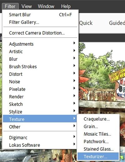
With the Watercolor layer active I go to the top tool bar and select Filter->Texture->Texturizer:
PSE opens the Texturizer options:
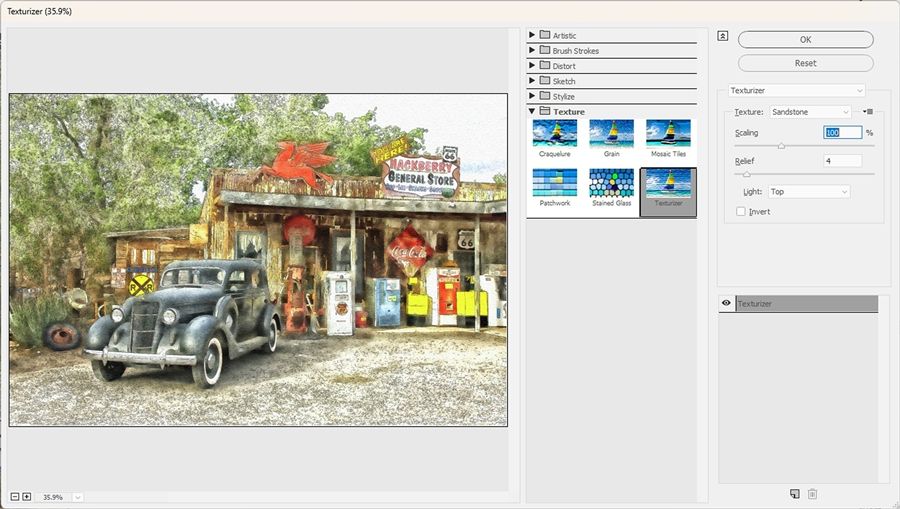
I select the view percentage of 66% (oddly it shows up as 66.7% after being selected). It really helps to zoom in a bit so I can better see how the texture looks.
I then change the Light to Top Left as that’s where the light is coming from in the photo. Sandstone is the default Texture. The other options are Brick, Burlap and Canvas.
Generally, Sandstone is my favorite. But this time I’m a bit torn between that and Canvas. After switching back and forth a few times I ended up going with Sandstone after all 😉:

The Scaling defaults to 100% and Relief defaults to 4. Depending on any textures inherent within a photo, I tend to bump these up a bit. But again, it’s totally fine to leave these at the defaults.
On this photo, with the gravel driveway I thought it might be good to increase the Scaling to 120% and the Relief to 7:
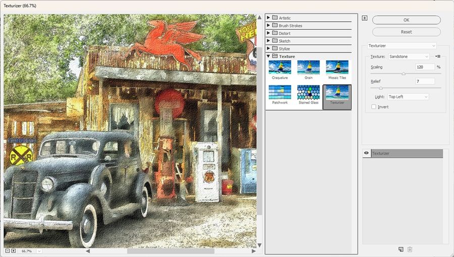
I’m happy with this but there is one last option…Invert. Most often I don’t see much difference when I check that box but today on this photo with these settings, I did decide to go with Invert checked:
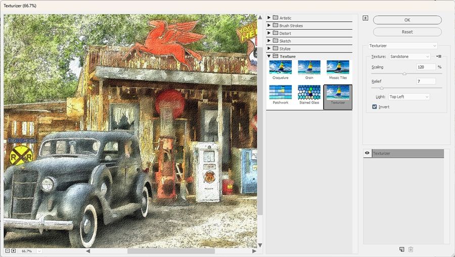
In the small image above, you likely won’t notice the difference. If you’re following along, you can toggle this on and off to see if it makes any difference to you.
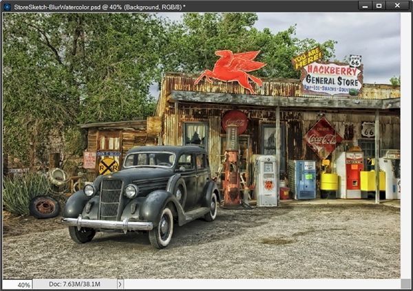
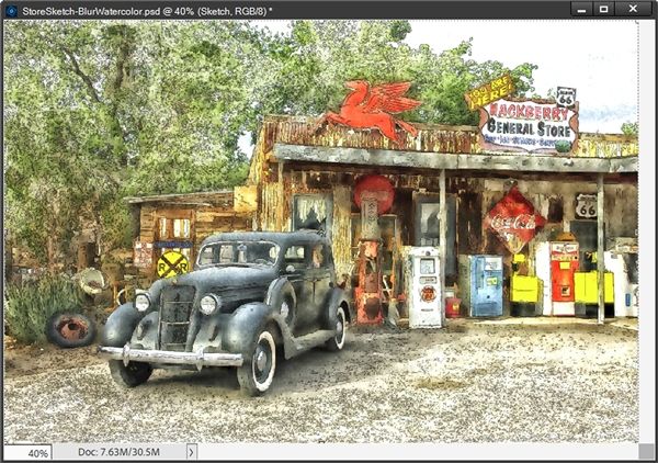
I am happy with this now so I click OK to confirm. And here’s the final result with texture:
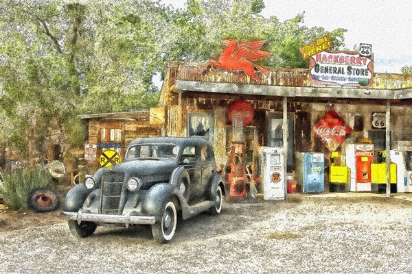
Now all I have to do is save this watercolor image as a JPEG file with a unique name. And I will also save the file as a PSD…just in case I feel like I ever want to make any other adjustments 😉
And here’s how my watercolor turned out following the exact same steps using the sketch I made with the Filter Method from last week:
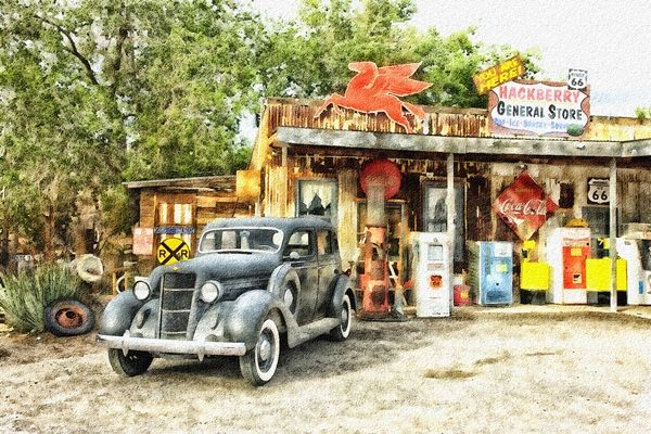
As you can see the results are fairly different but equally as lovely (at least in my opinion 😉)
All of the settings I used on the different layers creating this watercolor effect will vary depending on the photo being used. So don’t think you can just use these exact settings on any photo. They might be a good starting point but you really will need to experiment from one photo to the next. Just make adjustments until you’re happy with the result.
I hope you enjoyed seeing a sketch turned into a watercolor and will give it a try. And here’s a layout I created using my general store watercolor:

If you’d like to see more details about this layout you can find it in my 2025 Gallery.
More Tips
Remember, the steps outlined above will only work if you start with a sketch created using the techniques outlined in my “Photo Sketches” post.
To achieve a convincing watercolor effect, you can use a combination of smart blur values, brush size/opacity, blending modes and paper textures.
It is important that you not make your Blur layer too blurry. That will only end up in a more washed out look for your final watercolor.
A dry stipple brush is one of the best brushes to use when creating the watercolor effect. But if you feel adventurous, you certainly can try other brushes.
Don’t forget that if you end up with colors that are too dark or tones that are too bright, you can swap the chip colors so white is on top. Then just brush away some of those colors/tones with a low opacity brush.
When adding a paper texture using the Texturizer filter, be sure to experiment with the various texture types and scaling percentage.
When adding a texture, also try experimenting with inverting it for a different effect.
Most importantly, remember that the settings used in this post are not guaranteed to work on every photo. These will all likely vary depending on the photo being used. You really will need to experiment from one photo to the next.
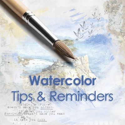
Note: The image at the top of the tips section was created using a layout featuring another one of my photos treated with the watercolor effect. You can find a layout titled “Free My Soul” in my 2019 Gallery that shows that watercolor effect.
Thanks for reading this week’s Tuesday Tip. Remember, if you have any suggestions or questions please don’t hesitate to “Message Me“. Check back next week for tips about easy tattered edges. Click “Follow Me” to stay in touch. I hope you have a wonderful week!