Gradient Blend
Today is the first day after a long holiday weekend here in the United States (Labor Day Weekend). So, I thought I’d start September with something fairly quick and easy. Well, hopefully quick 😉 Especially since my last two posts about creating sketch and watercolor effects were both pretty involved!
I don’t know about you, but every once in a while, I have a single photo that deserves to be the center of attention…but in a big way. By that I mean, that photo is going to make up the majority of the layout. There are more than a few examples in my galleries that confirm my love for using large photos.
Today I want to show you how to take a large focal point photo and seamlessly blend it into your background using a gradient!
Though I will admit, there aren’t but a couple in my galleries where the photo is the singular element on the page. And I’m not 100% certain you’d easily find one that uses the specific technique I planned for today. The featured image at the top of this post comes close! Another confession, my go to for blending is usually to use a mask of some sort 😉
That doesn’t mean I don’t use this technique. I just generally add other elements, journaling and/or photos, as you can see above. So, any that you might find in my galleries won’t look quite the same as what you’ll see today.
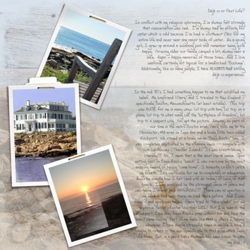
Note: You can see more details about the featured image above in my 2019 Gallery. The title of that layout is “Déjà vu or Past Life?” You can’t tell by looking but two of my large photos were blended with a paper (using a gradient) to create the background.
You have probably blended a photo or two into a background before. But the gradient blend may be new for you. So how about we take a look…
Large Photo
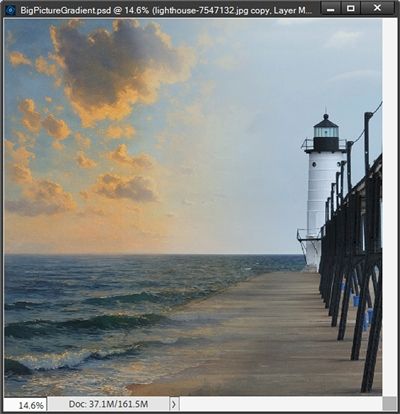
This technique typically works best when using a photo where the subject is in front of an interesting background. But that doesn’t mean I can’t use a simpler landscape like this:
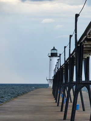
Clearly the first thing is to find a nice photo where the subject is large and fills the majority of the space. Something like the photo directly above. I found this photo of the Manistee North Pierhead Light on Pixabay. I have a similar one of my own but I wanted you to be able to download this one if you’d like to follow along.
Note: If you’re following along, you can use any photo that you like. Just be certain that it will fill at least three quarters of the page and the quality is high enough to allow re-sizing to 12” high without distortion.
Before I get started here’s a quick reminder, I use Photoshop Elements (PSE) 2024. If you use a different version, some of my screen shots may look different than what you see on your screen.
I’m going to keep this as simple as possible today. First things first, I ensure my Foreground/Background color chips are set to the default (press D).
As usual I’ll start with a 12×12 blank file. Then I’m going to pull in a seascape paper from “Lighthouse” by Manu Scraps:
Next, I pull in my lighthouse photo and line it up against the right side of the paper:
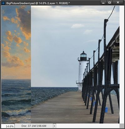
This photo from Pixabay was actually large enough to fill three fourths of the page almost exactly. But I am going to re-size and reposition it so the lighthouse is a bit larger and the water line matches the paper:
Blend Photo
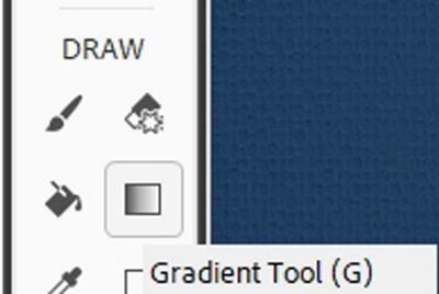
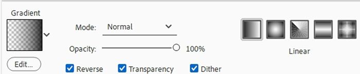
Then I grab the Gradient Tool:
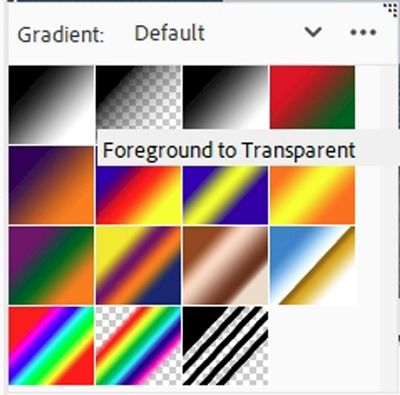
In the Tool options, I click on the down arrow to the right of the word Gradient to open the Gradient Picker. PSE opens the Default Gradient options (at least for me). I choose the Foreground to Transparent gradient:
Note: If you’re following along and PSE didn’t open the Default Gradient options, just click on the down arrow to the right of the Gradient set name that is open. PSE will display a dropdown menu and you can then choose the Default Gradients.
In the Tool options, I click on the Linear Gradient icon (leftmost box in the set of 5). I then set the Mode to Normal, the Opacity to 100%, check Reverse, Dither and Transparency:
I ensure that the photo layer is active in the Layers Panel and that the Foreground color chip is still black.
Then I click on the Add Layer Mask icon in the Layers Panel. The Layer Mask should now be active at this point:
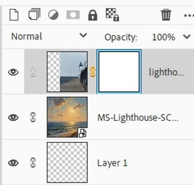
Note: If you’re following along, my Layer Mask has a blue outline. Yours could be outlined in a different color. If you don’t see an outline at all, be sure to double-click on the Layer Mask to ensure that it is active.
Then holding down the shift key, I just click a spot on the photo where I want the gradient to begin and then drag to the left until I hit a spot on the base paper where I want the gradient to stop. For me, those positions look like this:
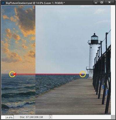
I had to make more than a few tries before I landed on the starting point of the gradient that you see in the image above.
When I tried starting farther away from the light house, I ended up with too much water coming over the pier. The ending point of the gradient didn’t seem to matter much in this scenario.
Note: Starting/ending points for the gradient will vary with each different combination of photo and paper. Most times it takes at least a few tries to get the blend effect that looks the best. You’ll just have to experiment. Again, this is why we have the “undo” feature!
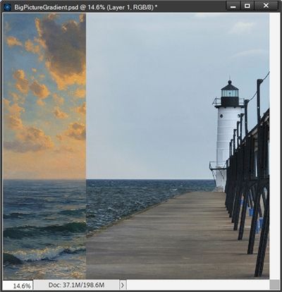
Here’s how my blend turned out:
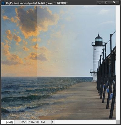
Is it a perfect blend? Not really. Can I tweak it? Absolutely!
With the Layer Mask still active, all I need to do is grab a soft round brush either from the Default Brushes or from the Basic Brushes.
Then I set the Size to something fairly large (200-400px), the Mode to Normal, and the Opacity to about 50%.
Remember the rules about Layer Masks…black conceals and white reveals. If I want to erase part of the gradient, I need to ensure that my Foreground color chip is still set to black. Then I just brush over the left edge of the gradient to soften the blend:
That’s much better! But as you may have already guessed the photo I used is perhaps not the best type of photo for this technique. Still, I was able to show you a way to make it work.
Ideally, this technique will work better using a photo that has a “busier” background. Something like this fall photo of a woman from Pixabay:
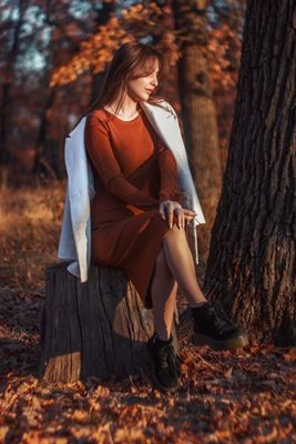
I pulled in a brown ombre solid paper from “Copper Spice” by Sekada Designs to use as the background behind that photo:
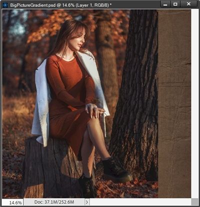
I add a Layer Mask to the photo layer and use the exact same gradient settings as I did for the lighthouse. Since the photo is left aligned on the paper, I create my gradient going from left to right:
This time the photo blended seamlessly! No extra brush work required.
I hope you’ve enjoyed learning about large photo blending and will try this technique on a layout.
Speaking of layouts…here’s my layout using my own photo of that same lighthouse I used in the first example:
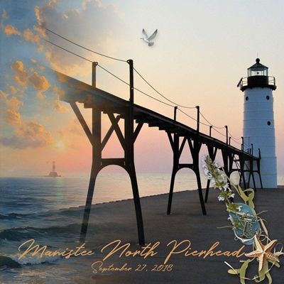
You can see more details about this layout in my 2025 Gallery.
Extra Tips

When using this technique, try to keep the layout simple. The whole point is for the big photo to be the center of attention. Use very few elements and keep journaling to a minimum.
This technique is designed to use a large photo that will fill about three quarters of your page. At a minimum your photo should be 12” high.
If you have a “subject” that is oriented more horizontally than vertically, just align your photo with either the top or bottom of the paper. But it should then be at least 12” wide.
This technique tends to work better with photos that have a somewhat complicated background. These are the types of photos that will blend more seamlessly with a paper. Especially if you’re trying to use a solid color paper.
Solid colors work best with photos that have an interesting/complex background. You can try using a patterned paper but try to find one that coordinates well with the photo’s background.
If your photo has a simple background, you’ll have more luck using a patterned paper. Just try to find a paper that fits the theme of the photo. You can try a solid paper but it will be even harder to create a seamless blend.
There’s no science to picking the start/end points for the gradient. All of that will vary with each different combination of photo and paper. It generally takes at least a few tries to get the “perfect” blend.
If you run into trouble getting the gradient blend to have a smooth transition, try using a brush (on the Layer Mask) to soften the blend.
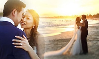
You can also use this technique to blend two photos together, like this:
Always ensure your photo is of high quality. The recommended resolution is at least 300 pixels per inch.
As always…experiment and see where your creativity will take you!
Thanks for reading this week’s Tuesday Tip. Remember, if you have any suggestions or questions please don’t hesitate to “Message Me“. Check back next week for tips about ragged edges. Click “Follow Me” to stay in touch. I hope you have a wonderful week!
