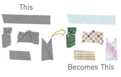
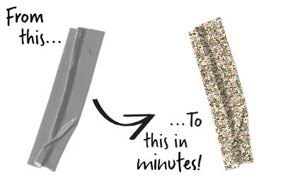
Custom Tape
Have you ever been working on a project where you need some tape but couldn’t find any in your stash that coordinated well? Me too! But there’s an easy way to work around this. Generally speaking, you can turn most any paper into a gorgeous piece of custom tape if you have some basic supplies in your stash.
All you really need is a grey tape, a nice paper and the correct blend mode to make it happen. It’s almost astonishing how easy it is to create your own custom tape.
Pick A Tape
Just a quick reminder before I get started. I use Photoshop Elements (PSE) 2024. If you use a different version, some of my screen shots may look different from what you see on your screen.
As I said in the beginning, you can use most any piece of medium grey tape you may have in your stash; flat, tattered, wrinkled, even shiny. They should all work nicely with this technique. Just avoid using a “washi” (semi-transparent) tape. And if you don’t have a piece of grey tape, not to worry.
If you’ve already read my post about Coloring Grey-Scale paper, you likely know how to turn a colored item grey. It’s as simple as going to the top tool bar and selecting Enhance->Adjust Color->Remove Color (Shift+Ctrl+U).The goal is to ensure the shade is not too light.
Another option is going to the top tool bar and selecting Enhance->Adjust Color->Replace Color. If you need to do this, try to shoot for a shade of medium grey that is no lighter than #8e8e8e.
I’m going to start by opening a 12×12 file with a white base in PSE. Then I drag this wrinkled piece of tape that I created years ago into the file:
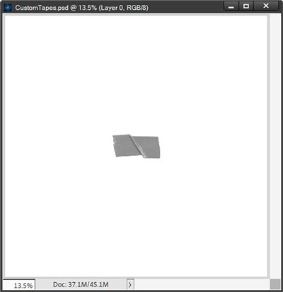
If you’d like to use this exact tape to follow along, just click here and it will be automatically downloaded for you.
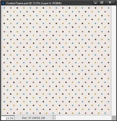
I have a 12×12 polka dot paper that I created years ago when the original Café was still open. It should work great for this technique. I open the polka dot pattern in PSE.
With the tape layer active I drag the pattern into my file:
Note: You can use almost any paper that you like. The only paper to avoid would be ones with large patterns, as they will be hard to see on the small piece of tape. Of course, depending on the paper, you might be able to resize it and still have the pattern show up okay.
If you’d like to use this exact paper to follow along, just click here and it will be automatically downloaded for you.
I clip the pattern to the tape layer:
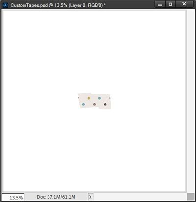
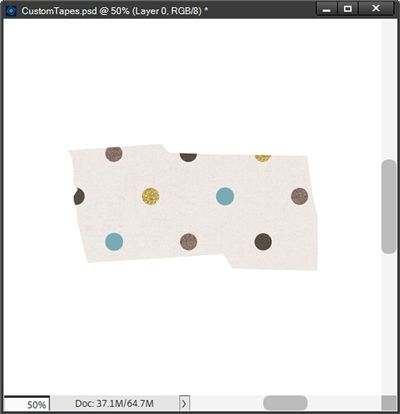
I want a few more polka dots to show up on this small piece of tape so I resize the pattern layer until I like how many dots are visible. I then zoom in to about 50% so I can better see the tape:
You should be able to notice that after clipping the paper to the tape, I can no longer see any of the texture on the tape, namely the wrinkle. No problem, there’s any easy trick to take care of that missing wrinkle.
But before I do that I am going to “cut” the paper down to only the size of the tape by adding a layer mask. I simply Ctrl-Click on the thumbnail of the tape layer to get a selection outline. I then click on the Add Layer Mask icon in the Layers Panel. PSE creates a Layer Mask that is black with a white tape shape. I can then simplify the pattern layer to remove the layer mask.
With the pattern layer still active in the Layers Panel, I change the Blend Mode to Overlay and the wrinkle returns:
There are some other “fine” textures along the torn edge of the tape (on the left side) that are a bit too hard to see in this small image (even if I zoom in). But they are there.
So, you can see this is a clever trick to let the texture of the tape shine through, but also keep the colors and the patterns of the paper.
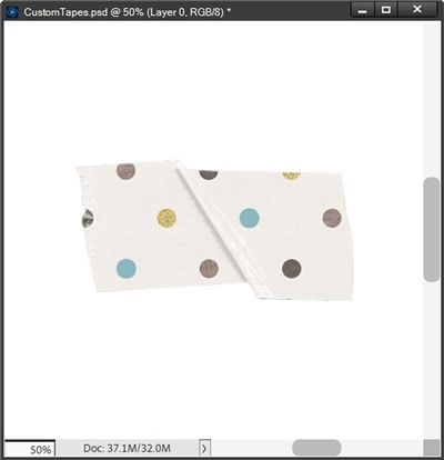
Since most tape (other than washi) is a bit thicker than paper, I’m going to add a drop shadow. Because the tape will still be very close to the background when I place it on my layout, it’s going to be a very small drop shadow.

With the tape layer active in the Layers Panel, I go to the top tool bar and select Layer->Layer Style->Style Settings. PSE opens the dialog box. I set the Lighting Angle to 120 degrees. I click on the box next to Drop Shadow to open those settings.
As you likely already know, I’m not a fan of black shadows so I set the color chip to a dark grey (#595858) somewhat similar to the original tape color. I set the Size to 2, the Distance to 4, the Opacity to 35% and click OK to confirm. My tape now looks like this:

This is a very subtle shadow but it does make the tape look a tad bit thicker or lifted giving some realism to the wrinkle effect.
One last thing I need to do when I actually use this tape…
Add More Realism
In real life whenever I put tape over something, I see a faint line (bend) in the tape from the change in elevation as the tape is farther away from the background paper. Adding this extra realism to my custom tape is easily accomplished by using either the Dodge or Burn tool.
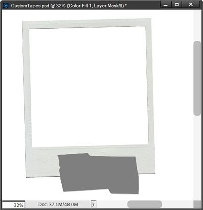
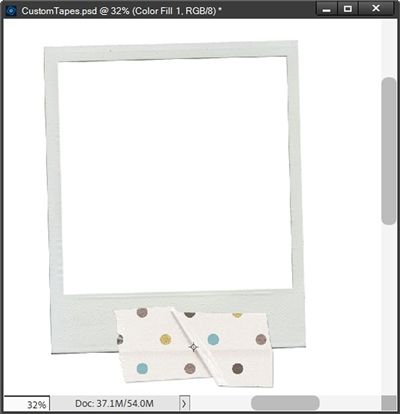
I’ve added a polaroid frame from my stash into my file and positioned it so that the tape overlaps the bottom edge of the frame. I also applied a simple drop shadow to the frame using a 120 degree Lighting Angle. In the Layers Panel, I move the frame below the tape layer:
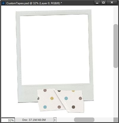
Note: I’ve zoomed out to 32% so I can see both the tape and the frame fairly well. I want to keep it zoomed far enough that I can get a good view of my tape for the rest of this.
Two factors will determine whether I will use the Burn tool or the Dodge tool to add this extra touch of realism; the placement of the tape and the lighting angle on my layout.
On almost all of my pages, I use a lighting angle of 120 degrees. This means the light on my page comes from the top-left and casts shadows to the bottom-right.
Given that, if I place my tape along the bottom or right edge of the frame, I’m going to want to use the Burn Tool to darken that slight bend where the tape crosses the frame’s edge.
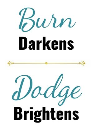
If I place my tape along the top or left edge of the frame, I’m going to want to use the Dodge Tool to brighten that slight bend where the tape crosses over the frame’s edge. Basically, the Dodge Tool is used in opposition to the shadow direction. I hope this makes sense.
Now I’m about to do something that’s going to seem a bit scary at first. Just trust me.
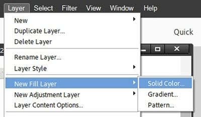
With the pattern layer active, I go to the top tool bar and select Layer->New Fill Layer->Solid Color:
PSE opens the New Layer dialog box:
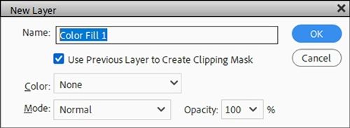
I leave the PSE default Name as is (Color Fill 1 for me), I ensure the Use Previous Layer to Create Clipping Mask box is checked and click OK to confirm. PSE then opens the Color Picker:
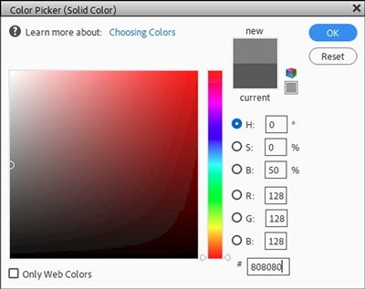
In the Color Picker I set the color to #808080 and click OK to confirm. The grey solid fill layer is now clipped to the paper layer:
I’m using this specific shade because it is precisely 50% grey. If you look closely in the Color Picker image above, you’ll see a half circle exactly at the midpoint along the left side of the color box.
And yes, once more I’ve lost all the texture from the original tape. But don’t panic. I’m about to fix that. All I have to do is change the Blend Mode of the Color Fill 1 layer to Overlay:
I know you’re wondering why I did this. Using either the Dodge or Burn tool is something called a destructive process. I don’t want to do this to the actual paper. By creating this solid fill layer, I can perform the destructive process (Burn or Dodge) on that fill layer and achieve the same result.
With the Color Fill 1 layer still active, I simplify the layer. I then Ctrl-Click on the thumbnail of the frame layer to create a selection outline of the frame:
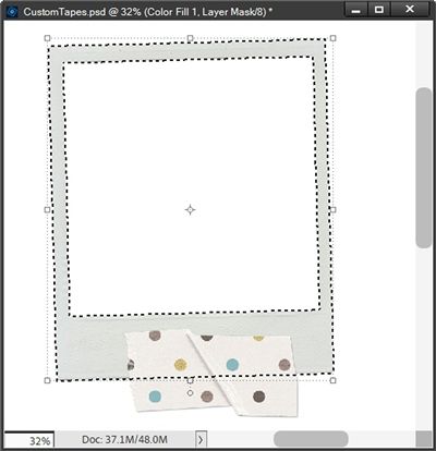
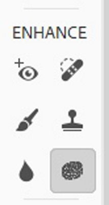
Next, I go to the top tool bar and click Select->Inverse to invert the selection (Shift+Ctrl+I). Now I grab the Burn Tool (in PSE it’s located in the Tools panel, grouped with the Dodge and Sponge tools, most often represented by a sponge-like icon):
When I select the Burn Tool (it looks almost like a hand forming an O), PSE opens the tool options. I set the Range to Midtones, the Exposure to 50%, choose a Soft Round brush from the Default Brushes and set the Size to 35px.
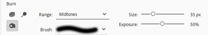
Note: If the patterned paper clipped to the tape layer is mostly white or something very bright, I recommend changing the range to Highlights. The burn tool is designed to make something darker. If there aren’t any midtones in the paper then it’s not going to change anything. By changing the range to Highlights the tool will be working on the very brightest colors of the paper. It may also be necessary to adjust the exposure to 50% or even all the way up to 100%.
I ensure that the Color Fill 1 layer is still active. Then holding down the Shift key I click and drag a line across the tape just below the selection line at the bottom of the frame. Since my pattern paper is somewhat light, I may need to click and drag more than once just to increase the darkening of that slight bend of the tape. When I’m happy with the effect, I cancel the selection (Esc or Ctrl-D):
Note: It took me three brush passes over that edge to get the result you see above.
And here’s a look at a different piece of tape (same pattern) on the left side using the Dodge Tool. This time I went opposite of the shadow direction since there is no shadow on the left side of the frame. That means I wanted to make the bend lighter.
This may sound odd but I can generally use the exact same tool settings as I did for the Burn Tool above:

Now I can see that my tape has some realism and some depth added to it. With no shadow on the left it’s now easy to see why I use the Dodge tool. There’s nothing but light on that left edge yet I can still see the bend effect.
All that’s left is to save this new custom tape for use on my layout. For now, I’m saving only the original custom tape (without frame or darkened “bend”). I won’t know until I get the tape on my layout how it’s going to be used/placed. So, I’ll need to add that later:
All I have to do is hide the white base layer, crop the file to size and save the custom tape as a PNG file with a unique name. In this case I don’t see a need to save this as a PSD file for use as a template later. If I did that for every piece of custom tape I create, I’d be overrun with PSDs 😉 Now, if I had a “sheet” of different tape shapes/sizes I might think about it.
And here’s a look at a layout where I used a custom tape:
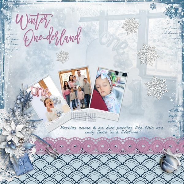
If you’d like to see more details about this layout you can find it in my 2026 Gallery. The title of this layout is “Winter One-derland”.
More Tips

If you run into trouble getting your paper to look nicely blended over the tape element, you may want to adjust the color of your tape to ensure it’s a nice medium grey; something no lighter than #8e8e8e. This shade of grey has worked out great for me in this technique.
Experiment with layering two pieces of tape on top of each other. This can really add good visual interest to a project.
All of my examples today were based on using a lighting angle of 120 degrees. If you use a different angle, you just need to remember, in whatever direction your shadow is cast, that is when you’ll want to use the Burn Tool. The Dodge Tool is used in opposition to the shadow direction.
When adding the “bend” line with Burn/Dodge, Range and Exposure settings will typically be the same for either tool.
When adding the “bend” line with Burn/Dodge, setting the Range to Midtones will be best for most all papers clipped to the tape. If you’re having trouble with Midtones, switch to Highlights to see if that helps.
When adding the “bend” line with Burn/Dodge, and the paper clipped to the tape is mostly white, you’ll need to change the Range from Midtones to Highlights. You may also need to increase the Exposure to as much as 100% and brush multiple times for the desired look.
When adding the “bend” line with Burn/Dodge, and the paper clipped to the tape is mostly black, you may need to change the Range of the tool from Midtones to Shadows.
Regardless of the Range and Exposure settings used, you may need to make multiple brush passes to get the look that feels right for you. Just don’t get too carried away, the effect should be subtle yet still noticeable.
Give this some thought; Don’t let go of your courage the moment things stop being easy or rewarding. Because that moment…That’s the moment “Interesting” begins!
Thanks for reading this week’s Tuesday Tip. Remember, if you have any suggestions or questions please don’t hesitate to “Message Me“. Check back next week for tips about creating realistic washi tape. Click “Follow Me” to stay in touch. I hope you have a wonderful week!
