
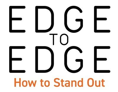
Edge-To-Edge
No…it’s not my birthday. That featured image above is actually the front of a card I designed for a friend.
I’m not going to make a promise but I am going to try very hard for this to bring an end to a barrage of title posts.
I love this technique and I wish I used it more than I do. Though I admit, it’s not always easy to picture a layout focused around an edge-to-edge title. Regardless, it can make a stunning impression. And if you read last week’s “Transparent Edge” post, you know how I feel about that!
Today I’m going to show you how easy it is to achieve an edge-to-edge title using the Magic Wand tool.
Note: The featured image at the top of this post was created using products from “The Big One” by Keep In Touch Designs.
Full Page Title
Quick reminder, I use Photoshop Elements (PSE) 2024. If you use a different version, some of my screen shots may not look the same as what you see on your screen.
I’m going to keep this as simple as possible today. As usual I’ll start with a 12×12 blank file. And I’m going to pull in a nice textured white background from my stash (not sure by whom or from where):
Note: If you’re following along feel free to use any paper you like.
Before I get too far along, I do want to say that whenever I use this technique, I have to make up my mind that the title and its placement will typically drive the look of my layout. I know this feels sort of like putting the cart before the horse, right? For most of us it isn’t how we do things!
Firstly, this title is going to take up a lot of real estate on the layout. That isn’t typical for most of us either. Secondly, most of us probably have a title in mind, if not at the beginning, at least part way through a layout.
But if you’re even a little like me, sometimes the title changes as the layout evolves. These two things alone can make working with this technique a bit challenging. And that all has a lot to do with why I don’t do this more often.
An edge-to-edge title isn’t just a title; it is likely the main focal point on a layout. For a lot of us that feels like a huge mistake. So many people believe that making the title a “big deal” is totally taboo.

I know I myself have made a lot of statements about how a title shouldn’t dominate a layout. But I’ve also admitted that there are always exceptions…sometimes the title can be the star. And this is one of those times.
Even with the challenges, I do still love this technique and I don’t want my comments to scare you off. These edge-to-edge titles can make a huge impact and a very lovely look when used as a primary element on a layout.
This technique really only works well with script fonts. Today I’m going to be using “Christmas Mystery Regular” available at Creative Fabric (sadly not free without a subscription). But there are truly oodles of free script fonts similar to this one. I’m going to list just a few:
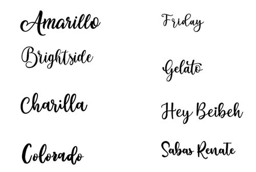
While that image above may be a bit hard to read, each of those fonts is listed (in the same order) below:
All but two of these (Brightside and Friday) are available at DaFont. But you can just click on any of the font names above and go to the font’s download site.
I’m going to open the Horizontal Type tool:
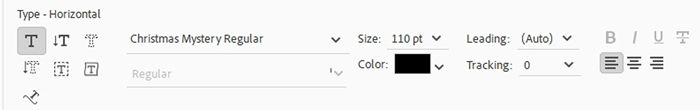
I select the Christmas Mystery Regular font, set the Color to black, the Size to 110, the Leading to Auto, the Tracking to zero and I click on the Left align text icon.
Note: If you’re following along feel free to use whatever font & color you like.
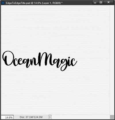
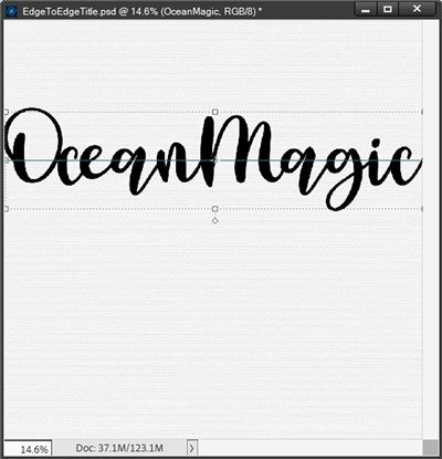
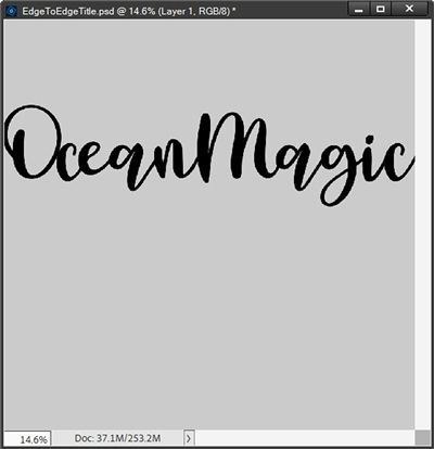
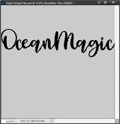
Next, I click close to the center at the left side of the document and type my title (with no spaces between words):

That’s pretty good for a starting point. But there are a couple things I need to fix. For this technique to work properly, all letters much be touching.
Right now, even though I did not type a space between the words Ocean and Magic, there’s a small gap between them. I need to close that gap. Additionally, there is a huge gap between the first two letters of the word Ocean! That too needs to be closed.
Now, you may be thinking that all I have to do is go in and adjust the Tracking. Well, you are mostly correct. But I don’t want to affect the tracking for the entire title. If I use a tracking value of minus 100 on the entire title, the letters will start to overlap looking something like this:
Can you see how the tail from the letter “e” in Ocean overlaps slightly with the letter “a”? And this happens in two other places within the word Magic. This is never a good look with a script font. But this is easy to correct.
Rather than adjusting the tracking for the entire title I’m only going to adjust the tracking between the letters that aren’t already touching: the “O” and “c” in Ocean and the “n” in Ocean and the “m” in Magic. All I have to do is double-click on the text layer, then highlight/select only the first two letters:

For these two letters I had to set the tracking value to minus 110. Then I highlight/select the “n” in Ocean and the “m” in Magic:

Now for these two letters I only had to use a tracking value of minus 50 and I click the check mark to confirm:

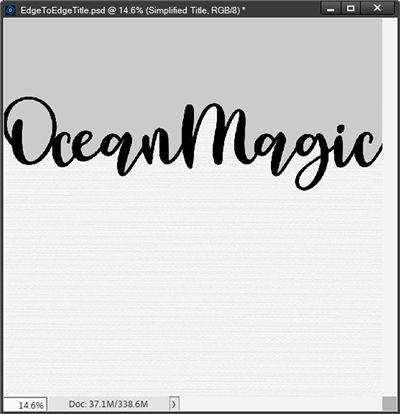
And both gaps are now closed!
Note: The tracking values I used worked on the font I’m using. Depending on the font you’re using, you may need to play with the tracking to close gaps between letters/words in your title.
While this looks much better, there are two other gaps that will cause a problem. Are you scratching your head? For this technique to work, both edges of the title must be slightly overlapping the edges of the document.
The first thing I’m going to do is click on the text layer in the Layers Panel to ensure it is the active layer. Then I just nudge the title to the left until the “O” in Ocean is just barely over the edge of the document:

Then I grab the top right corner anchor point of the bounding box and click and drag to the right until the tail of the letter “c” in Magic goes just over the right edge of the document and I click the check mark to confirm:

With this particular font and title, I didn’t have too much trouble getting all the letters to touch nicely. That isn’t always the case. I want to give you a few quick pointers on how best to deal with those situations.
Here’s a word from part of another layout’s title that actually presented just that problem:
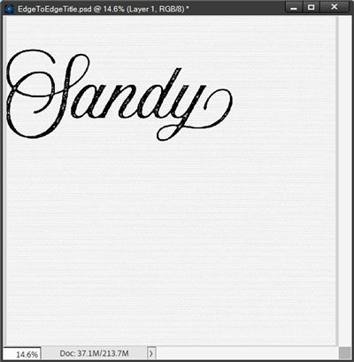
I was using the “Aurora Script Aged” font from Creative Market (not a free version) and when I tried adjusting the tracking on the first two letters so they would touch, I got this:
I didn’t like how scrunched up those two letters looked compared to all the others in the word. It looked unbalanced and I knew I’d never be happy with this. This font has some nice glyphs so I checked those next.
Note: There is a free version of the “Aurora Aged” font but it does not come with any of the fancy glyphs.
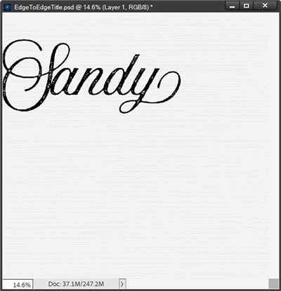
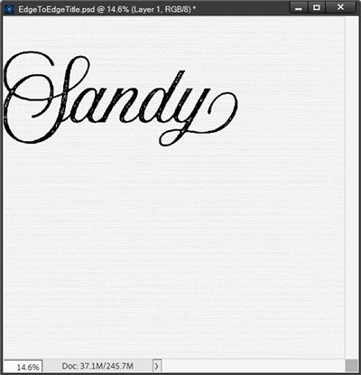
There was a fancier letter “S”, so I tried that. After again trying to adjust the tracking between the first two letters as before, I was able to get them to touch:
But it was still too scrunched and I really didn’t like the extra swoosh at the bottom of the “S”. So, I still wasn’t happy.
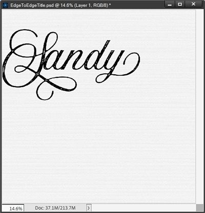
Well, if you read my “Fancy Ligatures” post…you know I’m not afraid to create my own “glyph”! So that’s what I did. And that wasn’t as hard as you think.
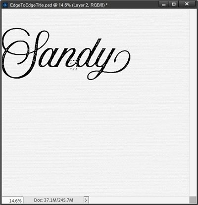
I duplicated the text layer and hid the original. Then I simplified the duplicate layer and renamed it to Sandy. With that layer active in the Layers Panel, I made a selection around the connecting “tail” between the letters “n” and “d”:
Note: If you’re following along and run into this with your word don’t worry about simplifying the text layer at this point. You’ll need to simplify it later anyway!
I then created a new layer from that selection and named that new layer Tail. With the Tail layer active in the Layers Panel, I just repositioned it so it would connect the “a” to the “S”:
Then all I had to do was merge the Sandy and Tail layers together so it was a simplified word.
Now, I probably could have fixed this connection issue by using a brush to paint a tail between those two letters. I just find it easier to cut and paste. For me it always looks cleaner than when I use a brush. But again, that’s just me.
At least now you know a few ways to address letters that don’t easily connect.
Now back to my current title…
Generally, the next thing I do is going to be driven by the layout on which I’m working. I need to know where on the layout the title will be placed. Then I position my text in the desired location.
For now, I’m just going to shoot for the middle of this title to be about one third of the way down from the top. This is another time when using a horizontal Guide comes in handy.
Since this is a 12×12 document a third of the way down would be 4”. So, I create my horizontal Guide at 4” and nudge my title up until the center of my title is aligned with that Guide:
I can hide my Guide line now as I won’t be needing that anymore. And I know you’re wondering how you’ll know where to place your title right now if you’re not completely sure how the final layout will turn out.

Getting the vertical location right is pretty important. So first off, this is one time when I will sometimes work directly on a layout that is in progress. But if you haven’t already started the layout don’t feel the need to rush into it. What matters is that you’ve already committed to using an edge-to-edge title!
Don’t stress about getting the exact location set right now. It’s perfectly okay to create the edge-to-edge title separately and simply guess at the location you “hope” to use. And I’ll explain how to work around any location issues shortly.
Now for the interesting part…
Create Title Template

That’s right, I’m going to create a template for my title. That’s why it’s not imperative that I know exactly where the title will be placed on a layout.
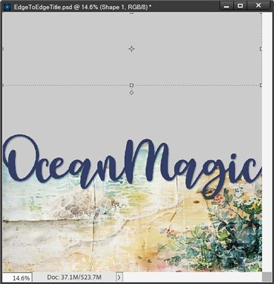
I already have my title positioned at the desired vertical location and I’m certain that the title just barely crosses both the right and left edges:
I ensure that the text layer (OceanMagic) is the active layer. I change my Foreground color chip to a light grey color (#cccccc). Then in the Layers Panel, I click on the Create a New Layer icon.
Note: If you’re following along, it’s not required that you use a light grey color for this layer. I always do because that’s kind of the pseudo-standard color for a lot of template shapes to which a paper or photo will ultimately be clipped.
PSE creates a new blank layer (Layer 2 for me) directly above my OceanMagic layer. This new layer should now be the active layer. I press Alt+Backspace and PSE fills the new layer with the Foreground color.
Next, In the Layers Panel I move the light grey layer below the OceanMagic layer:
Next, I duplicate the OceanMagic text layer and hide the original (for now). I then move this hidden text layer below the light grey layer in the Layers Panel.
Note: I always save the original text layer just in case I need to go back and make any changes later.
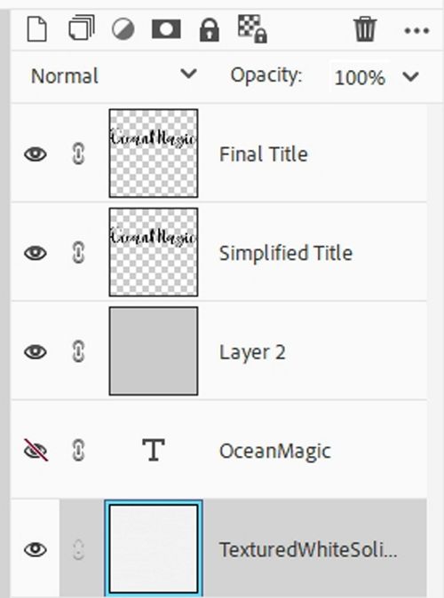
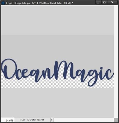
Now, I can simplify the duplicate text layer and rename it to Simplified Title. Then I duplicate the Simplified Title layer and rename the duplicate to Final Title. I know all of this might sound a bit confusing. So, to help clear things up…here’s what my Layers Panel looks like now:
In the Layers Panel I select the light grey layer (Layer 2) and the Simplified Title layer making them both active. Then I right-click somewhere over the selected layers. PSE opens a dropdown box and I select Merge Layers:
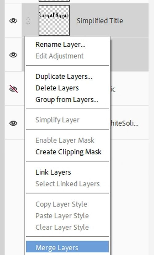
PSE merges those two layers and the merged layer is named Simplified Title. For now I’m also going to hide the Final Title Layer.
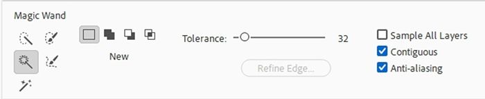
Next, I open the Magic Wand tool. In the tool options, I click on the New Selection icon, set the Tolerance to 32, Uncheck Sample All Layers, and check both Contiguous and Anti-Alias:
Next, I click once on the light grey portion below the title. PSE then creates a selection of only that bottom grey area:
Note: If you’re following along and any portion of your selection extends above the bottom of your text, one of two things has happened: 1 – your title has not extended beyond the edge(s) of the document. 2 – not all of your letters are touching.
Before I proceed, I want to point one thing out. Notice the open area in the tail of the letter “g” in Magic? It is not part of the selection. And now you’re wondering why I pointed that out.
In the next step I’m going to delete the selected grey area which currently does not include that little section with the letter “g”. What this ultimately means is that the layer beneath (my white paper) will not be visible in that little section. At this point it’s strictly a personal choice that needs to be made.

If I want the white to show through, I would add that little section inside the tail of the letter “g” to the selection. If I don’t want the white to show…I leave things just as they are. Either way is fine. As I said…it’s a personal choice.
In this particular case, the “g” is the only letter with a tail. So, my personal preference this time is to let the white show. So, I’m going to add that little section to the selection:

Then I press Backspace and PSE deletes the selected area and I cancel the selection (Ctrl+D or Esc):
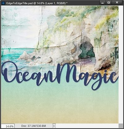
Next, I’m going to bring in a beach background paper from “Sparkly Sunset Beach Backgrounds” at Creative Fabrica and layer it over the Simplified Title Layer in the Layers Panel:
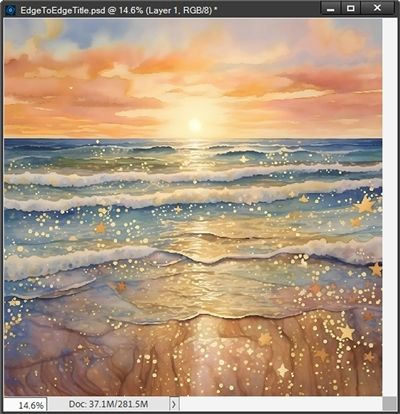
I then clip that paper to the Simplified Title layer and nudge the paper layer up a bit so the sun is closer to the top of the document:
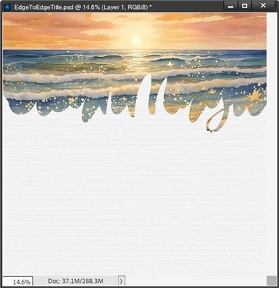
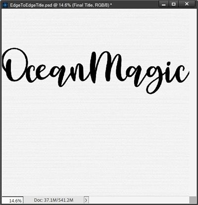
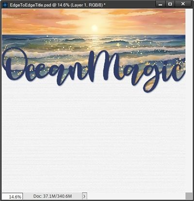
Now I can unhide my Final Title layer and recolor the title to match the paper better:

I ended up picking a darker blue (#283e66) from inside the waves near the horizon in that paper.
A lot of people might say it’s not good design to add a drop shadow to text. By now you likely know I’m not one of those people. Especially in this case. At this point I’m actually using word art so adding a drop shadow just enhances the design. Well, that’s one way to justify a shadow…right?!?!
With the Final Title layer active I go to the top tool bar and select Layer-> Layer Style-> Style Settings. PSE opens the Style Settings dialog box and I click on the Drop Shadow box to open those settings:
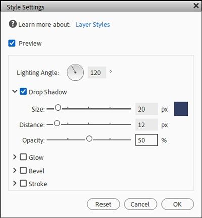
I change the color to the same darker blue (#283e66) I used for the title (you likely already know I’m not a fan of black for shadows 😉). Then I set the Lighting Angle to 120 degrees, the Size to 20px, the Distance to 12px and the Opacity to 50%:
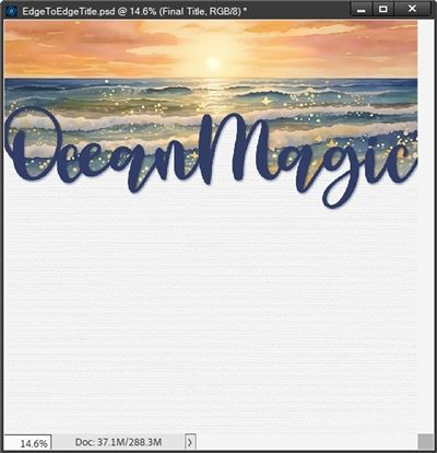
And there you have it, a lovely edge-to-edge title. Oh, before I forget – this is what it would look like if I had chosen to not have the white show in the tail of the letter “g”:
You can see that either of these titles looks lovely. And sometimes it’s tough to decide which way to go with those “tails”. Just remember…it’s your choice!
Location Workaround
I’m guessing at this point you’re questioning why I even said I was creating a template. It’s simple. If I didn’t have a layout in process but I knew this was the title I intended to use, all I have to do is make a few adjustments and save this as a PSD file.
Here’s what I’d do to create the template. First, I would crop the file so that it is no “taller” than just below the bottom of the shadow for the title:

Then I delete all layers except the hidden original text layer (OceanMagic), the Simplified Title and the Final Title:
I then link those three remaining layers together and save this as a PSD file with a unique name. I’m naming mine Edge-To-Edge Ocean Magic Template.
When I work on my actual layout all I have to do is open this PSD file and copy (drag) those three layers onto my actual layout.
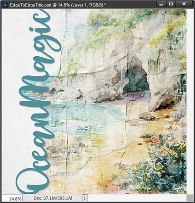
Now I can position this title exactly where I need it to be. Let’s say I want the title a lot lower so it sits below the opening of the cave on the paper I’m using:

Clearly, I need to expand the top part of the grey area so it goes all the way to the top of the layout. And that’s easy. All I have to do is use the Rectangle tool and draw a rectangle (preferably the same color as the template but it could be any color) that covers the gap:
Now I just merge that new grey layer with the Simplified Title layer, move my paper above the new merged layer in the Layers Panel and clip the paper to it:
Or, I could have even rotated the title so that it ran vertically instead of horizontally:
This is why I create a template if I’m not creating a title on an actual layout. This also explains how I get around not knowing exactly where the title is going to go!
Note: The papers used in the example “layout” above are from “Shore Thing” by CarolW Designs.
I hope you’ll try this technique to give your next title an “edgy” boost!
And here’s a layout I created using this “magic wand” trick on my title:
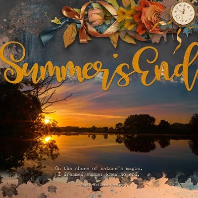
If you’d like to see more details about this layout you can find it in my 2025 Gallery.
And here are two more examples using this technique that can be found in my 2020 Gallery:
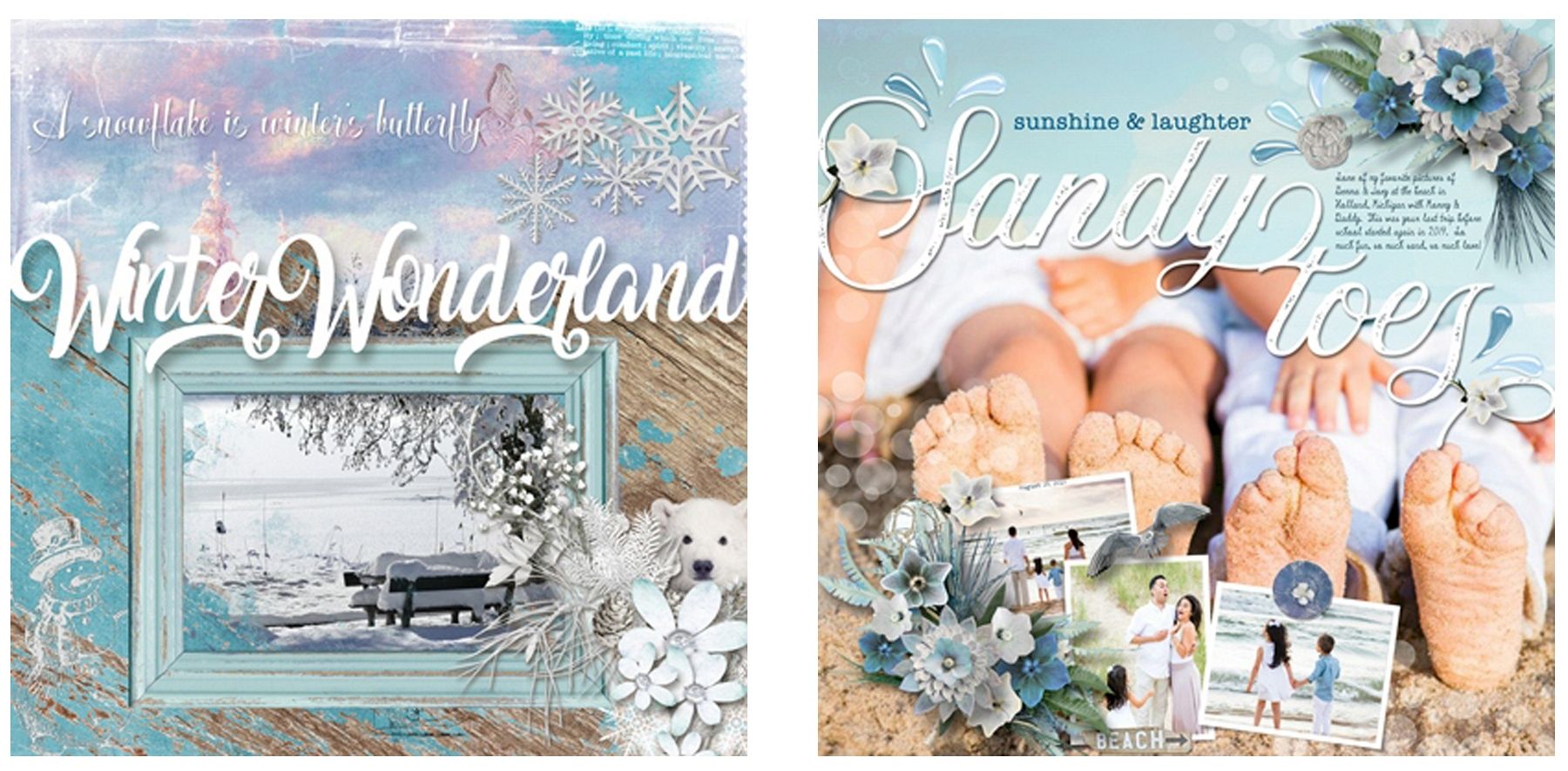
Notice in the second example above that the last word in the title sits a bit below the first word, yet it is still “attached” to the first word. That was accomplished by typing each word separately and simply nudging them together until the appropriate letters were touching. Your title does not have to follow a straight line to be able to use this technique!
And you may recognize the word Sandy from that layout 😊 That’s the one I had so much trouble with earlier.
Extra Tips

Remember, this technique is really designed around using script fonts. That doesn’t mean you can’t try doing this with a Sans or Sans Serif font. I’ve just never tried it and can’t recall ever seeing an example.
You don’t have to create your edge-to-edge title on a blank file. You can execute this technique directly on a layout in progress.
If you haven’t settled on an exact location for your tile, just create the edge-to-edge title you want to use and save it as a template.
If you have a multi-word title it is not required that all of the words are on the same horizontal line. You just need to ensure that the first word touches the second which touches the next word and so on.
And your title doesn’t have to run horizontally. You can just as easily run it vertically.
Remember, you don’t have to change the tracking on the entire title if only a few letters aren’t touching.
In some cases it isn’t always possible to get letters to touch and not end up with a squished mess. In those cases, consider manually creating a connection between the letters once the title has been simplified.
If you want the “open tails” of any letters in your title to remain open just remember to include those “open” spots when making the selection before deleting the bottom part of the grey layer.
Thanks for reading this week’s Tuesday Tip. Remember, if you have any suggestions or questions please don’t hesitate to “Message Me“. Check back next week for a fun tip about sketching. Click “Follow Me” to stay in touch. I hope you have a wonderful week!
