Letter Board Part 2
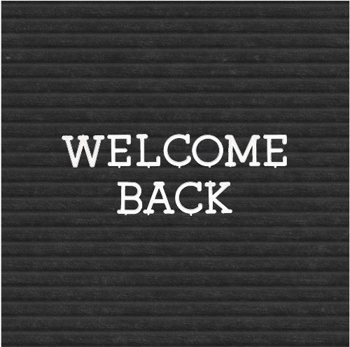
Welcome back to letter boards. So, in last week’s “Old Signage” post all the steps/images for creating that grooved felt for the background took up a lot of real estate, heh? None of it was overly complicated…just a lot of steps. Sadly, I didn’t get to discuss letter board characters.
You may recognize the background in the featured image at the top of this post. That’s the letter board grooved felt I created last week. And today I can get to creating the characters.
Once again, I’ll try my best to keep this as short as possible. But just as how things went last week, there are going to be a lot of steps and images.
If it starts to get too long again today, I promise to wrap things up next week.
Adding Words
Before I get started here’s a quick reminder, I use Photoshop Elements (PSE) 2024. If you use a different version, some of my screen shots may look different from what you see on your screen.
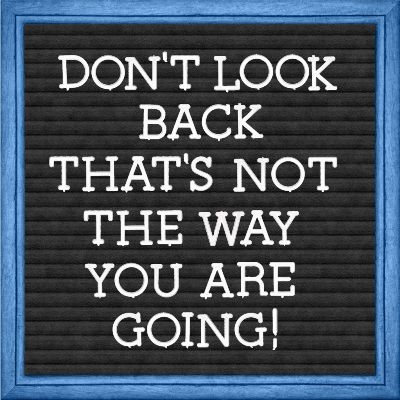
The image directly above should also look familiar if you read last week’s post. If you look closely, you should be able to see that the letters have what looks like “tabs” in certain places. This mimics what real letter board plastic characters had so they would attach into the grooves of the felt board.
I have a digital set of those “tabbed” characters. If I were certain I had acquired them “for free” I’d gladly share them with you. What I can do is tell you that a set of similar characters is available (currently for free if you create a new account) at Creative Fabrica:
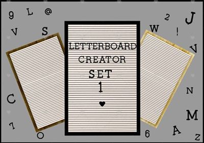
The characters are black but can be easily converted to white! Sadly, this set contains only 2 punctuation marks (! and @).
There is a different set also available (currently for free if you create a new account) at Creative Fabrica:

This one shows up as a letter board font by Pixillo. Unfortunately, the font is a bit map font and only works with Photoshop 2017 or higher and cannot be used in PSE. Bit map fonts store characters as a grid of pixels and originated for pixel art games, digital watches and scoreboards.
But, along with the font there is a separate download link for Bonus Files. This is where you will find the actual “plastic” characters including all punctuation marks.
It’s certainly not a requirement to use a digital set of alpha characters. Using a font is almost ALWAYS an option 😉
Select A Font
If you already have a set of letter board characters that you’d rather use, feel free to skip down to the next section.
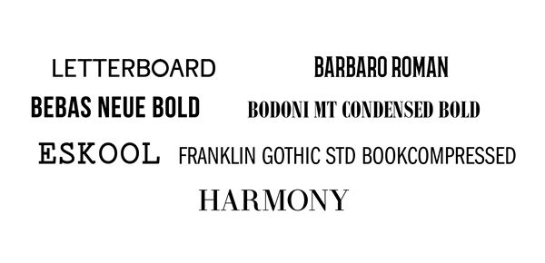
As I mentioned earlier it’s hard to find digital sets of letter board characters for free. It’s not that difficult to find free fonts that can work reasonably well. The image directly above shows some that I’ve found which look nice on a letter board.
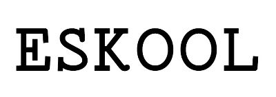
If you click on any of the following font names you will be taken to its download location: Letterboard, Barbaro, Bebas Neue, Bodoni MT Condensed, Eskool, Franklin Gothic Std Book Compressed and Harmony.
Letterboard Regular, when used in all caps, actually includes the tiniest of tabs on the characters which could mimic the old plastic characters. The only thing is, I’ve found that unless your letters are fairly large, that little tab doesn’t really show up very well. That doesn’t mean you can’t try it!
Pick A Quote
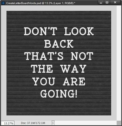
The quote in the image above is a variation of a Mary Engelbreit quote; “Don’t look back – you’re not going that way.” This quote (in either form) has always resonated with me for many reasons.
It serves as a simple, powerful reminder that the past does not define the future and that progress requires a forward-looking perspective. I have also used it as a mantra of sorts when starting a new project or artistic endeavor. It tends to encourage me to avoid second-guessing and focus on the work ahead.
Clearly you can pick any quote or phrase that is meaningful to you.
Note: If you’re trying to follow along, you may find it easier to use the same quote as mine. But the choice is totally up to you!
Type The Quote
In trying all of the fonts I listed above, I found that the Eskool font replicated almost exactly (sans tabs 😉) the lettering in the letter board shown above.
Given that, I thought it might be nice to show you just how closely I can replicate that letter board using this particular font.
Clearly you can pick any font you like.
Note: If you’re trying to follow along, you may find it easier to use the Eskool font. But the choice is totally up to you! If you do use the Eskool font, please download and install it before moving on.
To keep this quick I’m just going to open a blank 12×12 file in PSE and pull in the GroovedBlackFelt file I created last week:

Note: If you also created a grooved felt background last week, please open/use that file now.
I immediately save this as a PSD file with a unique name “CreateLetterBoardWords”. This will automatically safeguard the original background.
Now it’s just a matter of adding the words. I know I’m working with a “full size” background at this point. But sometimes it’s better to start out bigger than what I need. I know for me it just makes the creation process easier. It’s generally not a big deal to downsize an image later.
I want all of my text centered on the background so I’m going to start by going to the top tool bar and selecting View->New Guide and creating a Vertical Guide with a position set to 6 inches:
Note: I have my Guide color currently set to a deep aqua color (#1c7676). If you’re following along your Guide color may be different which is fine.
I also want my text to be white so I’m going to swap the default Foreground/Background color chips so the white is on top (press X). Then, I grab the Horizontal Type tool and select the Eskool font:
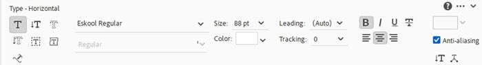
I set the size to 88pt, the Leading to Auto, click the Faux Bold icon, set the tracking to zero, click the Center Text icon and check the Anti-aliasing box. The color is already set to white because my Foreground color chip is white.
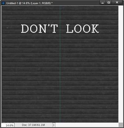
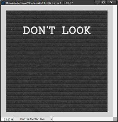
Then I position my cursor in the center and along the top of the fourth groove down and type the first two words of my quote in all caps:
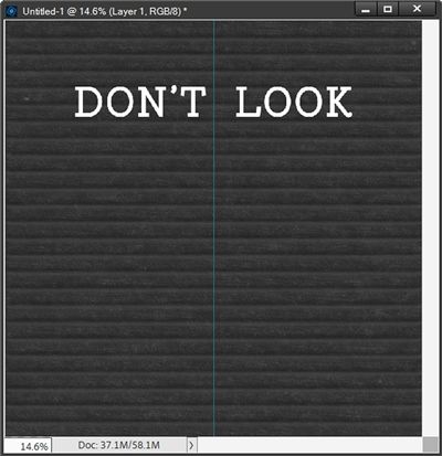
PSE actually placed the words at the top of the third groove so I just nudged them down to the top of the fourth groove.
You may be wondering why I didn’t just type my whole quote and manually break the lines as I typed. I have found that when working with this grooved background, it’s just easier to place each line of text on its own layer as opposed to fooling around with the Leading value (line spacing). If you’d rather type the whole quote, feel free to do so.
Before I add any more of my text, I wanted to try getting a “plastic” look figured out.
I played around with a few variations before ultimately settling on two versions. The first was by using a PSE Standard Bevel combined with the PSE Standard Wow Plastic. I’ll cover that option first.
Note: If you already have a Photoshop Layer Style that will give the letters a plastic look, feel free to use that instead. You can then skip down to the section named Duplicate Row #1 where I add the next row of text (BACK) by clicking here.
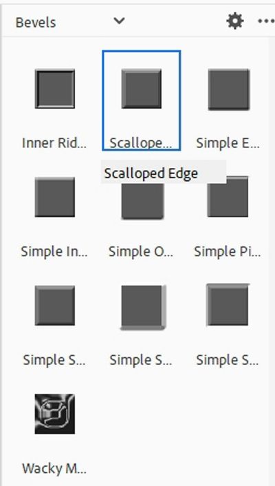
With the DON’T LOOK layer active in the Layers Panel I click on the Styles icon at the bottom of the Layers Panel. PSE opens a dropdown of all the styles currently loaded on my system. I just scroll all the way to the top until I find Bevels. I then select the Scalloped Edge option:
After selecting that style I click on the Layers icon at the bottom of the Layers Panel so I can see my file’s layers again.
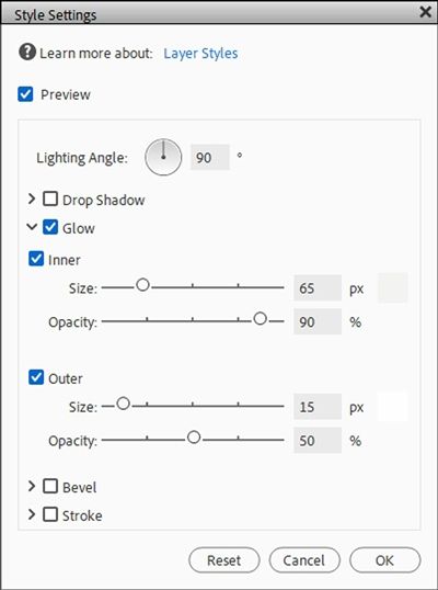
In the Layers Panel I click on the fx icon at the far-right edge of the DON’T LOOK layer and PSE opens the Style Settings dialog box:
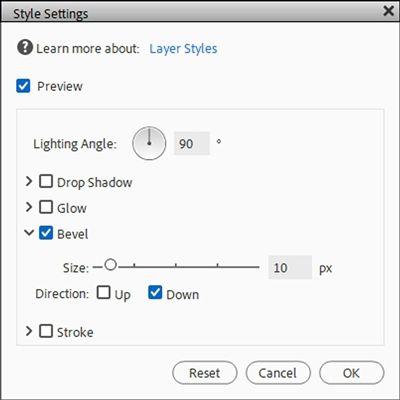
I leave the Lighting Angle at 90 degrees, change the Size from 21px to 10px and change the Direction from Up to Down. I press OK to confirm:
This looks okay but not much like plastic. To get that look I duplicate the DON’T LOOK layer (new duplicate named “DON’T LOOK copy” for me).
Before moving forward I’m going to hide my Vertical Guide since I really shouldn’t need it any longer.
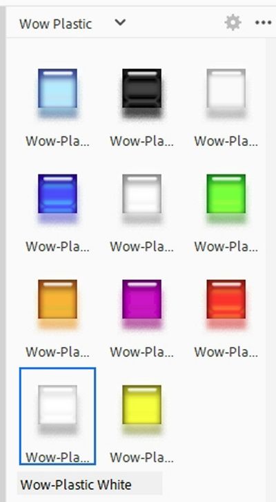
Ensuring the duplicate layer is active I again click on the Styles icon at the bottom of the Layers Panel. This time I scroll all the way to the bottom until I find Wow Plastic. I then select the Wow-Plastic White option:
After selecting that style I click on the Layers icon at the bottom of the Layers Panel so I can again see my layers.
I then click on the fx icon at the far-right edge of the DON’T LOOK copy layer and PSE opens the Style Settings dialog box:
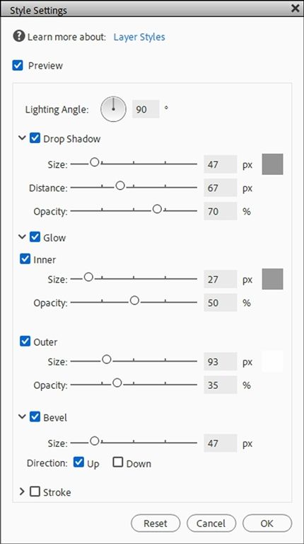
I leave the Lighting Angle at 90 degrees. I don’t want either the Drop Shadow or the Bevel so for each of those I uncheck the box and click on the down arrow to the left just to hide the options completely.
I do want both of the Glow options. For the Inner option I change the color chip to a very light grey (#f4f3f3), the Size from 27px to 65px and the Opacity from 50% to 90%.
For the Outer glow I change the color chip to a nearly white color (#fefefe), the Size from 93px to 15px and the Opacity from 35% to 50%. This is how the Style Settings look now:
I press OK to confirm. Then I set the Blend Mode of this duplicate layer (DON’T LOOK copy) to Pin Light. Here’s how the text looks now:

That looks pretty good but it is a bit darker than I’d like. So, I’m going to duplicate that layer (new duplicate named “DON’T LOOK copy 2” for me). I simplify the DON’T LOOK copy 2 layer, change the Blend Mode to Linear Dodge and change the Opacity of the layer to 50%:
That definitely brightened the text up a bit. I’m happy with how this turned out. To keep things from getting too confusing I’m going to select all three of these layers in the Layers Panel (DON’T LOOK, DON’T LOOK copy and DON’T LOOK copy2). Then I create a new group and name it Don’t Look – Plastic.
If you’re not interested in the full-on plastic look, the alternative option is to use only the PSE standard Scallop Edge bevel I used above. Skipping the other two layers for each row of text will save some time.
Duplicate Row #1
Regardless of which method I use to create the words (with or without the plastic style) for the first text layer/group, all I have to do is duplicate the layer/group and change the text to BACK. I hope that makes sense!
Note: If you’re following along and created the plastic effect detailed above you will need to delete the simplified layer (DON’T LOOK copy2) in the group and recreate it (using the same Blend Mode of Linear Dodge and Opacity of 50%) after changing the other text to BACK.
Now all I have to do is nudge the second text layer/group (BACK) down so the top of the text is even with the bottom of the next open groove:
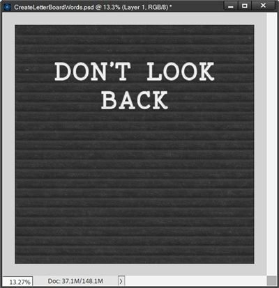
Now I’ll just repeat that process for the remainder of the quote:
Not too shabby if I do say so myself! I know that probably seems like a lot of work. I thought it was worth it. But the bevel only option is definitely an easier way and it truly looks reasonably nice:
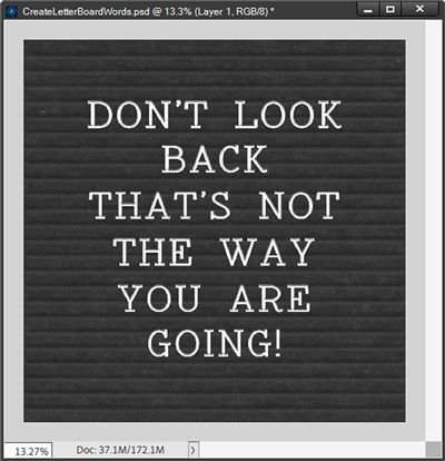
Honestly, either of these will work nicely. You can decide for yourself if the “plastic” option looks like it’s worth the extra effort.
Note: If you opted to create the “plastic” look letters for your letter board, you may want to consider creating a full set of characters (letters, numbers, punctuation and symbols) using your selected font and layer style. This way you’ll always have a set of letter board characters ready to go. And nothing says you can only use them on a letter board.

At this point I am going to save the current file with the felt and both character combinations (plastic look and bevel only look) as a PSD file. This way I’ll have this quote preserved if I need/want to make any changes. But I am also going to save the version with the plastic characters as a JPG file at its full size 12×12 (3600×3600). I named that file “DontLookBack-Plastic”.
For this to look like a classic letter board all it needs now is a frame. I know, seems like that ought to be pretty straight forward, right?!?
But I do want to show you some specific frame options that will help the finished letter board look more like the timeless, classic ones. This will include some tips on spacing and frame sizing.
Again, probably doesn’t sound like much. But if you’ve been following me for very long, you already are aware that brevity is not my strong suit.
I’ve already covered a lot today and I believe it really would be best to complete the letter board in next week’s post.
Clearly you can use any frame you like at this point but I do hope you’ll join me next week to see the classic look.
A Few Tips

The single most important tip is to not let your text remain flat!!! I can’t emphasize this enough. Please don’t take this the wrong way…if you’re just going to use flat text, you may as well not use a letter board.
Don’t be afraid to try different fonts. Classic letter boards typically didn’t use script text. That doesn’t mean you can’t try using a script font on your letter board.
You don’t always need to center your text on the board. Sometimes it’s nice to change things up by justifying all the text to either the left or right.
Your letter board characters do not have to be white. You can use whatever color fits your project.
If you have Layer Styles that add depth, dimension, sheen, etc., experiment with them for different effects on your text. You could even try metallic/chrome styles or on rare occasion even glitter. When using layer styles, you may still need to add a bevel since not all styles include that. This may mean the text could still appear to be flat.
When using a glitter style, I would recommend that you scale the layer effect down by a significant amount (somewhere between 10-40%). This will keep the glitter from looking so chunky.
Never feel as though you can only use traditional alpha characters. In the old days we would stick shapes cut out of felt to the letter board. Yes, felt sticks to felt because the fuzzy texture of the fibers creates a temporary adhesion, which is the principle behind a felt letter board. This was a fun way to add some pizzazz to a letter board. But digitally, you can use shapes of any media (metal, wood, plastic, etc.) just try not to use anything that looks completely flat.
Thought for today…Creativity is a wild mind and a disciplined eye. – Dorothy Parker
Thanks for reading this week’s Tuesday Tip. Remember, if you have any suggestions or questions please don’t hesitate to “Message Me“. Check back next week for tips about framing the board. Click “Follow Me” to stay in touch. I hope you have a wonderful week!
