More Color Pop
In my “Color Pop” post last week I showed you how to use my free template to create the Black & White & Color Pop effect. I got a little carried away with showing you so many options.
Since it got so long, it didn’t seem right to include the steps to achieve the same effect without using my template.
So today I’ll show you how to create the effect “from scratch”!
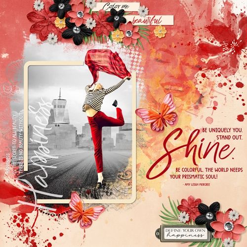
Note: The featured image at the top of this post is a good example of the technique I’m presenting today. If you want to see more details about that layout you can find it in my 2025 Gallery. The title of the layout is “Shine”.
No Template
Before I get started here’s a quick reminder, I use Photoshop Elements (PSE) 2024. If you use a different version, some of my screen shots may not look the same as what you see on your screen.
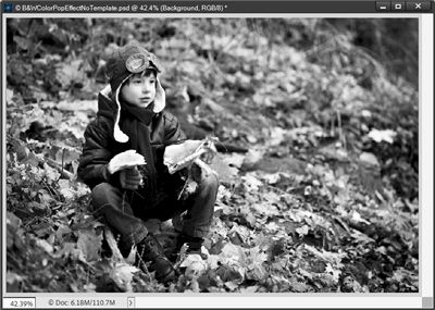
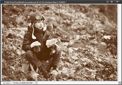
I’m going to start with a fall photo of a boy that I found on Pixabay:
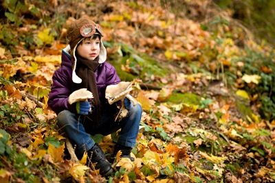
Note: If you’re following along, you can use any photo you like.
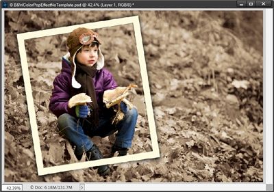
Since I’m not using the template, I’m just going to open this photo directly in PSE:
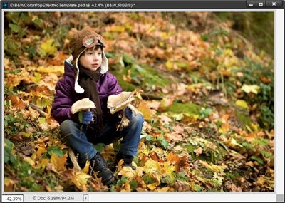
The first thing I do is save this as a PSD file with a unique name. Then I duplicate the photo, hide the duplicate and rename the original to B&W.
If you read last week’s post you might remember that I used a Gradient Map to create the B&W photo. I explained that using a gradient map instead of “convert to black and white” in PSE allows for greater control over the image contrast by allowing adjustments to the color stops in the gradient editor.
For that same reason, I’ll be using a Gradient Map again today. And as I said last week, you really don’t have to stick with the standard black & white, you can choose or create a gradient with any combination of colors. I’ll also show you how to do that.
Create Gradient Map
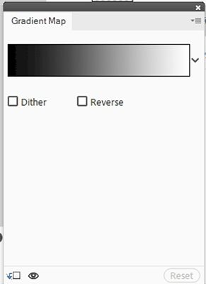
Before going further, I ensure that my Foreground/Background color chips are set to the default (press D). Then, with the B&W layer active I click on the “Create new fill or adjustment layer” icon in the Layers Panel (the circle that is half back & half white) and PSE opens the fill/adjustment layer options dropdown box:
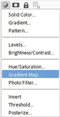
I select Gradient Map and PSE opens the Gradient Map options box:
I click somewhere inside the gradient color box and PSE opens the Gradient Editor:
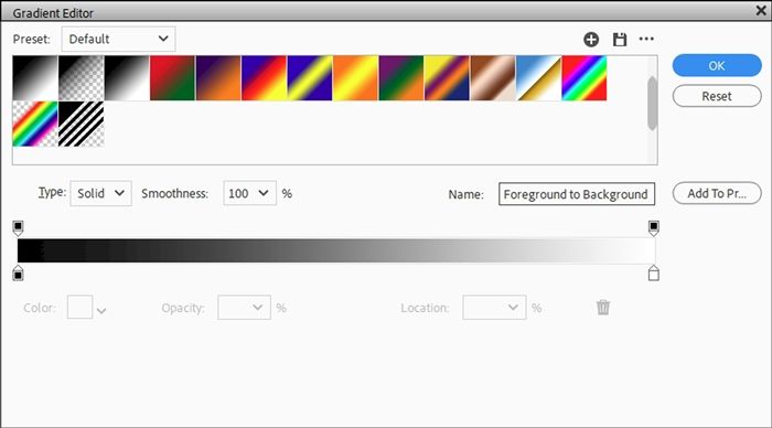
For me the Gradient Editor shows the Gradient preset group of Default and the gradient Name is already set to Foreground to Background, which is exactly what I want.
Note: If you’re following along and the Default presets are not open, just click the down arrow to the right of the Preset name and select the Default set. You can then select the Foreground to Background gradient (first option in the displayed gradient images).
At this particular point, for me all other settings are fine as they are so I click OK to confirm and also close the Gradient Map (click the X in the upper right corner):
And just as I discussed last week, I could now adjust the darkness and lightness of the black & white by changing the colors associated with the two bottom color stops.
For the example below I changed only the black color stop using a lighter shade (#313131) and the results is this:
I’m happy with the original version so I’m going to stick with the original gradient.
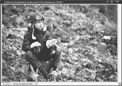
I’ll unhide the duplicate photo in the Layers Panel:
Since I’m going to be making edits to this photo, I need to simplify it first. Now, it’s just a matter of deciding how I want to highlight that little boy.
I could actually replicate any one of the “frame” options I showed last week when I used the template (frame or blending mask). Or I could simply make a selection around the boy.
Make Selection
Since everything except making a selection has already been covered, I want to use the selection method this time.
In PSE 2024 I have the option to make a selection around my subject:
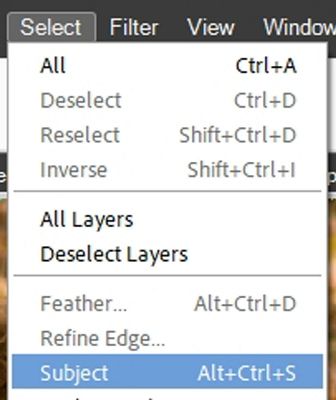
When I selected that option PSE immediately created a selection around the boy.
Note: If you don’t have access to the Select Subject option, you can use whichever selection method works best for you.
I want more than just the boy. I want a bit of the color left all around him. But specifically, around one leaf stem hanging over the rightmost mushroom.
So, I go to the top menu bar and click Select->Modify->Expand:
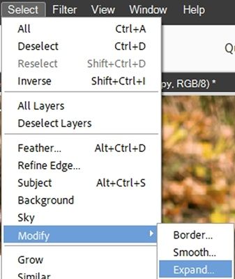
With the Expand Selection dialog box open, I set the Expand By value to 80px, and click OK to confirm. And here is my selection:
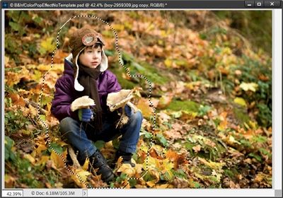
You may not be able to easily see the marching ants surrounding the boy. But trust me, they are there.
Note: Expanding the selection (at least by a bit) is typically a good idea specifically when using the Select Subject method. If you used another selection method you may not need to expand your selection. And nothing says you have to expand it at all! You can decide based on how the selection looks for you!
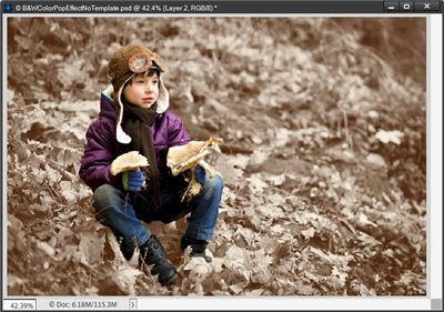
Then I invert the selection (Select->Inverse) and press Delete on my keyboard:
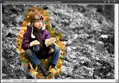
And there’s my subject in color against the B&W background. Generally, when I use this method, I will blur or brush away some of the color so the edge doesn’t look so harsh.
Today I’m going to use a Layer Mask with a soft round brush at an opacity of 80% and brush a bit of the color away:
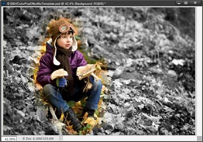
And there’s my final fall boy “popped” in color.
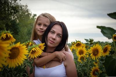
Now I want to show you a bit of a twist on things with a different photo. I’m going to be using a different photo from Pixabay:
I simply open this photo in PSE just as I did with the boy. The first thing I do is save this as a PSD file with a unique name.
I know you’re expecting me to duplicate the photo, hide the duplicate and rename the original to B&W.
Not this time. Rather, I’m going to jump right in and make a selection around my subjects:
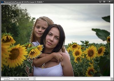
Again, all of the marching ants may not be easily visible but they are there.
This time, I’m going to create a new layer using this selection (Ctrl+J) and I rename the new layer B&W. Yes, I’m going to change the subjects to black & white instead of the background!
So, with the B&W layer active I apply the same B&W Gradient Map I used earlier on the boy. And here is a reverse color pop:
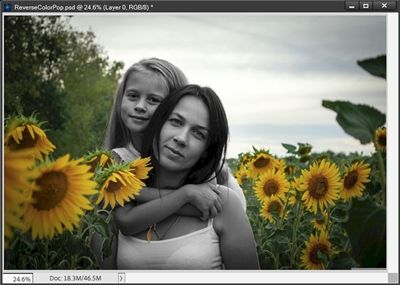
Sometimes doing a reverse color pop like this can be equally as impactful as the original method!
Gradient Map Color Options
Up near the very beginning of this post, I mentioned that you could create a gradient with a color combination other than black and white.
I thought this might be a good time to give you a couple of examples that would work well with the fall photo of a boy I used above:
I’ve hidden the B&W Gradient Map I created above. Next, I set my Foreground color chip to a very dark olive color (#44430b) that I picked out of the original photo.
Then I set my Background color chip to a very soft/pale gold color (#f3e1ad) that I also picked out of the original photo.
With the B&W layer active I click on the “Create new fill or adjustment layer” icon in the Layers Panel. PSE opens the fill/adjustment layer options dropdown box and I select Gradient Map and PSE opens the Gradient Map options box:
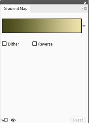
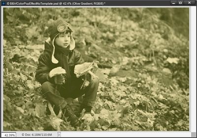
Since I had already selected the Foreground to Background gradient when I created the B&W gradient above, PSE is still using that. So, there’s no need to open the Gradient Editor at this point. And this is what my photo looks like with this “olive” gradient map:
With the duplicate layer of the original photo active, I’m going to create a new selection of the boy that won’t be expanded the way I did above. And here’s how he looks on this olive background:
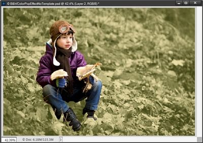
That turned out nice. So, you can see that you don’t always have to use a B&W background to get a color pop to turn out nice!
I want to show you one more color option.
I’ve hidden the Olive Gradient Map and new selection of the boy that I created above. Next, I set my Foreground color chip to a very dark rust color (#4d2003) that I picked out of the original photo.
Then I set my Background color chip to a very soft/pale cream color (#fcf4e9) that I also picked out of the original photo.
With the B&W layer active I click on the “Create new fill or adjustment layer” icon in the Layers Panel. PSE opens the fill/adjustment layer options dropdown box and I select Gradient Map and PSE opens the Gradient Map options box:
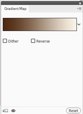
PSE is still using the Foreground to Background gradient. So, there’s no need to open the Gradient Editor at this point. And this is what my photo looks like with this new gradient map:
This is a fairly good representation of a sepia tone. And here it is with the boy in color:
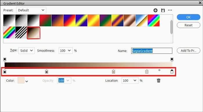
I also have a custom gradient that I created years ago to turn a color photo to a sepia toned photo.
As opposed to the two color stops used for the above gradient, my custom gradient has five color stops:
And this is what the color boy would look like if I used my custom gradient instead:
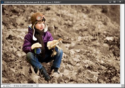
There’s definitely a difference between the two. Given different color casts on different screens, combined with the small size of the images, you may not be able to see the difference the same way I can.
I can tell you that I do still like my custom gradient better. But I also think the first result is definitely an acceptable version of sepia tones.
If you wanted to try the sepia look using the five color stops, it’s not that hard. Especially if you already have created a gradient map using the two colors I used above.
If you’re following along, all you have to do is this:
In the layers panel, double click on the thumbnail of whatever gradient map is active in your file and open the Gradient Editor. Then you can change the first color stop’s color to #170400 (Location 0%) and the last color stop’s color to #f6e5d5 (Location 100%).
Next you just have to add the other three color stops as follows: 2nd color stop #6b4e3b (Location 25%), 3rd color stop #c5a989 (Location 65%) and the 4th color stop #dfcebf (Location 85%).
Note: If you need tips on adding color stops refer back to my “More On Folds” post where I discuss how to add color stops to an existing gradient.
If you like that custom sepia gradient and think you would use it on other photos even if not doing the color pop effect, I’d encourage you to save your new gradient to the Presets.
Note: If you need tips on saving a gradient, please refer back to my “More Bi-Color” post for instructions on saving a gradient.
And here’s the last color pop with a simple frame:
So, there you have it…lots of different color pop options using a Gradient Map to create the effect without a template. I hope you’ve enjoyed seeing this no template color pop technique and will give it a try.
Extra Tips

Remember, using a gradient map instead of “convert to black and white” for the background photo allows for greater control over image contrast. That doesn’t mean you can’t try the “convert to B&W” option and see how it works for you.
Don’t limit yourself to always doing a color pop with black and white as the background. Think outside the box and try different colors.
Experiment with simply extracting the subject rather than always creating a traditional frame with a “photo spot”. You can always put a simple “empty” frame around an isolated subject!
Use whatever selection method works best for you if you do decide to create a selection around your subject.
If you have the Select Subject option available to you, that’s a great starting point. You can always modify the selection if it’s not 100% to your liking.
When creating a selection around a subject, experiment with expanding the selection so some of the original, colored background is also selected.
Be adventurous, switch things up and try using a reverse color pop sometime!
One more tip for adjusting the tone of the black & white photo version of your photo. Sometimes modifying the colors in the gradient map can get tricky. If you’re having trouble making adjustments that give you the look you’d prefer, try creating a new layer below the photo and fill it with white. Then play with the opacity level of the photo to see if that helps you get a better tone for the Gradient Map.
And remember…You can’t use up creativity. The more you use, the more you have! – Maya Angelou
Thanks for reading this week’s Tuesday Tip. Remember, if you have any suggestions or questions please don’t hesitate to “Message Me“. Check back next week for a color selection tip. Click “Follow Me” to stay in touch. I hope you have a wonderful week!
