More Grunge
I know I’ve posted multiple times about creating grunge overlays. Most recently I shared a layered technique in my “Artsy Layered Overlay” post back in September.
There seems to be countless ways for us to achieve a grunge look for a piece of paper or even an element. But today I want to show you how to create some grunge with the use of the Wave Filter (within the Distort category).
The Wave Filter is somewhat hidden and rarely used mostly because a lot of people don’t understand its capabilities. But it’s really handy especially for creating a variety of textures like what I’ll show you today.
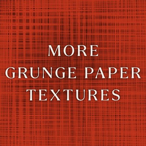
Note: The base for the featured image at the top of this post was created using a solid burnt orange (#c3351c) background layer and grunge created using today’s technique.
Wave Filter

Before I get started, I want to briefly explain to you how the Wave Filter actually works in Photoshop Elements (PSE).
The Wave Filter in PSE works by applying various patterns of waves to an image or selection based on user-defined settings for type, number of generators, wavelength, and amplitude. And here’s a quick breakdown of the different settings and what they control:
- Type: This establishes the shape of the wave: Sine (smooth and bendy), Triangle (choppy), or Square (waves).
- Number of Generators: Setting a value between 1 and 999 determines how many individual waves are created. More generators create more complex patterns.
- Wavelength: Use the minimum and maximum sliders to define the distance from one wave crest to the next.
- Amplitude: Drag the minimum and maximum sliders to control the strength or height of the waves.
- Horizontal & Vertical Scale: Adjust these sliders to change the width and height of the wave effect.
- Randomize: Click this button to generate different wave results based on the current dialog box settings. Watch the preview box to see how things change.
- Undefined Areas: Wrap Around fills the voids in the image with content from the opposite edge of the image. Repeat Edge Pixels extends the colors of pixels along the image’s edges often creating a cleaner look.
It is important to note one thing here; The size of the image to which the filter is applied will have a bearing on the results even if using the same settings on each different size.
Create The Grunge
Just a quick reminder, I use PSE 2024. If you use a different version, some of my screen shots may look different than what you see on your screen.
I’m just going to create a new 12×12 file with a white base (Layer 1):
I set my Foreground color chip to a medium grey color (#848282). I want to use this color for the grunge overlay since I’m not 100% certain what color background I’ll ultimately use.
If you read my post about “Coloring Grey Scale” you already know I can quickly add color to a grey-scale or other neutral paper/element by using a Fill Layer with a solid color and a Blend Mode. That means I only need to create one grunge overlay that I can recolor time and again.
Now I click on the Create a New Layer icon in the Layers Panel. PSE creates a new blank layer (Layer 2) above the white base.
Next, I grab the Rectangular Marquee Tool. In the tool options I click on the New Selection icon, set the Feather to zero and the Aspect to Fixed Size. Then I set the width (W) to 8.5 inches and the height (H) to 5 inches:
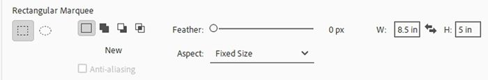
Note: If in your system it indicates pixels (px) instead of inches, simple change the “px” to “in” and you should be fine.
Now all I have to do is position my cursor about 3.5” down from the top and roughly 2” from the left edge of the file.
I’m trying to set this so the rectangle will have roughly the same amount of space between the top and bottom and equal spacing along the left and right edges. But the location doesn’t have to be exact. This technique doesn’t require precise placement of this rectangle.
And I click and hold:
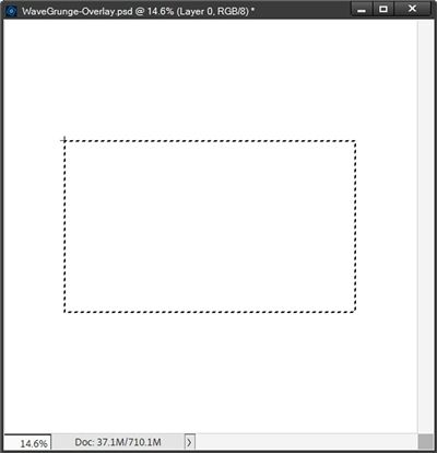
You should be able to see an “empty” rectangle attached to the cross-hairs cursor. As long as I continue to hold, I can move this empty rectangle if it isn’t exactly where I want it. This actually looks pretty good so I just release the hold.
Then I press Alt+Backspace to fill the selection with the Foreground color (medium grey), cancel the selection (Ctrl-D or Esc) and here’s my grey rectangle:
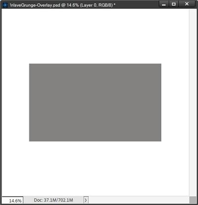
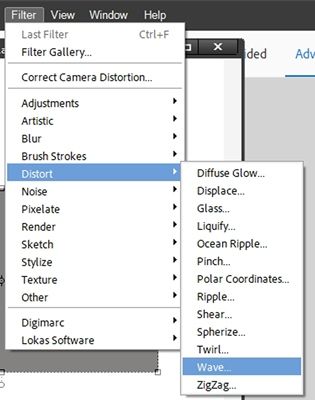
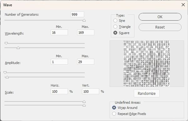
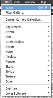
With the grey rectangle active in the Layers Panel I go to the top tool bar and select Filter->Distort->Wave:
PSE opens the Wave Filter dialog box:
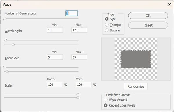
The settings shown above are the typical “initial” settings that produce a soft, undulating pattern.
Note: If you’re following along, the settings you see may be different. Especially if you’ve ever used the Wave Filter. The settings depend on how they were used previously, and they are not automatically reset to a universal value each time you use the filter.
I’m going to set the Type to Square, the Number of Generators to 999, the Wavelength Min. to 16 and Max. to 169, the Amplitude Min. to 1 and Max. to 29, the Scale Horiz. and Vert. both to 100% and the Undefined Areas to Wrap Around. I am NOT going to click the Randomize button at this time:
I know with this small image the preview area in the dialog box may not show up very well, especially since I used a grey image to start. But you should still be able to see a representation of the Wave results using the current settings.
If I were to now click the Randomize button, that preview image will change:
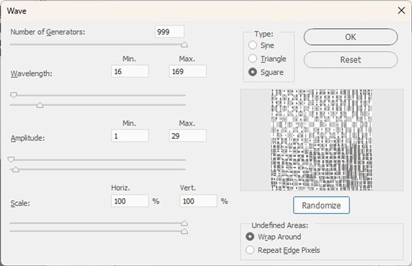
Even with this small image you should still be able to see how the preview of the Wave results changed. Every time I click the Randomize button, PSE will generate a different result.
I’m going to click Cancel at this point and reopen the Wave Filter dialog box so I can go back to the original settings (without using Randomize):
Note: If you’re following along and want to play with the Randomize option, feel free to do so.
I click OK and here is the result:
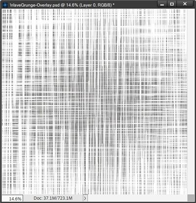
Note: If you’re following along, don’t be surprised if your grunge does not look exactly like this. A variety of things (i.e. size and placement of the rectangle) can affect the results you get. But most especially using the Randomize option or even running the filter multiple times.
Now with the grey rectangle still active in the Layers Panel, I’m going to go to the top tool bar and select Filter:
Notice how this time the top option in the “list” is Wave? When I select that option PSE will automatically reapply the exact same Wave Filter to the grey layer:
That looks almost solid at this point so, for now I think I’m going to undo (Ctrl-Z) that and get back to the original:
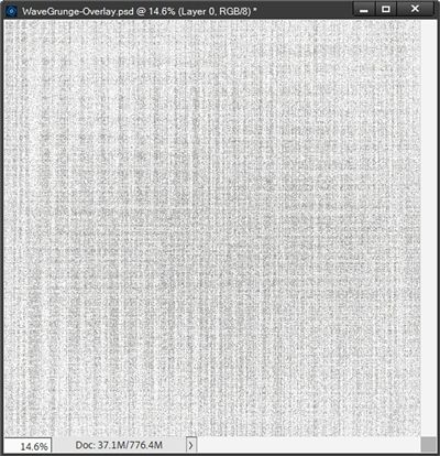
I’m going to hide the white layer and save this as a PNG file with a unique name. I named mine WaveGrunge-GreyOverlay01.
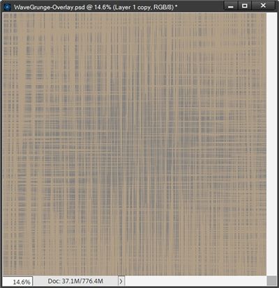
And here’s what that grunge looks like over a background that is colored beige (#b49f88):
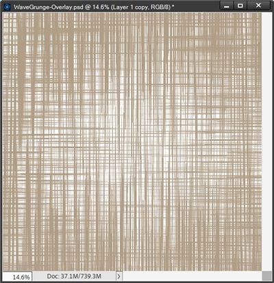
I’m going switch my Foreground/Background color chips so white is on top (press X). Then with the grey layer active in the Layers Panel, I press Shift+Alt+Backspace and PSE fills the “overlay” with white:
Next, I’m going to try a medium-dark brown (#6e4212) and recolor the overlay using a Solid Fill Adjustment layer with an Opacity set to 60%:
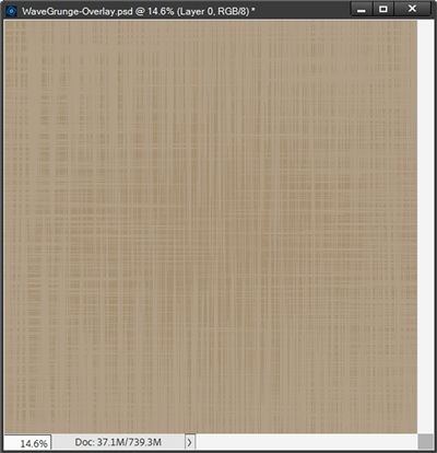
Well, that’s a nice soft grunge effect!
As you can see, there are multiple ways to change the look of that one grey overlay.
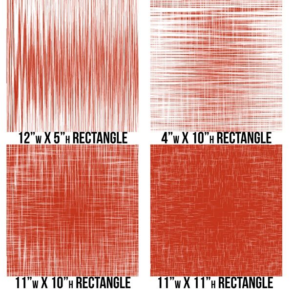
I want to show you how changing the size of the original rectangle can affect the results of the Wave Filter even using the exact same filter settings I used above. This time I used a burnt orange color (#c3351c) for the rectangle so the results would show up a lot better:
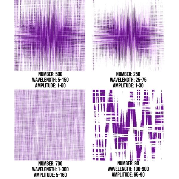
I also want to show you how using the original sized rectangle but varying the filter settings can affect the results. This time I used a deep purple color (#6e1493) so it would stand out from the orange above. I kept the Type at Square, the Scale for both horizontal & vertical set to 100% and the Undefined Area at Wrap Around for each of the examples:
So, you can see there are countless ways to affect the look of the grunge overlay.
And don’t be afraid to try placing the overlay over any solid (or mostly solid) paper you have in your stash!
And here’s a layout where I used that grungy background:
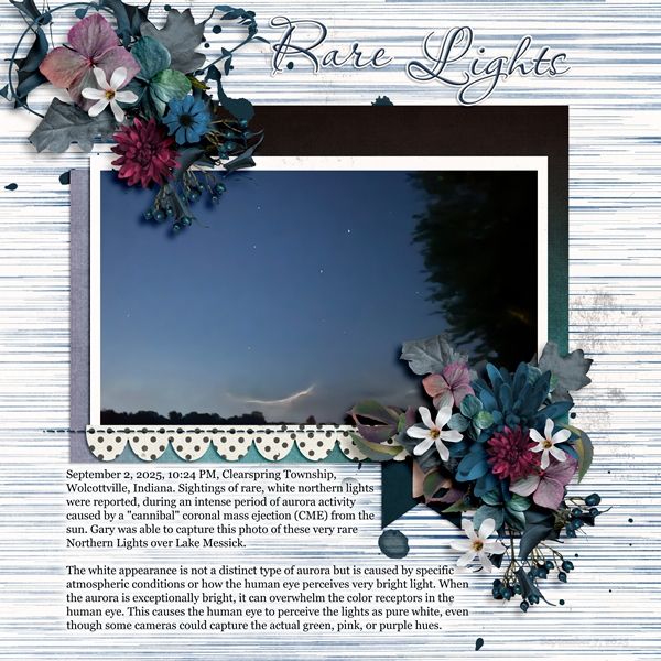
If you’d like to see more details about this layout you can find it in my 2025 Gallery. The title of the layout is “Rare Lights”.
And here’s my grunge overlay (recolored beige #b49f88) applied over a flower from “Back To The Classroom” a Gingerscraps designers’ collaboration (the September 2025 kit free with a $10 purchase):
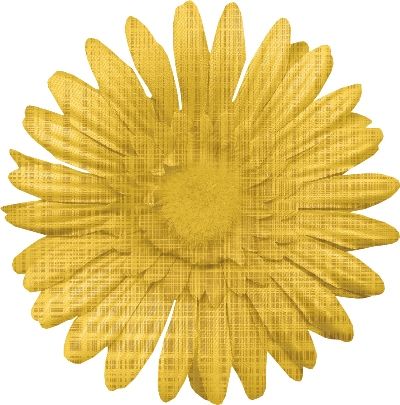
Note: I preserved the original center of the flower so it wouldn’t be affected by the grunge overlay. I did that by creating a “rough” selection around the center and placing it on a new layer. I flipped the overlay vertically and clipped it to the flower. I changed the Blend Mode of the overlay to Multiply and the Opacity to 70%. Then I placed the preserved center above the overlay and masked away any parts of that center that didn’t belong.
I hope you enjoyed learning about a grunge effect using the Wave Filter! Please give it a try and I’d love to see what you create.
More Tips

You can create your grunge overlay using whatever color rectangle you like. It’s easy enough to recolor the overlay to match whatever project you have in progress.
Experiment with different filter settings to see what alternate grunge effects you can create.
Don’t be afraid to try applying the Wave Filter more than once (at the same settings) to see how that changes the look of the grunge
For different types of grunge, play with the size of the rectangle. The bigger the rectangle, the heavier the grunge layer will be.
Play around with different Blend Modes for the grunge overlay to see how it changes the grunge effect.
You can also adjust the Opacity level of the grunge layer to vary the intensity of the effect.
Try rotating your grunge layer 90 degrees either right or left to see a different look.
You can try duplicating the grunge layer and rotating the duplicate to create another variation.
This overlay can work on elements. Though it is not well suited for all elements. You can always give it a try on anything to see how it goes. When using on things like flowers, try to preserve the original center on a separate layer.
Have fun playing with the different kinds of grunge you can make with this technique and save each and every version for future use.
And don’t be afraid to try new things. As Henri Matisse once said – Creativity takes courage.
Thanks for reading this week’s Tuesday Tip. Remember, if you have any suggestions or questions please don’t hesitate to “Message Me“. Check back next week for a tip about “ransom” Word Art. Click “Follow Me” to stay in touch. I hope you have a wonderful week!