
Neutralize Colors
I’ve written multiple posts about changing colors of elements and papers. And I’ve also written several posts about using filters. And most recently I even talked about neutralizing colors in my “Patterned Vellum” post.
Today I want to share with you a whole new way to think about neutralizing. This time I’m going to be using a filter…
Halftone Filter
Before I move forward, just a quick reminder that I use PSE 2024. If you use a different version, some of my screen shots may not look the same as what you see on your screen.
Using the Halftone Filter and two surprising color chips I can quickly neutralize bright, bold colors on papers or even elements. This technique is great for creating a monochrome effect for any layout.
I’m going to start with a blank 12×12 file and leave the base layer (Layer 1) blank.
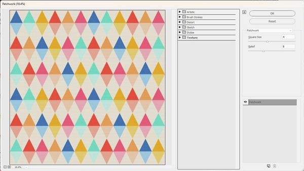
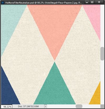
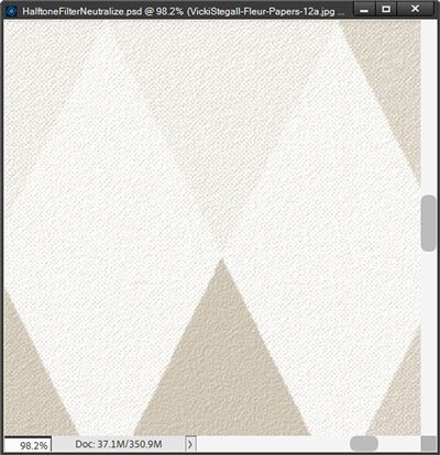
Next, I’m going to pull in a colorful patterned paper from “Fleur Patterned Paper” by Vicki Stegall:
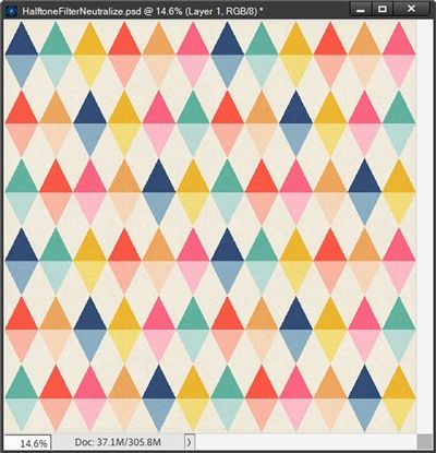
To start with a simple example, I’m just going to “neutralize” this paper into a monochromatic beige theme.
Set The Color Chips
So, now it’s time to set up those surprising color chips! I’m going to start by setting my Foreground color chip to a neutral beige (#d3c7b7):
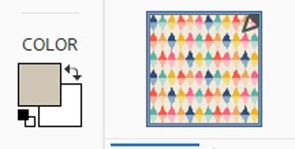
For now, I’m going to leave my Background color chip set to white.
And next comes the fun part…
Run The Filter
With the patterned paper layer active, I go to the top tool bar and select Filter->Filter Gallery:
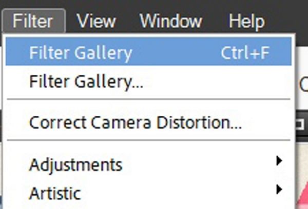
You can see that Filter Gallery is listed twice in the Filter Menu. This happens when I’ve already been using a filter. If I hadn’t been using a filter the top occurrence will look like this:
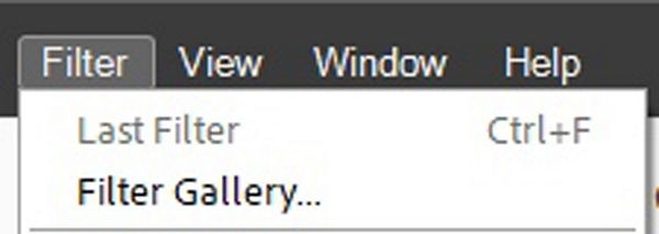
Last Filter is greyed out so I can’t even select that option.
When both occurrences say Filter Gallery and I’m certain I want to use the same filter I can choose the top occurrence of Filter Gallery.
If I want to be certain that I’m starting a “fresh” filter, I always choose the bottom occurrence of Filter Gallery.
For whatever reason, when PSE opens the Filter Gallery options box, it still shows a preview using whatever filter I had used previously (at least for me in PSE 2024):
There’s no need to be concerned when this happens. I would need to actually apply the filter to this paper by clicking OK. Since I’m not going to do that, the paper will remain unaffected.
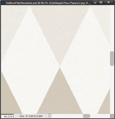
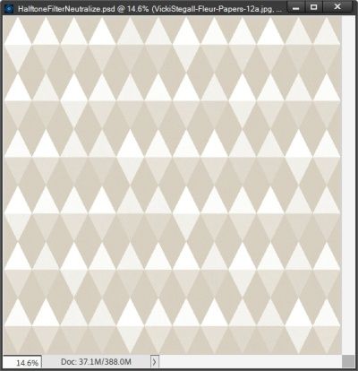
In the dialog box, I choose the Sketch filters category and select the Halftone Pattern filter. I set the Size to 1, the Contrast to 10, and the Pattern Type to Dot:
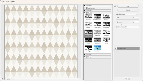
For now, this looks good so I click OK to confirm:
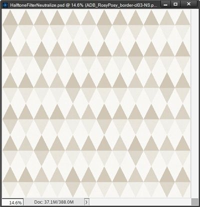
You can see that all of the colors have been “neutralized” into shades of beige and white (based on the original range of tones).
One thing you probably didn’t see in the original paper is that it did have a slight texture:
That texture is now gone…sort of. Rather than a real texture it has basically been replaced by the Halftone dot pattern:
Even though I zoomed in quite a bit, it may still be barely visible. The whole point of setting the size of the dot pattern to 1 is so that the halftone effect is barely noticeable. But I have sacrificed the texture. Sometimes this doesn’t matter to me. But sometimes it does.
There is a way to restore some texture if so desired…
Add Texture (optional)
All I have to do is go back to the top tool bar and select Filter->Filter Gallery this time being sure to select the bottom one. If I select the top “Filter Gallery” PSE will automatically re-apply the last filer used. And I certainly don’t want that 😉
When PSE opens the Filter Gallery options box, I choose the Texture filters category and select the Texturizer filter:
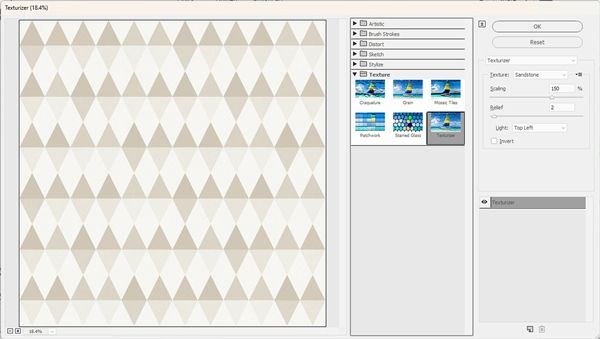
I set the Texture to Sandstone, the Scaling to 150%, the Relief to 2, the Light to Top Left and Click OK to confirm:
Even at this smaller size you should be able to see there is a texture rather than the Halftone dot pattern.

Note: If you’re following along you can experiment with the Burlap or Canvas texture patterns, the Scaling % and the Relief settings to achieve whatever texture suits your project. Typically, I would say not to play with the Light setting. But if you have a distinct “shadow” in your paper that is coming from an angle different than top left feel free to adjust this as well. Again, this is a totally optional step. If you’re happy with the halftone effect alone, that’s perfectly fine!

Now all I have to do is save this paper with a new name. In my case I used a subset of the original paper’s name and added Neutral to the end (Fleur-Papers-12aNeutral).
This technique works on most patterned paper but I want to show you a few other things I can do using different color chips, different papers and even a cluster.
Other Options
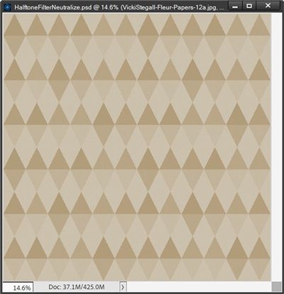
First let’s see what happens to this current pattern if I flip the color chips and apply the Halftone filter with the same settings I used above:
There is a greater difference than I expected. This is a lot darker than the original halftone. I like this well enough that I’ve added the texture back and saved this paper under a new name as well.
Let’s try another example using this same pattern. This time I’m not going to use white in either color chip. I’m going to use a dark tan (#b59b79) for my Foreground color chip and the same beige (#d3c7b7) that I used above for the Background color chip:
What a difference this made by using no white at all…I think I might like this one the best.
One more example for this pattern. This time I’m going to choose a different color from the pattern for each color chip. I set the Foreground color chip to a pale blue (#85abc0) in one of the triangles. I then set the Background color chip to a pale pink (#ffbeca) in one of the other triangles:
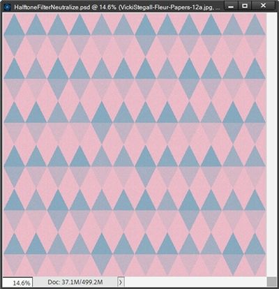
So, you can see how versatile this Halftone technique can be in helping you create a near endless variety of paper options using the original pattern.
I also want to quickly show you what can be done using a more complicated piece of paper. I’m going to be using this “metal” paper from “Funky Metals (two)” by Joyful Heart Designs:
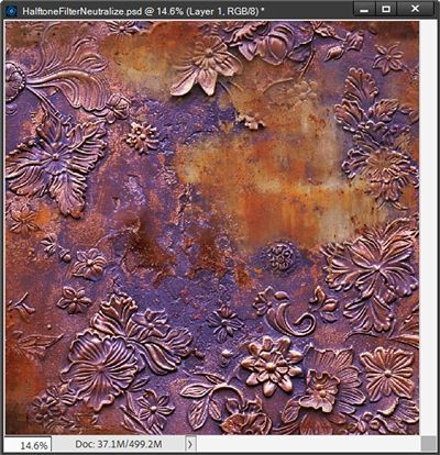
I’m going to use the same dark tan (#b59b79) for my Foreground color chip and the same beige (#d3c7b7) for the Background color chip that I used on the triangle pattern:
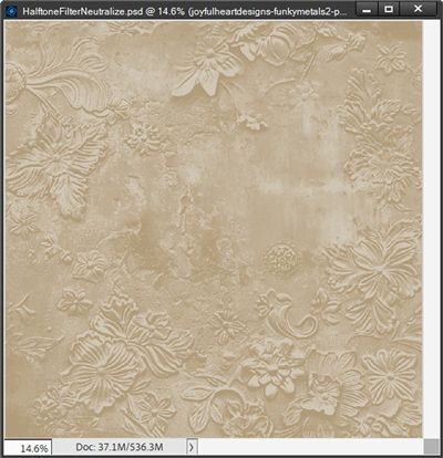
Oh, that turned out so much better than I could have imagined. I certainly don’t need to add any texture on this one. This just goes to show you how quickly you can take a very bold paper and turn it into something so soft and lovely.
And why stop at paper. Let’s see what happens if I use this “busy” cluster from “Rosy Posy Cluster Borders” by ADB Designs:
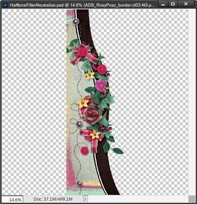
Again, I’m just going to use the same color chips I used on that metal paper. But this time I set the Halftone Contrast to 20:

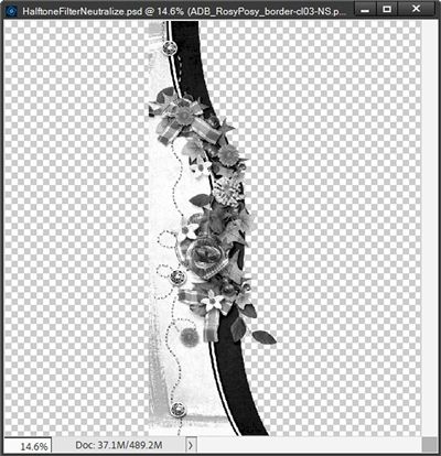
Okay, so that cluster may not have been the best choice. Or perhaps it was the color chips. Let’s see what it looks like if I just use black & white and return the Contrast to 10:
Oh, that’s much better. Now I’m going to try using that dark tan(#b59b79) instead of black and set the Contrast to 15 just to see if I can get a better version of the first attempt:
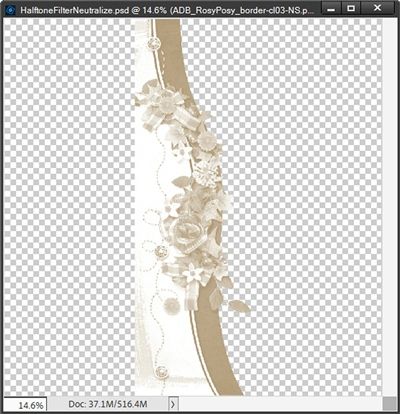
Oh, that could definitely work! In any case, I think you get the idea. It’s certainly possible to “tone down” more than just paper using the Halftone technique.
More Tips

Experiment with different papers (or elements) to see upon which ones this technique will work the best.
Try different color chip options. As you can see from my examples, some work better than others.
Try using an off white vs. a stark white for a “softer” contrast with the other color you use.
And don’t forget to try flipping your color chips. You’ve already seen what a difference that alone can make.
If you add a texture, don’t be afraid to play around with the Scale setting. The higher the setting the more pronounced the texture.
Thanks for reading this week’s Tuesday Tip. Remember, if you have any suggestions or questions please don’t hesitate to “Message Me“. Check back next week for some fun tips about the Solid Fill “Adjustment” Layer. Click “Follow Me” to stay in touch. I hope you have a wonderful week!
