Old Signage
Last week I talked about ransom style word art. Today I want to talk about some old signage – Letter Boards as word art.
If you’ve read my “About Me” page you likely already know I had a long stint in the corporate world. Over the years I planned more than one conference or other corporate “get together” that generally required some form of signage.
Way back in the twentieth century, letter boards were a very common form of signage. They were one of the easiest ways to display directions to different conference venues, display titles of topics being discussed, or schedules for the day, just to name a few.
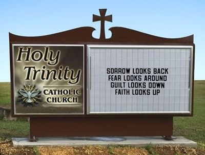
Back in “the dark ages” before all the electronic media these were like theater, restaurant or church marquees such as this one:
Most letter boards would come with not just the basic letters of the alphabet but also extensive options of common words, phrases, symbols and sometimes even pictures. They were a vital communications mechanism that became widespread in places like schools, churches, government buildings, and businesses. They served as a budget-friendly way to display official information, business hours, prices, and event details.
Today letter boards are most certainly a social media mainstay. Posts of funny silly or sentimental sayings show up everywhere. They’re loved for mixing old charm with new style not just for their unique look but as a flexible way to make a statement. They’ve also enjoyed some resurgence within the scrapbooking world.
You’ve likely seen some at a scrapbook supply shop. Their popularity repeatedly peaks and wanes over time. But they’re never really gone. Some designers call them signs, letter boards or felt boards, some lump them in with their word art and others place them with cards.
Sweet Shoppe Designs is a great place to shop for letter boards. They even have a pack of letter board backgrounds in multiple fun colors.
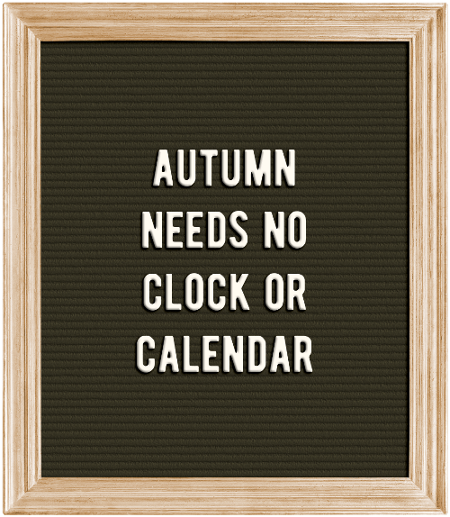
Note: The featured image at the top of this post is a letter board from “Autumn Lazy Days” by Just Because Studio (now retired)
Letter Boards

As scrapbookers, one of the biggest advantages to letter boards, over typical word art, lies in their changeability. You can express yourself as much as you want – literally, because as long as you keep your felt board and letters handy, you can change things out on the regular. So, from motivational to mad, and snarky to sad, your letter board content is yours to decide, over and over again.
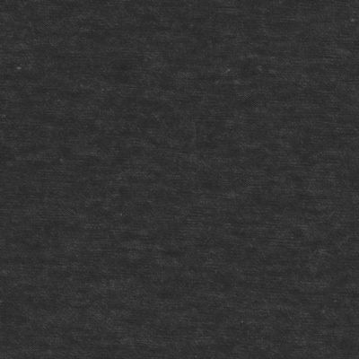
Note: The image directly above is a letter board I created using supplies from my stash. All of which were accumulated over many years. I can’t even tell you from where I got the original letters.
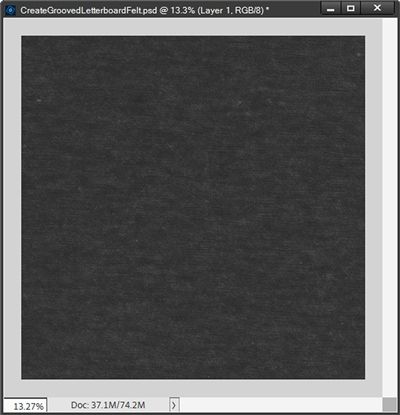
Did you notice how the black “felt” background in the image above looks like it is grooved? That’s because real letter boards need those grooves for character placement. Creating this grooved background is the first step in building a letter board.
Spoiler Alert
Well maybe a warning more than a spoiler…

You likely already know that one of my passions is helping people learn how to create amazing things. I love it when I hit on something that inspires me to write a post.
I also strive to provide as much detail as possible so as to give you the best possible path to a successful outcome. This is one case where I firmly believe that too much information is generally better than not enough. I hope you agree!
And sometimes, it’s just a matter of one thing leading to another and I end up covering more than originally intended.
That was the case with letter boards. As hard as I tried I just couldn’t (or rather didn’t want to) get a whole letter board put together in one fell swoop. All the steps/images for just the background took up a lot of real estate.
So, today we’ll start our letter board project slowly. I want to promise that I’ll finish it up in one additional post. But it may take two more. I’ll see how things go next week
Now, let’s make some felt…
Create The Felt
Before I get started here’s a quick reminder; I use Photoshop Elements (PSE) 2024. If you use a different version, some of my screen shots may look different from what you see on your screen.
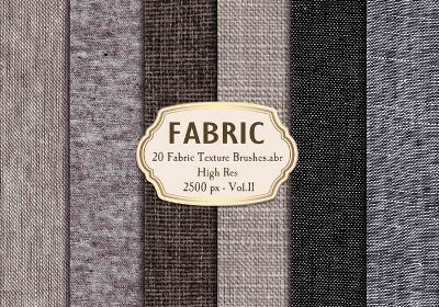
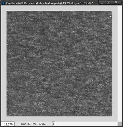
The image above is a piece of black “felt” paper that I created using a free fabric texture brush from Brusheezy:
I was just going to let you download the paper I’ve created but I’d rather teach you how to make it. That way you can create a collection of felt papers in an assortment of colors if you so choose.
If you already have a 12×12 piece of “felt” paper that you’d rather use, feel free to skip down to the section about creating grooves by clicking here.
And if you already have a piece of letter board felt (with grooves) feel free to forego the remainder of this post and simply join me next week for adding words.
Note: If you want to follow along exactly, please download and install the Brusheezy texture brush before going forward.
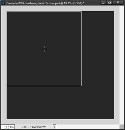
I’m going to start with a blank 12×12 file and fill the base (Layer 1 for me) with a very dark grey – nearly black color (#232323):
Next, I click the Create a new layer icon at the top of the Layers Panel. PSE creates that new layer (Layer 2 for me) directly above my “blackish” base. I’m also going to reset my Foreground/Background color chips to the default (press D)
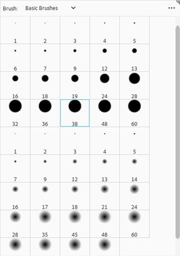
Then I open the brush tool and click the down arrow to the left of the current brush. PSE then opens the current brush set (Basic Brushes for me):
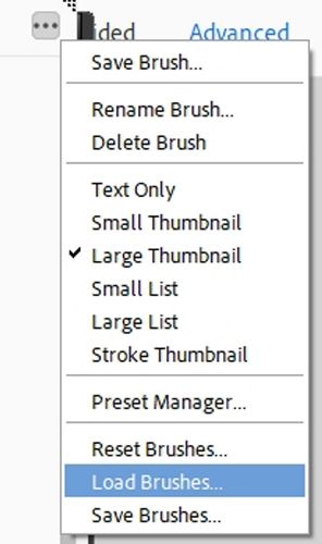
I already have the fabric texture brush loaded. If you don’t have it loaded, just click the three dots in the upper right corner of the brush set dialog box and select Load Brushes:
Note: PSE may open the system folder that contains the PSE brushes. If you have your downloaded brush stored in a different folder (as, do I), you will need to navigate to the correct folder.
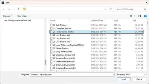
With the correct brush folder open, I look for the brush named “20 Fabric Texture Brushes” and double-click on the brush name. PSE loads the brush and returns me to the dialog box for the fabric texture brush:
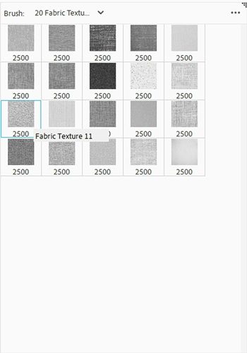
I select the brush named “Fabric Texture 11″, the leftmost brush in the third row from the top.
These bushes are all sized to 2500x2500px. I cannot change the size to anything larger than that. But that’s not a problem. I can re-size the image after I “stamp” the texture.
I swap my Foreground/Background color chips (press X) so that white is on top. Then, I position the brush at the upper left corner of the file:
I click once. PSE “stamps” the texture:
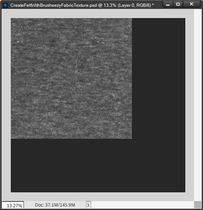
I’m now going to re-size that image so it covers the entire base:
The texture is nice but I want this to be darker. So, I’m going to change the Blend Mode of the brush (Layer 2 for me) to Soft Light:
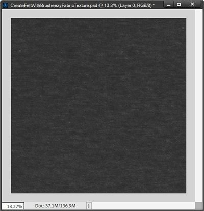
That looks much better. I’m going to save this working file first as a PSD file with a unique name “CreateFeltWithFabricTexture” so I can go back to the file any time I’d like to make a different color of felt.
Next, I’ll also save this as a JPG file with a unique name for use when proceeding with creating the letter board. I named my file “LetterboardBlackFelt”
But this doesn’t look like a letter board background just yet. I still need to add the grooves. But before I get to that I want to mention a few things about using different colors.
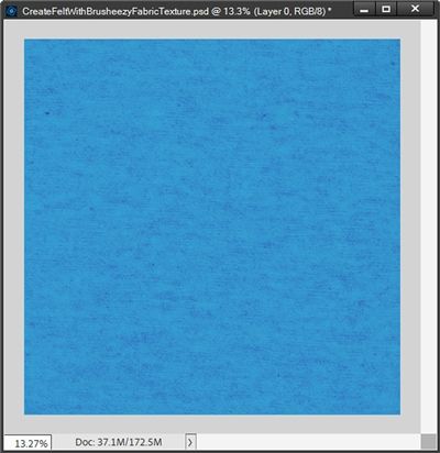
When using a color other than “black” for the base background, setting the Foreground (brush) color to white may not always work. Try using a Foreground (brush) color of black with a Blend mode of Overlay. Here’s an example of how that looks using a bright blue (#12acd9) background:
Another option would be to use a Foreground color that is a darker hue of the base color. Using the bright blue background above with a Foreground (brush) color of a deeper blue (#006296) and a Blend Mode of Normal, I get this:
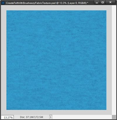
You may not be able to notice the difference between the two in these small images, but it is noticeable at full size.
One final color note. When using a white base, it seems to work best to set the Foreground (brush) color to a shade of light grey (#c4c2be) and change the Opacity level of the brush layer to something between 40-60%.
I’d encourage you to play with different Foreground (brush) colors and Blend Modes when using different base colors.
Now let’s add the grooves…
Adding Grooves
Before I go on, I want to stress that everything in this section is driven by the size of the felt background being 12×12 (3600×3600). If you are using a different size you will need to use different settings for the size & number of grooves and bevels.
I’d recommend that for the first attempt, please use a 12×12 background. It can always be re-sized later. And you can play with different settings on your own with a different sized base once you know how things are created.
Moving on…
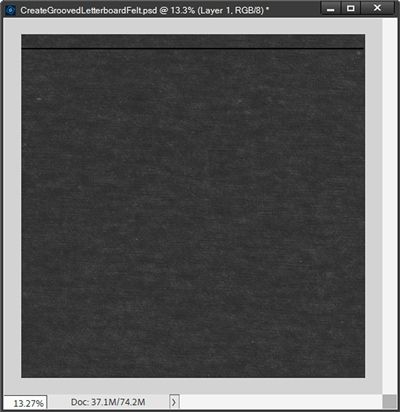
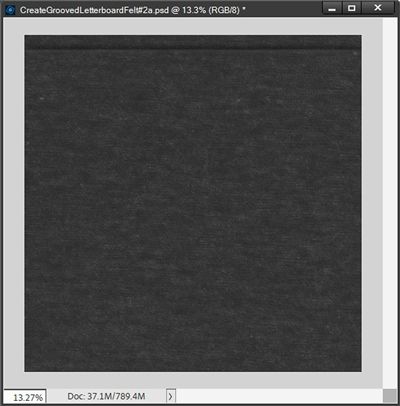
In PSE, I’m going to open the LetterboardBlackFelt file I created above:
By default, PSE named that layer Background. I double-click on the layer’s thumbnail. PSE opens the New Layer dialog box:
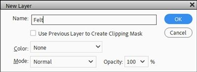
I set the name to Felt and click OK to confirm. Then I immediately save this as a PSD file with a unique name “CreateGroovedLetterboardFelt”. This will automatically safeguard the original felt file.
Note: PSE did not create a new layer. Rather the Background layer has just been simplified and renamed.
I ensure that my Foreground/Background color chips are set to the default (press D). Then in the Layers Panel I click on the Create a new layer icon. PSE places that new layer directly above the Felt layer.
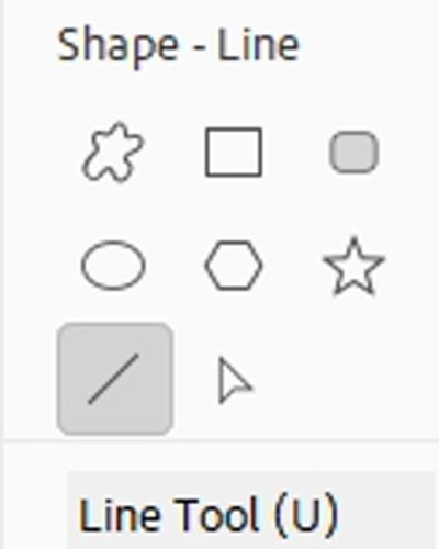
Next, I grab the Line Tool. It’s nested within the other shape tools:
In the Line Tool Options, the color chip is already set to black because that’s how my Foreground color chip is set.
I then set the Width to 40px, the Arrow Head options to No Arrow Head, and select the Create a New Shape Layer icon:
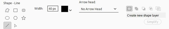
Note: Depending on the version of PSE that you’re using, when creating a new line you may see an option for Style. If that is the case, set the Style to None.
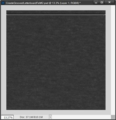
On the file, holding down the Shift key, I click and drag a line from the left edge, near the top of the Felt layer so that it spans the entire width of the paper without extending beyond the edges.
As soon as I release the cursor, PSE places the line in that new layer and renames the layer to Shape 1 (at least for me):
I know it may be a bit hard to see the line on the small image above. If you right-click on the image and open it in a new tab, you may be able to see it a bit better.
With the Shape 1 layer active in the Layers Panel, I right-click on the layer’s thumbnail and choose Simplify Layer from the dropdown.
Then I go to the top tool bar and select Filter->Blur->Gaussian Blur:
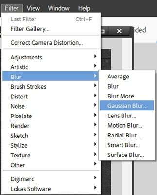
In the Gaussian Blur dialog box, I set the Radius to 25px and click OK to confirm.
Now I’m going to add a bevel to this line. So, I go to the top tool bar and select Layer->Layer Style->Style Settings:
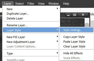
PSE opens the Style Settings dialog box and I click the box next to Bevel to open the options for that setting. I leave the Lighting Angle at 90 degrees (PSE default), set the Direction to Down and the Size to 25px:
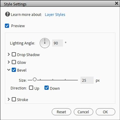
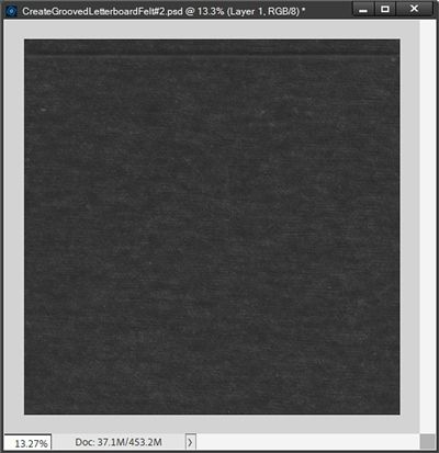
I click OK to confirm. I then set the Blend Mode to Soft Light and the Opacity to 80%. And here’s how that line looks now:
Again, I know the change might not be easily recognizable at this small size. Try opening the image in a new tab to see if that helps.
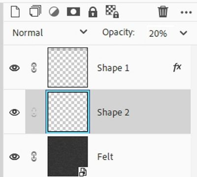
Next, I’m going to add a slight highlight to enhance the bottom of the “groove”. To do this I select the Felt layer in the Layers Panel and click on the Create a new layer icon. PSE places that new layer (Layer 1 for me) directly above the Felt layer.
Next, I grab the Line Tool and set the color chip to a very light grey (#eeebeb), the Width to 20px, the Arrow Head options to No Arrow Head, and select the Create a New Shape Layer icon.
On the file, holding down the Shift key, I click and drag a line near the bottom of the groove, again without extending the line beyond the edges. PSE again places the new line in that new layer and renames the layer to Shape 2 (at least for me):
With the Shape 2 layer active in the Layers Panel, I simplify the layer. I then go to the top tool bar and select Filter->Blur->Gaussian Blur (I want to use a different blur than I did on the black line). I set the Radius to 10px and click OK to confirm.
I then nudge that blurred light grey line up until just a bit shows at the bottom of the groove and set the opacity of the layer to 20%:
The highlighted groove should show up a little nicer for you now!
And here’s what my Layers Panel looks like at this point:
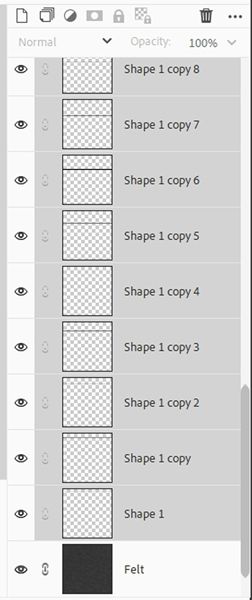
The last thing I need to do before moving forward is to merge the two shape layers together in the Layers Panel. Because the Shape 1 layer was the top layer before the merge, the merged layer created is still named Shape 1.
Clearly, I need more than one groove to complete the letter board look.
With the Shape 1 layer active in the Layers Panel, I press Ctrl-J twenty-three (23) times. I then end up with a total of twenty-four (24) shape layers (lines/grooves).
If you aren’t careful counting it will ultimately throw off the spacing between the grooves. Double check how many layers you have. There should be no more than 24 shape layers in the Layers Panel.
The top layer in the Layers Panel is now named “Shape 1 copy 23” (at least for me).
At this point, all that has happened is the groove simply looks more pronounced. So, I’m not going to display an image here.
I select the Move Tool (press V) and ensure that the “Shape 1 copy 23” layer is active (top layer in the Layers Panel). I position my cursor over the active groove in the file.
While holding the Shift key I drag the “Shape 1 copy 23” layer down (on the file – not in the Layers Panel) until there’s about the same amount of space between the groove and the bottom of the felt background as I have between the original groove and the top of the felt:

At this point you should be able to see a really dark groove at the top and a not so dark groove at the bottom. Not to worry, there’s a super easy way to spread the rest of those grooves evenly across that background.
With the “Shape 1 copy 23” layer active in the Layers Panel, I hold the Shift key down and scroll all the way to the bottom of the Layers Panel and select the “Shape 1” layer. What you can see of my Layers Panel looks like this:
Then all I have to do is ensure the Move Tool options are displayed and click on the Distribute Center icon. PSE then distributes the remaining lines equally:
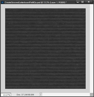
And there’s the final grooved felt background.
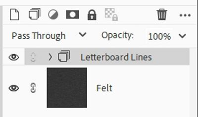
With all of the shape layers (Shape Layer 1 thru Shape Layer 1 copy 23) still active/selected in the Layers Panel, I click the Create a new group icon at the top of the Layers Panel (it looks like a stack of papers).
PSE then places all of the shape layers into the new group and names it Group 1. I change the name of that group to “Letterboard Lines”. And my Layers Panel now looks like this:
I’m now going to save my original PSD (CreateGroovedLetterboardFelt) so I can use it again if I want to create different colored grooved backgrounds. Then I save the file as a JPG with a unique name (GroovedBlackFelt).
Note: If you’re using a color other than black for your felt, you should still be able to use the grooves created using black. In most cases simply changing the Blend Mode of the Letterboard Lines group from Pass Through to either Overlay, Soft Light, Vivid Light or even Difference should do the trick. Depending on the felt color you may also need to adjust the Opacity of the group.
That’s it for today. I wish I could have kept this shorter. But come back next week and we’ll work on adding words!
Lots Of Tips

Using letter boards as word art can be really fun. They tend to add a very different level of interest to a layout.
When creating a letter board background remember that classic, old-time letter boards had grooved felt backgrounds. There’s no requirement that says you must do the same. You don’t have to include grooves or even felt. It’s all about the look you want!
If using a brush to create the felt texture, experiment with different colors, Blend Modes & Opacities to see how the texture changes.
When using a color other than black for the base background, a brush color set to white may not always work. Try using black with a Blend mode of Overlay. It often creates a satisfactory result.
Another option for the texture would be to use a brush color that is a darker hue of the base and a Blend Mode of Normal.
When using a white base, a brush color in a shade of light grey (i.e., #c4c2be) and an Opacity level of something between 40-60% tends to work the best.
You are not required to stick with black when creating the grooves. In my experience it tends to work the best. But you can just as easily use a much darker shade of the base felt color to create the grooves. Feel free to play around and see what you can achieve.
Don’t be afraid to try creating different colors of the grooved felt background. Once you’ve completed the black one, in a lot of cases it can be a simple matter of changing the Hue/Saturation by using the Colorize option (Ctrl-U). This may not always work but it’s always worth trying. It will save having to recreate the background from scratch.
I highly recommend that you always blur the grooved line. This will not only make it blend in better with the felt, it will also provide a more realistic look.
Adding a slight highlight to the bottom of the grooved line is not required. I do this mostly to enhance the realism of the groove.
Remember to count the duplicated lines carefully in your Layers Panel. For a 12” tall background a total of twenty-four (24) lines provides the ideal, realistic letter board spacing.
After creating the grooved felt background, keep this one thing in mind. The grooved lines end up with a bevel that will make it virtually impossible to flip the background vertically. In doing so it will completely change the effect of the groove.
If you’re planning to continue by adding words in next week’s post, please save your felt background as a JPG file. It will be our starting point next week.
Ponder this…I begin with an idea and then it becomes something else. – Pablo Picasso
Thanks for reading this week’s Tuesday Tip. Remember, if you have any suggestions or questions please don’t hesitate to “Message Me“. Check back next week for tips about adding the words. Click “Follow Me” to stay in touch. I hope you have a wonderful week!
