Patterns Again?
I know I talked about working with clearly defined patterns a lot last year; at least five different times. It all started with my Patterned Vellum post on May 6, 2025 and ended with my Masking Patterns post in December of 2025. Today I’m going to use some of the same tools/techniques I wrote about in all those 2025 posts to show you a fun, new result…Glitter Patterns!
If you’ve already read some of these earlier posts, a lot of the steps today will be very familiar. And I will be running through these steps rather simply with minimal “illustration”.
If you need a quick (more detailed) primer on working with clearly defined patterns, you may want to read my Masks & Wands post from May 13, 2025.
As with a lot of the other “pattern” techniques I’ve written about, this one also works best with papers that have clearly defined patterns and a sharp contrast with the background. It’s also best that the paper doesn’t have any other underlying texture like canvas or woven fabric. Whenever possible I recommend using a black & white pattern but it is not required.
Glitter Patterns
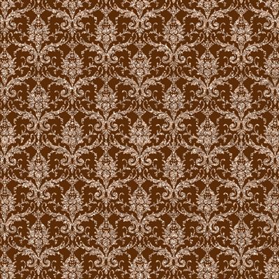
From time to time, I like to dress up a layout by taking a sort of plain pattern, “glamming” it up and adding some sparkle. There are lots of glittery patterned papers out there. But it’s not always easy to find just the right glitter pattern for my layout.
That’s when I get into my DIM (do it myself) mode 😊 And, it’s easier than you might think. Just take a look at the image directly above. I’m not trying to brag; just stating a fact. It took me less than five minutes to create that glittery damask!
Let me show you just how easy this is…
Select The Pattern
Before I get started, just a quick reminder. I use Photoshop Elements (PSE) 2024. If you use a different version, some of my screen shots may look different from what you see on your screen.
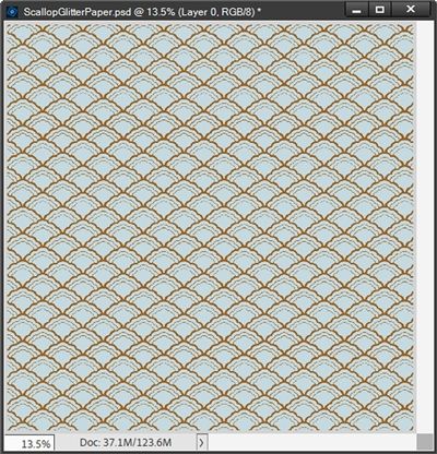
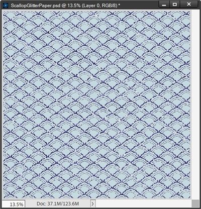
I have this 12×12 scalloped pattern paper that I created years ago when the original Café was still open. It should work great for this technique. I open the scalloped pattern in PSE:
If you’d like to use this exact paper to follow along, just click here and it will be automatically downloaded for you.
Note: You are free to use any paper that you like. Just be sure it is a clearly defined pattern with sharp contrast to the background.
I want to change only the brown part of the pattern and keep the background as it is. So, I grab the Magic Wand tool. Then in the Tool options, I use the following settings: Tolerance set to 32, Sample All Layers unchecked, Contiguous unchecked and Anti-Aliasing checked.
I then click somewhere on any part of the brown pattern:
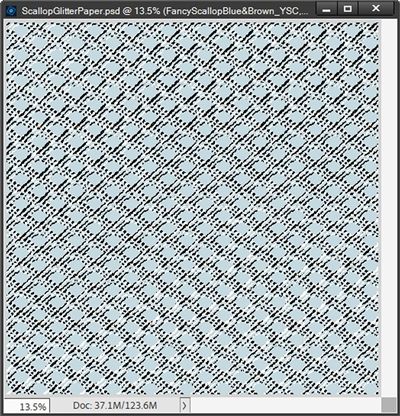
You should be able to see the marching ants around the entire pattern. I simply create a new layer from the selection (Ctrl+J). PSE then places the selected pattern on its own layer (Layer 1 for me). I then rename that new layer to “Pattern Mask”.
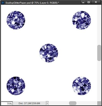
The Pattern Mask layer is now the active layer in the Layers Panel. To glam up my pattern, I’m going to be using a nice blue glitter paper from a pack I found at Creative Fabrica:
I selected paper “number 61” and bring that into my file and clip it to the Pattern Mask layer:
Note: You are free to use any glitter paper you desire.
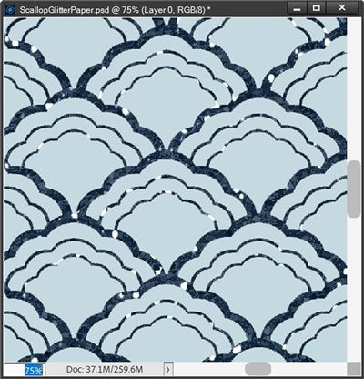
Now, at this small image size that doesn’t look very pretty. Unfortunately, it looks even less pretty at full size. And here’s the pattern zoomed in at 75%:
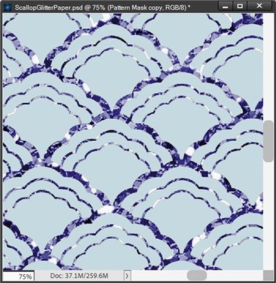
Not a good look in my opinion. And you may be asking, why?
I have to admit; I did all of this purposefully. I wanted you to see what happens if you use a delicate pattern such as this scallop and a seemingly “standard” glitter paper.
When I say “standard” I’m referring to the chunkiness of the glitter. If you look at most glitter papers that come with a kit, all of the flecks making up the glitter tend to be of the same size. And that size can vary from one designer (or paper) to another.
Is this bad? No, you just need to be mindful of the glitter size when selecting the glitter paper for your pattern. For example, if I took that same glitter paper from above and clipped it to a polka dot pattern, it would look like this:
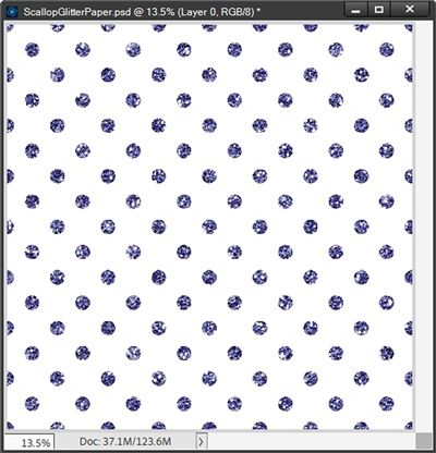
And here’s this one zoomed in at 75%:
That looks better than it did on the scallop. But to me it’s still a little too chunky.
But everyone’s tastes are different and this size glitter might look perfect to you. And that’s fine. I just wanted you to be aware of how the size of the glitter can impact the look of the pattern.
There is an alternative to using glitter paper that gives me a bit more control over the look of my pattern. For the delicate scallop pattern I chose today I would normally not use a paper. Instead, I would use a Layer Style.
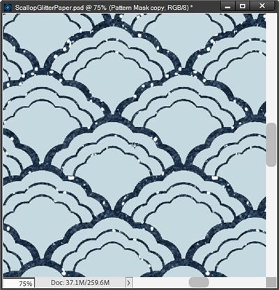
Going back to the scallop pattern with the Pattern Mask layer active in the Layers Panel, I can apply a blue glitter style to that layer:
Note: The glitter style I used was one from “Autumn Aura” by Aimee Harrison Designs.
Zoomed in at 75%, this already looks better than the glitter paper. The blue is a bit darker but I’m ok with that. I’d still prefer that the glitter look a bit smaller. Since I used a Layer Style, this is easy to adjust.
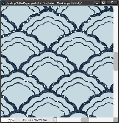
With the Pattern Mask layer active, I go to the top tool bar and select Layer->Layer Style->Scale Effects. PSE opens the Scale Layer Effect dialog box and I set the Scale to 60%:
I’m happier with this smaller glitter on my delicate pattern. In this particular case it amounts to more of a shimmer than a glitter. Honestly with this pattern, I think that’s just right!
So, there you have it. More than one way to apply glitter to your pattern.
Whichever glitter method I’ve used, there’s one more thing I want to do to make this look finished. I want this glitter to look like it’s been glued to the paper as it would in real life.
Again, with the Pattern Mask layer still active, I go to the top tool bar and select Layer->Layer Style->Style Settings. PSE opens the dialog box. I set the Lighting Angle to 120 degrees. I click on the box next to Drop Shadow to open those settings.
If you’ve been following me for very long you know I’m not a fan of black shadows so I set the color chip to a dark blueish grey (#30383f) since my glitter is blue. I set the Size to 3, the Distance to 1, and the Opacity to 50%. Zoomed in a 75% it now looks like this:
This is a very subtle lift off the paper but it does make it look more realistic. All that’s left is to save this new paper as a JPG file with a unique name for use on my layout.
And here’s how that layout turned out:
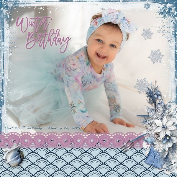
If you’d like to see more details about this layout you can find it in my 2026 Gallery. The title of this layout is “Winter Birthday”.
Simple Tips

This technique works best with clearly defined patterns having a sharp contrast with the background.
Be mindful of the scale of the glitter on whatever paper you use. If your pattern fills an entire 12×12 paper, there’s no easy way to get a 12×12 glitter sheet to look less “chunky”.
If your pattern is very delicate (thin edges like the scallop pattern above) working with glitter sheets can get tricky. It’s not impossible…just not as quick.
If you have the “perfect” 12×12 glitter sheet but it’s too chunky…not to worry. Resize your glitter sheet to 50%. This should result in a 6×6 sheet. Duplicate the resized layer 3 times. Then just reposition the duplicates until you have a full 12×12 sheet of smaller glitter. Merge the glitter layers together and clip the merged layer to your pattern.
Experiment with using glitter Layer Styles vs. glitter sheets. When using a glitter style, it’s very easy to adjust the scale of the effect.
Adding a tiny shadow to the pattern is not required but it will make it look more realistic.
This is soooooo me…”Ideas are like rabbits. You get a couple and learn how to handle them, and pretty soon you have a dozen! – John Steinbeck”. I hope it made you laugh!
Thanks for reading this week’s Tuesday Tip. Remember, if you have any suggestions or questions please don’t hesitate to “Message Me“. Check back next week for tips about creating custom tape. Click “Follow Me” to stay in touch. I hope you have a wonderful week!