Transparent Edge
If you’ve been following me for the last few months, you know I’ve been talking a lot about titles. I think I finally figured out why I’ve been on this kick for a while. Titles are kind of a big deal for me. It’s how I introduce my layout to the viewer.
And you know how important introductions can be. A good introduction should be more than just words. It’s about highlighting the essence of your story and making a lasting positive impression.
And if you read my “Title Tip” post back in September or 2024, you know I sometimes struggle getting my title to be noticed without dominating the layout. And I’m fairly certain I’m not the only person that faces this challenge.
Today I’m going to show you a super simple way to highlight just about any title in a very subtle way.
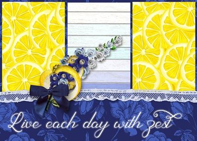
Note: The featured image at the top of this post was created using products from “Lemon Squeezy” by Renne Looney at ForeverJoy.
Title Trick

You probably are already aware that I love using bevels and drop shadows. But there are an awful lot of people that will tell you those are big No-Nos for text/type.
Clearly, I disagree with those people. I maintain that bevel and drop shadows can be used as long as they are used properly and don’t become distracting.
And I think I’ve mentioned that I really dislike the “sticker” look for most word art but specifically for titles. Don’t get me wrong, stickers can be fun but they have their place. And in my mind…it’s not in word art or titles! But that’s just me!
So, you’re going to be surprised that I’m about to show you how to turn a title into, wait for it…
…a sticker with a transparent edge!

Oh yeah, I can see your shocked face 😉
Quick reminder, I use Photoshop Elements (PSE) 2024. If you use a different version, some of my screen shots may not look the same as what you see on your screen.
I will admit that I don’t use this technique very often. So infrequently actually that I had all but forgotten about it until a friend of mine reminded me.
I’m going to keep this very simple today. As usual I’ll start with a 12×12 blank file. And I’m going to pull in a nice patterned background from “Seashell Memories” by Heartstrings Scrap Art:
Note: If you’re following along feel free to use any paper you like.
This technique will work on any font and just about any simple text word art. By simple text I mean word art that doesn’t have any embellishments. Something like this piece of word art that I got at Creative Fabrica:

I’m going to be using a script font today “Sherley Regular” available free at DaFont. So, I grab the Horizontal Type tool:

I select the Sherley Regular font, set the Color to a medium aqua (#549bad), the Size to 80, the Leading to Auto and the Tracking to zero and click on the Left align text icon.
Note: If you’re following along feel free to use whatever font & color you like.
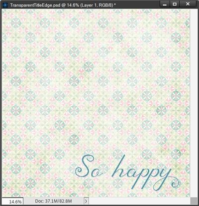
I then click once near the bottom middle of the document and type my title and position it exactly where I want it to sit:
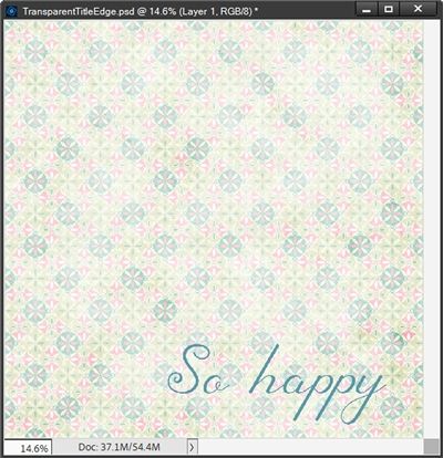
This looks nice. But the Sherley font has some nice glyphs and I’m going to use one to change the “y” at the end of happy:
Making this change is totally optional. But if you need some pointers about using glyphs please refer back to my “Fancy Ligatures” post from April of this year.
Next, I go to the top tool bar and select Layer-> Layer Style-> Style Settings:
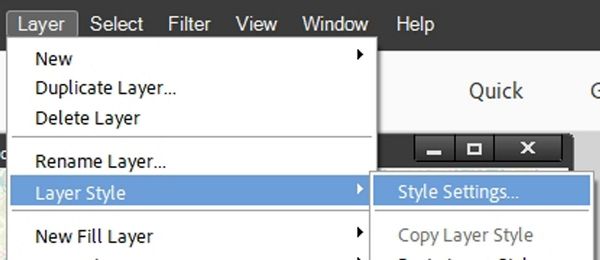
PSE opens the Style Settings dialog box and I set the Lighting Angle to 120 degrees. Then I click the Drop Shadow box and set the shadow color chip to a very dark grey (#262626), the Size to 12px, the Distance to 10px, and the Opacity to 70%.
Next, I click the Stroke box and set the Stroke color chip to white, the Size to 10px, the Position to Outside, and the Opacity to 20%.
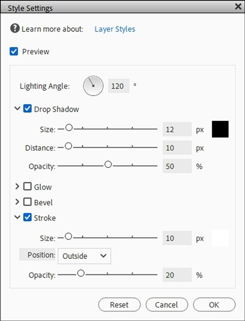
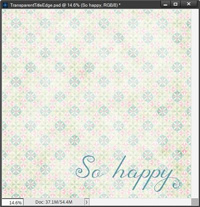
I click OK to confirm and here’s my “sticker” title:
I know the difference is really hard to see in this small image so here’s a closer look at the before and after:
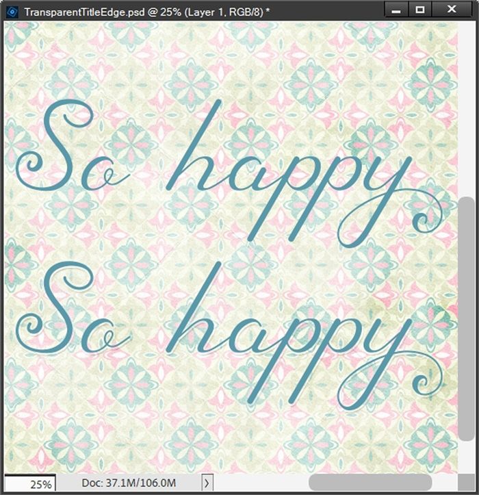
Even with this image you may not be able to see the difference. If that’s the case just right-click on the image above and select Open image in new tab. That should give you a better view.
I’ll admit this technique is designed to give just the slightest “lift” to the title keeping it very subtle. On the light background I used, it’s extremely subtle.
You can play around with the Size of the Stroke and Drop Shadow settings for different fonts and backgrounds or just for a more pronounced effect.
For example, here’s a closer before and after look at the title in the featured image at the top of this post:

Using the same settings I used for my “So Happy” title, the results on a dark background are significantly easier to see.
I hope you’ll try this simple little trick to give your next title a little boost!
And here’s a layout I created using this little trick on my title:
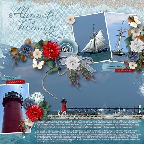
If you’d like to see more details about this layout you can find it in my 2025 Gallery.
Extra Pointers

Keep in mind this transparent edge trick is designed to make a very subtle change to the way your title/word art appears on the background.
Font size and color can have a lot to do with how this “transparent sticker” turns out. The lighter color text you use, the less noticeable the stroke will be. In those cases, raising the opacity of the stroke can make it more noticeable. But, if you’re trying to avoid the “sticker” look, I would recommend not going any higher than 30-40%.
The color of the background can also affect the “transparent sticker”. The darker the background the less noticeable the stroke may be. In those cases, raising the opacity of the shadow can make a big difference.
If you’re using a fairly light patterned background and you’re having trouble getting the “transparent sticker” to show up by changing opacity levels, try changing the color of the stroke to one of the lighter colors in your pattern.
When adjusting shadow color, size and opacity be careful that you don’t end up with what looks like a floating title. Those are almost never a good idea!
I highly discourage the use of a dark color for the stroke unless you are working on a dark solid or patterned background. In those cases, a dark stroke can actually work to enhance the effect a bit more.
Thanks for reading this week’s Tuesday Tip. Remember, if you have any suggestions or questions please don’t hesitate to “Message Me“. Check back next week for a quick tip about an edge-to-edge title. Click “Follow Me” to stay in touch. I hope you have a wonderful week!
