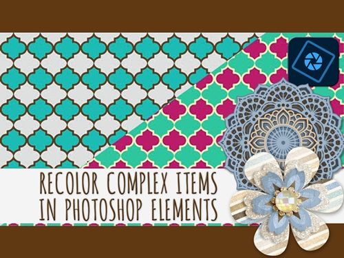
Recolor – Part 2
In last week’s “Recolor Anything” post I covered basic color theory and recoloring simple items. Today things will be a bit more complicated but not overly difficult. I’m going to show you some additional techniques to recolor more complex items using the Color Blend Mode.
This time we’ll be looking at patterned paper along with multi-layered and multi-colored elements.
Recoloring multi-color objects in Photoshop Elements (PSE) requires a non-destructive approach to preserve details and isolate specific hues without affecting the entire image.
Recolor Complex Items
I’m still going to be using the Color Blend Mode method I showed you last week. If I don’t get too verbose this week, I’ll also include tips to increase the range of colors you can recolor.
There are a lot of complex items in my digital stash. I’m fairly certain you can say the same. Complex items can range from patterned paper to layered clusters and everything in between. Even a button can become complex if I’m thinking about trying to recolor it. If you look at the image directly above, you’ll see several complex items; three of which I’ll tackle today.
Not all digital paper is the same. Some have patterns, and some of those patterns can be simple while others are very complex. For papers with a reasonably basic, clearly defined pattern having a sharp contrast with the background, things won’t get too complex. The more complicated the pattern, the more work it will take.
The same can be said for flowers. It never ceases to amaze me the complexity some designers employ to create multi-layered/multi-colored flowers.
For both flowers and patterns I’m going to show you an easy item and a harder item. And I am going to go through some of the steps fairly quickly, so bear with me. If you’ve read my “Patterned Vellum” post from May 6, 2025, some of the papers and selection techniques I’ll be using today should seem familiar.
Just a quick reminder; I use PSE 2024. If you use a different version, some of my screen shots may look different from what you see on your screen.
Recolor Patterns
I have this lovely paper pack that will work great with this technique; “Travel Edition: Mouse Papers” by Marisa Lerin:
Other than the plaids, any one of the other papers will work great. Patterns like plaid can get really tricky & time-consuming if you want to recolor more than one of the colors. But if you have the patience and the right plaid…it can be done 😉
Note: If you’d like to follow along you can use any simple pattern that you like. Just be sure that it is a clearly defined repeating pattern having a sharp contrast with the background.
I’m going to start with a blank 12×12 file and pull in the white polka dots on the saffron yellow paper (farthest on the left in the image above):
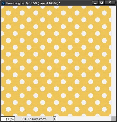
This is a very simple pattern with just two colors. And you might be thinking that since one of the colors is white, all I really need to do is create a solid fill layer like I did last week. Not quite!
Note: Last week, out of an abundance of caution I duplicated my original paper before making any adjustments so I wouldn’t accidentally overwrite the original. For today I’m going to forego duplicating the original paper. If you want to be extra careful, please feel free to duplicate/hide your original paper.
I’m going to set my Foreground color chip to the light blue color from last week (#89a5c3).
If I click on the Create new fill or adjustment layer icon in the Layers Panel and select Solid Color, PSE opens the Color Picker dialog box. At this point it is already pre-filled with the color I used for my Foreground color chip.
So, I go ahead and click OK and change the Blend Mode of the solid fill layer to Color. And this is what happens:
You should be able to see that those “white” polka dots aren’t really white anymore. Part of the issue is that those dots weren’t a pure white to begin with. They were actually a slightly off-white, almost grey (#f1f1f1). If they had been strictly white it would have worked out just fine.
I’m going to hide that solid fill layer for now.
While this is still a nice paper, I really do want the dots to be the original “white”. But I will still save this version as a JPG with a unique name. As you likely already know…you can never have too much paper, right?!? 😊
With the paper layer active, I grab the Magic Wand tool. In the tool options I click the New Selection icon, set the Tolerance to 32, ensure that both Sample All Layers and Contiguous are unchecked and check the Anti-aliasing box:
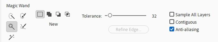
I then simply click on one of the white dots to create a selection around all of them:
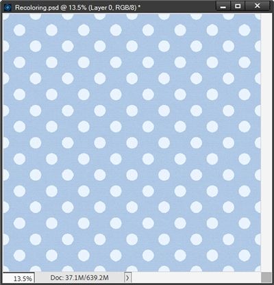
I press Ctrl+J to create a new layer using the selection. PSE places that new layer directly above the original paper in the Layers Panel. I rename that new layer to Original Dots and move it above the hidden solid fill layer in the Layers Panel.
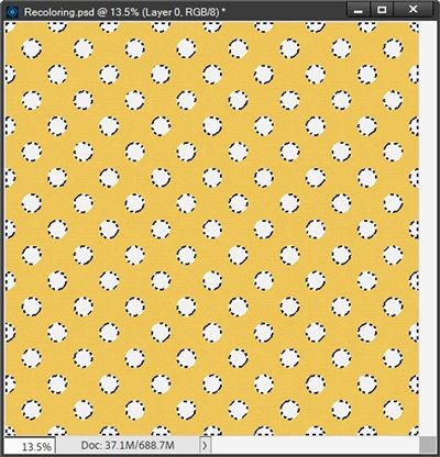
I can now unhide the solid fill layer and ensure the Blend Mode is still set to Color…this is how it looks now:
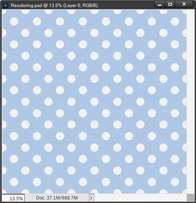
You should be able to see that the yellow color is now blue and the dots are their original “white”. I know it might be hard for you to see the difference between this image and the image for the first attempt. So, here’s a look at the two options side-by-side:
As I said earlier, the first attempt was a nice paper. But it truly is nicer having kept the original “white” dots.
I can now save this second version of the blue & white polka dot paper as a JPG with a unique name for use later.
Now for an extra little quick trick. I can create a solid fill layer above the Original Dots layer using a seafoam green color (#95c389), clip it to the dots and change the Blend Mode to Color just as I did with the paper. And this happens:
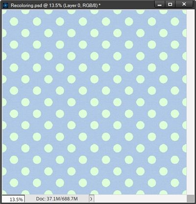
How fun is that. I can now change both the background and the dots anytime I want! And because I use the Color Blend Mode method, the paper retains any texture and shading variations.
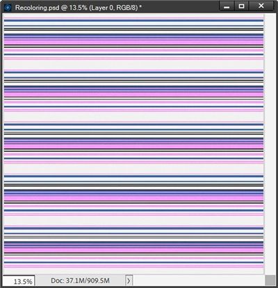
Next, I want to show you a more complex pattern. Let’s take a look at the multi-color striped paper from that same pack I used above (third from the right in the image of the pack):
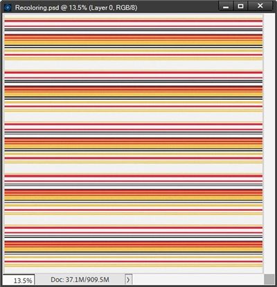
First, I’m going to point out that once again, the “white” isn’t really white. It’s the same, almost grey (#f1f1f1) that I ran into with the polka dots. So, I immediately know I need to create a selection using all of the “white” stripes and place them on their own layer. And I did this using the Magic Wand tool just as I did with the polka dots.
I also want to change the red and saffron yellow stripes meaning I also created individual selections of each of those colors and placed them on their own layers.
In my Layers Panel I now have three different layers with stripes; the Grey Stripes, the Red Stripes and the Saffron Stripes. And here’s how my Layers Panel looks:
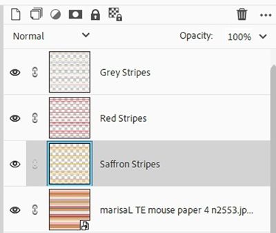
I want to change that saffron color to a vibrant pink color. So, with the Saffron Stripes layer active, I create a solid fill layer using a fuchsia color (#d358de), clip it to the stripes and change the Blend Mode to Color:
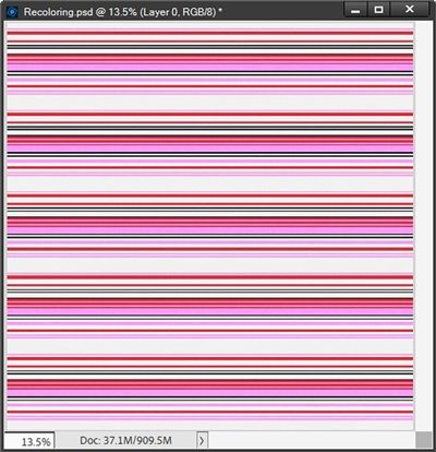
Note: This is another one of the times when I go to the top tool bar and select Layer->New Fill Layer->Solid Color to create the fill layer and have it clipped automatically.
Now I’m going to do the exact same thing for the red stripes only this time for my solid fill layer I’ll be using an azure blue color (#5b9be0):
I’m really happy with the way this turned out and I’ll save it as a JPG file with a unique name.
One last paper example. And this falls under the category of very complex. The majority of the process to recolor the pattern will remain largely the same.
But the following steps are most important when isolating color(s) on a more detailed pattern with less contrast than what I had in the papers above.
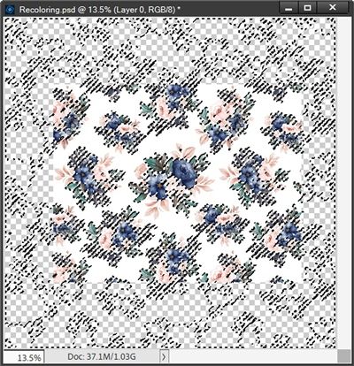
I’m going to pull in a lovely floral pattern that I found at Creative Fabrica:
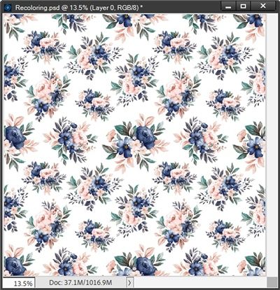
I want to change the blue flowers to red and the pink flowers to a golden yellow. The selection method I’m going to use on these flowers is a bit more complex than what I’ve done before. It is a variation of a method I detailed in my “Patterned Vellum” post last year.
The difference is, for the vellum I was removing the background whereas today I will be extracting the flowers. But the basic process is the same. So, if you’re brave enough to tackle a paper such as this, I’d encourage you to read that “Patterned Vellum” post for more details on the selection method.
With the paper layer active, I select the Rectangular Marquee Tool and just draw (drag out) a rectangle to include the part of the pattern I want to focus on.
My goal here is to select a portion of the pattern that encompasses a comprehensive selection of the floral colors. There’s no “science” behind how large the selection needs to be. That will vary from pattern to pattern.
Paying attention to the repeating flowers I just try to be certain I’ve grabbed enough to get all the varying colors. If I make the selection large enough it usually works 😉 And here’s my selection:
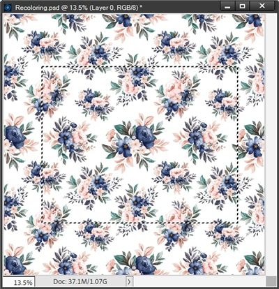
You should be able to see the marching ants around my selection. Ensuring that the paper layer is still active, I click the “Add layer mask” icon in the Layers Panel. This is what happens:
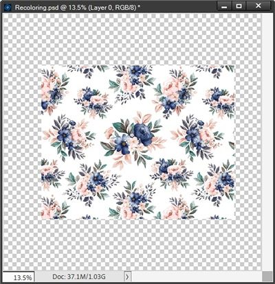
Don’t panic. The rest of the paper is still there. Now, pay close attention…this is VERY important; I double-click on the paper’s thumbnail in the Layers Panel. I must do this as I need the next few steps to happen on the entire layer not just the mask! I DO NOT want the Layer Mask active!
Then using the Magic Wand tool (with the Tolerance set to 15 this time) I start clicking on the shades of blue that I want to isolate. I zoom in fairly close while doing this so I’m certain (or at least mostly) that I grab all the shades):
Notice anything strange about the marching ants? Can you see how they’ve extended beyond the visible portion of the paper? I’m guessing you might be a bit confused by this. Don’t feel bad…you’re not alone. Most people think that once you create a Layer Mask that’s all you have to work with.
Quite the contrary. In PSE, even when a Layer Mask only partially hides a layer, you can still select the entire original layer’s area because the Layer Mask only controls visibility, not the actual pixel data.
I can now press Ctrl+J to create a new layer from this selection. I name this new layer Blue Flowers.
With the paper layer active I once again double-click on the layer’s thumbnail and repeat the selection process for the pink flowers and create a new layer naming it Pink Flowers.
At this point I can delete the layer mask from the original paper layer. I then recolor each of the extracted flower layers using a solid fill (clipped to the layer) and the Blend Mode of Color; I used a saffron color (#efc95c) for the pink flowers and a ruby red color (#b2272c) for the navy flowers:
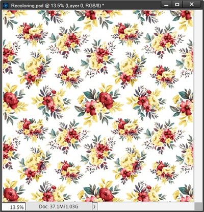
I now have a more fall-themed color palette for my floral paper. And I will definitely save this as a JPG file with a unique name.
This may have seemed like a lot but after this, the upcoming flower elements will feel easy!
Recolor Complex Flowers
I’m certain you have more than one flower in your stash that isn’t as simple as the flowers in last week’s post. These more complex flowers are a bit trickier to recolor using the Blend Mode method. But it can still be done fairly easily.
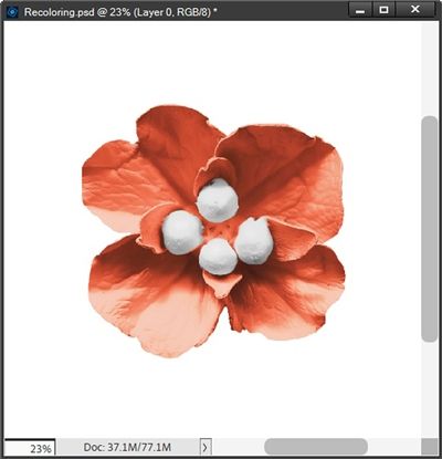
Here’s a slightly complex flower I created a few years ago:
Note: If you’d like to follow along exactly, you can click here and this flower will be automatically downloaded for you.
So, the first thing I need to do is select the center white pistils/stamen and copy the center to its own layer. With this particular flower I think the Quick Selection tool will work better than the Magic Wand tool.
Note: You can use whatever selection tool you’re most comfortable with when isolating a flower’s center.
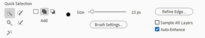
With the flower layer active I grab the quick Selection tool; click on the Add to selection icon, set the Size to 15px, ensure that Sample All Layers is unchecked and that Auto Enhance is checked:
I then click on each white section:
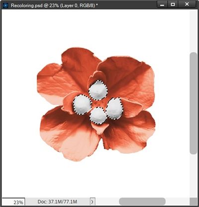
With the selection made I press Ctrl+J to create a new layer from the selection. I rename the new layer Center.
I want to change that coral color to a purplish color. So, with the original flower layer active, I create a solid fill layer with a deep purple color (#311d4f), clipping it to the flower and change the Blend Mode to Color:
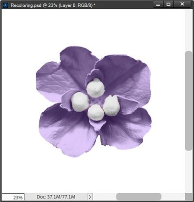
Now that wasn’t so bad, right?!?
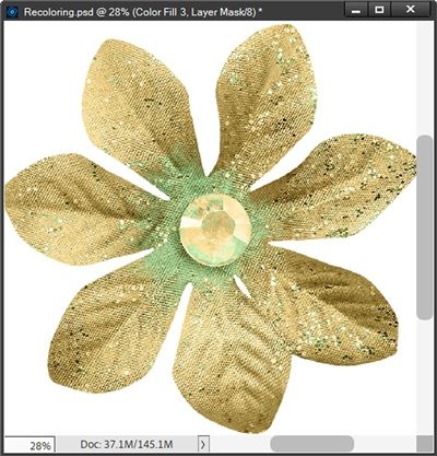
Some of the toughest flowers to recolor using this method are flowers that are multi-layered, multi-colored or have a multifaceted gem-type center.
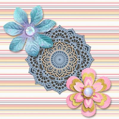
I’m going to try and knock out two of those options using this flower from “Remember The Magic: Ice Magic” by Studio Flergs:
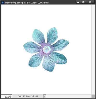
Clearly this is not as simple as the last flower. But it can be recolored with a little extra effort. You may have noticed the flower is not a single solid color and the multifaceted gem in the center also has multiple colors.
With the last flower, I used the Quick Selection tool to select the white center pieces. Using that tool here won’t be a good option because the gem has a rainbow of colors within it. So, you might be thinking I’m going to use the Elliptical Marquee tool to simply select the entire gem.
Not this time. And now you’re wondering why. Well, the reason is exactly the fact that the gem has a rainbow of colors in it.
This can happen whenever a designer uses a multifaceted “clear” gem over a multi-colored flower.
In real life, a clear gem like this frequently picks up color(s) from the element on which it has been layered. If the designer creates a flower using “real” pieces and then creates a digital image, that clear gem won’t remain clear!
That could easily be the case with this gem. This would specifically be why we see the pinkish-purple color(s).
If I were to isolate the gem and change only the color(s) in the flower, the colors in the gem will no longer match the flower. That certainly would look unnatural or at the very least inconsistent. But that could just be me and how I think!
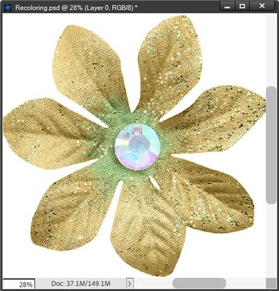
Anyway, instead of isolating just the gem, I’m going to isolate only the pinkish-purple color in both the gem and the flower. The best way to do this is going to be using the Magic Wand tool.
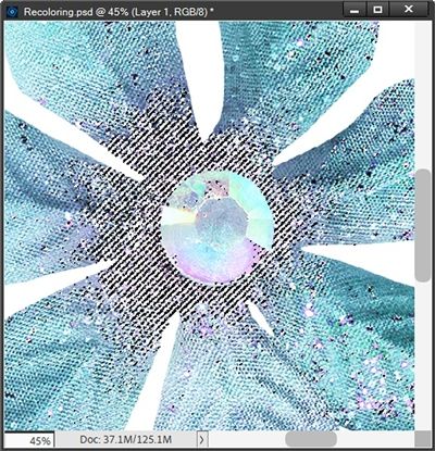
So, with the flower layer active I zoom in to about 45% so I can get a good view of the center section of the flower. I then grab the Magic Wand tool, click the New Selection icon, set the Tolerance to 25, ensure that both Sample all Layers and Contiguous are unchecked and Anti-aliasing is checked.
Then I click somewhere on the pinkish-purple on the flower itself:
I’m sure you can see the marching ants. PSE made a fairly good selection of that color. But there’s some more that I need to add. So, in the tool options I click on the Add to selection icon and lower the tolerance to 15. I then click on the other section(s) of the pinkish-purple that I want to change; including those in the gem:
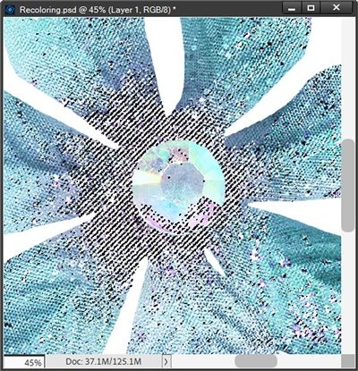
That looks pretty good. I’m comfortable that I’ve selected all of that pinkish-purple; or at least enough that any I may have missed won’t be noticed. And I’m not overly concerned about the shades of blue that are in that gem as they will recolor just fine along with the other portion of the flower.
With the selection made I simply press Ctrl+J to create a layer from that selection and rename the new layer Pinkish-Purple. That new layer is the active layer and above the flower layer. I can now create my solid fill layer using a soft pistachio color (#c7edb2), clipping it to the Pinkish-Purple layer and change the Blend Mode to Color just as I’ve been doing:
This worked out so nicely. You might be able to see that there’s a tiny bit of pinkish-purple still showing through in a few spots. I’m not sure it’s going to be a problem but if it is, I’ll show you how I can fix that later. Though I am fairly certain that the next step will fix it for me 😉
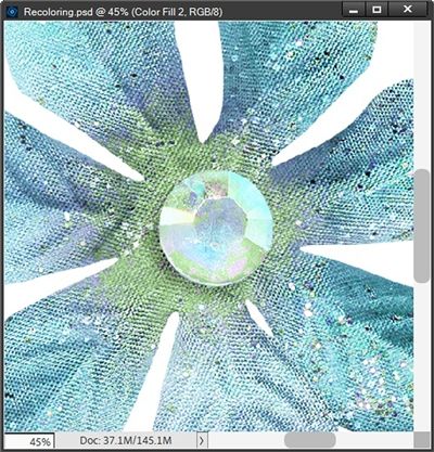
Now all I have to do is recolor the flower itself. So, I make the flower layer active, create my solid fill layer using a golden-brown color (#d4b46e), clipping it to the flower layer and change the Blend Mode to Color:
I zoomed out some so you could see the entire flower. And I have to admit, this turned out so much better than even I expected. And I don’t see any of the pinkish-purple!
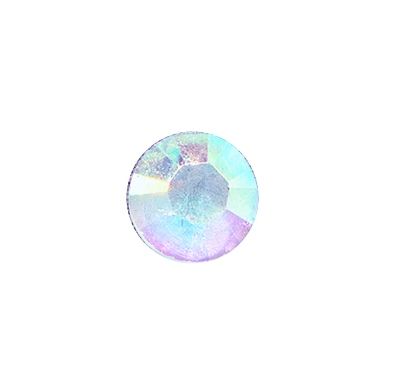
Now here’s what the recolored flower would have looked like if I had simply isolated the entire gem and only recolored the flower:
Definitely not as nice (or natural) a look, right? And looking at that flower directly above and the one below, here’s why you want to avoid that kind of look.
This flower from “Scrap Your Stories: Winter” also by Studio Flergs (now retired) appears to have the exact same center as the “blue” flower I just recolored:
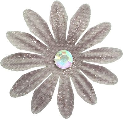
This is the kind of thing that happens when a designer digitally creates a flower and uses a “stock” gem without taking into account how the gem’s colors may not fit the beige flower. I know, I know…that’s just my OCD, Type-A personality 😉
Either way, I think you get the hint that working with flower centers that are gems (or jewels) can be a bit tricky. Just remember that you can isolate individual colors within a gem and recolor them independently to get the best possible result.
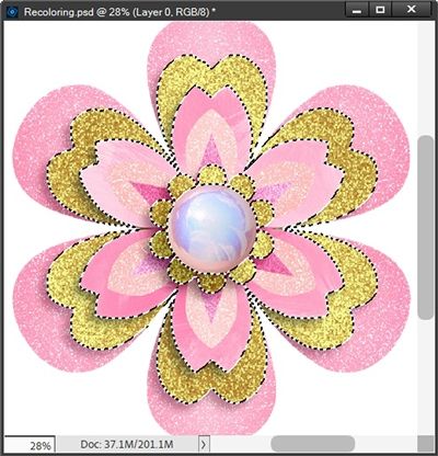
Ok, one last complex flower from “Wicked” by Studio Flergs. This is a really good example of a very complex flower:
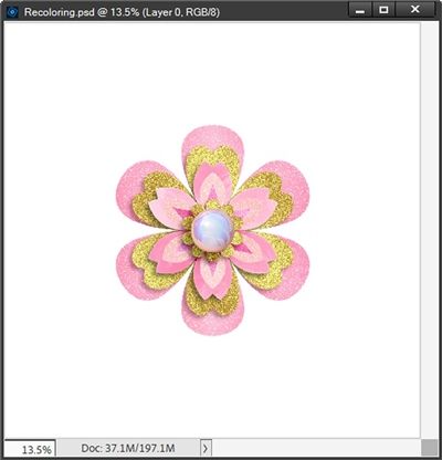
Not only is this a multi-color flower, it also has multiple layers. Now, I could go in and isolate each color individually. But since all of the “pink” in that flower consists of varying shades/tints of the same hue I see no need to recolor each different shade independently.
The gold glitter is another story. I definitely want that to either remain gold or be recolored depending on what color I use for the remainder of the flower. And thankfully, the center is pink enough to recolor with the rest of the pink in the flower.
Because I’m basically looking at needing two different solid fill layers I’m going to start by isolating the gold sections since they really need to be on their own layer. And this will be another case where using the Quick Selection tool might be the way to go.
With the flower layer active I grab the quick Selection tool. I zoom in fairly close so I can get a good look at all the gold. I then just click on each gold section:
With the selection made I press Ctrl+J to create a new layer from the selection. I rename the new layer Gold Petals.
Before I do anything with the Gold Petals, I want to change that pink color to a blue color. So, with the original flower layer active, I create a solid fill layer using a cool grey-blue color (#89a5c3), clipping it to the flower and change the Blend Mode to Color just as I’ve been doing:
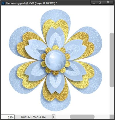
I’m very happy with how the new blue color worked out. And because the gold petals were on their own layer, they remained gold. But I’m not really happy with the idea of keeping them gold.
Now, I can create a solid fill layer and select any other color that would go well with the blue. I think I’d really like to see them in white or maybe silver. Unfortunately, using the Color Blend Mode method, changing any color to white is virtually impossible. But there are other recoloring methods that will work and I’ll try to cover those later. So, for now I’ll have to settle for silver.
So, with the Gold Petals layer active, I create a solid fill layer using white (#ffffff), clipping it to the flower and change the Blend Mode to Color:
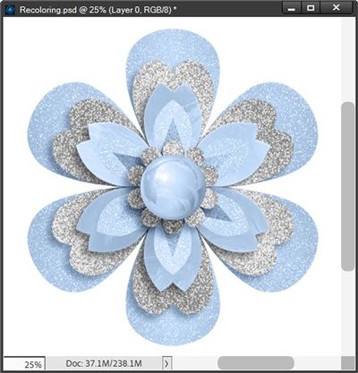
Oh, that looks so much better than the gold (at least to me). And if I wanted to, I could go ahead and isolate the center, recolor it using a solid fill layer in a grey color (#5f5f5f) blended as I’ve been doing and set the opacity of the center’s layer so it was more grey than blue:
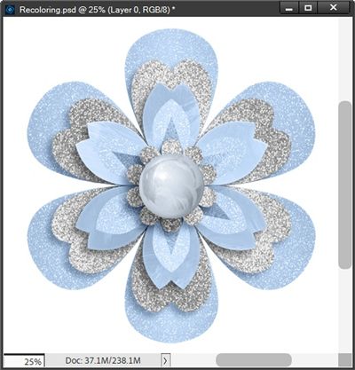
Actually, that ended up being a rather subtle difference. But either way is nice so I think I’ll save both 😊
Now if I really wanted to get crazy, I could also isolate those pointed pink petals (leaving the inner glitter portion alone) and recolor them using a solid fill layer in a crimson red color (#bd020b) blended:
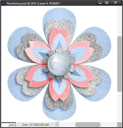
Well now, here in the United States, that could work for a “patriotic” theme!
Okay, I’ll stop now. I’m certain you’ve already seen more than you bargained for. And clearly, I still haven’t gotten to the tips about increasing the range of colors you can recolor. So, I guess I’ll be tackling that topic next week.
Today’s Tips

Remember, the key attribute of using the Color Blend Mode recoloring method is that it keeps any texture (including glitter) and shade variations but changes the color.
Recoloring any item that is comprised of more than 2 colors is generally going to be tricky using the Color Blend Mode method. Isolating each color independently is about the only way to achieve a good result, and in a lot of cases that’s not going to be easy. And you run the risk of losing some of the fine details.
If you decide to recolor something that has more than two colors or parts instead of one, you may want to isolate more than one of the parts to recolor differently. When doing this try to rename the isolated layer(s) with a descriptive name so you can keep track of what parts have been recolored.
Remember that you can isolate individual colors within a gem and recolor them independently to get the best possible result.
Using the Color Blend Mode method, changing any color to white is virtually impossible. But there are other recoloring options that will work. Check back next week for more details.
Today’s creativity quote: Color is a power which directly influences the soul. – Wassily Kandinsky
Thanks for reading this week’s Tuesday Tip. Remember, if you have any suggestions or questions please don’t hesitate to “Message Me“. Check back next week for tips on increasing the range of colors. Click “Follow Me” to stay in touch. I hope you have a wonderful week!
