White Space
Have you ever had your heart set on a classic white space layout only to find it feeling a bit lackluster in the end? You’re not alone. As trendy as white space tends to get from time to time, it can still be a challenge to strike a good balance.
Today I have a quick and easy fix that will help dress up a white space layout without losing the negative space.
Unfamiliar with white space layouts? Read on…
What Is White Space?

White space (also referred to as negative space) is a design technique that intentionally uses significant, empty areas — not necessarily white in color — around photos and embellishments. It can be created using solid paper, patterned paper, or simply by leaving empty space around clusters of items. It is not meant to make the page look unfinished, but rather to purposely create a clean, and often elegant atmosphere.
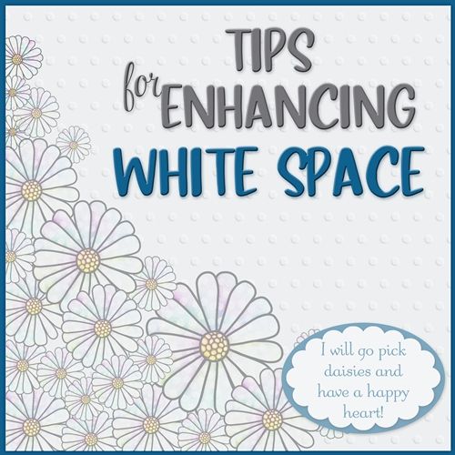
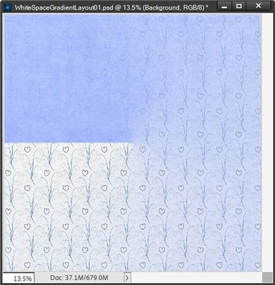
Note: The image above is a layout I created several years ago for a scrapbooking challenge to use white space. If you’d like to see more information about this layout you can find it in my 2022 Gallery. The title of the layout is “Sledding”. Depending on which device you’re using, it can be as far down as about 18-35 rows.
White space can be categorized as active (carefully designed, intentional empty space), passive (symmetrical, predictable, and quiet), or dynamic (asymmetrical, creative, and engaging). Active white space typically draws attention. Passive white space generally goes unnoticed, but rather serves to increase legibility.
White space reduces clutter, provides breathing room, and directs the eye to the focal point, resulting in a clean and simple atmosphere. It helps create a visual hierarchy, making the story of the page more impactful. By leaving large areas empty, the eye is naturally drawn to the photo(s) and any journaling.
Now let’s take a look at how to keep white space from looking boring…
White Space Angled Gradient
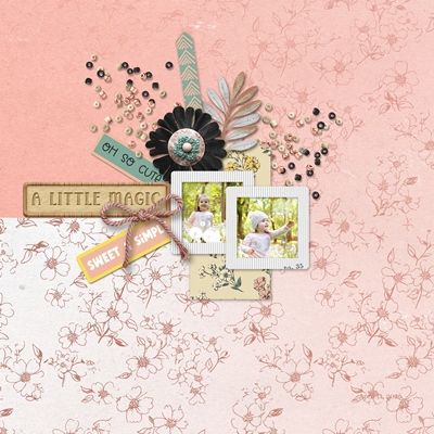
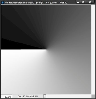
I’ve used white space in layouts during the majority of my “digital life”. It wasn’t until sometime in 2022 that I discovered a technique using an angled gradient. The image above is a layout that showcases that particular technique.
Note: The layout above is one I created specifically to give you a current example. If you’d like more details about this layout, you can find it in my 2026 Gallery. The title of the layout is “A Little Magic”.
When I first used this angled gradient technique, I was happy with the original layout but not particularly thrilled with the gradient’s one hard edge that resulted. You should easily be able to see the edge that I’m talking about in the image above.
I’m still not a huge fan. But that particular gradient can come in handy from time to time. I just find it not nearly as flexible as the other gradients that I’ll show you today.
If I don’t get too carried away, I’ll give you the steps to use for that angled gradient before I close out for the day.
White Space Diamond Gradient
Before I get started, here’s a quick reminder. I use Photoshop Elements (PSE) 2024. If you use a different version, some of my screen shots may look different from what you see on your screen.
I’m going to start by creating a new 12×12 file with a white background and ensure that my Foreground/Background color chips are set to the defaults (press D).
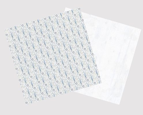
To create my white space background, I’m going to be using two coordinating papers one mostly solid and one patterned:
You can use any coordinating papers that will fit your project. Or, if you’d like to use mine, you can download them by clicking on the paper names below and they will be automatically downloaded for you:
I open each one of these papers in PSE. I don’t need those papers just yet but they’ll be waiting in my photo bin until I’m ready.
In my file I have the white background layer active in the Layers Panel. I click the Create new layer icon in the Layers Panel. PSE creates the new layer (Layer 1 for me) directly above my white background and I rename the new layer to “Clip Pattern Here”.
I then grab the Gradient tool.
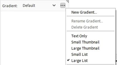
In the tool options, I open the Gradient Picker (click on the down arrow below the word Gradient). PSE opens the dropdown menu and I choose Default.
Note: If you don’t see the names of the gradients, open the flyout menu (the three dots to the right of the dropdown arrow). PSE opens the flyout menu. Then just place a checkmark next to Large List and go on to select the Default gradient:
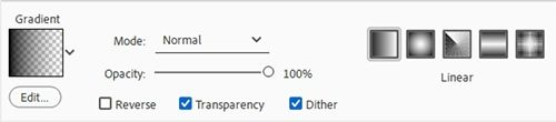
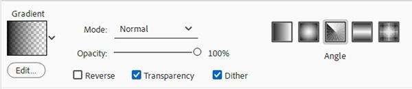
With the Default Gradients selected, I double click on the Foreground to Transparent gradient. Set the Mode to Normal and the Opacity to 100%. I ensure that Reverse is unchecked then check both Transparency and Dither.
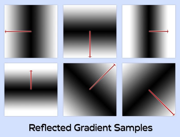
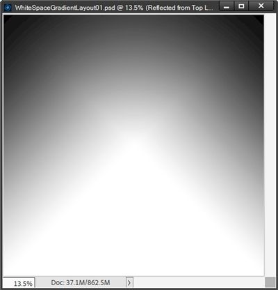
Now, if you look at the various gradient styles in the tool options, you likely see five; Linear, which blends in a straight line. Radial, which blends in a circular pattern from the center. Angle, which creates a clockwise sweep around the start point. Reflected, which mirrors a linear gradient on both sides of the starting point. Diamond, which blends from the center outward to a diamond shape.
Note: These five styles have consistently appeared in the Tool Options bar since early versions of PSE. These tools were already fully established by the release of PSE 7 in October 2008. So, I’d be shocked if you don’t see all of them in the tool options on your system.
I then click on the Diamond Gradient icon:

Note: The style name (Diamond) appears centered under the five icons. The active style is the one with a light grey outline (for me) around it.
I want my gradient to go from one corner to somewhere close to the center of the page. I’m not overly concerned about it being the exact center. So, I’ll just “eyeball it” 😉
Note: If you would like to know the exact location of the center of the page before you draw the gradient line, simply go to the top tool bar and select View->New Guide and set both a Horizontal and a Vertical guide using 6 inches for the Position.
Ensuring that the Clip Pattern Here layer is still active, I click at the top left corner of the file and drag a line toward the lower right corner stopping about midway down:

The length and angle of the line I draw is subjective. If I want more of the gradient to be present, I just drag a longer line. If I want it to be straighter, I just draw the line at less of an angle.
Note: Holding down the Shift key while dragging will constrain the angle to 45-degree increments.
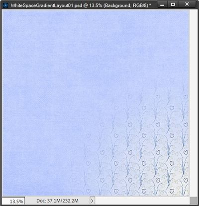
So, the Clip Pattern Here layer should still be active. I grab the Blue Floral Pattern from the photo bin, drag it into the file and clip it to the layer:
I then activate the background layer in the Layers Panel, grab the White Wood Grain from the photo bin and drag it into the file:

All that’s left now is to finish the layout. Or, if I was 100% positive I’m happy with how this turned out I could save the file as a JPG for use later.
The other thing I could do would be to swap the location of the papers; clipping the wood grain to the gradient and placing the floral paper over the background:

Well, that didn’t turn out as well as I’d hoped. No problem I just go back to the original plan 😉This happened because my “solid” paper is nearly white. If I had used a different color, such as a cornflower blue (#7fa6ff), the result would look something like this:

That’s better but I personally prefer that the patterned paper be more of a subtle accent and the solid makes up most of the “white space”. So, I’m going to stick with the original paper locations.
And here’s a layout I made using a Diamond Gradient:
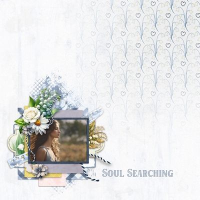
If you’d like to see more information about this layout you can find it in my 2026 Gallery. The title of the layout is “Soul Searching”.
White Space Radial Gradient
I’ve already shown you a version using the Diamond Gradient. Next, I want to show you what the Radial gradient can do.
I’ll basically be doing almost everything the same as I did with the Diamond Gradient. I’m going back to the plain white background with the blank Clip Pattern Here layer. I again grab the Gradient tool.
Since I haven’t closed PSE or made any other changes to the current gradient, the Gradient Mode, Opacity and other settings are all the same as what I used above. This time I click on the Radial Gradient icon:

Just as before, the active style is the one with a light grey outline (for me) around it.
This time I want my gradient to go from the bottom right corner to somewhere close to the center of the page. Again, I’ll just “eyeball it” 😉:
I’m going to grab the same floral paper I used above and clip it to the Clip Pattern Here layer:

Instead of using that other white wood grain paper, this time I’m going to use that cornflower blue paper I mentioned earlier.
Note: If you’d like to use the same blue paper you can click here and it will be automatically downloaded for you.
I simply place it over the white background layer and set the opacity level of the blue paper to 80%:
I think this turned out very nicely. And swapping the papers ended up giving nearly the same result as above. But let’s see what happens if I use a different version of the Radial Gradient.
I’m going to unclip the floral pattern from the Clip Pattern Here layer and hide the pattern. Then I add a new layer above the Clip Pattern Here layer (Layer 1 for me) and hide the Clip Pattern Here layer. I’m not going to rename the new layer since I know the floral pattern will be clipped here
With Layer 1 active I grab the Gradient tool. PSE has retained all of the settings so all I need to do is change how I create the Radial Gradient. This time, I’m going to drag a line from the center to a corner. Any corner will work:

Now I can unhide the floral pattern, clip it to this new gradient and change the opacity of the blue solid back to 100%:

I like this version much better. But as you may have already guessed, the size of the gradient used is really a matter of personal choice.
And here’s a layout I made using this second Radial Gradient technique:
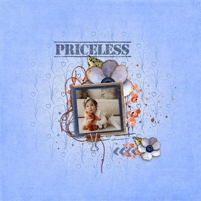
If you’d like to see more information about this layout you can find it in my 2026 Gallery. The title of the layout is “Priceless”.
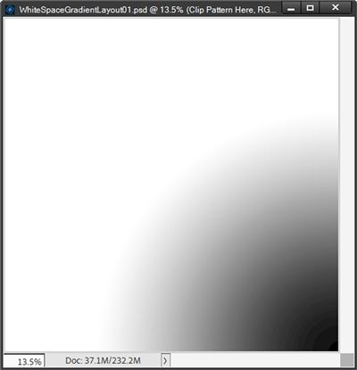
I said if I didn’t get too wordy, I’d give you the quick steps to create the Angle Gradient I showed you at the very beginning of this post. So, let’s take a quick look…
Create Angled Gradient
Again, everything is almost the same as with the other two gradients. I’m going back to the plain white background. This time my blank layer above the background is named Clip Solid Here. I grab the Gradient tool. All of the settings are still the same as what I used above. But now I click on the Angle Gradient icon:
This time I want my gradient to go from the approximate center to the left edge. To maintain a precise horizontal line, I hold down the Shift key while dragging:
I’m going to grab the same blue paper I used above and clip it to the Clip Solid Here layer and place the floral pattern over the white background:
Note: I did lower the opacity of the floral pattern to 70% so it didn’t look quite as vibrant.
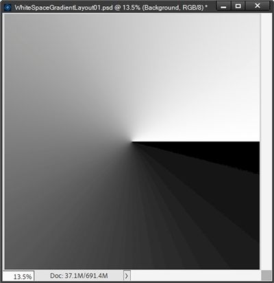
You should be able to see that the angled gradient starts at 100% on the left edge and becomes less gradient in a clockwise direction until it hits 0% at a place beyond the pivot point.
In this particular example, the pivot point is where the hard horizontal line of the blue paper meets the center. If I had wanted a counter-clockwise gradient, I would need to check Reverse in the Tool Options before drawing the line.
The beginning of the line being drawn will always be the rotation point of the gradient. If I had started at the center and dragged my line to the top edge, I would have ended up with a gradient that is identical but appears to just be flipped horizontally.
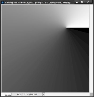
If I had started at the center and dragged my line to the right edge, I would get this:
Conversely, if I had started at the center and dragged my line to the bottom edge, I would have ended up with a gradient that is identical to the one directly above but again appears to just be flipped horizontally.
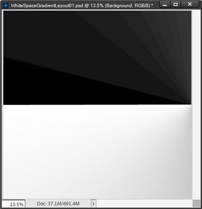
But I’m not limited to dragging from the exact center and only in a precise horizontal or vertical direction. If I start about a quarter of the way down from the top and drag to about a quarter of the way left of the right edge of the page, I end up with this:
Yes, I still did a precise horizontal line. But here’s what can happen if I start about an inch and a half up and right of the center (same distance up and right) and drag to the bottom left corner:
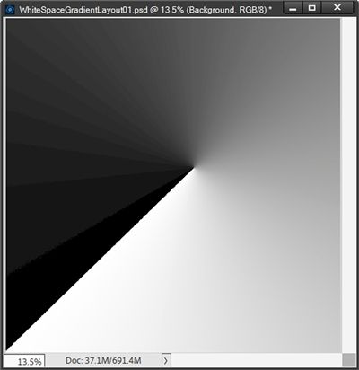
Now I want you to be aware of what doesn’t work out well with the Angle Gradient option. If, starting from the right edge and dragging to the center, the result will be this:
That’s not a very nice gradient, right?!? But don’t be afraid to play around with different angles and start/stop points. As I always say, that’s why we have the “undo” button 😉
The best way to capitalize on a “good” angled gradient is by placing the subject of your page close to the pivot point. Let’s look at the original example again:
You can see how I placed my subject (two photos) over the pivot point. The majority of the remaining elements were arranged in and around the high opacity pixels of the gradient. Some additional elements were included on the lower opacity portion of the gradient as an added accent for the photos.
The key here is using the “solid” gradient as the backdrop for the entire element “cluster” and the pattern becomes the white space.
White Space Reflected Gradient
The only other gradients I haven’t touched on are the Liner and the Reflected. Linear is pretty straight forward so I don’t feel the need to say much on that one. And if you remember, earlier I mentioned that Reflected basically mirrors a linear gradient on both sides of the starting point.
That said, the best results will nearly always be starting at the center and dragging a line outward at the desired angle. Having said that the center is the best place to start, I can say that dragging from one corner or side to the opposing one or just to the center will end up looking not much different than when using the Linear Gradient.
Rather than going through a lot of steps I’m just going to show you some example images of Reflected Gradients using the settings I’ve been using all along. Each image indicates the starting and ending points with an arrow:
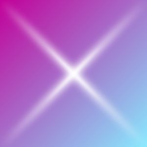
Earlier I said the best Reflected Gradient results would nearly always be starting at the center. I have found one example that contradicts that. If I create a Reflected Gradient starting at the top left corner going to the center, I see this:
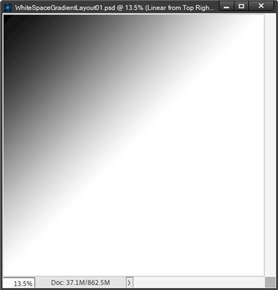
This looks about the same as if I had created a Liner Gradient doing the same. Now, I’ll create a new layer above this gradient. On that new layer I create a new Reflected Gradient starting at the top right corner going to the center and end up this:
I love this effect. And yes, you can also achieve this exact same look with the Linear Gradient 😊
What this also shows is that you can experiment with combining different gradients to create a very unique white space environment!
Note: I recommend keeping different gradients on their own layer until you’re happy with the result. Once you’re satisfied, duplicate the layers and hide the originals. Then merge the duplicates into a single layer. This will make it easier for clipping the paper.
Sorry…this got a little longer than I’d planned. I hope you can have fun creating some white space with all these gradients!
Additional Tips

Anytime you want to know the exact location of the center of the page before drawing any gradient, you can go to the top tool bar and select View. Then you can either turn the Rulers on or set new Guides. Either option will give you a guide when clicking and dragging.
The length of the gradient line drawn is a matter of personal preference. If you want more of the gradient to be present, just drag a longer line.
The angle at which the line is drawn will determine the angle of the gradient. If a straighter gradient is desired, just draw the line at less of an angle.
With the settings used today, the gradient pixels will always start at 100% opacity and fade to 0% opacity.
Using the color black (or other very dark colors) for your gradient will generate the most saturated version of the gradient. PSE will map to the darkest parts of the clipped paper, reducing its brightness and intensity to create deep shadows.

When using lighter colors for your gradient, PSE will map to the brightest parts of the paper, increasing its intensity, making it appear brighter or more washed out.
Using vibrant, saturated colors in the gradient will increase the color intensity of the corresponding, lighter areas of the clipped paper.
Because a gradient is pixel-based, it cannot be moved after it is drawn. If it needs to be moved, you will likely need to redo it. However, as long as the position doesn’t change, it can be resized by dragging from a corner.
With either the Diamond or Radial gradients created at the top or bottom left, you can rotate the layer 180 degrees and position it at the opposite corner.
With the Reflected gradients created from the center going vertically or horizontally, it really doesn’t matter which direction you drag the line. The result will be the same.
Don’t be afraid to experiment with different Blend Modes for the gradient. This will make the gradient colors blend more naturally with the paper texture rather than just painting over it. Try setting the gradient layer to Overlay, Soft Light, or Multiply.
If you play with combining different gradients together, keep each gradient on its own layer until you’re happy with the result. Then just merge the layers together. This way you only have one layer to which you’ll clip a paper.
Again, when playing with different gradients on their own layers, another option would be to clip different papers to individual gradients.
If you want to get really creative, try making a selection of only a portion of the page to restrict the gradient to a specific area.
Creative quote for this week: Learn the rules like a pro, so you can break them like an artist. – Pablo Picasso
Thanks for reading this week’s Tuesday Tip. Remember, if you have any suggestions or questions please don’t hesitate to “Message Me“. Check back next week for tips on avoiding “trapped” white space in a layout. Click “Follow Me” to stay in touch. I hope you have a wonderful week!