Type Layers
Over the last two weeks I’ve talked about fonts and used them in different ways. In the Drop Caps post from last week, I used two different kinds of type layers. And in my post about Dingbats I stuck with just one kind of type layer. Today I thought it might be a good idea to give you a good explanation of the different type layers and how best to use them.
In Photoshop Elements (PSE), the terms “type” and “text” are often used interchangeably to refer to written words, but they technically represent different aspects of how the words are created and edited.
So, what exactly is the distinction between the two? And why does it matter? Read on…
Type Layers vs. Text
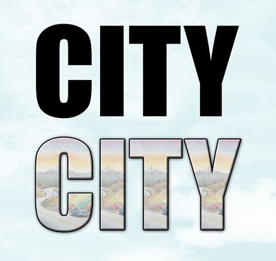
I want to talk about this first in the context of layers. If you look at the image above one of those words is very clearly text. And one of those words looks more likely to be word art. So, any guesses as to which one is the “Type” layer?
Quick reminder; I use PSE 2024. If you use a different version, some of my screen shots may not look the same as what you see on your screen.
In PSE, “Type” refers to the tools we use to create written characters, such as the Horizontal Type Tool and the Vertical Type Tool.
When we use the Type tool, PSE creates a vector-based layer. This means the letters are created using mathematical formulas rather than fixed pixels. We can scale the type up or down to any size, and the edges will remain perfectly crisp and smooth. As long as the layer remains a Type layer, you can go back at any time to double-click the text and change the font, color, spelling, or size.
In PSE, “text” usually refers to the actual letters, words, or paragraphs you type onto the file. Some layers may contain text but they may not always be Type layers.

When using a Type Mask Tool (which creates a selection marquee in the shape of text) or after simplifying (rasterizing) a regular Type layer (converting it from vector based to pixels), the text becomes a standard image layer. Once this happens, the text is no longer editable with the Type Tool, and it will lose its crisp quality if you try to make it larger.
Technically speaking, there truly isn’t ever a “Text” layer in PSE. If we have text that is not rasterized on a layer, it is a Type layer. Other than Background, Shape, Adjustment and Fill Layers, PSE defines all other layers as “Image” layers.
Now take a second look at that image at the beginning of this section. Which one of those words is the “text” (image) layer? If you said the “word art” one, you are correct. If you still thought it was the “black” word, maybe you should go back and read the explanations again.
Another quick way to make the distinction is to look in the Layers Panel:
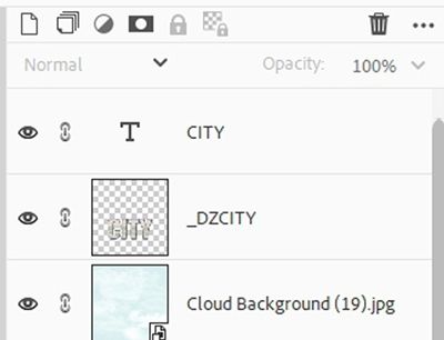
You should be able to see that only one of the layers has a distinctive capital “T” icon on the layer’s thumbnail. According to PSE that means the layer is a Type Layer. The layer below the Type layer, may have originally been created using “text”, but PSE now considers that layer an Image (pixel based) layer.
Does any of this mean we need to stop using the terms interchangeably? Not really. But now that you know there is a legitimate distinction, just think of “Type” as the function and “Text” as the content.
Line vs. Box
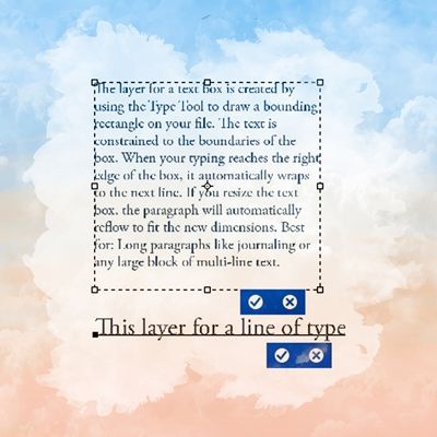
Understanding the difference between a simple type layer and a “container” of text can help you figure out which will be the most useful. Neither is universally “better” – it depends purely on what you are typing.
In PSE, the main distinction between a line of type (often called Point Type) and a text box (Paragraph Type) is how the text behaves when it reaches the edge of your image.
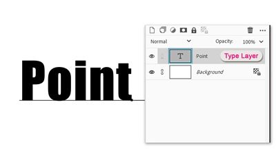
The layer for a line of type expands horizontally as you type. It will keep going indefinitely off the edge of your file unless you manually press Enter/Return to start a new line. The text will never jump to a new line unexpectedly. You can easily resize the text by dragging a corner handle without worrying about text reflowing or bounding box constraints (text size does not change). Best for: Single words, titles, dates, signatures, or short photo labels. Downside: Editing and formatting long paragraphs is difficult because you have to manage every line break manually.
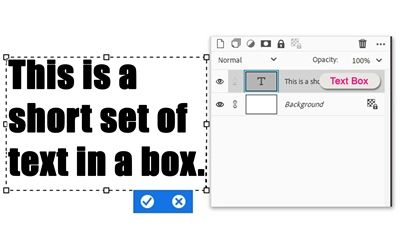
The layer for a text box is created by using the Type Tool to draw a bounding rectangle on your file. The text is constrained to the boundaries of the box. When your typing reaches the right edge of the box, it automatically wraps to the next line. If you resize the text box, the paragraph will automatically reflow to fit the new dimensions. Best for: Long paragraphs like journaling or any large block of multi-line text. Downside: To resize the text itself, you must either change the actual size of the font in the Type Tool or use the bounding box associated with the Move Tool to resize the box and the font.
Choosing the right one simply depends on whether you’re creating a short label or a full paragraph.
Type Layers Quirks
Every piece of software has a personality. Some are helpful. Some are quirky. And some wake up each morning and choose chaos. I’ll let you decide into which category you would place PSE 😆
I’m sure each of us has encountered at least a few eccentricities when working with PSE. The more advanced the software gets, the more likely we are to run into them. Over the years I’ve tried to point out as many “undocumented features” as I can. Today I want to cover some that are specific to Type layers.
Style Picker Option
So, there’s one thing I know for certain I’ve never discussed in all the posts where I mention the options for the Horizontal (or Vertical) Type tool. I suspect most people ignore it because it’s generally not an active option. Let’s take a look at what, at first glance, appears to be a “superfluous” option:

I know this is a relatively small image but you should be able to see there’s an “empty” looking box right above where Anti-aliasing sits. This box has no label and merely indicates that you can “Set the style of the layer”.
Note: This option is a “later-stage” addition to the Horizontal/Vertical Type tools. I was not able to find any official Adobe documentation stating exactly when this option was added to the Type tools. Multiple internet searches resulted in varying estimates. My best assessment is that the Style option could have been included within the Tool options sometime between September 2012 (release of PSE 11) and October 2019 (release of PSE 2020). So, depending on what version of PSE you’re using you may or may not see this option.
While you are actively typing or editing text, this option is disabled. A style setting becomes an option only after committing the text. And even then, with the Type layer active, that “Styles” box initially shows up as disabled:

At least now if you hover over the down arrow on the box, PSE indicates that you can “Click to open the Style picker”.
You can use this option instead of (or in addition to) using the Style Settings traditionally accessed via the fx icon on the layer, the Panel Bin beneath the Layers Panel or the top tool bar. Just be aware, if you set Styles within the Type Tool, PSE may (or may not) automatically apply the active style to newly created text layers. I’ve heard/seen that it can happen!
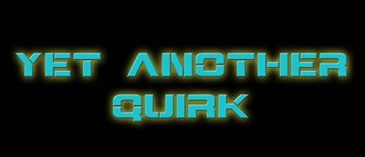
Here’s a real-life scenario: Someone created a beautiful title with a bevel and drop shadow (using the Style picker in the Type Tool). Later they switched back to the Type Tool to add journaling. Unexpectedly, their journaling inherited the title’s layer style. Once again, PSE confusion ensues. 😄
Personally, I tend to stick with doing things the traditional (old) way. But that could have a lot to do with me just being set in my ways.
Opening Wrong Type Layers
I already discussed this in my “Text Hijinks” post back in March of this year. But I thought it might be wise to include it here again today. Just in case you didn’t already know about this annoying quirk.
When there are multiple text layers already in my file and I try to add another, PSE graciously opens one of the existing text layers for editing. I admit I already know how to prevent this. So unless I’m not paying attention, I always use this great little trick.
This is so simple…just hold down the Shift key while clicking on the Type tool to force PSE to create a new text layer instead of selecting an old one.
Centering Type Layers
I’m not sure this really qualifies as an actual quirk in PSE. What I can say is it can be confusing and annoying if you don’t understand why it happens. That’s right…Centering!
I wish I could admit that this is hardly ever an issue for me but I still catch myself running into it. Mostly because I sometimes get in a hurry or perhaps even just lazy when working on a project.
PSE gives us multiple ways to easily align all kinds of “things” on a page, including text. And we should all know how to center text within a text box. But sometimes it’s not as straight forward to center the text box on the file.
The key to centering type layers on a file is ensuring the “footprint” of each layer is no larger than it needs to be. Let me show you what I mean.
I have this simple greeting card in process:
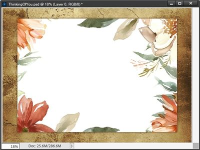
All I’ve got done at this point is the artwork. I still need to add the text.
Note: If you want to try following along as I create the sentiment, you can really use any size file you like as your base.
I’ll start by adding the “heading”. I grab the Horizontal Type tool, set the font (Playlist Script), size (90) and color (#700e04). Since I’m just going to type a line of text it doesn’t matter which alignment option I use. However, in most cases Align Left works best.
Then I click on the file at about the point where I want the heading to start, type my heading and click the checkmark to commit:
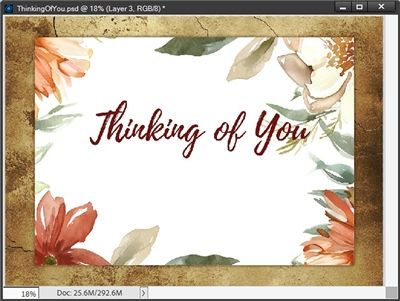
I know it’s not centered but I’m not going to worry about that right now.
Generally speaking, when I’m using multiple fonts on a single layout, I try to keep each different font on its own layer (and at the top of the Layers Panel when possible). That’s why I only typed the heading first. There’s a method to my madness here so just be patient.
I can now add my “verse”. I grab the Horizontal Type tool again. I set the font (Arimo Regular), size (30) and color (#5b5f3e). Since this is a text box, I am going to click the Center align text icon.
Then I just drag out a box that should be big enough for my paragraph, type my verse and click the checkmark to commit:
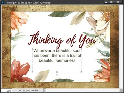
Again, I know the text box isn’t centered but that’s kind of the point for this section. So, let’s see what happens when I try to center both Type layers horizontally on the card base.
In the Layers Panel l activate the layer with the artwork and both of the Type layers. Then I grab the Move tool so I can see the Align and Distribute options below the workspace. I then click the Align Middle icon:
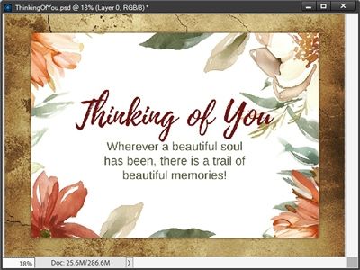
That looks pretty good. But you can see that the text still isn’t centered vertically. Since I’m working with two different Type layers, I need to group them together before I try to align them vertically. If I don’t do that, they’ll just end up stacked on top of each other.
So, I activate both Type layers and click the Create a new group icon. PSE places both Type layers in that group which is now the active layer. I then press and hold the Ctrl key while clicking somewhere in the name for the artwork layer (not the thumbnail).
With the group and the artwork layer both active, I grab the Move tool again and click the Align Center icon:
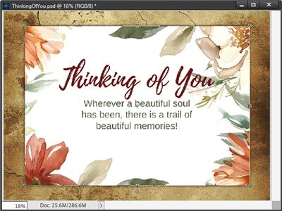
Well, that doesn’t look right, does it? The text is definitely not vertically centered. Now, if you look back about two images ago, you might have an idea as to why this happened. But I’m going to explain. Right after I undo this attempt at centering 😉
I’m going to expand the group with the two Type layers and activate the verse layer. Let’s take another look at the verse layer:
Can you see how the bounding box of that layer extends quite a bit below the end of the text? That’s what I meant earlier when I said the “footprint” of each layer can be no larger than necessary.
I purposefully made that text box too big (tall) so I could show you how to avoid the failed vertical centering. And text boxes are the only Type layer that can make vertical centering challenging. PSE has no way to identify only the amount of space taken up by the text. The system is constrained by the parameters of the entire bounding box.
Generally speaking, horizontal centering isn’t as challenging. This happens quite naturally because 99.99% of the time a text box is never wider than it needs to be. That doesn’t mean it can’t happen.
I’ve seen text boxes that were wider than they should have been and lines of text were separated by pressing the Enter/Return key. As long as the text is still centered within the text box, things will be fine. But if the text is aligned left or right and the text box is wider than it should be it can still make a mess:
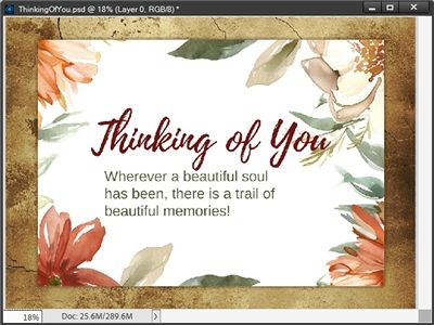
Definitely not a good look if you’re shooting for centered! Ok, so here’s how to fix both horizonal (rare) and vertical (common) centering issues.
In my case, all I have to do is double-click on the verse layer and drag up/down (or from the side) on the bottom (or side) middle handle of the text box until the bottom/side of the text box meets the bottom/side of the text within it:
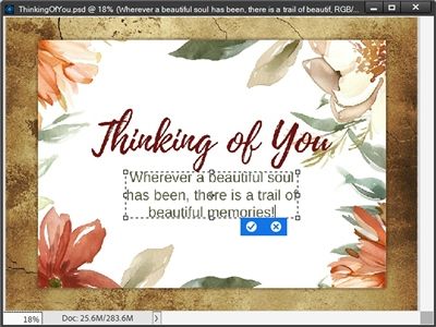
I click the checkmark to confirm. Now I can go back and try recentering again.
Note: When resizing a text box, I generally drag up/down until the line of text disappears and then slowly drag back in the opposite direction until it reappears (including any letter “tails”). This tends to safely ensure that the layer’s footprint is no larger than needed, leading to successful centering.
Once again, with the group and the artwork layer both active, I grab the Move tool and click the Align Center icon:
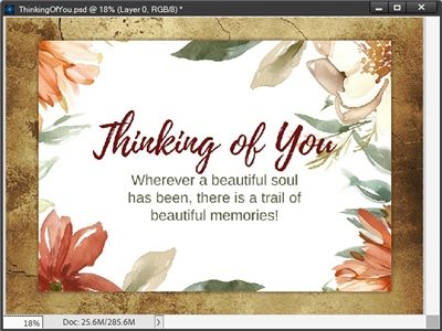
That looks so much better! And I’ll give credit where credit is due on this one. This centering issue really isn’t PSE’s fault.
Note: For that greeting card, the floral frame is one I found at Creative Fabrica. The papers are from my stash.
In summary
A single line of type (Point Type) is best for: Single words, titles, dates, signatures, or short photo labels. The “footprint” for this layer will never be larger than necessary.
A text box (Paragraph Type) is created by using the Type Tool to draw a bounding rectangle on your file. The text is constrained to the boundaries of the box. These are best for: Long paragraphs like journaling or any large block of multi-line text. Downside: The “footprint” for this layer can end up being larger than necessary which can lead to alignment confusion.
To get the most out of your text, whenever possible/practical manage your Layers Panel stack so your text is always on top. This just makes it easier to find your Type layers if something needs to be edited. There are always exceptions. I realize that sometimes we may intentionally place some “text” behind a photo or element. So, it may not always be possible to move a Type layer to the top of the Layers Panel.
If you want to add effects to your Type layer, use clipping masks to fill text with textures or images, and avoid simplifying (rasterizing) Type layers as much as possible.
Remember, once you simplify a Type layer, you can no longer edit the text content or fix typos, so make sure your spelling is correct and you have saved a backup of your original text layer!
If your text unexpectedly appears with effects such as shadows, strokes, or bevels, double-check the Style setting within the Type tool to see if it is active.
When using multiple fonts on a single layout, I recommend keeping the different fonts on their own layers. It keeps font management easier and also helps with managing the layers’ “footprint”.
If you’re having trouble centering Type layer(s), always double-check the size of the text box’s “footprint”. A line of type typically shouldn’t cause any centering issues.
If you have more than one Type layer that you want to center as a unit, remember to create a group that contains all of those layers. That’s the only way you can successfully achieve proper vertical centering.
Fill your paper with the breathings of your heart. – William Wordsworth
Thanks for reading this week’s Tuesday Tip. Remember, if you have any suggestions or questions please don’t hesitate to “Message Me”. Check back next week for a few quick tips about the transform tool. Click “Follow Me” to stay in touch. I hope you have a wonderful week!