Dingbats
Today is all about creating fun elements for a layout using a dingbats font. I know this might sound kind of silly but it’s a simple way to add a bit more interest to a layout. And there’s certainly no shortage of dingbats fonts out there. And in just a minute, I’ll provide you with a few resources to get you started.
There are a multitude of ways to use dingbats as elements. But today I’m going to talk specifically about typing them on a selection or around a shape. And if you’ve been following me for the last couple of years you already know how to do that.
If you need some refreshers, you can check any one (or all) of these posts: “Text On Shapes” from March of 2024 which covers text on a shape, “Type A Stitch” from July 2024 which covers text on a path or “Curvy Words” from May 20, 2025 which covers text on a selection.
Now let’s take a look at some of those resources I mentioned…
Dingbats Fonts
I’m going to start by apologizing up front on the off chance that I’m about to send you down the proverbial “rabbit hole” 😊 I’m usually not shy about admitting I’m a certified font junkie. There really ought to be a “twelve step” program for those of us with the affliction. And sadly, dingbats can become addictive quickly!
But I did promise to share!
There are oodles and oodles of dingbats (please no jokes about dim witted people – though there seem to be many of those as well 😉). DaFont is one of my favorite font sites and they have a specific category for Dingbats. At last count there were 21 subcategories with a total of 139 pages to browse. If you want to narrow your scrolling down a bit, I’d recommend the Shapes, Various and even Kids categories to get started.
In addition to all the dingbats at DaFont, there are several dingbats fonts I’ve used over the years for multiple reasons and thought I’d share. I know the table below isn’t the easiest to read but hopefully you’ll get an idea of the various dingbats.














All you have to do is click on the dingbat sample and you will be taken to the site from which it can be downloaded. In case it’s really hard to see the font name I’m going to list them in the order in which they appear (top to bottom starting in the first column): Blumen Regular, Bodoni Ornaments, Butterflies (by Typadelic), Eisenbahn, Face It!, Harbour Lights, KR All Heart, KR Butterflies, Nymphette, Retro Pack 2 Dingbats, Snowflake, Sun Moon & Stars, Swinging Dingbats and Transportation Dingbats.
Note: If you click on the sample for Retro Pack 2 Dingbats it will take you to a page that starts with some clipart (not free). Just scroll all the way to the bottom of the page to find the link for the dingbats download.
If you already have some fun dingbats, you’re welcome to use whatever will fit your project.
Finding Keyboard Characters

Quick reminder; I use Photoshop Elements (PSE) 2024. If you use a different version, some of my screen shots may not look the same as what you see on your screen.
I’m going to start by setting my Foreground/Background Color chips to the defaults (Press D). If you’re following along, you can use any color that you like. Then I create a new 12×12 file using a white background. Again, you can start with a file any size/color of your choosing.
Okay, just so we’re all on the same page, Dingbats are fonts that use shapes, symbols, or designs in place of what would normally be the letters, symbols and numbers associated with keyboard keys. Dingbats generally are NOT characters that will make a legible text. Though some dingbats fonts do include words!
To access a complete list of icons (glyphs) available within a dingbats font, you’ll likely need to use the Character Map App in Windows or Font Book on a Mac. I use a font manager which makes things a little easier. If you need more information about how to find a specific glyph, refer back to my “Fancy Ligatures” post from April of 2025.
I’m going to be using the Sun Moon & Stars font (link provided above) which I have already installed on my system. You can use the same font or any other dingbats font that works best for your project.
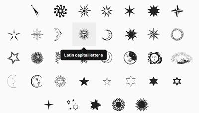
As I mentioned, I use a font manager (FontBase) and here’s how the glyphs show up for me:
And here’s what it looks like in the Character Map App in Windows:
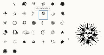
Either way, when hovering my cursor over the sun I want to use, I can see that I need to use the uppercase letter “A”.
Now I can grab the Horizontal Type tool. In the tool options the Color Chip should already be black, I select the Sun, Moon & Stars Regular font, set the Size to 35, the Leading to Auto, the Tracking to 10, and click on the Left Align Text icon:

Note: Again, you can use whatever font, size and color that works best with your project.
Now I’m all set to create a sunny element…
Fun Elements
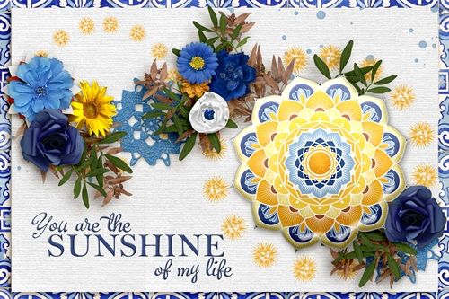
In an effort to keep this really quick and simple, I’m going to show you how to create a circle element using that sun dingbat I showed above.
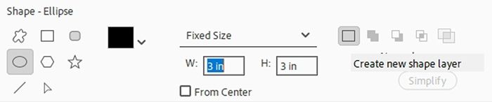
So, I’m going to grab the Ellipse Shape tool. In the Tool Options, I set the geometry option (unlabeled) to Fixed Size, the width (W) to 3 inches and the height (H) to 3 inches. I click on the Create New Shape Layer icon. If applicable, I ensure there is no active Style:
Then on the file, I click once near the center. PSE creates a circle shape (Shape 1 for me) and it is the active layer. It doesn’t have to be precisely centered:
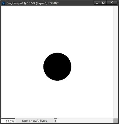
Note: This technique works best on rounded shapes with no sharp corners. I definitely wouldn’t recommend most geometric shapes such as squares, diamonds, triangles, etc. Even a heart shape can get tricky due to what could be sharp “points” at the top and bottom. But you’re welcome to give this a try on any shape you like to see how it turns out.
With the Shape 1 layer active I can go back to the Horizontal Type tool (all the settings should still be set as they were above). I then hover my cursor over the top center edge of the circle. I need to be sure the cursor icon changes to depict text on a path mode. It should look like a capital “i” with a curvy line running through it (also called the I-Beam). When that I-Beam appears I just click to place the cursor:
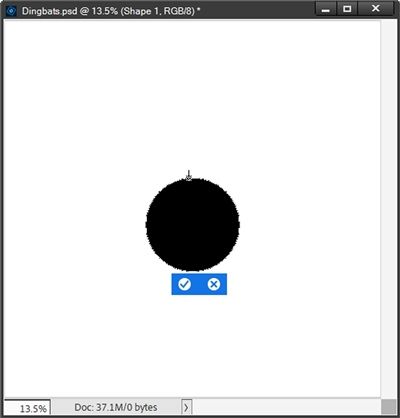
I know with this small image it’s likely difficult for you to see what looks almost like “marching ants” marking the path around the circle. But they’re there. If you’re following along and you don’t see the “path” around your shape, you need to go back and try again.
Remember, I already figured out which keyboard character I need to use to create the element (uppercase “A”). So, I just press that as many times as it takes to fill the path around the circle without “overlapping”:
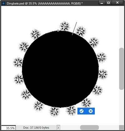
I zoomed in fairly close so you can see this a little better. You should be able to see the gap at the top of the circle. That can be caused by one of two things: Not enough characters were typed, or too many characters were typed.
In my case I know for a fact that I typed too many characters. I know this because I already knew what tracking I needed to use to space the suns almost perfectly around the circle.
But even if I didn’t know that, there is another clear indication that the characters are “overlapping”. You should be able to see the cursor positioned between the two suns to the right of the gap. That’s because there is an overlap – too many characters.
Either way, all I need to do is press Ctrl+End to ensure I’m at the last character and just press the Back/Backspace key until I resolve the gap.
Now, if the original gap looks like this:
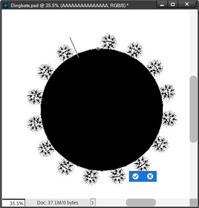
You can see the cursor is left of the gap. I know that means I didn’t type enough characters. If I type another character and still end up with a gap, that tells me I either need to adjust the tracking to a lower number or adjust the font Size lower.
Either one of those adjustments will solve the problem. I just need to decide if making the suns smaller is better than lessening the space between. As the old saying goes “Six of one, half a dozen of the other”. When it’s all said and done the two choices are nearly equivalent.
And better yet, if part of that circular element is going to be tucked beneath another element on the layout, I really don’t have to fool with it at all!
In my case, I didn’t have to make that choice as I already had my size and tracking values exactly where I wanted them. And here’s how my circular sun element turned out (with the original circle hidden):
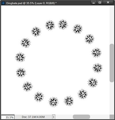
That should look somewhat familiar if you paid attention to the image at the top of this section!
And aside from how I used that circle on the “card” above, here’s another great way to create a fun element:

To create that chipboard element, I initially created the circle of suns on the outside of the circle. When I was done, I just resized the layer to fit inside the circle.
Dingbats On A Selection
Now, let’s say I wanted to use a non-standard PSE Shape to create my dingbat element. Think back a few weeks to my “Scallop Border” post on June 23, 2026. We all know that there isn’t a PSE scallop shape. Ergo, the need to even write that post.
That doesn’t mean I can’t use a scallop shape to create a fun dingbat border. Things are just going to be a bit different.
I’ve hidden my circular sun element. And here’s my scallop border from that post:
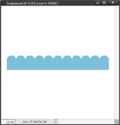
I specifically used a scallop shape because I want you to know how to navigate the “valley” of the scallop. You’ll know what I mean in a minute.
Note: If you want to follow along exactly, please click here and that scallop border will be automatically to download for you.
For this example, I’m going to use the KR Butterflies font (link provided above) which I have already installed on my system. If you’re not using the scallop shape you can use any other dingbats font that works best for you.
Note: If you plan to use the scallop shape I provided and hope to achieve the same results, please also use that KR Butterflies font. If you use a different font, you will likely need to make adjustments to the size, tracking and spacing that will differ from the settings I’ll use.
My Foreground/Background Color chips are still set to the defaults. With the scallop layer active I grab the Horizontal Type tool. In the tool options I select the KR Butterflies font, set the Size to 40, the Leading to Auto, the Tracking to zero, click the Left Align Text icon and select the Text on Selection icon:

Then I click and drag around the scallop shape to make the selection:
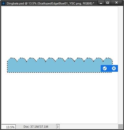
I click the Checkmark to confirm and zoom in fairly close so you can see the path marking around the scallops just as we saw with the circle above:
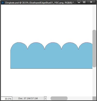
Note: If you’re following along and you don’t see the “path” around your shape, you need to go back and try again.
I then hover my cursor as closely as possible over the part where the first scallop starts at the left edge (see the pink cursor with crosshairs I added):
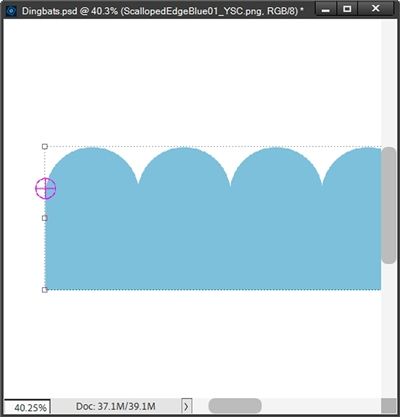
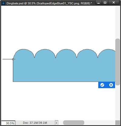
I need to be sure the cursor icon changes to depict text on a path mode. It should look like that I-Beam with a curvy line running through it (like we saw above with the suns). When that I-Beam appears I just click to place the cursor:
I already know that I need to type the uppercase letter “J” to get the butterfly I want to use. So, now all I need to do is start typing. When I type the uppercase “J” twice, things look pretty good:
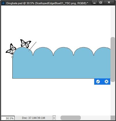
I’m can already tell that typing another butterfly at this point won’t work out very nicely. Surely that third butterfly will end up in the “valley” of the scallop. But let’s see just to be sure:
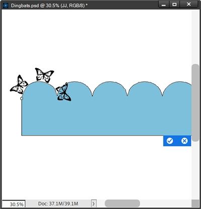
Definitely not a good thing for that poor butterfly 😉 So, I press Back/Backspace to delete that one. In its place I add one space to see where the cursor ends up:
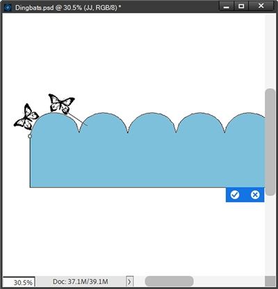
That looks to be about perfect. So, I’m going to try typing uppercase “J” twice more and add an extra space again. That extra space put the cursor too far over the next scallop so I removed that extra space and just typed another uppercase “J”.
I then follow that with another extra space. That means at this point, altogether I’ve typed “JJ” space “JJ” space “J” space:
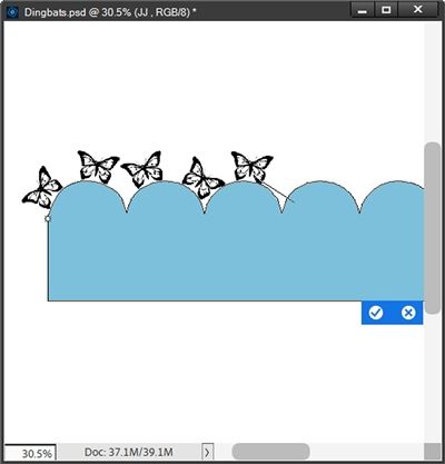
That looks like it should work. So, I’m just going to repeat the last part of the sequence (“JJ” space “J” space) until I get to the end:
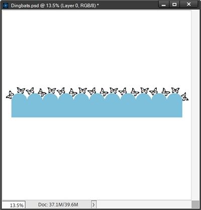
And here’s how it looks without the scallop shape:
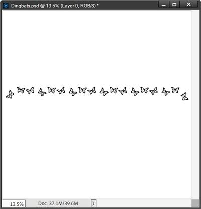
Well, that’s a whole lot prettier than a straight line of butterflies, right?!?
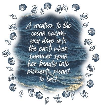
And here’s a fun “seaside” frame around some word art I created using a wavy frame border from my stash and the KR Down By The Sea font:
Last but by no means least, here’s a layout I created where I used some fairy dingbats to “tie” the three photo frames together:
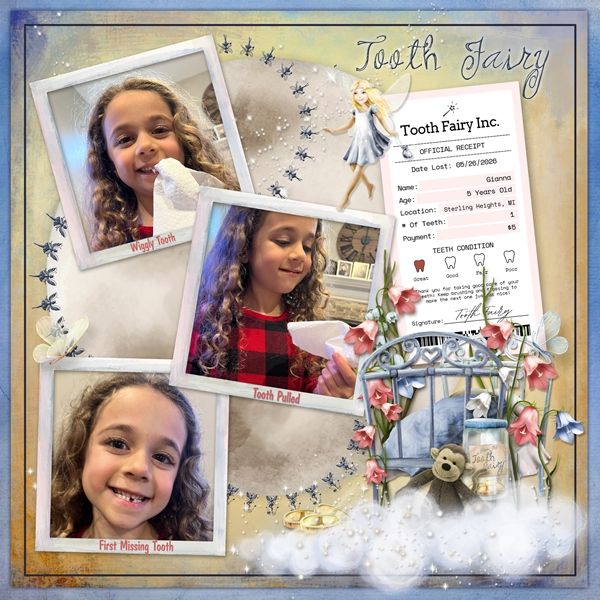
I used the Magic Fairy Regular dingbat font (letters G, R & Y) to create the fairy dingbat circles. If you’d like to see more details about this layout you can find it in my 2026 gallery.
Extra Tips

Don’t be afraid to try typing dingbats around just about any shape you have handy. Just remember things will be easier if there aren’t any sharp corners or angles.
I know I gave you quick pointers about navigating “valleys” in shapes. It’s mostly a matter of working with the font size and spacing. Play around with both when you have a shape with sharp angles. Just don’t give up too quickly…sometimes it takes a while to figure it all out.
Regardless of the shape, sometimes adding extra space(s) between characters is easier than fiddling with the tracking. And it can vary from font to font. If adjusting the tracking gets too frustrating, try adding extra space(s).
Any time you add extra space(s) between characters, don’t forget that you can adjust the size of the space(s) to a size different from what you’re using for the actual font.
Watch the spacing of your dingbats when typing; particularly around a circle. A quick way to identify an issue with spacing around a circle is to simply double-click directly on the thumbnail of the type layer to highlight the entirety of the text. If there’s a gap you will clearly see white space somewhere between characters. If there’s no gap the text will be completely “covered”…no white showing between any of the characters. It should look something like this:
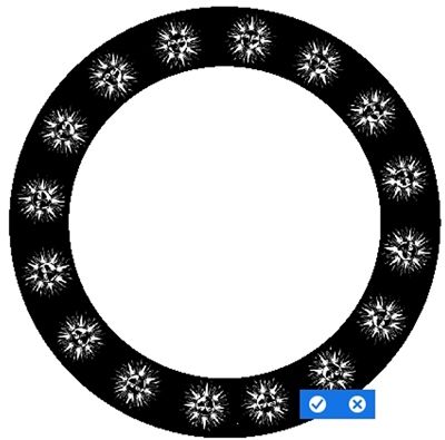
After typing your characters if you find a noticeable gap you’ve either typed too many or too few characters. If you can’t see your cursor or if it is positioned between the two dingbats to the right of a “gap”, you have typed too many dingbats. If the cursor is to the left of the gap, you likely typed too few.
If you have a gap around a circle and adding/deleting a character didn’t help, either the font size or tracking will need to be adjusted. But, if the gap isn’t very noticeable, it may not be worth making the adjustment.
Just because you created your dingbat element using a “path” doesn’t mean you can’t transform the text layer after the fact. Just click on the type layer to activate it then click on any corner anchor point. You can then either resize the layer or even rotate the layer. Then just click the Checkmark to commit.
Since you’re working with a text layer you can change the color or apply any styles you’d like.
Creativity: Take the obvious, add a cupful of brains, a generous pinch of imagination, a bucketful of courage and daring, stir well and bring to a boil. – Bernard M. Baruch
Thanks for reading this week’s Tuesday Tip. Remember, if you have any suggestions or questions please don’t hesitate to “Message Me”. Check back next week for tips about “drop caps”. Click “Follow Me” to stay in touch. I hope you have a wonderful week!