Color Replacement
For almost all recoloring jobs, the Color Blend Mode method I showed you back in April will fit most needs. But sometimes, there are items that we might want to recolor that just won’t work with the Color Blend method. So, today I’m going to show you what is likely the quickest, next best option. The Color Replacement Brush.
As with the paper from last week’s “Recolor Plaid” post, sometimes there are items to recolor that have difficult-to-select parts. In last week’s example I showed you the Colorize Photo method. The Color Replacement Brush is another alternative method when trying to recolor those difficult items.
I am going to spend some time explaining the various Color Replacement Brush tool settings. Trust me I can “see” the eye roll 😉 But it’s really important to understand how all these settings work. Then I’ll show you how I use this brush to recolor a flower.
Coloring Brush
Before I get started, I use Photoshop Elements (PSE) 2024. If you use a different version, some of my screen shots may look different from what you see on your screen.
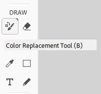
The Color Replacement Brush is nestled with the other brush tools:
It’s easy to use, and when it comes to recoloring, it’s as fast or faster than the Color Blend method.
Its major drawback is that the Color Replacement Brush process is done in a destructive manner. When I use the term destructive, I mean that the changes occur on the same layer as the original item. As opposed to the Color Blend method where the changes occur on separate layers and the original item is still intact.
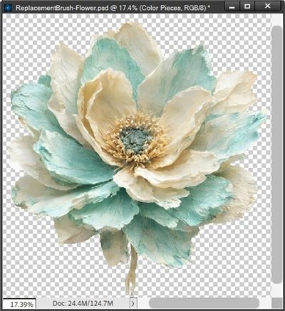
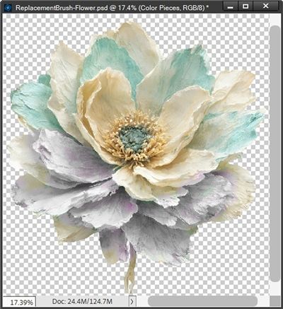
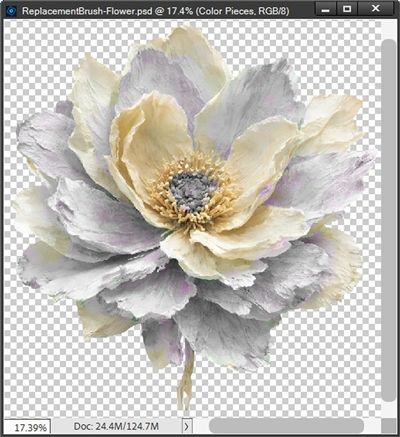
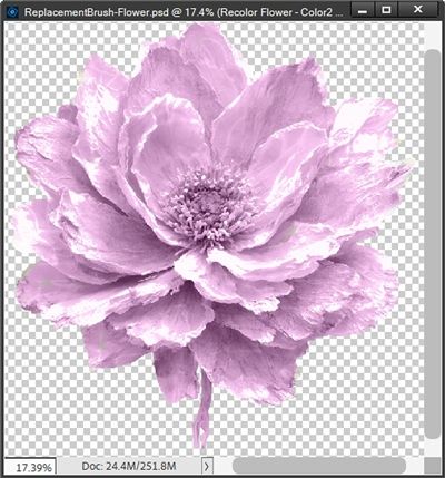
I’m going to start by creating a new 12×12 file with a blank background. Then I open a multi-color flower from my stash and pull it into the file:
Note: If you’d like to follow along exactly, you can click here and this flower will be automatically downloaded for you.
As you can see, this flower has sections of color that would be a bit tricky to isolate if using the Color Blend method. I immediately duplicate this flower layer, and hide (or delete) the original and rename the duplicate to Recolor Flower.
Note: I could open the flower directly without pulling it into a blank file. But that would just make it doubly important that I duplicate and rename/save the flower. Remember, this is a destructive process so I don’t want to accidently overwrite my original flower.
Now, let’s learn about the brush settings…
Color Replacement Settings
I grab the Color Replacement Brush tool:
I’m sure you’re thinking that using the actual Color Replacement brush can’t be very difficult. And that is true. But the settings are really important. So, I’m going to spend a little time going over those first. And yes, I know this can be the boring part. But it’s really important to know how all these settings can affect the results.
Note: Please also keep in mind, the settings information I’m providing is geared toward recoloring elements; not paper or photos. That doesn’t mean you can’t use the brush on things besides elements. It just means you will likely use other settings.
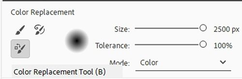
In the Tool options you’ll see the following “primary” settings:
Size – The Size will vary depending on the object you’re recoloring. With today’s flower I’ll start with a size around 100-150px. Depending on the item you are recoloring, you may want to make the brush very large. In some cases, it may be better to work with a smaller brush. I’ll explain more about this in a little bit.
Tolerance – Sets how sensitive the brush is. A low percentage targets colors very similar to the exact pixel you initially click, while a higher percentage replaces a broader range of similar tones and shades. In most cases it doesn’t hurt to start out setting this to a lower value…around 30-40%. If you want to include more closely related colors raise the value. I have yet to actually find a situation where somewhere around 40% doesn’t work well for me.
Mode – This is basically telling the brush which of four Blend Modes to apply to the brush while using the color in the Foreground Color Chip:
- Color (Default) replaces both the hue (the actual color) and the saturation (the intensity of the color) while keeping the original shadows and highlights based on the current Foreground color. Some sources say this can be used for most everyday projects, making it highly effective for changing an element’s colors.
- Hue applies only the color (hue) of the current Foreground color. This works well when the original color is a very light pastel, has varying “blends” or dark shadows, as it produces more natural-looking color shifts in these areas. The coloring is much less intense than when using the Color mode. This leads to a subtler and often more natural tint.
- Saturation instead of applying a color, this mode changes the vividness of the image based on the current Foreground color. Setting the foreground color to black and using this mode is a quick way to desaturate an element/area and convert it to grayscale. This can also be a quick way to create a color pop effect.
- Luminosity preserves the original colors of the image while applying the brightness (luminosity) associated with the Foreground color. This works best for fine-tuning contrast or black-and-white tonal balancing, rather than applying color.
Which mode to use will vary from project to project. Color and Hue are the top two contenders. Typically, (at least for me) Hue is the first choice. In some cases, Color may work the best. Each time you use this brush, you’ll have to test to see which mode will give you the desired results. If using Hue for the Mode setting isn’t working nicely try switching to Color.
Limits – This option controls the tool’s spatial boundary, determining how far it will spread when recoloring. You likely see only two options Contiguous or Discontiguous:
- Contiguous samples constantly as you paint and replaces the sampled color only when the pixels are directly touching or adjacent to the color immediately under the brush’s cross hairs. This is the best option for keeping color changes inside the lines and preventing accidental recoloring of detached objects.
- Discontiguous Replaces the sampled color anywhere it appears within your brush boundaries, regardless of whether the pixels are connected. This is useful for sweeping across scattered, matching elements, but requires a precise brush to avoid altering the wrong parts of the image.
Note: if you are using a version of PSE older than 2018 you may see a “Find Edges” sampling option. This was removed from the Color Replacement Brush in PSE 2018 (released in October 2017). If you see this sampling option, I recommend against using it. It really does not work for the recoloring process I’ll be showing you today.
In some recoloring situations, it won’t matter which option you choose. I tend to start with Discontiguous with elements like the flower I’m using today. If that isn’t working it’s easy enough to switch to contiguous.
Sampling (not labeled) – There are three icons for this setting located to the right of Limits:
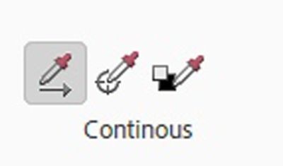
In the image above Continuous is the first icon followed by Once and then Background Swatch. These options function as follows:
- Continuous (the default) as the brush is dragged over the image, PSE continuously samples and replaces whatever color is directly underneath the brush’s cross hairs. This is best for objects with natural highlights, shadows, and color variations.
- Once samples the color of the very first pixel that is clicked on. As long as the mouse button remains held down, PSE will only replace pixels that match that exact color, even if the brush is dragged over other colors. In my experience, this doesn’t work as well as advertised. It’s still worth trying but results tend to vary dramatically.
- Background Swatch unlike Continuous or Once sampling, Background Swatch is “rigid”. It acts like a mask that only triggers when the brush encounters the exact color value set in the Background Color chip. When the brush detects that color, it swaps it for the color set in the Foreground Color chip, preserving the underlying shadows, highlights, and textures. I have never found this to be extremely useful. The key word above is EXACT. It will not apply the desired color to all the varying hues of the Background color. It does however, ignore any areas that are not the Background color, which can come in handy in some circumstances. Still, this is an option that I very rarely use.
Anti-aliasing – Selecting this checkbox tells PSE to apply smoother edges to the areas being recolored.
Here’s a quick summary of the primary settings I’ll be using: Size at 150, Tolerance at 40%, Mode to Hue, Limits to Discontiguous, Sampling to Continuous and Anti-aliasing checked.
Now, there’s still one last group of settings…
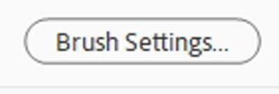
Brush Settings – The “button” just below the Limits options. These are the settings I almost always use when using the Color Replacement brush: Hardness at zero percent, Spacing at 1%, the Angle at zero degrees and the Roundness at 100%.
Note: Depending on the version of PSE you’re using, you may see a setting for Size – Pen Pressure with an exclamation mark by it. You can just ignore this setting unless you’re working with a stylus connected to a tablet. Unfortunately, I can’t provide you with any details about using Pen Pressure if you are working with a stylus.
I have found that it’s important to keep the Hardness and the Spacing at the settings mentioned above in order to keep the recoloring smooth. Unless I run into a situation where things just don’t look right, I usually don’t have to change those settings.
Now, let’s recolor this flower…
Color Replace
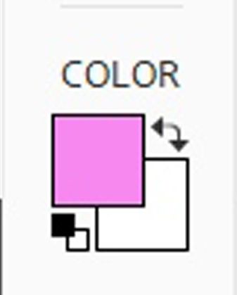
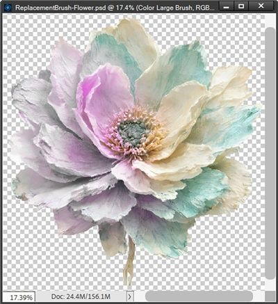
So, now I’m going to pick a new color for this flower. Instead of turquoise, I want to try pink. So, I set my Foreground Color Chip to a bright fairy pink (#f68df2):
I know this looks pretty bright but remember, I’m using the Mode of Hue. So, this pink will match only the hue of the turquoise. If I wanted the resulting flower to be a brighter pink, I would use the Mode of Color and believe it or not, actually a warm pink-lilac color (#d2a1cc). Remember, Color matches both the hue and the intensity of the original turquoise color.
I want to recolor only the turquoise sections of the flower. So, I’m going to reiterate my primary brush settings for you now: Size at 150, Tolerance at 40%, Mode to Hue, Limits to Discontiguous, Sampling to Continuous and Anti-aliasing is checked.
With the Recolor Flower layer active, I’m going to brush over only the sections of the flower that I want to recolor. I will use the cross hairs in the center of my Color Replacement brush as a guide going along the edges of colors. This will help keep me from coloring “outside the lines”. Here’s how it looks after the first bit of brushing:
Well, that doesn’t look very pink, right?!? I didn’t really expect pink given the settings I’m using. But I thought it would be pinker rather than the lavender I see now.
And I’m guessing you might be thinking that if I keep brushing over those same parts, they’ll pick up more of that pink color. You may also be wondering if increasing the Tolerance will make a difference.

If you read my “Recolor Anything” post back in April of 2026 you may remember that recoloring using any form of blend mode is dependent on the hues, tints, shades, and tones of the original color. I could sit here and brush all day and the greyish-lavender color is never going to look pink. But I’m okay with that. I actually like how it’s turning out so far.
Note: There is one thing I do need you to be aware of. And that is how setting the Limits to Contiguous and the Sampling to Continuous can affect the speed at which you see changes occur. As I said above, these two settings will cause PSE to sample constantly as you paint. When dragging over large areas or quickly clicking multiple times, computer resources can get sluggish. If you don’t see things changing instantaneously, just wait before clicking/dragging again. Give the system time to catch up.
As I go back in to finish the recolor, I’ll zoom in and/or out for more precision when replacing the color; especially when there are small sections such as the flower’s center or those tiny gaps between petals. Let’s take a look at how I did:
The thing I needed to be the most careful of was staying away from the golden cream color. Just a few minutes ago I mentioned something about not coloring “outside the lines”. The brush worked really well if I was close to the almost-white sections of the flower. It didn’t try to apply color there. But as soon as I got close to that darker cream, it would start applying color to that as well. And Why????
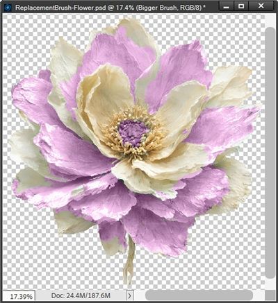
If you’ve been paying attention, you know what the answer is! That golden cream color is similar in hue to the turquoise. The almost-white is completely different in hue. Now watch what would happen if I started with a larger brush, maybe 900 pixels:
While I ended up with more pink, it’s really only showing up in the places I didn’t want to recolor. This is why it’s almost always best to start with a smaller brush.
Now let’s take a look at what happens if I use all the same settings from above except, I change the Mode to Color and use that other pink color (#d2a1cc) I mentioned before. Again, trying to avoid the darker cream color:
I got a nice pink but the color blend is anything but smooth. This doesn’t look at all natural. And if that wasn’t bad enough, take a look at this:
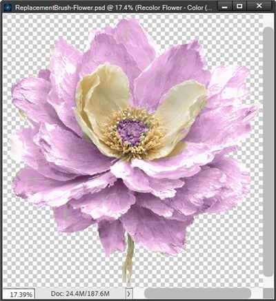
When using the Mode of Color, even the almost-white parts of the flower ended up pink! And even worse…I could brush over the entire flower and end up with a completely pink flower:
For me, that defeats the purpose of using this brush since I could have ended up with that using the Color Blend method from April’s posts! Granted, there’s some variation in saturation that I might not see with the Color Blend method, but it’s still very similar!
I just wanted to make the point that while a lot of people think the Mode of Color can be used for most everyday projects, it really isn’t well suited for the kinds of “difficult to separate” colors I am working with today.
Simple Color Replacement
Two more quick examples using the same brush settings and that same bright fairy pink (#f68df2) for my Foreground color that I used on the flower. I have a cute glitter edged label from my stash that I pulled into a 12×12 file with a slightly grey background:
I used that background because I wanted you to be able to see that the label itself is a textured white. Since the label has a mostly white middle, I can just drag my brush all around the label and I end up with this:
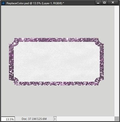
Super-fast recoloring here. I didn’t have to isolate the glitter or the white middle. Just drag a brush! How cool is that?!?
And last, I pull in this adorable polaroid frame with a sentiment from my stash:
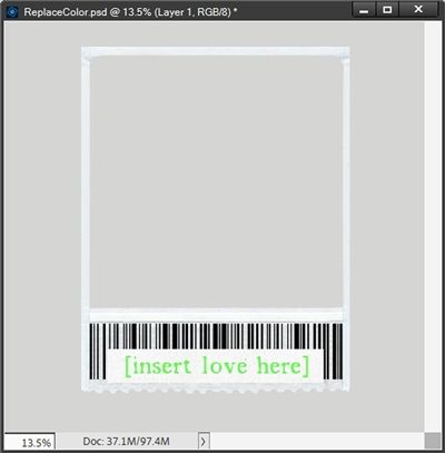
I just want to change the color of that sentiment to the same pink I’ve already been using. Again, since the background behind the sentiment is white, all I have to do is drag my brush over the sentiment:
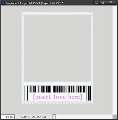
This is a nice little trick if you have to recolor one colored part on an element that is otherwise mostly white (or black)!
I hope you’ll try the Color Replacement brush option on at least one of your “difficult to color” elements. Being able to recolor tricky items is usually a lot easier than trying to find the same item in a color that fits your current project.
More Tips

The absolute most important tip I can give you is to ALWAYS make/save a duplicate of whatever you set out to recolor. The Color Replacement brush is a destructive process.
The next most important tip for you is to keep a copy of the Color Replacement Brush tool settings handy. The settings I used today should work most of the time.
Sometimes it’s a good idea to use a smaller brush and zoom in and/or out for more precision when replacing a color.
If you just want to recolor part of an element you can make a selection around the area and only recolor what is inside the selection.
Picking a good “new” color can be a lot trickier when using the Mode set to Hue. Sometimes it can take a lot of time to find a color that will give you the results you want. And sometimes, you just can’t get it to come out how you expected.
When using the Mode of Hue on an element (or even paper) containing sections that are white or black, those sections will not be recolored.
When using a Mode of Color, you can quickly achieve nearly the same results you would see using the Color Blend method I showed you in April of 2026.

Life is a great big canvas, and you should throw all the paint on it you can. – Danny Kaye
Thanks for reading this week’s Tuesday Tip. Remember, if you have any suggestions or questions please don’t hesitate to “Message Me“. Check back next week for a quick tip about scalloped borders. Click “Follow Me” to stay in touch. I hope you have a wonderful week!