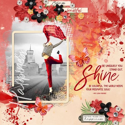
Browsed by
Author: admin

See the About Me page.
Cut-Out Twist

Cut-Out Twist

Last week I showed you how you to create a whimsical title using letter cut outs. That post made me a bit nostalgic for some old-time typography. While this post is not so much about a title as it is about typography, I am going to reintroduce you to another fun approach to a title. By looking at the featured image at the top of this post you may already be guessing what old typography I’ll be discussing today 😉…

Read More Read More

Title Cut-Outs

Title Cut-Outs

In my post about “Thick Titles” a couple weeks ago, I mentioned that I was going to continue an apparent “title kick”. Well, here’s new title tip #3 in the continuing “kick” saga (just in case you’re counting) 😉 Late last year in my “Another Title Tip” post, I showed you how you could incorporate word “elements” within your journaling to create your layout’s title. Today I’m excited to share with you a super fun way to do sort of…

Read More Read More

Subtle Chipboard

Subtle Chipboard

In last week’s post about “Thick Titles”, I showed you how to create a chipboard-esque look for your layout’s title. Today I want to show you how to create a look for a chipboard title that will blend almost seamlessly into a layout and won’t be such a distraction… Compound Blending You may be wondering what exactly is compound blending? I’ll answer that in a minute but I first want to explain what it isn’t. Frequently a layout will have…

Read More Read More

Thick Titles

Thick Titles

Since the Fall of 2024 I think I’ve written at least six different posts about creating varying title looks. Earlier this year I may have mentioned that it must have seemed as though I’d been on kind of a title kick lately. Well, I’m going to continue that “kick”. At least for a few more posts 😉 And if you read my “Title Tip” post from September of 2024, you know how I feel about titles taking over a layout….

Read More Read More

Coloring Grey-Scale

Coloring Grey-Scale

In last week’s “Neutralizing Colors” post I showed you how to tone down bold bright colors in papers and even elements. Today I’m going to do just the opposite. I want to share with you a quick way to add color to a grey-scale (or some other neutral color) patterned paper. Now, don’t shut this down right away. I’m certain you’re sitting there thinking, “This isn’t for me…I really don’t have any grey-scale paper!” Just give me a chance! I…

Read More Read More