Color Pop
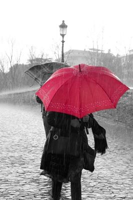
I love using photos that are B&W with a pop of color. Especially if I’m trying to highlight one particular part of a photo (as in the image below). And yes, this is another technique where Photoshop Elements (PSE) has a Guided Edit (B&W Color Pop) available.
It works fairly well if you’re trying to isolate a given color within your original photo. But it gets a little tricky when it comes to figuring out how to edit/include more than one color; say an entire subject!
Once again, I prefer to have a bit more control over the results than I can generally accomplish using that Guided edit. But, perhaps that’s just me.
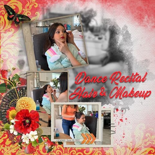
Note: The featured image at the top of this post is a good example of the technique I’m presenting today (as well as the blur technique). If you want to see more details about that layout you can find it in my 2022 Gallery. The title of the layout is “Dance Recital Hair & Makeup”.
Black & White & Color
Earlier this year I wrote about a fun technique in my “Blur Distractions” post. Today I thought I’d show you a twist on that same technique.
On that original post I provided a template but also showed you how to create everything from “scratch”. Today I’m going to be doing the same thing but with a new template.
I’ve actually created a new template based off the original Blur & Focus Template from that “Blur Distractions” post I mentioned above.
This new template is going to look and “work” pretty much the same (other than the color of the text) as the Blur & Focus template. It’s certainly not necessary to use the template it just makes it go quicker.
The single biggest difference between the two templates is that the new one uses a Gradient Map to turn the majority of the photo to black & white allowing the focal point to remain in brilliant color to draw the eye.
I can hear the wheels turning in your head. “Why a gradient map vs. just converting the photo to black & white?”
First of all, gradient maps are adjustment layers, meaning they are non-destructive. The original color photo remains unharmed underneath the gradient map layer, providing flexibility to turn the effect on or off, or to make further adjustments later.
Using a gradient map instead of “convert to black and white” in PSE also allows for greater control over image contrast. By adjusting the color stops in the gradient editor, you can push darker tones towards black and lighter tones towards white, increasing the image’s contrast in a more controlled way than when using “convert to B&W”.
And if you really want to think outside the box, instead of a standard black & white, you can choose or create a gradient with any combination of colors, creating a very unique look for your photo.
Frame & Pop Template
If you’re not a template user…no worries. My plan is to show you how to accomplish the same effect without a template a little further along in this post.
The template is set up to use a standard 6” x 4” (landscape) photo. It certainly can be easily rotated to accommodate a portrait-oriented photo if needed.
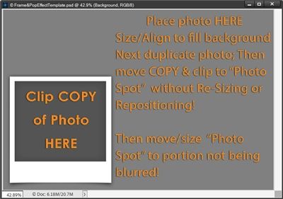
Note: If you want to follow along all you have to do is click here or on the image below and the template will be automatically downloaded for you. This template is in PSD format. If you can’t use this format, please message me and I will help you get a TIFF file instead.
Before I get started here’s a quick reminder, I use PSE 2024. If you use a different version, some of my screen shots may look different than what you see on your screen.
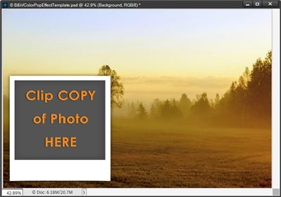
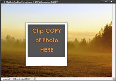
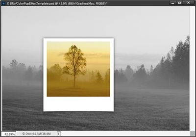
When I open my Frame&PopEffect template in PSE, it looks exactly like the image you see above.
This template lets you choose a favorite photo and “color pop” just a special part of that photo. The color pop is accomplished by adding a frame and applying a Black & White Gradient Map to the majority of the photo. Leaving the focal point in brilliant color to draw the eye.
Ready? Let’s go…
You may have noticed that the “photo spot” looks similar to a polaroid frame. But the template also includes an option for a simple rectangular frame which is the first layer in the Layers Panel (should be hidden when you open this template).
And here is what the Layers Panel looks like:
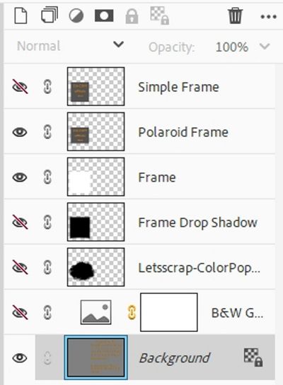
And if you have the original template (Blur&FocusEffect) you may also have noticed something else that’s new in this template. I’ve added a photo mask (should be hidden) that can be used instead of the “framed” photo spot! I’ll tell you more about that in a bit.
You will also see a hidden Gradient Map layer (named B&W Gradient Map) directly above the Background layer. I’ll also explain that Gradient Map layer shortly.
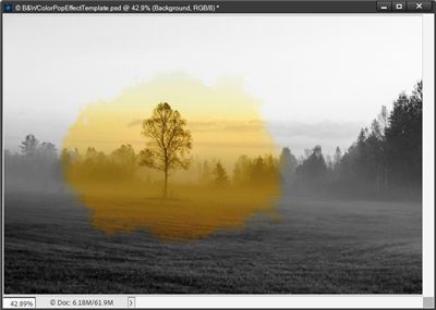
I’m going to be using a fall landscape photo that I found on Pixabay:
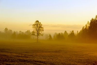
I picked this photo specifically because there’s no way I could use the PSE Color Pop Guided edit and achieve anything close to the results you’ll see in a few minutes. If you’re following along, you can use any photo you like.
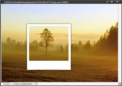
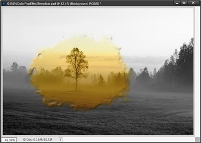
With my Frame & Pop template open in PSE, I drag my photo into the file just above the Background layer:
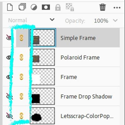
The frame is definitely not in the right place for this photo. This is easy enough to fix. I’ve linked all the frame parts (including the photo mask) so they move as one when I reposition them over the photo:
Now, I can click on any one of those “frame” layers in the actual file and move them all simultaneously so they’re roughly centered over the section I want to keep in color:
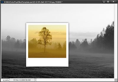
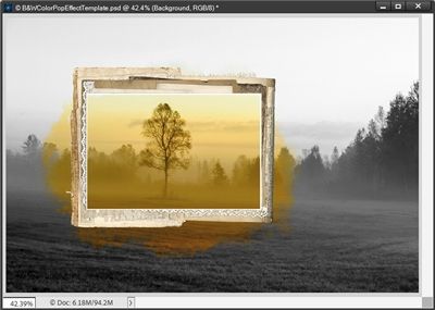
Next, I duplicate the photo. In the Layers Panel I move the duplicate photo above the Polaroid Frame layer and clip it to the Polaroid Frame Layer:
The frame isn’t in the exact spot I wanted but I can fix that later. Now I can unhide the B&W Gradient Map.
Tada! Like magic, the original photo layer is now black & white.
I can now play with the gradient to change the depth of black, or the highlights of white. First, I need to ensure that my Foreground/Background color chips are set to the defaults (press D).
Then in the Layers Panel, I double-click on the thumbnail of the B&W Gradient Map and PSE opens the Gradient Map options box:
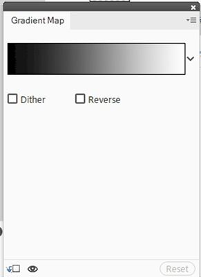
I click somewhere inside the gradient color box and PSE opens the Gradient Editor:
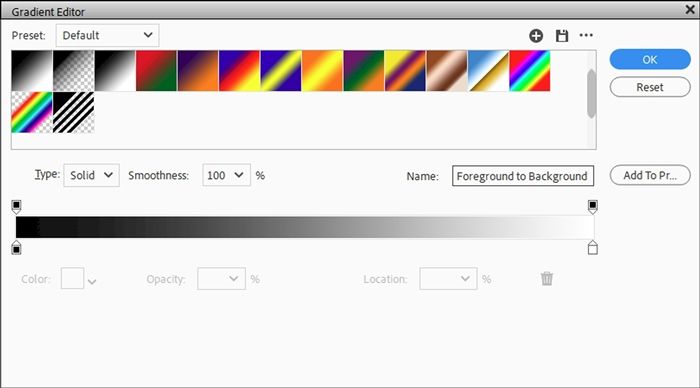
I can now adjust the darkness and lightness of the black & white by changing the colors associated with the two bottom color stops. Changing the black to a lighter shade (#313131) and the white to a darker shade (#eaeaea) results in something like this:
Making that adjustment did give the B&W photo a lighter tone.
I’m pretty happy with the original look so I’m going to press Ctrl-Z to undo the gradient edit!
Then I close the Gradient Map (click the X in the upper right corner). If you’re following along feel free to make any adjustments you choose on your Gradient Map.
All that’s left is to adjust the position of the “frame” (but not the clipped photo) and save this as a JPG for use on a layout. I could also save it as a PSD (with a unique name) in case I want/need to make any other adjustments later.
Note: Remember, I’ve linked all the frame parts so they move as one. You can resize, reposition and/or rotate the frame anyway you choose to highlight your subject. Also remember to never move the photo when moving the frame.

Whether you’re messing with the Gradient Map adjustments or not, using the template makes this all so quick and easy!
But what if I wanted a completely different frame or perhaps even a blended/masked photo with or without a frame?
Adding a different frame is easy. All I have to do is grab whatever frame I like from my stash, pull it into the file and layer it above the Polaroid (or Simple) Frame in the Layers Panel:
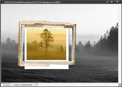
Note: The frame I’m using is from “Finally Fall” by Alexis Design Studio (retired). If you’re following along, you can use any frame of your choosing.
I’ve already rotated it so it is landscape oriented vs. portrait. I also repositioned and resized the frame. Next, I hide the Frame and Frame Drop Shadow layers in the Layers Panel. Then I unlink the Polaroid Frame in the Layers Panel and resize the Polaroid Frame to fill the new frame:
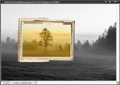
Note: If you’re following along and have used the Simple Frame vs. the Polaroid Frame, then you will resize that frame.
And that’s how easy it is to add a different frame using this template. I’m not going to add a drop shadow at this point. I usually don’t save a “color pop” photo as a JPG file. So, I’ll wait to add the drop shadow after copying the necessary layers to my project.
Using the new photo mask requires some different steps but is equally easy. I’m going to go back to the look I had before using that new frame:
This time I hide the Polaroid Frame, Frame and Frame Drop Shadow layers. Then I unclip the photo from the Polaroid Frame in the Layers Panel and move the photo layer so that it is directly above the ColorPopMask layer in the Layers Panel. Now all I have to do is unhide the ColorPopMask and clip the photo to the mask:
Note: If you’re following along and using a different photo, you may need/want to resize the mask. just be sure to unlink the mask in the Layers Panel before doing that. You also can use any mask of your choosing instead of the one provided in the template.
This doesn’t “highlight” the chosen subject quite the same as a frame does, at least not on this photo! But I have found that if I add a light shadow (Lighting angle: 120 degrees, Color: (#696258), Size: 10px, Distance: 8px and Opacity: 65%) it helps some:

But what really helps it pop in a “cleaner” way is a very slight bevel. I just go to the top menu bar and click Layer->Layer Style->Style Settings. PSE opens the Style Settings box and I set the Lighting angle to 120 degrees, Size to 15px and Direction to Up:
Using either a shadow or bevel on the mask is totally optional. And honestly, on some photos neither may be required. Besides that, there’s nothing that says you can’t put a frame over a masked photo (no shadow or bevel) for a completely different look:
I hope you’ve enjoyed seeing how simple the template makes this color pop technique and will give it a try.
I know at the beginning of this post I had said I was going to show you how to create this effect without a template! I got a little carried away showing some extra options and I really didn’t want this to get too long. So, rather than cramming too much in today I thought it best to finish next week!
I promise we’ll take a look at creating this effect without using this template next week!
Extra Tips

Remember, the template is free. If you haven’t already done so, click here and the template will be automatically downloaded for you.
Think outside the box, you can change the gradient map to use any combination of colors, to create a very unique look for your photo.
Using a gradient map instead of “convert to black and white” for the background photo allows for greater control over image contrast. That’s why the template already has one set up for you.
You can resize, reposition and/or rotate the frame provided in the template anyway you choose to highlight your subject. Just don’t move the photo!
You are not required to use the “frame” provided with the template. You can use any frame you choose and/or a photo mask for your color popped subject.
Nothing dictates that you must use a frame at all. It’s your project so you can highlight the colored portion of your photo any way you choose!
One more tip for adjusting the tone of the black & white photo version of your photo. Sometimes modifying the colors in the gradient map can get tricky. If you’re having trouble making adjustments that give you the look you’d prefer, try creating a new layer below the photo and fill it with white. Then play with the opacity level of the photo to see if that helps you get a better tone for the black & white.
And think about this…Creativity is a continual surprise! – Ray Bradbury
Thanks for reading this week’s Tuesday Tip. Remember, if you have any suggestions or questions please don’t hesitate to “Message Me“. Check back next week for tips about color pop without a template. Click “Follow Me” to stay in touch. I hope you have a wonderful week!