
Split Title Twist
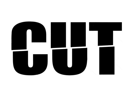
So, in last week’s “Gradient Split” post I showed you how to “cut” your title in half simply by using a two-color gradient.
Today I’m going to show you another way to “split” your title by folding it in half using the Transform Tool.
If you’ve been digi-scrapping for any length of time surely, you’ve run across at least one example of folded paper. And you may have even seen a tutorial about how to digitally fold paper.
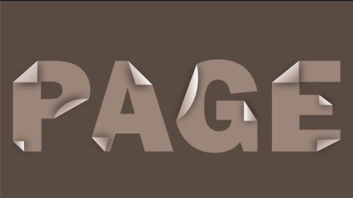
And you may already know how to fold individual letters as you see in the image above. But today I want to show you how to fold a word.
This technique will work on any word regardless of whether the colors are split or not. And this is another technique that works best with heavier (wider) serif or sans serif fonts. Fonts that may fall into the “block type” category.
Folded Words

There are some “Photoshop Design” text effects available that can mimic a fold like what’s shown in the image directly above. I’ve never found any of them to be easy to use or as realistic as I’d like. So, I came up with my own method.
As with the color split methods I’ve shown you over the past two weeks, the technique I’m about to explain will work best if you follow the same centering steps I used in those methods.
Once again, I’ll state…DO NOT attempt this technique on an actual layout. It really is best to start with a separate 12×12 file (or whatever size will adequately accommodate the title). The title can always be re-sized if it’s too large when moved to the final layout.
Quick reminder, I use Photoshop Elements (PSE) 2024. If you use a different version, some of my screen shots may not look the same as what you see on your screen.
I’ve created a new 12×12 file with a white base (Layer 1) and the Guide lines just like last week:

Note: I have my Guide color currently set to a deep aqua color (#1c7676). If you’re following along your Guide color may be different which is fine.
I get the Horizontal Type tool:
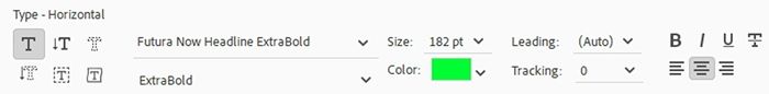
I select the Futura Now Headline Extra Bold font, set the Color to a very bright green (#14f80f), the Size to 182, the Leading to Auto and the Tracking to zero and click on the Center Text icon.
Note: If you’re following along feel free to use a similar bold, sans serif font.
I then click once in the middle of the document and type the word FOLD in all uppercase. I click the check mark to confirm.
Next just as I did with the “Bi-Color Titles” post, I center the word horizontally and vertically using the Align Center and Align Middle icons (in the Move Tool options):
Note: If you’re following along feel free to type a different word. Just be careful not to make it as wide as the document. You’ll need to leave space (about 1 inch) on each side of the word. If you have to adjust the size of the word you can make it smaller than 182pt.
I duplicate the text layer (FOLD). PSE names that layer FOLD copy. I simplify the Fold copy layer and hide the original FOLD layer.
Next, I will actually split the word in half…
Split The Word
This is where the centering and that horizonal Guide will be important.
With the Fold copy layer active in the Layers Panel, I select the Rectangular Marque tool:
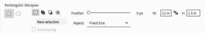
I click on the New Selection icon, set Feather to zero, the Aspect to Fixed Size, the width (W) to 12 inches and the height (H) to 1.5 inches. I click on the document somewhere near the top of the word and the selection box is displayed:
Note: If you’re using a different sized word than mine, feel free to create a selection rectangle that covers the top half of your word simply by using an Aspect set to Normal (no height or width measurement required).
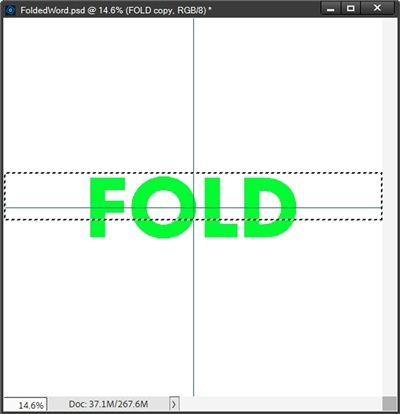
Now all I have to do is nudge the selection upward until the bottom of the selection box is perfectly aligned with the horizontal guide:
I zoomed in really close so I could ensure that the marching ants appear to have replaced the horizontal guide.
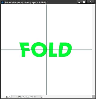
Then I just press Shift+Ctrl+J. PSE then cuts the top half of the word out and places it on a new layer. I rename this new layer FOLD Top. And I rename the original FOLD copy layer to FOLD Bottom. And the word doesn’t yet look any different!
Now for the folding…
Create The Fold

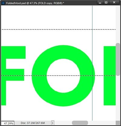
With the FOLD Top layer active in the Layers Panel, I go to the top tool bar and click Image->Transform->Perspective:
Before I start the process, I do want to clarify one thing. I know the Perspective tool has only been around since PSE 15 (sometime in 2016).
If you’re using an older version of PSE than that, you should be able to use the Distort or Skew tool instead. Both the Distort & Skew transformation tools have been present since the early days of PSE.
The biggest difference will be that you will need to do the steps below (about clicking and dragging) independently on each corner of the word. But you should still be able create the fold effect. Just not quite as easily as with the Perspective tool.
Moving on…PSE places a bounding box around the top half of the word:
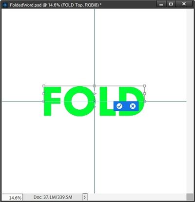
Then while holding the Shift key, I click on the top left corner anchor point and start to very slowly drag directly to the left until I see a black box show up that I’ll call a skew indicator box:
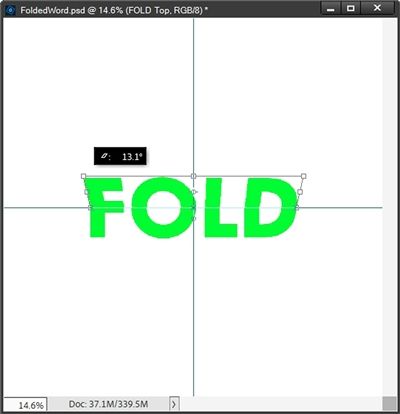
That box has a number of degrees represented and I continue dragging until that “skew number” reaches a positive 10 or so…not much more than that. Then I just stop dragging.
In the Transform tool options I check to ensure that Constrain Proportions is unchecked. The only other change I make is to set the width (W) percentage to 110%:
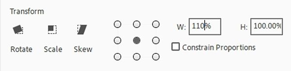
Then I click the check mark to confirm:
I know this doesn’t look much like a fold at this point. Hang in there with me, the next step will help.
I’m now going to do the exact same thing on the FOLD Bottom layer. Only this time while holding the Shift key, I click on the bottom left corner anchor point and start to drag directly to the left until that “skew number” again reaches a positive 10 or so.
Then In the Transform tool options I again check to ensure that Constrain Proportions is unchecked, set the width (W) percentage to 110% and click the check mark to confirm:

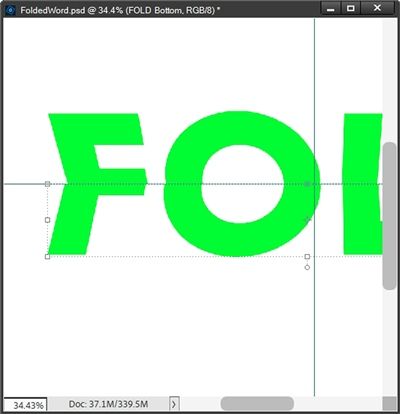
Now this is starting to look like it’s folded. But if you look closely, you should be able to see that some of the edges aren’t lining up exactly right. But that’s easy to fix.
With the FOLD Bottom layer active in the Layers Panel, I’m going to zoom in fairly close so I can see the mismatched edges starting with the F:
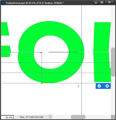
I go to the top tool bar and click Image->Transform->Warp:
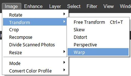
Before I start this process, I do want to clarify another thing. I know the Warp tool has only been around since PSE 2022 (sometime in 2021).
If you’re using an older version of PSE than that, you should be able to use the Distort or Skew tool instead to adjust the fold effect. Just perhaps not quite as easily (or neatly) as with the Warp tool. But I do think with some patience…you can make it work 😉
PSE places a different bounding box around the bottom half of the word:
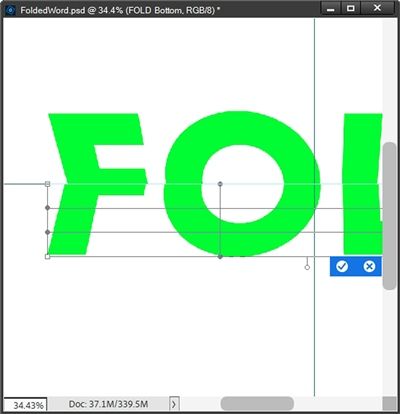
That’s a whole lot more anchor points than when I used the Perspective tool. But don’t panic. Since the mismatched edges are along the center, I’ll only be using the anchor points along the top of the bounding box.
I’ll start with the letter F. While holding down the Shift key, I’m going to click on the top left anchor point and drag it directly to the right until the left edges are aligned:
Note: If you’re following along, while dragging an anchor point using the Warp tool, it is imperative that you drag as straight as possible without moving up or down. Even the slightest movement up or down can throw off the look of the word.
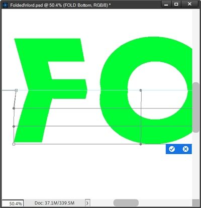
Moving on to the O, the left side doesn’t look too bad but the right side needs some work. This time I’m going to use the top anchor point near the center of the O and “Shift drag” it to the left until the right edges are aligned:
The L looks close enough:
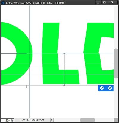
I could adjust it a teeny tiny bit but I think it’ll be fine the way it is. So last is the D. This one is off more than just a smidge 😉
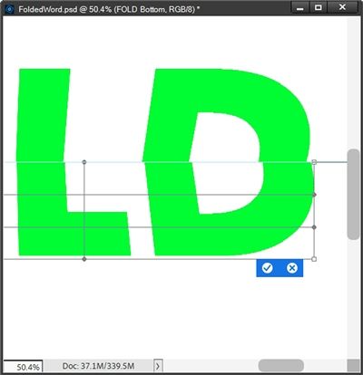
This time I’m going to use the top right anchor point and “Shift drag” it to the left until the right and left edges align:
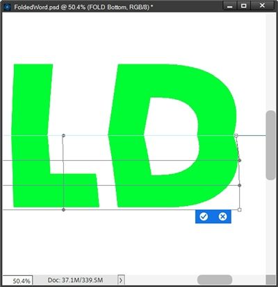
Now, before I click the check mark I always zoom in extra close and inspect the top of that bounding box to ensure none of the anchor lines have strayed up or down. If I find any of those, I just drag them back level with the center guide.
I’m happy with the alignment so I click the check mark to confirm, and here’s how the word looks now:

That looks pretty good if I must say so myself 😉 But, it still looks flat.
I’d love to show you how to enhance the look and add some realism. But, as it seems to be a bad habit of mine…this post has already taken up quite a bit of your time. I think it’s best we stop here and pick up again next week.
There really is a bit more involved to enhance the fold!
If you’ve been following along and will continue with next week’s post, please save your work on a folded word as a PSD file so you can pick up where you left off. If you like your folded word well enough as it is, feel free to crop it to size, remove the white background and Guide lines and save it as a PNG file!
I hope you’ll try making a folded word just for the fun of it. And join me again next week for the added special effects 😉
Extra Pointers

This is another technique that works best with heavier (wider) serif or sans serif fonts. Fonts that may fall into the “block type” category.
If you’re using a version of PSE older than PSE 15 the Perspective tool will not be available to you. Both the Distort & Skew transformation tools have been present since the early days of PSE and should work out fine to create the fold effect. Just not quite as easily as with the Perspective tool.
And, if you’re using a version of PSE older than PSE 2022 the Warp tool will not be available to you. Again, the Distort or Skew tool should work. Just perhaps not quite as easily (or neatly) as with the Warp tool. It may take extra time and patience…but I think you can make it work 😉
When using the Warp tool to realign edges please be very careful to not move the cursor up or down. It is imperative that you move only left or right. Otherwise, you could end up with gaps between the top and bottom halves of the word.
Depending on the number and types of letters in your word, the Skew or Distort tools may sometimes work better than the Warp tool when trying to realign edges.
Last but by no means least…just have fun playing with folds!
Thanks for reading this week’s Tuesday Tip. Remember, if you have any suggestions or questions please don’t hesitate to “Message Me“. Join me again next week, there’s more to the fold! Click “Follow Me” to stay in touch. I hope you have a wonderful week!
