Letter Board Part 3
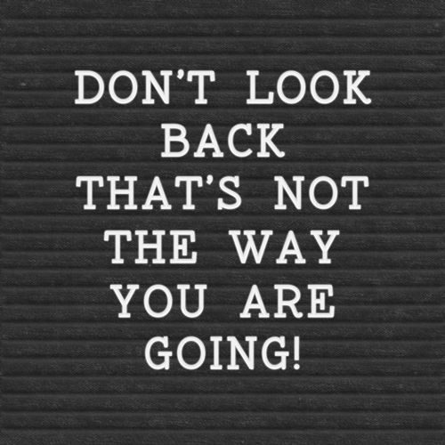
Well, the image above should look familiar if you read last week’s “Adding Words” post. As per usual, I got long winded. You really should be used to that by now 😊 Today I’ll be taking that image from last week and making it look like a classic letter board. It’s all about the frame…
Framing a letter board adds a finished aesthetic. A frame also offers a way to match it to your layout through different colors and finishes, and can be a feature in itself. A frame elevates a simple word art “board” into a decorative piece.
Classic Board
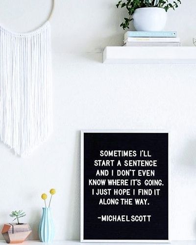
Back in “my day” classic letter boards looked pretty much like what you see in the image above. But letter boards could also be square. Most often the frame was metal, generally black, white or chrome. Occasionally, a frame would have rounded corners but not very often.
The blue framed letter board example you’ve seen in both the “Old Signage” and “Adding Words” posts had a wooden frame. Definitely not typical for old classic letter boards. But all manner of frames can be used for letter boards today.
You can use whatever frame you choose. But I want to show you a few ways to create a classic letter board look using more traditional-type frames.
Before I get started here’s a quick reminder; I use Photoshop Elements (PSE) 2024. If you use a different version, some of my screen shots may look different from what you see on your screen.
To complete today’s sample letter board, I am going to show three different options. Since the current text format is mostly square, I’m going to start with a square, chrome frame I found on Pixabay:
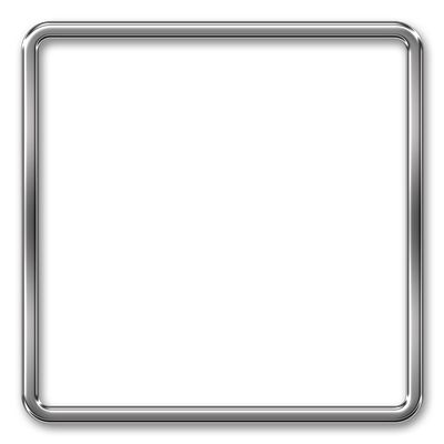
I’ll just open this frame directly in PSE and pull in the felt/quote file I created last week (DontLookBack-Plastic). I immediately save this file as a PSD named “CreateLetterBoardFramed”. This ensures the integrity of the original chrome frame.
In the Layers Panel I move the DontLookBack-Plastic layer beneath the frame layer:
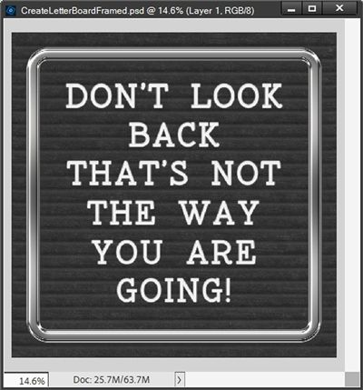
You can see that the DontLookBack-Plastic layer is larger than the frame. But this is easy to fix. I just need to decide if I want to make the DontLookBack-Plastic layer smaller or just delete the parts that fall outside the frame by creating a clipping mask.
It’s easy enough to figure out how this letterboard will look if I delete the extraneous parts. So, I’m going to see how it looks when I make the DontLookBack-Plastic layer smaller.
With the DontLookBack-Plastic layer active, I grab the move tool and hover my cursor over the top left corner until I see the double headed arrow (resize cursor). I click and drag toward the lower right corner until the top and left edges of the DontLookBack-Plastic layer are no longer visible outside the frame:
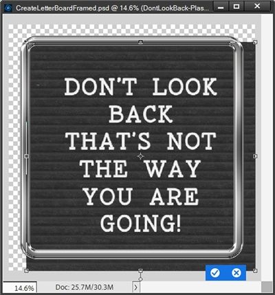
Then I position my cursor over the bottom right corner and click and drag toward the upper left corner until the bottom and right edges of the DontLookBack-Plastic layer are no longer visible outside the frame. I then click the check mark to confirm:
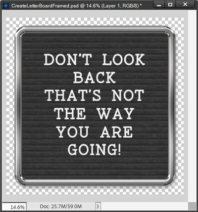
That looks great! I actually like this better since there’s more “black space” around the quote now. If you’ve read many of my posts at all, you already know I’m not big on adding shadows until I actually use an element on a layout.
But you may be wondering about adding a shadow to the inner edge of the frame. Since the background is basically black, I personally see no need to add a shadow. If you’re using a lighter color than black, feel free to add an inner shadow if you like.
I save the current PSD file (CreateLetterBoardFramed) and also save the file as a PNG using the same name.
For the next example I open a white rectangular frame directly in PSE and pull in my felt/quote file (DontLookBack-Plastic).
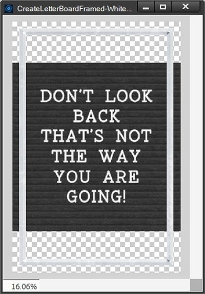
I immediately save this file as a PSD named “CreateLetterBoardFramed-White”. This ensures the integrity of the original white frame.
Note: This frame is from a “Galaxy Wars” kit that was retired a long time ago so I have no link to provide.
This time the DontLookBack-Plastic layer is smaller than the frame. But this too is easy to fix. I just need to decide if I want to make the DontLookBack-Plastic layer larger or the frame smaller.
Honestly, If I make the frame smaller, I think it’s just going to end up looking mostly square again. That seems kind of silly. So, I’m going to make the DontLookBack-Plastic layer larger. But not in the way you might think.
I really don’t want the quote itself to get any bigger. I like the amount of “black space” along the sides. All I really need to do is add more of the felt background to the top and bottom.
I’m going to zoom in just a bit so I can see the bottom of the last row of text a bit better. Then with the DontLookBack-Plastic layer active, I need to simplify the layer so I can make edits.
Then I grab the Rectangular Marquee tool and make a selection around the bottom of that layer:
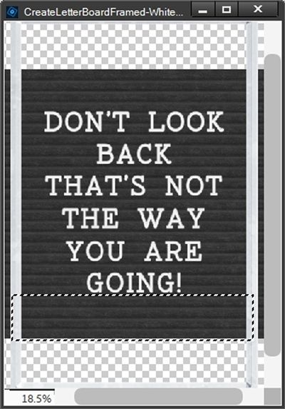
Can you see that the section doesn’t go beyond either side of the frame? There’s really no point in selecting anything beyond the frame. I’d only have to delete it later.
With the selection made I press Ctrl-J to Create a new Layer via copy. PSE places that selection on a new layer (Layer 1 for me). With Layer 1 active, I nudge that layer down until it is below the bottom inside edge of the frame:
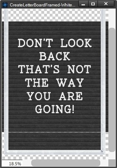
As you can see, Layer 1 is just short of being tall enough to bridge the gap. Good thing is, I think the distance is so minimal I can just stretch Layer 1 up to cover the remaining gap with virtually no distortion.
So, I zoom in very close near the top/center of Layer 1 and click on the visible anchor point and drag my cursor up until I see no more gap:
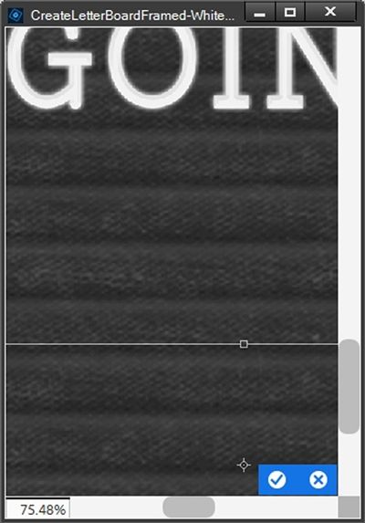
That looks great so I click the check mark to confirm. And here’s a close-up view without the bounding box:
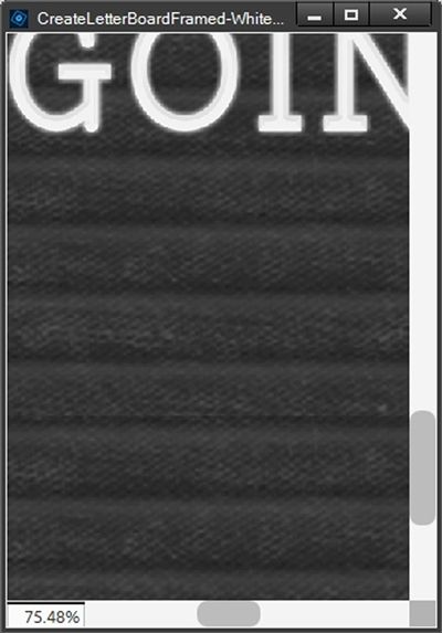
No one will ever be able to tell the difference…right?!? If the gap between Layer 1 and the DontLookBack-Plastic layer had been much bigger I would never have tried that. Instead, I would have made a duplicate of Layer 1 and adjusted the position of both new layers to fill the gap so it appeared seamless.
Now the absolute best part is I can duplicate Layer 1 and nudge the duplicate up until it is beneath the top inside edge of the frame:
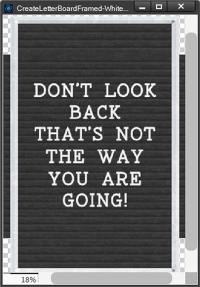
Well, that didn’t go quite as I’d planned. Can you see it appears there’s now a groove missing? But this too is easy to fix.
I just need to make a selection around the groove above the gap, create a new layer from the selection (Ctrl-J) and nudge that new layer (Layer 2 for me) to the middle of that “groove-less” space:
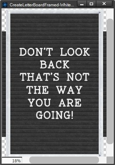
And again, I don’t think anyone will ever be able to tell the difference! All that’s left is to delete the extraneous felt along the sides.
With the DontLookBack-Plastic layer active I make a selection around the felt along the left side:
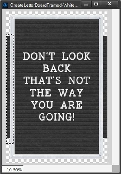
I press the Delete key and the felt is gone but the Selection box remains:
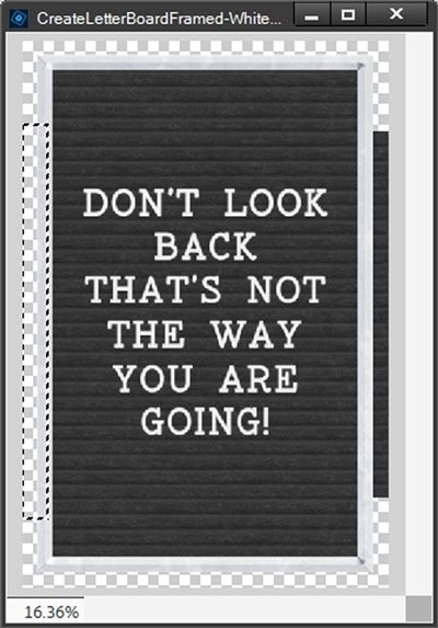
Now, I can just nudge that selection to the right and delete the remaining felt:
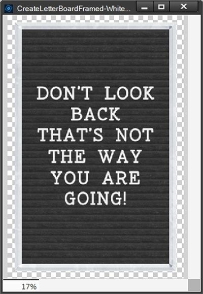
All that’s left is a little cleanup. I select the DontLookBack-Plastic, Layer 1, Layer 1 copy and Layer 2 layers in the Layers Panel and merge them into a new layer (now called Layer 2). As you may already know, I’m a fussy, Type-A person so for consistency, I’m going to rename Layer 2 to DontLookBack-Plastic.
Then I save the current PSD file (CreateLetterBoardFramed-White) and also save the file as a PNG using the same name (no shadows).
For the next example I’m basically just going to drag a black rectangular frame into the current PSD file and place it above the white frame. This frame does have a shadow so I will need to be careful that the selection extends wide enough to grab all of the shadow:
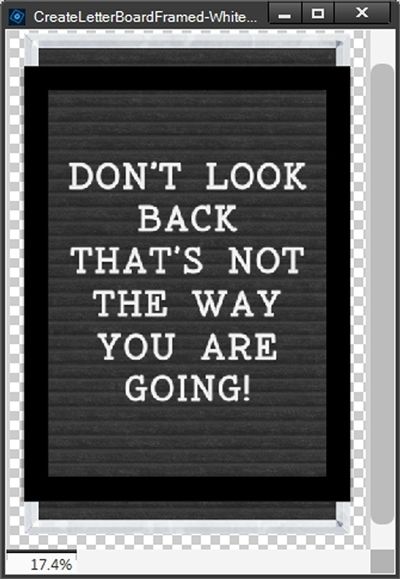
Note: This frame is from the “Spook” collection by Brooke Gazarek with a minor modification. I removed an inner white frame.
As you can see, the black frame’s width is great. But it’s not tall enough to cover the white frame. This is the only reason I’m sharing this example.
If you read my “It’s All About the Frame” post back in June of 2023, you already know it’s not always easy to re-size a frame without messing up the proportions. This particular frame may in fact not be subject to proportion issues the way some might. But over the years I have found the safest thing is to not take any chances.
Besides, this particular frame won’t be as difficult to re-size as some. It’s actually going to be even easier than extending the felt in the last example!
With the black frame’s layer active, I make a selection around a portion of the top of the frame that will be sufficient to cover the visible portion of the white frame and will also include any shadows along the edges:
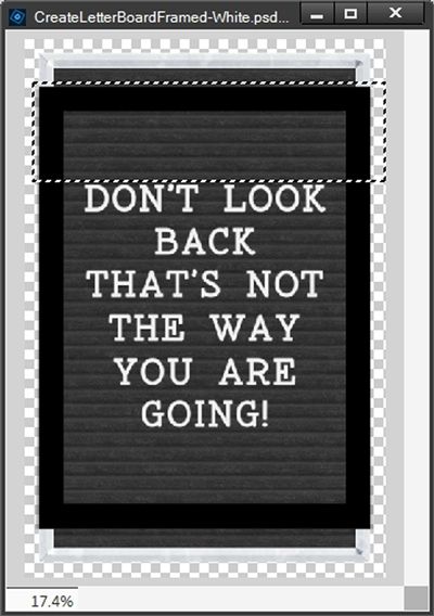
I know I made that selection a bit “taller” than may have been necessary, but better safe than sorry! This will make a bit more sense in a minute.
With the selection made, I press Ctrl-J to Create a new layer via copy (Layer 1 for me). I then just nudge the new layer upward until it covers the white frame:
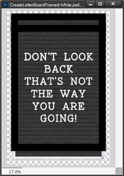
I know, this looks awful with that extra black band below the top of the new frame layer. But I can fix that lickety-split.
With the original black frame layer active in the Layers Panel, all I have to do is make a selection around only the top “cross bar” portion of the original frame being sure I extend the sides to capture any shadow that is present:
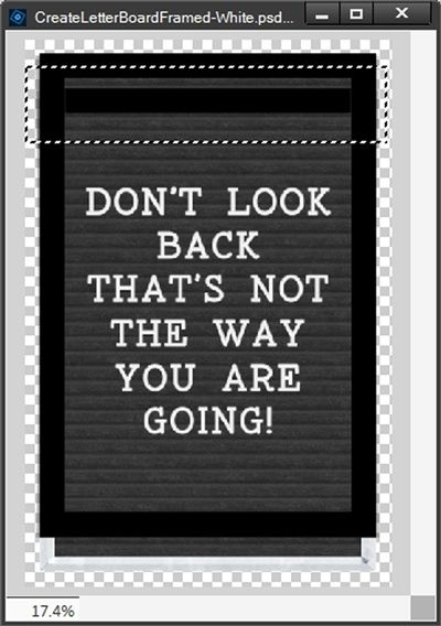
By making the selection as large as I did when I created the new layer (Layer 1) I didn’t need to be overly precise when I made this second selection over the original frame. I hope that makes sense now.
I ensure the original black frame layer is still active and I press the Delete key to remove that extraneous frame top and cancel the selection (press Ctrl-D or Esc):
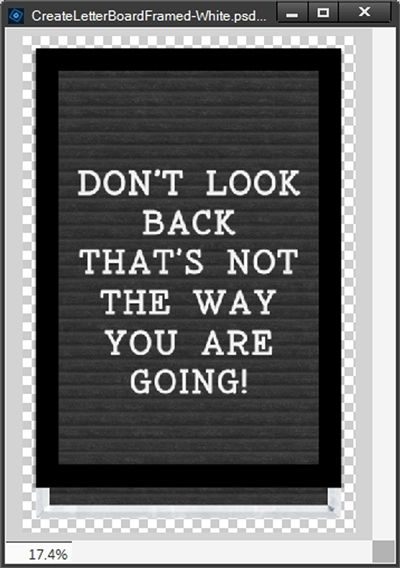
Now, as luck would have it this frame is so simple that I can actually just duplicate Layer 1 (the new frame top) creating Layer 1 copy, flip it vertically and nudge it downward until it just covers the bottom portion of that white frame:
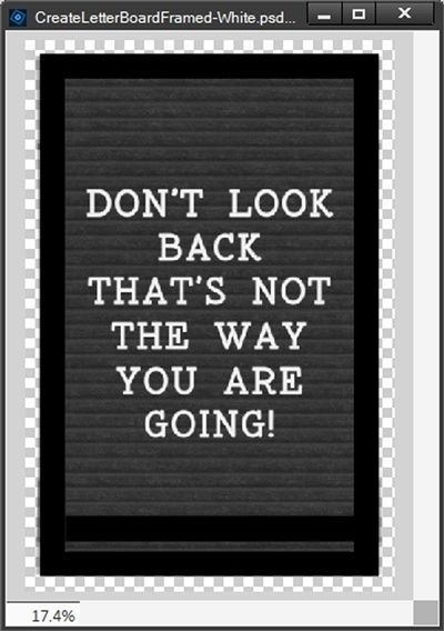
Again, there’s that extra black band above the bottom of the new frame layer. And I’ll just do the same as I did with the top. I make a selection around only the bottom “cross bar” portion of the original frame again extending the sides to capture any shadows:
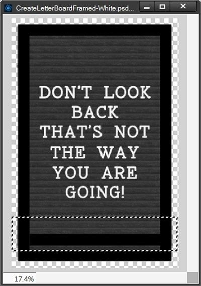
Note: There really shouldn’t be any concern about shadows at this point. Since this is a duplicate copy of Layer 1, those should have already been deleted. But it never hurts to be safe rather than sorry!
I ensure the original black frame layer is still active and I press the Delete key to remove that extraneous frame top and cancel the selection (press Ctrl-D or Esc):
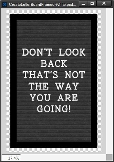
Now I’ll just tidy things up as I did with the white frame. I don’t need that white frame so I delete that layer. Then I select the original black frame layer, Layer 1, and Layer 1 copy layers in the Layers Panel and merge them into a new layer (now called Layer 1 copy).
And just as I did with the merged felt/quote layer under the white frame, I rename Layer 1 copy to the original name for the black frame layer (in this case – bgazarek_spook-frame-black).
Then I save the current PSD file with a unique name “CreateLetterBoardFramed-Black” and also save the file as a PNG using the same name.
And here are all three of the classic letter board options:
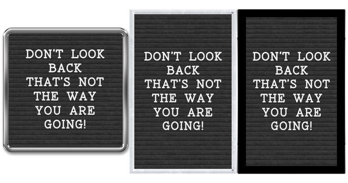
I hope you’ve enjoyed learning how to create letter board felt, characters and classic frames. Letter boards can make fun word art so I hope you give it a try.
And here’s how one of my other letter boards looked on an autumn layout:

Note: If you’d like more details about this layout, you can find it in my 2025 Gallery. The title of the layout is “Follow The Leaves”.
Closing Tips

You can use any frame you like to create your letter board; wood, chrome, plastic, fancy or plain. It’s really all about what will look best for your project.
While classic letter board frames were rectangular or square, don’t limit yourself to those two shapes alone. You could certainly try a circular or oval frame.
I would discourage you from using paper frames for a letter board. That wouldn’t really look much like a true letter board. But, it’s your project so do what looks right for you.
If you have the “perfect” frame for your letter board but you’d prefer a different finish (i.e., wood vs. metal) see if you can find a Layer Style that will help you get the look you want.
Think way outside the box and create a “floating frame”: This style allows the edges of the letter board to be visible beneath the frame, which is especially good for antique or unique boards.
Today’s thought…Creativity is not a talent it is a way of operating. – John Cleese
Thanks for reading this week’s Tuesday Tip. Remember, if you have any suggestions or questions please don’t hesitate to “Message Me“. Check back next week for a tip about Layer Mask magic. Click “Follow Me” to stay in touch. I hope you have a wonderful week!
