Echo Effect
After last week’s post about offset strokes, I thought it might be fun to show you how to create an echo effect using a twist on that technique. Today I’ll once again be using a marquee tool and a stroke outline. This technique is such a fun way to make a title look echoed.
If you haven’t already read my “Circles, Circles” post from last week, you may want to go back and read up on strokes. It’s not a requirement; I just might not be providing quite the same level of detail on all the steps today.

Before I begin, I want to talk a bit about the real-life echo effect. I’m fairly certain that we’ve all tried shouting out loud in an empty school gymnasium, into a well, a cave or at a scenic mountain stop and heard our voice come back. We all know that’s an echo. These echoes are produced due to our voice’s sound waves bouncing off other surfaces. The direction of the sound changes after it bounces off a surface. But interestingly, the echo is exactly the same as the original sound. Or is it?
As a sound wave travels outward, its energy is distributed over a larger spherical surface, making the intensity (loudness) decrease. When the less intense sound waves bounce back, they too will be distributed over an even larger spherical surface, decreasing the loudness even more as it returns closer to the source. That’s why echoes get quieter.
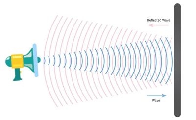
Looking at the above physical depiction of sound waves from a “shout”, you can see how they spread out and get larger as they travel farther away. Keep this principle in mind as I show you how to create the echo effect on a title.
One last odd little tidbit about echoes. It has been reported that some animal sounds (dogs barking and ducks quacking) do not produce any echo. And it’s still not clear why such a myth as this is so popular. Scientific experiments have shown that the quack’s trailing “aaaack” sound masks the echo, making it nearly impossible to distinguish. And a dog’s bark actually does echo, but humans often do not hear it because dog barks contain higher frequencies inaudible to humans.
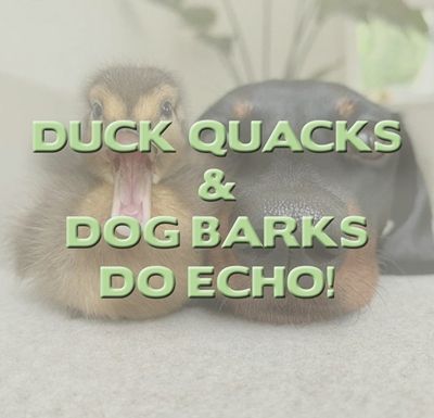
In summary, a duck’s quack and a dog’s bark are not special; they obey the laws of physics, but it is just too quiet and soft-ended to produce a noticeable, sharp echo.
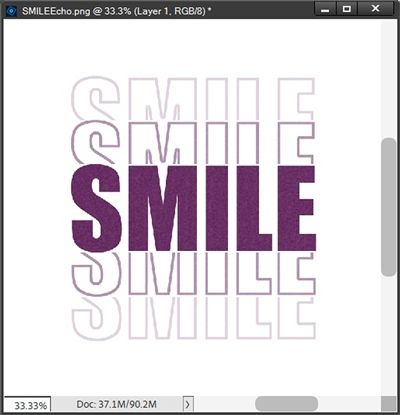
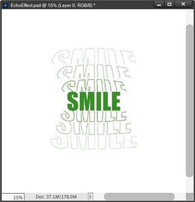
Stroked Title

The image directly above is an example of what I’ll be creating today. Just wait until you see how easy this really is.
Before I get started just a reminder; I use Photoshop Elements (PSE) 2024. If you use a different version, some of my screen shots may look different from what you see on your screen.
This technique will work best with a chunky, bold, sans serif font like: Arial Black, Arvo Bold, Bespoke Serif Extra Bold, Chintzy, Chunk, Espano, Franie, Frick, Impact, Toma Sunny and Uni Sans Heavy.
Of the fonts I listed above, Arial Black and Impact are general system fonts installed by default on the vast majority of Windows and macOS PCs. All the others are available free at various sites. Just click on any one of the font names listed above to see/download the font.
I’m going to start by creating a new 12×12 file with a white base in PSE:
I ensure that my Foreground/Background color chips are set to the default of B&W (press D).
Then I grab the Horizontal Type tool. In the Tool Options, I open the Font Picker and choose a sans serif font. Today I’m using Impact Regular. I set the Size to 100, the Leading to Auto, the Tracking to zero and click the Center Align icon. The Color Chip should already be set to black:
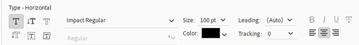
Note: You can use any chunky sans serif font you like. I caution you to avoid any that are script or italicized. I recommend using a font size between 90 and 125, depending on the font you are working with and the size of your title.
Because I want my text to be centered on my file, I am going to add both horizontal & vertical Guides:
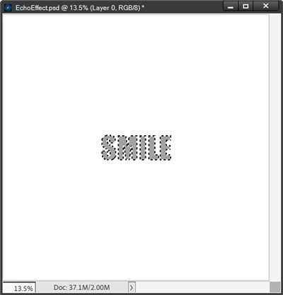
I position the cursor where the two guides intersect and click once. I then type SMILE in all caps and click the checkmark to commit the type:
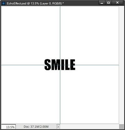
Note: Uppercase letters work best for this technique so all of the letters will be the same height.
Check The Tracking

I’m fairly certain you are already aware what the Tracking setting is in the Type tool. Tracking is the amount of space left between letters. Some fonts are designed with more space between each letter than others. I definitely don’t want any of the letters to be touching in any way. Nor do I want them to be too far apart.
Using Impact Regular with the Tracking set to zero, all of my letters appear to be sufficiently and equally spaced. So, I don’t see a need to adjust the Tracking for my word.
Note: If the font you’re using has either too much or not enough space between the letters, it is best if you adjust the Tracking (up or down) to achieve sufficient and equal spacing. Use my word spacing as a general guide. Just be sure not to reduce the Tracking so much that the letters overlap.
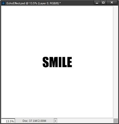
My word is centered on my file so I can now remove the horizontal and vertical guides.
Note: If you’re not certain that your word is centered exactly, please do the following. Select both the white layer and the text layer in the Layers Panel. Select the Move tool and in the options, click on the Align Center (horizontal) icon and the Align Middle (vertical) icon. Your word should now be perfectly centered.
Add The Stroke
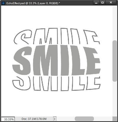
I’m now going to lower the opacity of the text layer to 50%:

Reducing the opacity of the text layer will allow me to see things a bit better during the next steps.
Ensuring that the text layer is active in the Layers Panel, I Ctrl-Click on the thumbnail of my text layer to create a selection:
I then click on the Create a new layer icon in the Layers Panel. PSE creates that new layer (Layer 2 for me) above the text layer. I immediately rename Layer 2 to “Bottom Echo”. I then go to the top tool bar and select Edit->Stroke (Outline) Selection.
PSE then opens the Stroke dialog box and I ensure the color chip is black, set the Width to 10px, the Location to Inside, the Blending to Normal, the Opacity to 100%, ensure the Preserve Transparency is not checked and click OK to confirm. I then cancel the selection (press Esc or Ctrl+D):
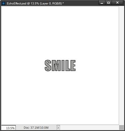
I now have a title with an inside stroke. Now to split the stroke…
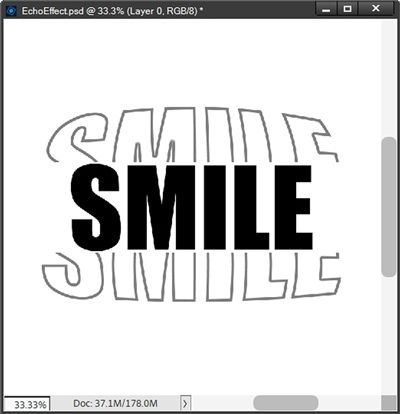
Divide The Stroke
The Bottom Echo layer should still be the active layer. I grab the Rectangular Marquee tool. In the options, I click on the New Selection icon, set the Feather to zero, the Aspect to Fixed Size, W (width) to 12 inches and the H (height) to 6 inches:
I click on the very top left corner of the file and PSE creates a 12×6 selection:
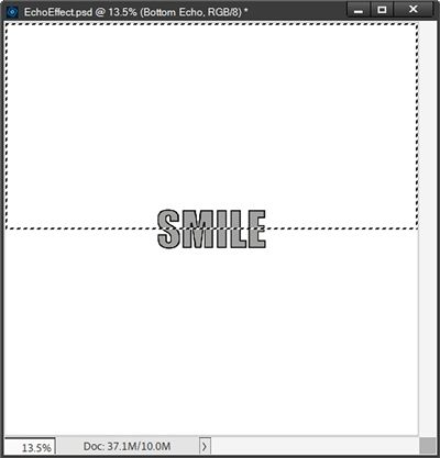
I then press Shift+Ctrl+J to cut the selection from the Bottom Echo layer and PSE places the cutout on a new layer (Layer 2 for me). I immediately rename Layer 2 to “Top Echo”.
At this point the selection box is gone and my “stroked” word still looks exactly the same. Now it’s time to make it echo…
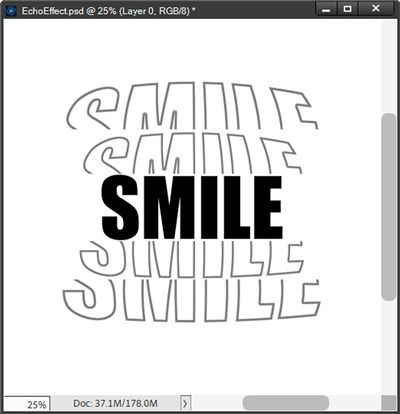
Create The Echo
The Top Echo layer should still be the active layer. I zoom in some and grab the Move tool. Then while holding down the Shift key I click and drag the Top Echo up until it’s positioned slightly above the solid title. I ensure there is just a small gap between the solid title and the top echo.
I want to keep my gaps consistent for the top and bottom echoes. The best way to do this is that I pay close attention to the “multidirectional arrow box” that displays while shift-dragging the layer. It looks something like this:
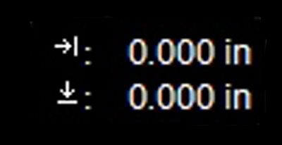
This indicator displays the change in the vertical or horizontal location depending on which direction I drag. I just make note of the value (for me it was .57) when moving the Top Echo up. Then I’ll try to achieve that exact same value when moving the Bottom Echo down.
Note: Given there are three decimal positions in that directional value, sometimes getting exactly the same identical value can be tricky. I’m happy if I can at least get it so it’s within .02 to .05 (plus or minus) inches of the original.
After positioning the layer, I lower the Opacity of the Top Echo layer to 50%:
Note: Holding down the Shift key while clicking and dragging ensures the layer moves directly up or down or directly side-to-side. It will also maintain a 45-degree angle while dragging diagonally.
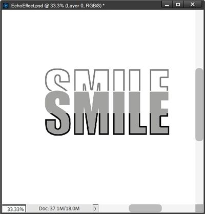
With the Bottom Echo layer active I hold down the Shift key and click and drag the Bottom Echo down until it’s slightly below the solid title. I ensure there is approximately the same small gap (.57) as what’s between the solid title and the top echo. I then lower the Opacity of the Bottom Echo layer to 50%:
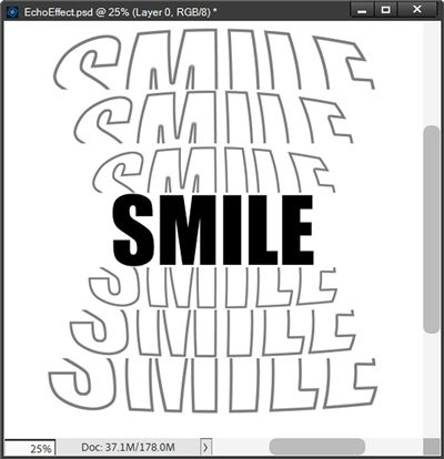
With the Top Echo layer active, holding down the Alt+Shift keys I click and drag a copy of the Top Echo up until it’s positioned slightly above the original Top Echo (leaving the same small gap). I then lower the Opacity of the duplicate Top Echo layer to 20%.
Note: Holding down the Alt+Shift keys while clicking and dragging will create a duplicate of the layer and maintain its horizontal or vertical position while dragging.
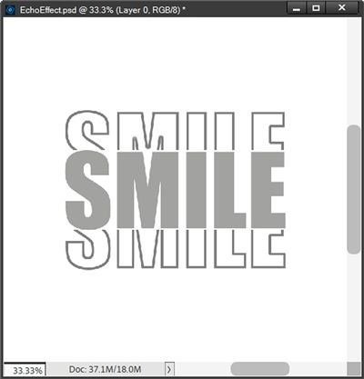
I repeat the same process on the Bottom Echo layer, change the opacity of the original text layer back to 100% and end up with this:
At this point I can do one of two things. I can copy/move all five of the layers to my layout in process; once on my layout I can recolor each of the layers independently.
Or I could hide the background, crop the file to size and save it as a PNG file with a unique name. When I pull that PNG file into my layout all I have to do is clip a paper (or a Solid Fill layer) to the image and the “echoes” will retain their transparency:
Either way, I now have what some would call a “traditional” title echo. And I’m sure by now you are likely aware I’m not always a strict follower of everything traditional 😉
Remember in the beginning I explained all the “sciency” stuff about echoes and sound waves? While the title echoes I created above are likely very similar to traditional ones you may have already seen, I have an alternate method that adds a more realistic touch…
Echo Realism
Creating an echo effect that is a bit more true to life is easier than you might think. I’m going to use nearly the same steps as I did above with a few modifications.
I’ll start with the same base word centered on my file:
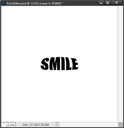
I duplicate the text layer. I hide the original text layer and immediately rename the duplicate Inflate.
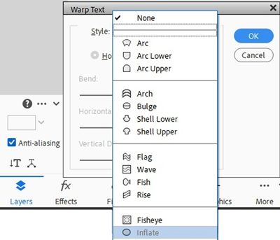
The first modification is that I’m going to create a warped text effect. I double-click on the Inflate layer to activate the entire text. I then click on the “Create warped text” icon in the Horizontal Type options (it’s beneath the Anti-aliasing box and looks like a T with diagonal arrows at the bottom). PSE opens the Warp Text Dialog box. I select Inflate:
PSE takes me back to the Warp Text Dialog box. The Horizontal button is highlighted and cannot be changed. I set the Bend to 50%, and set both the Horizontal & Vertical Distortion values to zero% (these seem to be the defaults):
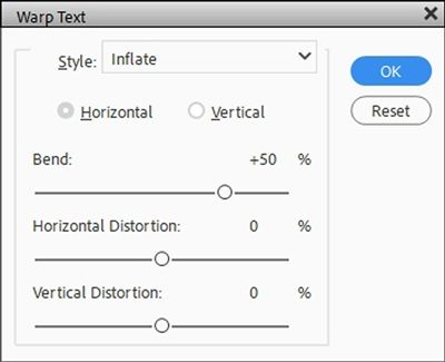
I then click OK to confirm:
Now I can create and split the outline just as I did above:
The thing is…the title needs to be “normal”; only the echoes should be warped. But this is easy to fix. I just hide the Inflate layer, unhide the original text layer and reposition the two echo layers to achieve the gap I desire:
And again, I can duplicate these echo layers just as I did before. But this time I’m going to increase the size of the duplicate echoes.
For each duplicate echo all I have to do is grab the Move tool, click on any corner anchor point in the bounding box and then set the W (Width) value to 115%. I can then just position the duplicate echo above/below the original echo:
I didn’t change the opacity on the second echo yet because I’m going to add one more set of echoes. I duplicate both the larger top and bottom echoes. Increase their sizes the same way I did in the step above and position them accordingly:
I like how the third echo accentuates the effect a bit more. I set the opacity of the echoes closest to the title to 70%, the middle echoes to 40% and the last echoes to 20%. I then add some color so you can see how this exaggerated echo effect looks:
I really like that these warped echoes seem to mimic how real sound waves get larger and “quieter” as they move farther away from the original “sound”. For me this is just a little more fun than the traditional echo effect.
You can play with both methods and decide which one you like the best.
And here’s a layout I made using an echo effect:
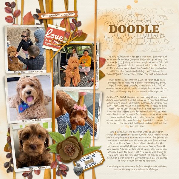
I love how the warped echo looks on this page! Not only does it echo the title, it echoes all the fluffiness of the dogs.
If you’d like to see more details about this layout you can find it in my 2026 Gallery. The title of this layout is “Doodle”.
A Few Tips

Remember…this technique works best with a chunky, bold, sans serif font. There aren’t too many script type fonts that work but something like Bellona can work. The trick is to make sure all the letters are the same height and not too italicized. But in my experience…most any script typeface will look odd in all caps!
If you save your echoed text as a PNG file for use on a layout it’s going to be easier to resize and recolor.
You can use as many “echo” layers as you have room for on your project. When using more than two echoes I usually adjust the opacity of each echo layer in different increments than what I used today. I try never to make the first echo any darker than 70% and the last echo no lighter than 20%.
If you have trouble clicking and dragging your echoes into a good position, try just using the keyboard arrows to nudge them up/down until you get the gap you desire.
You may need to play with the opacities of the echo layers depending on the color of your background and/or text.
Creativity involves breaking out of established patterns in order to look at things in a different way. – Edward de Bono
Thanks for reading this week’s Tuesday Tip. Remember, if you have any suggestions or questions please don’t hesitate to “Message Me“. Check back next week for tips about dimensional words. Click “Follow Me” to stay in touch. I hope you have a wonderful week!
