Puffy Words
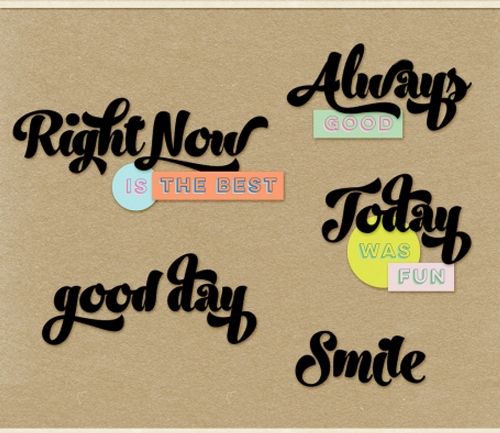
Last week’s post was all about an echo effect on titles. This week I want to talk about some word art. Do you ever look at some of your word art and find it falling flat? I know I’ve written lots of posts about word art. Today I want to talk specifically about layering your word art so it has some dimension. Take a look at the featured image at the top of this post; that certainly doesn’t look flat. And that’s just one form of layered word art. One way that isn’t used a lot but can be fun is to create some puffy words.
A lot of people don’t like puffy titles. I use them sparingly. However, when it comes to layered word art, I’m a bit more likely to puff up a word or two from time to time. But again, I don’t see too many designers that specifically use puffy words to create dimension in their word art.
And what I’m about to show you can be done with either the word art you create from scratch or some that has come with a kit.
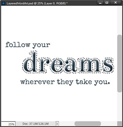
Note: The sample layered word art in the featured image is available at DigitalScrapbook.
Layered Word Art
Before I get started just a reminder; I use Photoshop Elements (PSE) 2024. If you use a different version, some of my screen shots may look different from what you see on your screen.
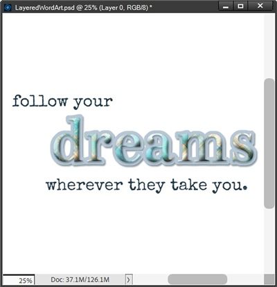
Note: The word art in the image above is made with elements and a paper from “Beach Breezes” by Jessica Dunn of The Curio Pantry. Fonts used: Bentham & Special Elite.
When I use the term “layered word art” I’m not simply referring to the single word that you see in the image directly above which is layered over a background of sorts. Layered word art comes in many forms. One form can be seen in the featured image at the top of this post.
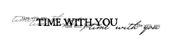
Then there is the “multi-type” version of word art that I use a lot which looks something like this:
That particular piece of word art is from a pack created by Katie Pertiet Designs. Another is this “multi-size” version:
The word art directly above is from “Ocean Bits” by Marisa Larin.
The image at the top of this section is some word art I created to give you an example that is more along the lines of what a lot of designers call layered word art. That type of layered word art frequently involves dimensional text of some sort layered over/with either elements (i.e. flowers, paint or transfers) or merely placed over a background shaped like the word(s).
My example specifically has a puffy word. And today I’ll be walking you through the steps required to create something similar “from scratch”.
I’m going to start by creating a new 12×12 file with a white base in PSE:
I have a layout in process and I know what quote I want to use for the word art (or at least I think I do 😉). So, I’m going to set my Foreground color chip to a shade of deep blue (#1f3b4c) that will go well with my layout.
I’m also going to be using the fonts mentioned above: Bentham Regular and Special Elite Regular (links above). You don’t have to feel obligated to use these fonts. Feel free to use any fonts you like.
I then grab the Horizontal Type tool and select the Bentham Regular font, set the Size to 125pt, the Leading to Auto and the Tracking to zero. The color is already set to the shade of blue I used for my Foreground color chip.
I position the cursor somewhere near the center of the file and click once. I then type my “key word” and click the checkmark to commit the type:
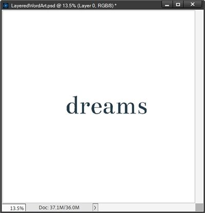
Note: You can use any color and placement of text that you like.
I then click somewhere on the white base and once again grab the Type tool. This time I select the Special Elite Regular font, set the Size to 30pt, the Leading to Auto and the Tracking to zero. The color is still set to the same shade of blue.
I’ll be using two other lines of text for my word art; one above my key word and one below. For the first line, I position the cursor somewhere above and about an inch or so left of the word “dreams” and type my first line and click the checkmark to commit.
For the second line, I position the cursor somewhere below and just slightly left of the word “dreams” and type my second line and click the checkmark to commit:
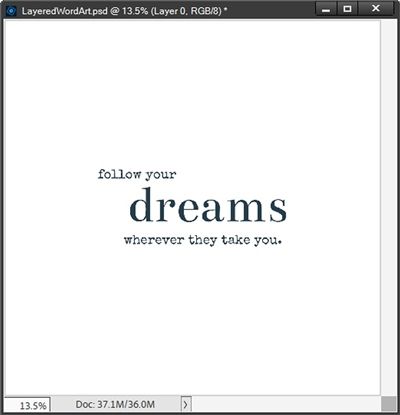
I want the word “dreams” to be the focal point of this word art. Right now, it’s larger and shows up nicely but it still just looks flat. That’s where the “puffy” part of this technique comes in…
Puff It Up
I’m going to duplicate the dreams text layer (duplicate is named dreams copy) and hide the original. I do this simply so I can keep a copy of the original, unaltered text. I’m going to add a bevel to the dreams copy layer.
Before I do that, I want to say one thing. In my experience I tend to be happier using a standard PSE Bevel layer style rather than creating one from scratch. Anytime I use a PSE bevel it just looks nicer and somehow a bit more pronounced than ones I try to create even if I use the same lighting, direction and size.
Here’s an example of what I’ve run into in the past:
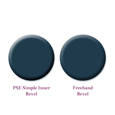
It could just be me, but I see a fairly noticeable difference when using the PSE bevel. So, for now that’s the way I’m going to go.
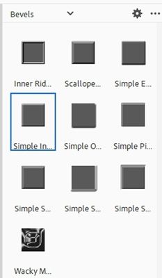
With that said, I ensure the dreams copy layer is active, I click the Styles icon at the bottom of the Layers Panel. PSE opens the set of layer styles I last used. I then scroll all the way to the top and look for the standard PSE Bevels layer styles:
I select the Simple Inner bevel (farthest on the left in the second row):
PSE applies the style to the text. I then go back to the layers panel and double click the fx icon on the right side of the dreams copy layer.
PSE opens the Style Settings dialog box and I set the Lighting Angle to 120 degrees. I then check the Drop Shadow box and set the color chip to match the same shade of blue (#1f3b4c) I used for the text, set the Size to 15, Distance to 10 and Opacity to 50%. Under the Bevel options I leave the Direction set to Up but change the size to 50px:
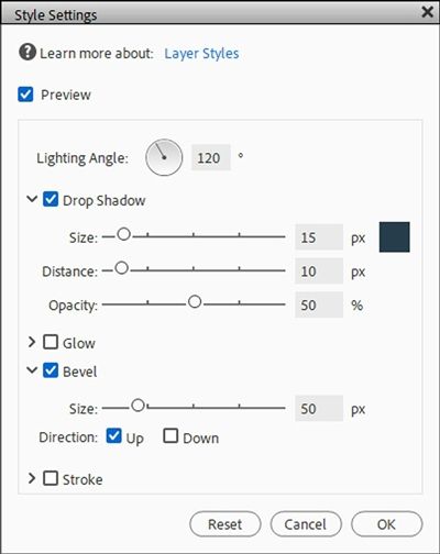
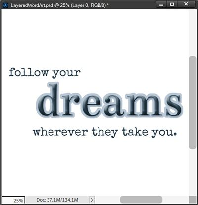
I click OK to confirm and zoom in just a bit so you can better see the change:
This certainly puffed the word up just enough to make it look more dimensional. But I do think it still needs a second layer to give it a bit more of a boost.
Note: If you’d rather create a bevel “from scratch” please feel to do so. Just go to the top tool bar and select Layer->LayerStyle->Style Settings. Then set the Drop Shadow and Bevel settings to the exact values I used above.
Add Second Layer
With the dreams copy layer active, I Ctrl-Click on the thumbnail of the layer to create a selection. I then go to the top tool bar and click Select->Modify->Expand. PSE opens the Expand Selection dialog box and I set the Expand By value to 23px and click OK:
I then click on the white background to make it the active layer. In the Layers panel, I click on the Create a new Layer icon. PSE creates that new layer (Layer 2 for me) directly above the white background. I’m going to set my Foreground color chip to a shade of blue (#98abbb) that will work well with my current project.
Then I press Alt+Backspace to fill the selection with the Foreground Color and cancel the selection (Esc or Ctrl+D):
Ensuring Layer 2 is still active, I go to the top tool bar and select Layer->Layer Style->Style Settings. PSE opens the Style Settings dialog box and I set the Lighting Angle to 120 degrees. I then check the Drop Shadow box and set the color chip to match the same shade of blue (#1f3b4c) I used for the text, set the Size to 15, Distance to 10 and Opacity to 50%:
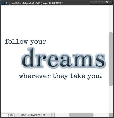
I really like how this adds just the right amount of dimension. The key word stands out, is clearly the “focus” word but does not seem overly distracting.
Note: Typically, word art with a second layer like this will result in no gaps between letters on that second layer. If you see gaps, you can do one of two things; start over and decrease the tracking of the original text. Or, actually the easier thing is to increase the amount by which you expand the selection around the text before creating that second layer.
I could go on to add another extra touch by clipping a paper to the puffy text. I’m going to pull in a nice plaid paper that I think might work well with the colors I’ve already used:
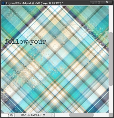
Note: This paper is from “Oceans” by WendyP Designs. You can use any paper that suits your project.
All I have to do is clip it to the dreams copy layer:
Well, that certainly added a boost to the puffy word! So, you can see, there’s more than one way to add dimension to the text.
I can now either move/copy all of the required layers (all text layers and the plaid paper) to a layout in process. Or I could just hide the white background, crop the file to size and save this word art as a PNG file with a unique name for use at a later time.
Note: Clipping a paper to the text is totally optional. You can try things both ways and decide for yourself which way works best for your project.
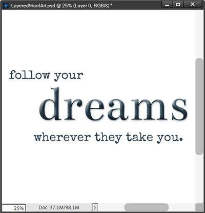
And here’s the layout where I used the puffy words effect on my word art:
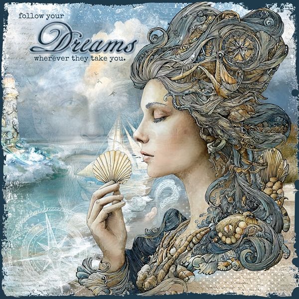
You may have noticed the word Dreams in this layout is not the same as what I showed at the start. I used a different font (Geographica Script Regular) and did not clip paper to it in the end.
If you’d like to see more details about this layout you can find it in my 2026 Gallery. The title of this layout is “Follow Your Dreams”.
Existing Word Art
Now, if you remember back at the very beginning, I mentioned you can add dimension not just to text but also to a piece of purchased word art.
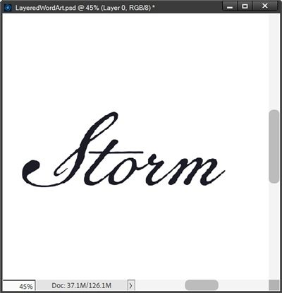
I have this lovely piece of word art from “Lighthouse” by Manu Scraps:
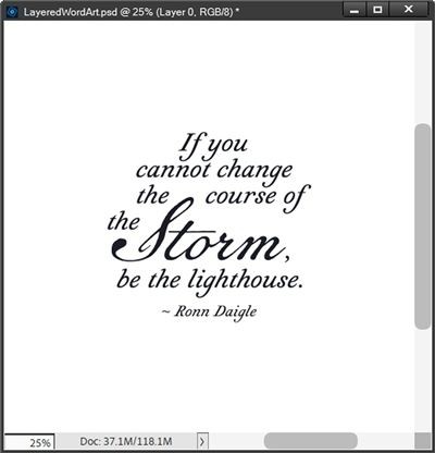
I want to add dimension to the word “Storm”. Before I do anything to modify this word art, I need to simplify the layer.
With the Polygonal Lasso tool, I create a selection around just that part of the word art:
I hope you noticed that I did not include the comma. I purposely excluded the comma because I may need to deal with that separately later.
With the word art layer active I press Shift+Ctrl+J to cut the word “Storm” out of the word art. PSE places the word on a new layer (Layer 3 for me) directly above the word art layer. I hide the original word art, rename the new layer to Storm and zoom in just a bit more:
For demonstration purposes, I am going to leave the word black. Truth be told, it’s not truly black. It’s actually a very, very dark shade of blue (#111924). I could alter the color but it won’t really change how I proceed with creating a puffy word.
I can now go on to repeat the same steps I used on the word dreams in the prior section. I create the bevel, shadow and second layer. But this time I expanded the selection for the second layer by only 10px vs. the 23px I used above. And here’s the puffy Storm layer:
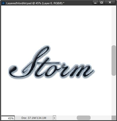
I know, right now it looks like the word storm isn’t “black” anymore. Trust me, it hasn’t changed. The highlights in the bevel seem to be picking up a color cast from the second layer. and honestly, I don’t mind that it now looks a bit different.
Note: I also lowered the intensity of the shadow on the second layer using the following settings: Size=8, Distance=10 and Opacity=35.
Now, I unhide the original word art layer and zoom out a bit so you can see the full word art:
As it turns out, I don’t need to do anything with the original comma. If I had made the second layer (the blue) any bigger I may have needed to adjust the placement of the comma. But I think it looks just fine as is.
If the comma had been too close to the puffy word, I simply would have cut the comma from the original word art (Shift+Ctrl+J) and nudged it farther away from the puffy word.
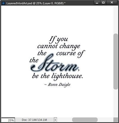
Again, I could also go on to clip a paper to the Storm layer but I think you get the idea. There is one other thing I want to share before I let you go for the day.
Multi-Type Word Art
Not all purchased word art will be as easy to work with as that last piece. The word “Storm” was not touching any other portions of the word art and it was easy to isolate that individual word. But don’t be afraid to tackle a piece of word art where that’s not the case.
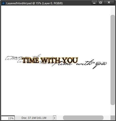
Let’s take a look at that “multi-type” version of word art I showed you earlier:
As a reminder, this piece of word art is from a pack created by Katie Pertiet Designs.
If I wanted to puff up the “TIME WITH YOU” phrase I can do one of two things. One would be to identify the font used and just type the phrase over top of the original word art. The other way is to create a copy of the phrase and remove any unwanted portions of the other text.
And if you’ve read my “What’s That Font” post from back in May of 2023, you already know you have to do all that just to identify the font. So, one way or the other I will have to “extract” the phrase.
Up above, the word Storm was easy to isolate (the font used for Storm was Geographica Script Regular) and I really didn’t need to retype it. The phrase I’m looking at now won’t be quite that easy. But it can still be done it’s just a bit trickier.
I’ve already created a copy of the phrase, named the new layer Time, hidden the original word art and zoomed in a bit more:
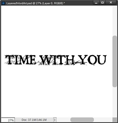
I then grabbed the Eraser tool and using a small hard round brush at 100% opacity I brush away all the portions of other text that I want to remove:
This was a bit tedious but it will be worth it in the end.
In order to identify the font, I only need to use one of the words. So, I make a selection around the word “WITH”, copy it to my clipboard (Ctrl+C), create a new file from my clipboard, save the file as a JPG and use that word in a font finder like WhatFontIs.
I was able to identify the font as BlackBeard Regular. Now I have a choice, I can either type the phrase over the original word art and try to get it to line up exactly, or just use the Time layer and puff up the phrase the same way I did above with the word Storm.
The key to making a decision boils down to a personal choice. If it’s too tricky to get the typed version to align exactly, sometimes the easiest way to go is using the extracted copy.
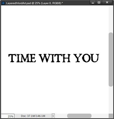
In this particular case I can tell you that typing the phrase was not as easy as using the extracted copy. The font was spot on but trying to get the tracking right was a nightmare. I could have made it work but for me, it was just easier to use the extracted version. And here’s how it turned out:
I think that worked out just fine. And since there’s so much other text behind, I think it might be a bit distracting to clip a paper to the phrase. I’m afraid it will just make it look a bit too busy.
Extra Tips

Clipping a paper to your puffy word is not required. In fact, sometimes I think it can be a distraction. It just depends on how you’re using the word art.
And there’s also no requirement to add the second layer. There are times when having only the puffy word is just right.
One thing to think about when setting the tracking for your text is whether you’ll be adding the second layer (solid “background”) to your word art. If you are and you don’t want the second layer’s letters to touch, you’ll need to adjust either the tracking of the text or the size of the selection around the text.
If you’re using purchased word art and want to try typing the portion you want to make puffy, even if you already know the font being used, it can be tricky to mimic the tracking exactly.
And know this…You do not need anybody’s permission to live a creative life. – Elizabeth Gilbert
Thanks for reading this week’s Tuesday Tip. Remember, if you have any suggestions or questions please don’t hesitate to “Message Me“. Check back next week for tips about PSE hijinks. Click “Follow Me” to stay in touch. I hope you have a wonderful week!
