What’s That Font?
I know I’ve written several posts about Fonts & Journaling and you’re probably wondering if I’ll ever stop. But I thought it was high time I made sure you knew how to identify a font in an image.
Have you ever seen a font online that looked perfect for your next project, but couldn’t figure out what it was? It’s happened to all of us, and there are few things as frustrating as needing to identify a font. Maybe you’re trying to match the font in an existing piece of word art, or you saw an amazing layout and fell in love with the font used for the title. Or perhaps it’s as simple as seeing a gorgeous G (so hard to find) on a wedding invitation.
Today, I’m going to offer some tips that I hope will help you.
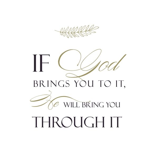
Note: The featured image is a piece of word art from my private stash…creator unknown.
Identifying Fonts
First of all, you need to level your expectations. While there are many tools out there for font identification, all of them have limitations. This is where a bit of typography theory would come in handy. But I’m not about to get into explaining how details such as the terminals, bowls, counters, loops, etc., will affect your search. If you want to learn about these typography details please search for some tutorials on the internet.
There are a multitude of free online tools that can help you identify a font. But as I already mentioned they each have their limits. Three of the most recommended tools are: What The Font (powered by My Fonts), What Font Is, & Font Squirrel. Of these 3 I find Font Squirrel to be the least user friendly, but I have used it from time to time.
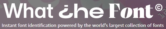
“What The Font” is great but the list of fonts a search returns will include only fonts available for purchase (at least in my experience). That said, it doesn’t mean that you can’t do an independent search for any of those fonts to see if there is a free version. The upside is that you typically don’t have to parse (separate) letters in a word that are joined together, as you’d find in most script fonts.

“What Font Is” gets my vote as the go-to font identifier. You have the option to select that the search returns only free fonts. So that’s a huge plus in my book. While you do have the option to draw lines between joined letters, it’s not always fool proof which brings me to the downsides. There are basically only two downsides: 1- there are some pesky ads but they aren’t a deal breaker & 2 – you may have to manually parse any joined letters to get good search results. More on that in a bit.
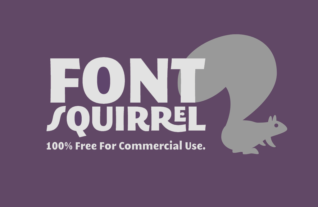
“Font Squirrel” just isn’t as user friendly as the other two. You will almost always have to parse any joined letters. And I have found the results returned aren’t anywhere near as close a match as what I see with the other two tools. Needless to say, this is my “last resort” tool but it can work in some instances.
Now on to the “hard part”…
Parsing Words/Letters
So, if you read my post about cutting elements into pieces this should be a breeze for you. At least in most cases. Regardless, today I’m going to walk you through some basic steps to get you started.
I’m going to work with the word art featured at the beginning of this post. Everything that follows is done using Photoshop Elements (PSE). If you don’t use PSE, I’m fairly certain you can accomplish the same in whatever graphics editor you are using. Just search for tips/tutorials for your specific package.
With the word art open in PSE, I selected the Rectangular Marquee tool in the Tool Options. I made a selection around the word THROUGH. Then I selected Edit> Copy which placed my selection into my clipboard. I then selected File> New> Image from clipboard. I saved that new file as a JPG under a new name.

For optimum search results it is best to convert your new image to black & white with a high contrast: If you’re not sure how to do that please refer back to my post about incorporating handwriting into digital layouts. For this particular word I didn’t need to do that as it is already black & white.
With the word extracted from the main image I uploaded it to “What Font Is”. Since none of the letters were touching, all I had to do was step through their process and execute a search. I’m not going to go into all the detail for the steps since it’s really self-explanatory on their site.
I was thrilled when the very first font returned in the search list was an identical match – Cormorant Upright. “What Font Is” provides a link to download the new font.
Easy peasy…right?
But what if your letters are touching as they are in the word God? Well, that depends. In this particular case I didn’t need to parse the letters because I knew I’d be able to “separate” them within my font search tool. And here’s what that looks like in “What Font Is”:
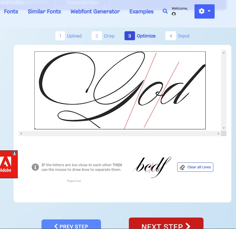
Unfortunately, neither “What The Font” or “What Font Is” returned an exact match for the font. “Font Squirrel” didn’t even come close! “What Font Is” did identify what I deemed a suitable alternative font – Fontaine de Diamant. Using “What The Font” a closer match was Desirable Calligraphy but I couldn’t find a free version of that particular font. I try not to make a habit of paying for fonts so I downloaded Fontaine de Diamant from Dafont.com…it’s close enough for my needs.
Sometimes you won’t be able to “cleanly” separate the letters using the lines in “What Font Is” as depicted above. Let’s look at a different word art example:

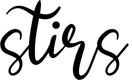
This is a piece of word art from “Winter Beach” by TraceyB Creations (no longer available). You can see that there are multiple places where the ”crossbar” of the letter “t” spans across other letters. It’s going to be pretty tough in some of those cases to draw clean separation lines in “What Font Is”. This is when you’ll want to parse your letters manually. I know there are words in that example that I could likely extract and still identify the font. But I want to show you how to parse letters when you have things like those pesky “ts”. So, I’m going to use the word stirs.
All I have to do is extract just that word from the word art and create a new file. If you’re not sure how to do that refer back to my post about removing parts of an element. Since the last “s” in stirs is so close to the “t” in the next word I’ll likely need to erase part of that “t” in the new file. This is what you want to see:
With the new file containing only the word “stirs” open in PSE I can begin parsing the letters so there is sufficient space between each letter allowing “What Font Is” to easily see the individual letters without the need to draw the separation lines.
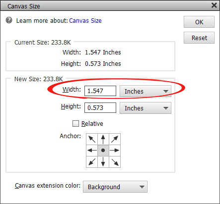
First, I need to increase the canvas size of the new image giving enough room to spread the letters apart. I usually just double the width of the canvas. Typically that gives more than enough room. To do this just select Image> Resize> Canvas Size. Increase the width of the canvas and select OK.
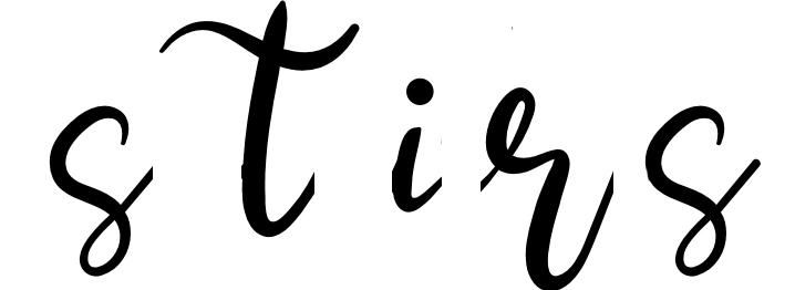
With the canvas resized I draw a selection box around the letter “s” and create a new layer via cut (not via copy) being careful not to cut into the letter “t”. It doesn’t have to be perfect as I can clean up each letter with the eraser tool if necessary. Then I just move the letter “s” over near the left edge of the canvas.
Now, the letter “t” is going to be a bit trickier. It’s not going to be possible to cut just that letter out. So, this time I’ll create a new layer via copy (not cut) being sure I have the entire letter. I’ll definitely need to use the eraser tool to remove the letter “i” from that new layer. Then I move the “t” to the left close (but not too) to the letter “s”.
Since the letter “t” was copied to a new layer, I also need to it erase from the original layer and finish “cutting” the remaining letters onto their own separate layers. This is what you want to end up with:
Crop the file to size and save it as a JPG file. It’s now ready to use in “What Font Is”.
All the hard work pays off when “What Font Is” shows a free font identical to what was used in the piece of word art – Anjellic Dafont. I definitely downloaded this one…it’s a very pretty script font!
Sometimes you’ll run into trouble finding an identical font due to the glyphs (fancy curls/extensions) the designer may have used when creating the word art. But you should be able to find a font that closely resembles your sample in all other ways. Often times when this is the case you may also find that once you pick & download a font, there may be glyphs associated that will work.
Replacing Words In Word Strips
Now that you know how to extract words to identify fonts you should be able to more easily modify existing word strips/bits to fit your needs. For example, let’s say you’re working on a layout about a vacation to Lake Michigan. You have the perfect kit complete with word art/strips. Unfortunately, they tend to be more seaside than lakeside oriented.
No problem. Just identify the font(s) and make the adjustments. However, there can be one little wrinkle when it comes to word strips. Unless your word strip is a solid color or made using a paper from the kit, you will need to get creative. But it’s not too difficult.

This word strip is from “Nantucket Feeling” by The Curio Pantry. I was able to identify the font as Trailmade and it was available free. So, that’s half the battle. Now what to do about the background?
There are several options. Since I know the font I could always create my own word strip using whatever background I want. But I do like this background so I’m going to do something else.
Since there’s no paper in the kit that matches I’m going to use the Clone Stamp tool to “brush away” the word ocean. With the word strip open in PSE I select the Clone Stamp tool and a nice, soft-edge round brush.
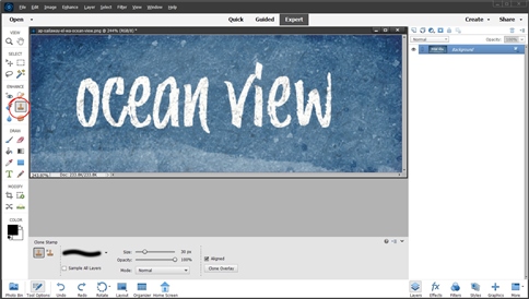
Then I just “clone” portions of the background over the word ocean until I’m happy with the background. This can be a tricky process if you’re a beginner. But just play around with it until you’re happy with the results. This is what I came up with:

Then, using my new font I just added the word lake to replace ocean:

I know I ran through all of this in an abbreviated fashion. If you get lost, confused or just need some help…please don’t hesitate to message me & I’ll try to be of assistance.
Single Most Important Tip About Identifying Fonts
Lower your expectations and be patient, even though there are hundreds of thousands of fonts out there…you still might not easily find the perfect match. Especially if you don’t want to purchase fonts. Sometimes you just need to learn how to settle for “close enough”. Believe me, I know how hard it is to do that 😉
I hope my pointers above encourage you to think outside the box and not feel like you’re stuck using only the supplies you have in a kit. Be creative, stretch not only your supplies but also your imagination.
Thanks for reading this week’s edition of the Tuesday Tip series. If you don’t want to miss what comes next just click “Follow Me” to stay in touch. And as always…“Happy Scrapping!”