Ready To Add Words?
Now that you’re working on some scrapbook layouts you’ll want to think about titles & journaling. This will likely lead you to exploring fonts & alphabets.
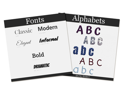
Step #9: Fonts & Alphabets
To some this might seem a bit redundant. Fonts, alphabets…aren’t they the same. Well, not exactly. In the world of scrapbooking these two things have always been different. For those of you who may not understand I’ll explain. Simply put, fonts are what we use in a word processing program or font tool in a graphics editor. With fonts, we merely type whatever verbiage we like using a predefined format for the text (the font itself). For alphabets, we use individual letters (elements) to physically create the word by placing each letter in place.
Should be easy right? Well, not always…
Fonts

Digital scrapbooking projects will often include text of some kind, whether it is for a title, a date, a poem or some journaling. To complete your layout, you can always use the text tool in your graphics program. It has many advantages over the use of fancy alphabets (alphas), but also some draw backs. When is it better to use fonts?
Fonts are the best choice when you want to add journaling, dates on photos or a caption underneath. This is obvious as you need something smaller and often simpler so it is easy to read. Considering that journaling or a caption is often written with text about 1/8th of an inch, you can imagine that you would likely lose all the fancy details of alpha elements. Also, if you want to use text that is supposed to be handwritten or printed, you don’t need the fancy textured and 3D alphas (although some alphas are made to look like flat ink or paint).
Fonts Allow More Flexibility
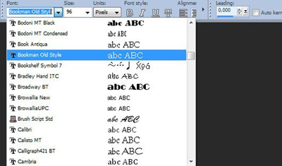
The text tool is present in just about all graphics programs, so you have the possibility to show your text displayed in your favorite font. If the text you want to write does not require a fancy look, simply typing it can be enough. If you want to be a little fancier, most graphics programs have “styles” that will let you “zhuzh up” your words after you have written them. Watch for a future post about using styles.
Using your own text tool and font will allow you to write just about anything, using letters, numbers, punctuation, accented characters or even some other types of symbols available in the particular font you want to use. Your graphics program probably has the option to choose a fill color and an outline color which will allow you to match your text to the project you are working on. Sometimes, you can even use gradients and patterns instead of solid colors as fill or stroke. Fonts are basic parts of your graphics and/or word processing program, whatever it is. If you want to learn more about using fonts, you can search for more tips & tutorials on the internet.
Finding New Fonts
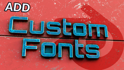
You can find many fonts on the internet and several sites specialize in free fonts. These fonts are often referred to as “custom” fonts because they didn’t come with your “system”. There are tons of choices in simple, traditional or fancy fonts. You can find a list of my favorite font sites on the “Resources” Page. Some stores and sites also offer some fonts for sale with a very wide price range.
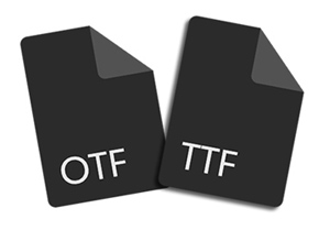
Font File Types
Most people struggle to understand what Open Type Font (OTF) and True Type Font (TTF) mean when we talk about fonts. These two are the most used fonts in current times, and generally, a comparison of the two will favor OTF. Though comparing the two is not a straightforward affair as there are a lot of dynamics involved.
TTF font was created because both Apple and Microsoft had a common goal: create a font that was capable of working across Windows and Mac and could be deciphered by most printers by default.
OTF was designed to enable more functions than TTF. An example being that OTF has a format capable of storing as much as 65,000 characters. The ability to keep extra characters besides the usual ones (A-Z, 0-9, punctuations, and symbols) gave designers a platform to add more character to OTF, such as: Ligatures, Glyphs, Small caps, Alternate characters, & Old-style figure.
The most significant difference between OTF and TTF for both “rookie” & professional designers lies in the advanced typesetting programs. For typical day-to-day tasks (non-professional), TTF will be just fine. But the key difference for most non-professionals is that OTF has provisions like glyphs and ligatures that present with multiple options for use.
When comparing OTF and TTF, the more robust of the two is the former due to its additional features. OTF is designed with more features to help designers and typesetters have the flexibility they need to make adjustments to a piece and make it look better. If you have to choose between the two, OTF is the choice to make, but if you cannot access OTF, there is no harm in using TTF.
Font Styles
There are thousands of fonts and typefaces existing in the world, and creatives are adding to that number every day! Every small variation could be considered a new, original font. To help narrow down and sort through the list, there are six basic categories that fonts will typically fall into:
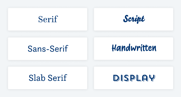
Note that there are additional categories, but knowing these six basics will give you a starting point to recognize the characteristics of each and make informed decisions about your text. While the first three (sans-serif, serif, and slab serif) are pretty straight forward, easier to distinguish, and might be suitable for all kinds of text, the latter three (script, handwritten, and display fonts) get tricky and should only be used for display purposes.
I was going to go into more detail about each style but you can look them up on the internet if you need more information. For now, I’m just going to offer a few simple facts on each!
Serif Fonts: This font style has these tiny decorative tails or tapers and has been used in print since the 15th century. Any font that has these fancy appendages is a serif font.
Sans Serif Fonts: “Sans” is the French word for “without.” So, a sans serif font is anything “without serif,” meaning no feet, no little strokes, no extensions. They started to gain popularity at the beginning of the 20th century and therefore are categorized as modern fonts.
Slab Serif Fonts: These fonts can have thick, sometimes exaggerated, block-like serifs. They seem to have come up in the 19th century. At least that’s when they were most popular. This is also the reason why they might be associated with the wild west, especially in display sizes with very striking or even decorated serifs.
Script Fonts: This font style represents calligraphy, writing tradition and penmanship. This is a very broad category, and it can go from something you would see on a wedding invitation (round hand script) to a Surfer’s Bar (brush script) or a beer label (blackletter).
Handwritten Fonts: This font style is about creating the illusion of being handwritten by someone. They seem approachable and relatable, not necessarily fancy, or artistic.
Display Fonts: This font style is basically everything that did not fit anywhere else. It’s a very broad category containing fonts that are designed for short-form and often large-format applications. They can get very thematic or atmospheric, and create all kinds of moods. Display fonts come in all shapes and sizes, AND can be any of the types listed above. A display font is defined by its purpose: an attention-grabbing header or standalone statement text.
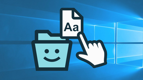
Installing Fonts
After downloading your fonts, I would highly recommend that you create a separate folder on your hard drive in which you can store all the fonts unzipped (decompressed) that you download. Then rather than just immediately installing these fonts you would place them in that “non-system” font folder. This way you’ll have an “extra” copy of the font besides the folder in which your system stores them if you do install them.
There are multiple reasons that I suggest this. First, depending on your computer system, it can be difficult to find where the system font folder is physically located. And even if you can find the location it may not be easy to see just a “list” of fonts. I think the Windows “font viewer” is cumbersome. But that is just my opinion…likely generated by years of having more fonts than I care to admit.
The next reason to save them before installing is two-fold:
1 – You don’t want to install unnecessary “duplicates”. What do I mean by that? Well, often times when you download a font, you may receive the same font in two different formats, True Type (TTF) & Open Type (OTF). You certainly don’t need to keep both. As I mentioned above, OTF is the choice I recommend. And you definitely don’t want to install both.
The actual process of installing fonts varies by operating system. This post is already pretty long so I’m not going to go into that here. If you want to learn more about installing fonts, you can search for more tips & tutorials on the internet.
2 – If you have all your fonts in a non-system folder you will have more options available to you.
So now you’re probably wondering what kind of options. Read on…
Font “Saving” Options
I’m certain you’ve likely encountered a situation where you download and try to install a font only to have your system tell you that it’s already installed. Yet when you look at the “font view” for each of them they’re clearly different. So how is this a duplicate?
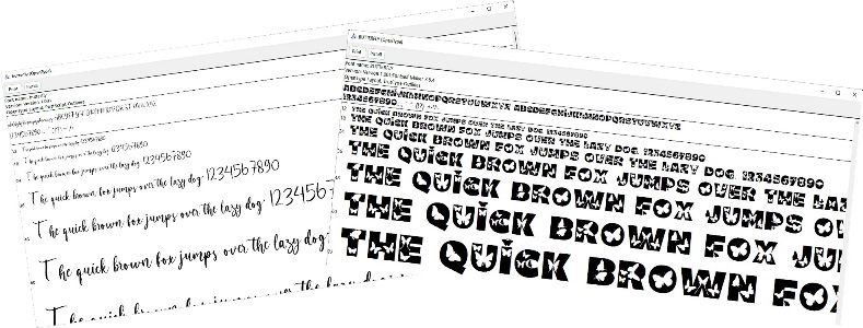
That’s a tricky question to answer. But here’s the quick version. The font “file name” (the one you see in the downloaded file) can be and often is different than the actual “internal” font name (the one you see at the top of the actual font view). The computer system looks at the font name vs. the file name when you install a font. It is possible for more than one font designer to create a font that has the exact same name as another.
Unless you have a robust font editor it is nearly impossible to change the internal font name. But you can change the file name and still keep both versions of the font in your non-system folder. This would allow you to uninstall one and install the other whenever you want to make a switch. Cumbersome but it works.
If by chance this “duplicate” font you just downloaded came in both OTF & TTF formats, you have another option. If the font you already have is in OTF format you can save the TTF format (rather than renaming) of the new one. This won’t change the issue of having to uninstall/re-install and you’ll potentially lose some special features contained in the OTF file. But it’s still an option.
By keeping your fonts in a separate folder, you can more easily use a font manager. With a font manager you typically never have to install a font again. All you need to do is “activate” the font you wish to use. A font manager typically doesn’t care if you activate more than one font that has the exact same font name. As long as the file names are different, you can have as many fonts as you find with the exact same internal font name. Watch for a special post about font managers in the very near future (wink, wink).
Some Important Tips About Fonts!
First, before downloading and using free fonts, you need to be aware of the rules. Just because it’s free doesn’t mean you get to do whatever you want with these fonts. Most of the free fonts available on the internet come with limited licenses, which means you can only use them with personal projects. However, there are sites that offer free fonts with commercial licenses. Just be sure to check the license for each font you download before using them with your projects.
Third, I really love fonts. I openly consider myself a font junkie. But how many fonts is too much to install on your computer? There is no “hard” limit on modern versions of Windows or Mac OS. But installing more fonts will use up more system memory & make your font menus longer and harder to navigate. It used to be that you could typically expect to run into installation problems with 1000 or more installed fonts. But today there really is no magic number. The maximum number of fonts will vary from system to system due to RAM/operating system and the way the system registry works.
That said, I personally ran into a very serious performance issue on a brand-new computer (with a huge solid state hard drive, massive RAM and running Windows 11) when I tried to install every font that I own (exact number will remain anonymous to protect the “innocent”). When I say a serious problem…I mean frequent crashing. Needless to say, this led me to finding a font manager. Which by the way, was the best thing that has happened to me (technologically) for a while.
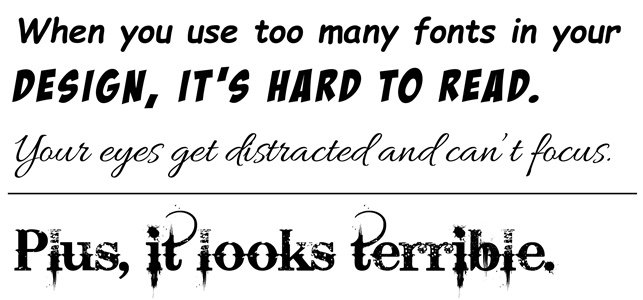
Fourth, too many fonts aren’t just an issue with computer/program performance. It is possible to use too many fonts on a page. Fonts can be fun to look at and play around with. After going through your whole font library, it may be hard to pick one or two that you’d like to use, so you might as well pick them all, right? Of course, I’m just kidding! As a rule of thumb, try sticking to two different fonts that work well together, and play around with the font weights to keep them balanced. Also, try keeping the content of your design in mind. Although you may have found two fonts that match each other, if they don’t match the content, your page could become confused. Look at the design above as a reminder that having too many fonts in one design is bad—really, really bad! I’ll offer some additional font selection & “pairing” tips in a future post.
Alphas
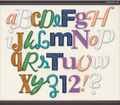
Alphas are significantly different from fonts as they are not installed on your computer, they are png files that you layer on your project in the same way as you would with other page elements. Alphas work best when designing titles or word art. Some punctuation marks and/or symbols can be used as interesting standalone elements on your page. Many digital kits come with customized alphas to match the kit’s theme/color scheme.
Alphas today aren’t just your simple block letter alphas. They come in a wide array of styles from boho to beautiful, fabulous florals to marvelous medieval alphabets, and more. All you have to do is search for Digital Scrapbook Alphabets on the internet or in any digital supply shop and you’ll see what I mean!
And not all alphas are created equal. You’ll find that some designers will include upper case, lower case, numbers, along with punctuation marks & symbols, all as individual elements. Other designers will just provide a full sheet (in png format) of all their alpha characters. When this happens, you’ll need to “cut out” each letter/symbol independently before using. So, if you don’t want to fuss with cutting each character out be careful when you purchase.
Single Most Important Tip About Alphas!
If you’re looking to purchase a standalone alphabet, look for simple, neutral alphas that are easily recolored.
If you like what you’ve read, please click “Follow Me” to easily stay updated for Step #10…