Trapped White Space
So, two weeks ago my post was all about creating White Space. After talking so much about white space I was reminded of a “rule” that I should really try to cover. I know, I generally say there are no rules but there’s always an exception or two (or more). And the trapped white space rule is one I try (not always diligently) to practice.
Typically, trapped white space is not an issue when creating a white space layout. I’m guessing you might be wondering why. Well, by its very nature, a white space layout helps to avoid “trapped” space by allowing the open areas to flow to the edges.
So, then what’s the fuss about trapped white space? Read on…
What Is Trapped White Space?
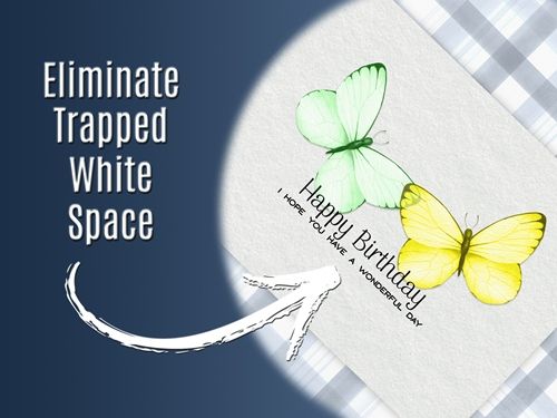
The kind of white space I’m talking about today tends to show up in more traditional (not white space) layouts or greeting cards, such as the one highlighted in the featured image above. It is much more common than most people realize. And frequently can be tough to identify unless you know what to look for and watch for it carefully.
Trapped white space occurs when a void is completely surrounded by other elements, preventing it from “flowing” to the page edges. Unlike intentional negative space which provides breathing room, the trapped space often looks like an unintentional “hole” that distracts the eye.
Let’s take a closer look at that greeting card from the featured image:

Sometimes it’s hard to tell what constitutes trapped space. Generally speaking, I look for the following: gaps in the design that aren’t flowing toward or connected to edges, pockets of empty background that interrupt the natural flow of the design, and areas of empty space between two closely overlapping text boxes or other elements.
Finding Trapped White Space
You may or may not easily notice the trapped white space in that card directly above. Trust me it’s there. And don’t feel bad if you don’t see it. A lot of people wouldn’t. Once you make a habit of looking for the “holes” they show up much more readily. Let me help you find it:

Can you see how I’ve drawn a red line around the hole between the butterflies’ wings and the text? Did you feel your eye being drawn to the hole in the middle, trapped between the two butterflies and the sentiment? That empty space can’t escape to the edges of the design…that’s what we call trapped white space.
Holes like that one can oft times go completely unnoticed. I have to admit; I probably have more layouts than I care to count that contain some overlooked trapped space. Trust me, it can happen so easily. And one thing that tricks most of us into missing these holes is that they’re sneaky. Just because the space has a patterned background doesn’t mean it isn’t trapped space.
Avoiding trapped space is essential for creating a visually appealing and effective design. It can sometimes be challenging to align elements or make layout changes without disrupting the overall design. But sometimes the fix is easier than some might think.
Make Changes
Earlier I mentioned that trapped white space tends to happen when all aspects of a design aren’t thought-out well. This causes the eye to go straight to the trap. Looking back at that greeting card above, a lot of people likely would find nothing wrong with the design.
In reality, rearranging things so the white space can flow to the edge of the design opens up that space. It’s no longer stuck and now creates more movement in the design:

Did you notice how easily your eye moved around the card? I know I can feel my eyes flitting almost like one of the butterflies. So free, no traps in sight.
Now let’s take a look at an even better (or maybe worse 😉) example of trapped white space:

Note: The image directly above is a near duplicate of another layout I made a while back. I intentionally created this one with trapped white space specifically for this post. More on that other layout in a few minutes. OBTW…you will not find this version in my gallery!
Yes, I purposely created that trapped space so I knew that it was there. But I have to admit, every time I looked at it while working on it (and still now) my eye went directly to the trapped space instead of to the little girl.
To many people that angled banner looks so cute and appears to “tie” the photo to the cluster. Unfortunately, that seemingly innocuous triangular hole interrupts the natural flow and directs the eye toward the empty space. That banner actually only serves to immediately divert attention away from the otherwise meticulously chosen and thoughtfully positioned design elements.
Now, lets take a look at the original layout:
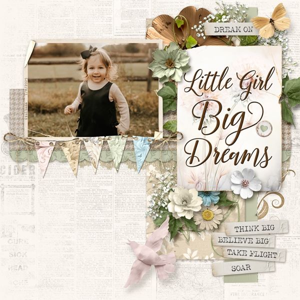
The change between this and the prior layout should be obvious. All it took was repositioning the cute banner. And just as with the butterflies, no more trapped space. The eye moves freely about the page and keys in on the sweet little girl very easily!
Note: If you’d like more information, this version is available in my 2026 gallery! The title of that layout is “Dream On”.
Okay Trapped Space
Not all trapped space is bad. It can be used intentionally to frame a scene with elements to draw the eye to a very specific focal point. And tiny gaps within a tight cluster can add depth without being distracting.
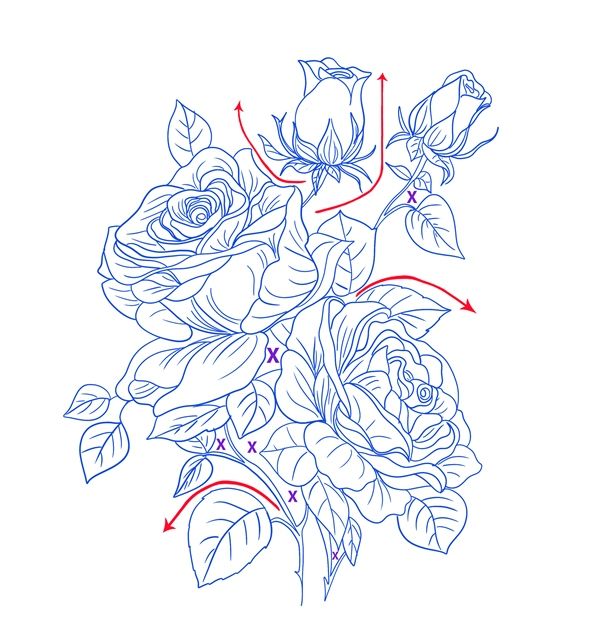
Let’s take a look at this lovely floral brush I have:
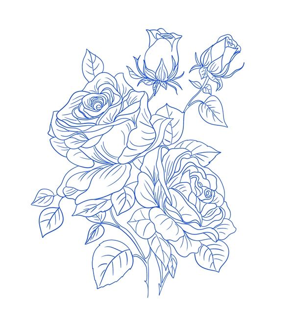
Note: That brush is from the “Photoshop – 75 Flower Stamp/ Brushes” set at Creative Fabrica
This is how I see the flow of the white space. There are tiny areas of trapped space, but they actually don’t draw the eye. I’ve marked these small trapped areas with purple Xs:
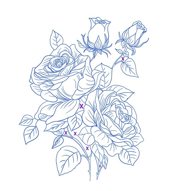
Those areas with purple Xs are not accidents. They were kept tiny on purpose. They create depth in the design without pulling the eye away from the roses.
There are also some open areas that border on being categorized as trapped space. These “borderline” areas are also intentional. They are designed to draw the eye away from the center of that set of roses and out toward the edges. I’ve marked some of those areas (just enough to give you the idea) with red arrows:
I hope this helps clarify the difference between good and bad trapped white space. I also hope I’ve given you a better understanding of trapped and planned white space. Read below for more tips about managing trapped white space.
Trapped Space Tips

I know you’re looking at that image above and thinking…”That looks like trapped white space!” And you are correct. While the “fix” above wouldn’t have worked on the original card at the beginning, it’s a perfect way to use that little trio of leaves to highlight a sentiment. The tiny triangle of trapped white space doesn’t draw the eye…it anchors the sentiment to the image, creating a stronger sense of unity and balance.
As the old Benjamin Franklin saying goes; An ounce of prevention is worth a pound of cure. Here are a few steps you can take to make sure you avoid the “trap” every time:
- Plan ahead. I’m sure you’ve heard the expression, “Fail to plan, plan to fail.” It applies to design, too. Consider the layout and placement of all the elements you intend to use before starting the design process. This can help you avoid trapped white space and make it easier to modify your design later.
- Use guides and grids. Guides and grids can help you create a balanced layout and ensure you align all elements in a way that’s both visually appealing and achieves the objective of the design. Knowing what will go in each space of the grid can help prevent trapped white space from occurring.
- Keep an eye on negative space. The most straightforward way to prevent trapped white space is to be mindful of the empty areas of your design as you create it. Be just as aware of the negative space as you are of the other elements and use it to add emphasis in all the right places. This will help ensure that you don’t box it in and turn it into trapped white space.
If you still find a pocket of space that feels “stuck,” try these quick design adjustments:
- Move elements closer together or farther apart to let the background “breathe” out to the edges.
- Overlap your photos or embellishments to eliminate the gap entirely.
- Use small stamps (like stars or dots), washi tape, or stickers to turn the “hole” into a planned design element.
- Use the space for a handwritten note or a small word strip to give the area a purpose.
As you continue to build on your design skills, working with white space will start to come more easily to you.
And remember, you’re not alone on this creative journey. As I said earlier…I probably have more layouts than I care to count that contain some overlooked trapped space.

We cannot solve all our problems with the same thinking we used when creating them. – Albert Einstein
Thanks for reading this week’s Tuesday Tip. Remember, if you have any suggestions or questions please don’t hesitate to “Message Me“. Check back next week for tips on Tabbed Journaling. Click “Follow Me” to stay in touch. I hope you have a wonderful week!
