Right Outline
If you’ve read my “Stroking Shapes & Stuff” post from back in April of 2024, you already know the basics about strokes. Over the years I’ve written multiple posts about using strokes but I sadly never really did a very good job explaining all of the settings. Today I want to go into more detail about not only settings but also about choosing the right outline (stroke).
Most people typically know how to add an outline to a shape. The trickier part is knowing how to figure out the best Position setting to get the right outline.
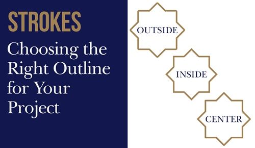
The featured image above shows strokes in each of the three positions available. You may or may not be able to clearly see the differences between each in that image. But I promise to give you better examples below.
Stroke Options
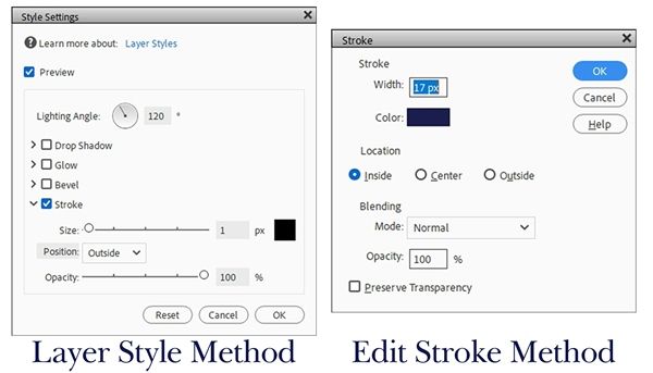
In order to determine the right outline, it’s best to understand stroke settings in general. You may be surprised when I say there are a lot of people that have no idea there are actually two different methods for creating strokes in Photoshop Elements (PSE). If you read that aforementioned post of mine from April of 2024, you already know that 😉
But there’s something perhaps you don’t already know; these two methods do not work the same. While both methods create outlines, they differ in how they are applied, edited, and rendered.
Which of the two is considered the most effective method is usually driven by the object. The Layer Style Stroke is best for editable effects, while the Edit->Stroke (Outline) method is highly effective for maintaining sharp, unrounded corners on text or complex objects.
In PSE, a very important difference is that the Layer Style Stroke is a dynamic, non-destructive effect tied to a specific layer, while Edit->Stroke permanently affixes a painted outline onto your pixels (sort of) I’ll explain that later.
I want to start by hopefully providing a good explanation of both methods!
Layer Style Stroke
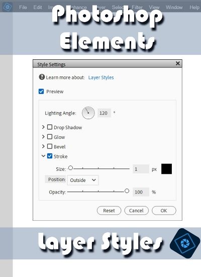
Quick reminder; I use PSE 2024. If you use a different version, some of my screen shots may look different from what you see on your screen.
Here is a quick breakdown of the Layer Style Method (Non-Destructive):
- How it works: Applied via the Styles panel (located in the Task pane at the bottom of the workspace) or the Layer->Layer Styles menu. It adds an outline to everything on that specific layer (text, shape, or cutout).
- Flexibility: Editable. You can double-click the fx icon on the layer at any time to change the color, size, opacity or alignment.
- Resizing: The stroke automatically scales up or down if you resize the object.
- Limitations: It cannot be combined with filters or distorted. Layer style outlines tend to round off the sharp corners of text and shapes as the stroke gets thicker.
This is often considered the best method for titles, text, logos and some graphics because it is non-destructive, meaning you can adjust the stroke size or color at any time without altering/damaging the original image layer.
Edit Stroke Outline

Now for a quick rundown of the Edit->Stroke (Outline) Method (Destructive):
- How it works: Applied by making a selection and going to Edit->Stroke (Outline Selection). This paints a solid border directly onto the pixels of your selected layer or active selection.
- Flexibility: Permanent. Once applied, it becomes part of your image layer. You cannot easily change its size or color later without immediately undoing and starting over.
- Control: You can place it on a blank, independent layer, and you can apply filters, smudges, or layer masks directly to the outline. Because it relies directly on your pixels, sharp corners on shapes and text will mostly remain crisp and sharp.
- Resizing: If you enlarge the stroked layer later, the outline may stretch and blur depending on how large the change in size.
This may surprise you but this is actually the foundational and most used stroke method in PSE (according to Adobe 😉).
The manual selection method creates perfectly crisp edges and works best for outlining an image, creating a frame, or tracing around a specific subject on a flat, rasterized (simplified) layer. Great for creating a border on a blank layer, outlining a lasso selection, or if you plan to apply filters directly to the stroked object.
Now let’s look at the correct placement for the right outline…
Right Outline Position
So, the primary question usually is, Inside or Outside? In my experience, a Position of Center isn’t used very often. Mostly because it can soften corners and often requires manual size adjustments to get the exact desired outline width. But that doesn’t mean you can’t use it.
When you apply an outline (stroke) to a selection or layer, you can align the outline using one of three different positions:
- Inside: The stroke is drawn completely inside the edges of your selection or layer boundaries. The stroke is built entirely inward from your selection edge. This is the only position setting that retains sharp, crisp corners. The outline stays strictly within the boundaries of the original layer. One drawback, since it eats into your layer’s pixels, a very thick inner outline might completely cover or distort small text or thin shapes.
- Center: The stroke is split evenly, with 50% of the border on the inside and 50% on the outside of your selection. This can be highly useful for blending the outline into the original shape, or for scaling text borders without making them look disproportionately thick in either direction.
- Outside: The stroke is drawn entirely on the outside of your selection edge or pixel content. This is best for keeping the outline from covering the original object. However, it will round off sharp, angular corners and significantly increase the overall footprint of your shape or text. Works great for adding borders to objects without shrinking them, making text pop from busy backgrounds, or creating comic-book style outlines.
And here are the better examples of each position that I promised earlier:
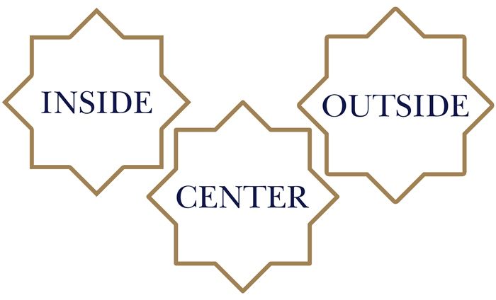
I used an outline Size of 40px on each 8-pointed star. You should be able to see the differences. If you want pointy outlines over pointy objects, the clear (and only) choice is to use Inside. All of the outer pointy corners are pointy; the inner pointy corners all appear to be pointy as well. But this only holds up as long as you aren’t “stacking” outlines. More on that later.
With Center, all of the outer pointy corners are clearly rounded; while only some of the inner pointy edges are rounded. With Outside, all of the outer pointy corners are clearly rounded; while all of the inner pointy edges appear to be pointy.
Generally speaking, these Position settings work the same when using either the Edit->Stroke or Layer Style method. However, there is one little known exception. When selecting any position using the Layer Style method, the outline stays within the boundary (size) but only as long as the opacity of the entire object is the same. Puzzled? You’re not alone…read on!
Not So Right Outline
Here’s the kicker. Using the Layer Style method, the “style” itself is somehow oddly applied over the entire object regardless of the size specified. So, I’m sure you’re saying “WHAT???”

Trust me, I said more than that the first time I encountered this “hidden feature” in PSE. So, here’s what happens. Layer Style outlines use the layer’s transparency data to define its boundary. If the object is fully solid, the “style” renders the outline based on the pixel size specified rather than filling the object completely with the designated color.
But, if the object contains any semi-transparent pixels, the “style” will cover those semi-transparent pixels because it treats them as part of the visible edge. This means the “style” expands the designated color over any transparency within the interior fill. But the semi-transparent areas will be affected by the solid outline color differently based on the position selected. Clear as mud, right?!?
Using a yellow (#ffcc00) triangle with the majority of the inside set at an opacity of 40%, a color chip set to black and a stroke size set to 40px, this is what happens with the different positions:
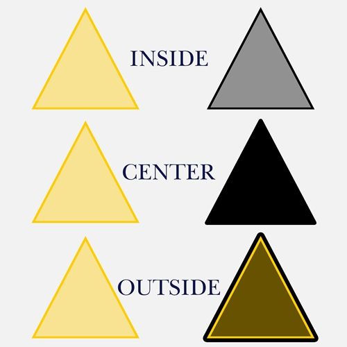
What’s even more confusing is you can actually run into the same issue using the Edit->Stroke method if you aren’t selecting the entire object (including any transparent areas) and not placing the outline on its own layer. More on that in a minute.
Well, this has probably been a whole lot more than what you bargained for! But at least now you should have a better understanding of just how complicated creating outlines in PSE can get. But, at this point you should also have a much better understanding of how the different Position settings work.
I would venture to guess that most people are already familiar with creating outlines using the Layer Style method. So, other than the Position, the remaining settings are all fairly straight forward. If you need a refresher, refer back to my “Stroking Shapes & Stuff” post from back in April of 2024.
Since a lot of people aren’t too familiar with the Edit->Stroke method I will spend just a bit of time explaining those settings…
Right Outline Settings (Edit Stroke)
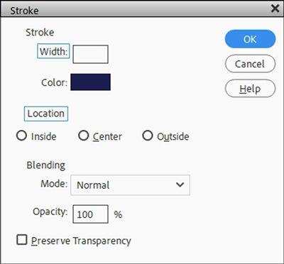
First and foremost, take a look at the image above. You should be able to see that I highlighted the words Width and Location with an aqua “outline”. Prior to now, I’ve been using the terms Size and Position for these settings; mostly because that’s what it’s called in the Layer Style method which is what most people use.
Don’t be confused…Location is interchangeable with Position and Width is interchangeable with Size. At least while we’re talking about strokes (outlines).
And I’m sure you’ve already figured out those aren’t the only differences in settings compared to the Layer Style options.
We’re only working on a Stroke at this point so there are no options for Drop Shadow, Glow or Bevel.
And with the Edit->Stroke method there is no Lighting Angle.

This is because PSE applies a flat, 2D raster outline directly to the object or selection. It doesn’t use a lighting angle because it is a flat fill which is unaffected by lighting.
But there’s now a setting for Blending!! Yes, this works exactly the same way it works in the Layers Panel. How fun is that?!? But what’s even more interesting is that there are two “new” Blend Modes for the Stroke: Behind and Clear.
Clear will act like an eraser; effectively cutting a transparent “hole” into the underlying pixels. PSE subtracts the outline from the pixels on the active layer/selection. And Behind works exactly as it sounds and is perfect for adding an outline to a cutout object or text without ruining or coloring over the original content.
The Opacity setting which appears to be nested under Blending, controls the opacity of the stroke regardless of the Blend Mode selected. This means if you set the Blend Mode to Clear, the Location to Inside and the Opacity to 50%, you can actually create a semi-transparent edge on your element or text.
Lastly, Preserve Transparency. Now mind you, I’ve been dealing with PSE for nearly ten years now and I’ve never been able to make heads nor tails out of this one option.

Honestly, I just ignore it. I could go into a really long and boring explanation of how Adobe presents it. But I have a feeling it wouldn’t make any more sense to you then it did to me. So, my recommendation is to leave it unchecked unless you really feel like playing around with it yourself.
Right Outline Examples
Generally speaking, the right outline for me is almost always going to be made using the Edit->Stroke method. I typically put my outline on its own layer and this gives me all the flexibility I need. I’ll give you just a couple quick examples.
If you read that “Stroking Shapes & Stuff” post from back in April of 2024, I showed you how to stack outlines around some text using the Layer Style method. It’s a whole lot easier to do that using the Edit->Stroke method.

I’m going to start by setting my Foreground Color chip to a deep navy blue (#182461). If you’re following along, you can use any color that you like. Then I create a new 12×12 file using a white background. Again, you can start with a file any size of your choosing. Then I’m going to grab the Custom Shape tool and select the Heart Card shape from the Default shapes category. You can use any shape you like.
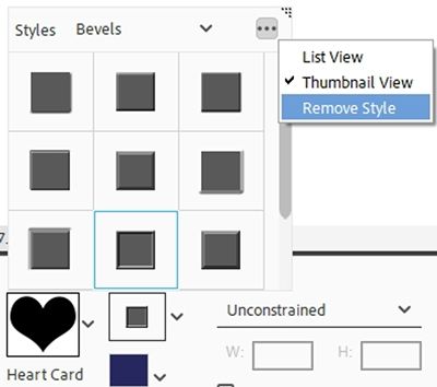
If I see anything other than blank space or a white box with a red diagonal line just to the right of the shape, that means a Shape Style has been turned on. I need to be sure to turn that residual style setting off.
So, I click the down arrow at the right of the style box. PSE opens the active styles. I click on the three dots in the upper right corner of the Style panel and select Remove Style:
I now see that white box with a red diagonal line just to the right of the shape indicating that no style will be applied to the shape:
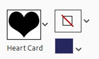
I have the geometry option set to Unconstrained and the color chip matches my Foreground color. Now I can just drag out a heart shape near the center of my file. When I release the mouse, PSE creates the heart shape (Shape 1 for me) which is the active layer:
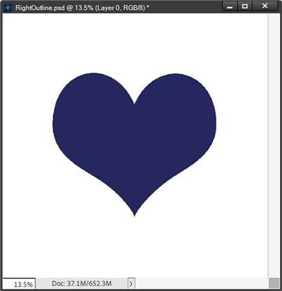
In the Layers Panel I Ctrl-Click the thumbnail for the Shape 1 layer. PSE places a selection around the heart. I then click the Create a new layer icon in the Layers Panel. PSE places that new layer (Layer 1 for me) directly above the Shape 1 layer.
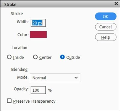
I go to the top tool bar and select Edit->Stroke (outline) Selection. I set the Width to 20px, the Color to a nice deep red (Old Glory Red-#b31942) and select Outside for the Location. I leave Mode at Normal, Opacity at 100% and Preserve Transparency is unchecked:
I click OK to confirm and I DO NOT clear the selection:
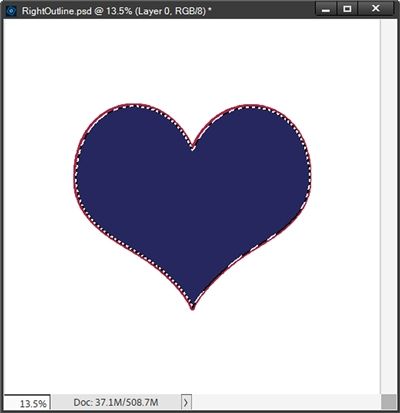
You should be able to see the marching ants indicating that the selection is still active.
With the Shape 1 layer active I click the Create a new layer icon in the Layers Panel. PSE places that new layer (Layer 2 for me) directly above the Shape 1 layer. I open Edit->Stroke (outline) Selection, set the Width to 40px, the Color to a white (#ffffff) and keep the other settings the same:
I know you can’t see the white outline but it’s there and will show up in just a minute.
With the Shape 1 layer active I again click the Create a new layer icon in the Layers Panel. PSE places that new layer (Layer 3 for me) directly above the Shape 1 layer. I open Edit->Stroke (outline) Selection, set the Width to 60px, the Color to a lighter blue (#0157ae) and keep the other settings the same:
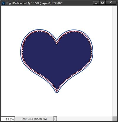
Now, I’m going to repeat those three strokes in the same order, (red, white and blue) increasing the Width by 20px each time, using all the other same settings, always starting with the Shape 1 layer active. After I’ve completed that second set, I cancel the selection (Press D or ESC) and here is my multi-stroked heart:
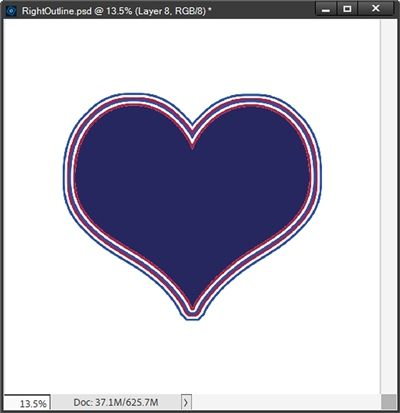
As you can see, the strokes around the bottom point all became rounded while the strokes around the top “point” remained pointy. This fits with what I said in the beginning.
Now watch what happens if I start with a fresh blue heart and repeat that entire series of strokes but using a Location of Inside:
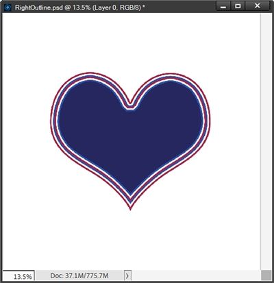
As you can see, this time the strokes around the bottom point all stayed pointy but only the first stroke around the top “point” remained pointy. This also fits with what I said earlier about how stacking strokes could result in rounded points even when using Inside.
Now I want to show you my favorite reason for using the Edit-Stroke method and keeping them on their own layers:

I was able to go in and add a glitter style to each one of those strokes. That’s something that would be next to impossible to accomplish with strokes created using the Layer Style method. Don’t get me wrong, I’d figure out a way but it would take me a whole lot more time than these did. All I had to do was select the stroke layer and add the style. Seriously, in two clicks I added glitter to a stroke!
And here’s one more quick example showing you how to use the Clear Blend mode.
I’m going to hide all the layers for the heart example above and change the background to black. I’m going to pull in a pretty tag from my stash:
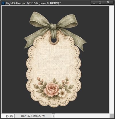
I’ve zoomed in fairly close so you can see all the detail as I work on this. First, I’m going to duplicate this tag, hide the original and simplify the duplicate. I then Ctrl-Click on the thumbnail of the duplicate layer to create a selection around the tag:
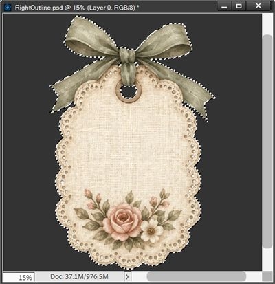
I don’t want the bow to be part of the selection so I grab the Selection Brush tool and subtract the parts of the selection I want to remove:
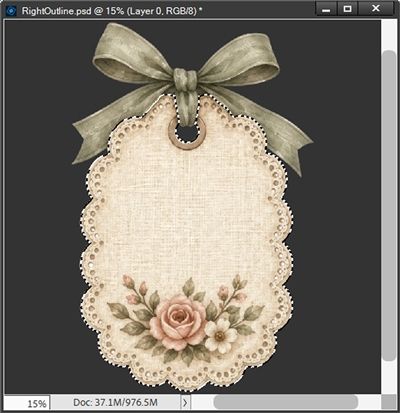
You should be able to see that only the tag itself is part of the selection at this point. I then press Ctrl-J to create a new layer from this selection. I rename the new layer Tag-No Bow and I hide the layer with the duplicate of the original. I DO NOT cancel the selection
With the Tag-No Bow layer (and selection) still active I go to the top tool bar and click Select->Modify->Contract and set the Contract By value to 105px:
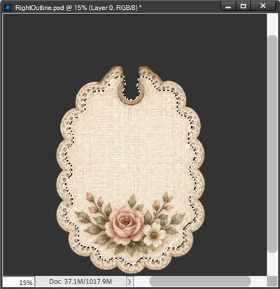
I then click Ctrl-J to create a new layer from this modified selection and name the new layer Contracted Selection. And I know you’re wondering why I did all this. The answer is twofold. First, I used this as a way to determine how many pixels wide my “outline” will need to be to cover just that portion of the scalloped edge.
The second reason is that eventually, that area around the tag’s “hole” will end up being impacted by the next step and I will want this “contracted” layer later. I’m going to hide this layer for now. I promise, this will make sense in a minute.
I cancel the selection and make the Tag-No Bow layer active. Then I click Edit->Stroke (Outline)Selection and set the Width to 105px, Location to Inside, Mode to Clear and Opacity to 60% and click OK to confirm:
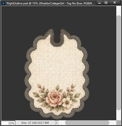
And I now have a semi-transparent edge around that scalloped tag. But you can also now see what I meant about the “hole” being impacted. All I have to do is unhide that Contracted Selection layer and that fixes that issue:
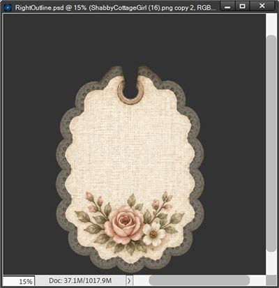
I still need to bring back the bow. So, I unhide that “original” duplicate layer (which is beneath the Tag-No Bow layer). As soon as I do that, the semi-transparent “outline” is lost. But this too is an easy fix. With the “original” duplicate layer active I Ctrl-Click on the thumbnail of the Tag-No Bow layer to create a selection:
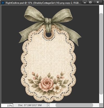
I then press Delete and cancel the selection:
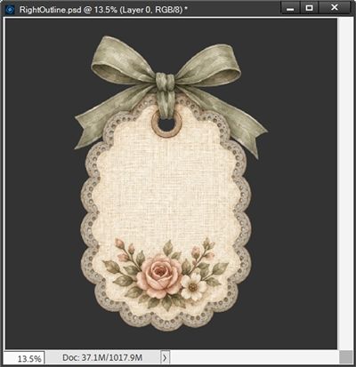
And there’s the complete tag with a semi-transparent edge. The degree of transparency is going to be completely dependent upon the color over which that tag is placed. Because I used a transparency setting of 60%, the transparency will be most noticeable on darker colors.
Sorry that last, “quick” example ran into so many steps. But it really does go rather quickly once you know the required steps! If I had used a simple flower, it would have been a lot quicker 😉
Now that you know more about working with different strokes I hope you’ll have some fun adding them to at least a few things!
Reminders

You cannot create an outline on text using the Edit->Stroke method without first simplifying it or creating a selection around it.
You cannot create an outline on an element (or shape) using the Edit->Stroke method without first simplifying it or making a selection around it and creating an active blank layer directly above the element.
You can always edit, change colors, or resize a Layer Style outline at any time. An Edit->Stroke outline becomes permanent “painted” pixels unless it’s placed on its own layer.
If you create a Layer Style outline there is no way to add any other styles (emboss, glitter, gloss, etc.) to only the outline.
If you create an Edit->Stroke outline on its own layer you can add other styles, or clip paper to the outline. You can’t do that with a Layer Style outline.
If you resize a layer with a Layer Style outline applied, the stroke maintains its pixel thickness. With an Edit->Stroke outline, resizing the layer may blur, stretch or squash the outline.
If you need to outline a box or text using Outside and keep the outer corners sharp and pointed, Layer Styles and Edit->Stroke will both fail (they each round the outer corners).
Art is the only way to run away without leaving home. – Twyla Tharp
Thanks for reading this week’s Tuesday Tip. Remember, if you have any suggestions or questions please don’t hesitate to “Message Me”. Check back next week for tips about dingbat fonts. Click “Follow Me” to stay in touch. I hope you have a wonderful week!