Stroking Shapes & Stuff
Have you ever wanted just an outline of a shape in Photoshop Elements (PSE)? This seems like something that ought to be easy to accomplish. However, so many people seem to struggle with this. Most people typically know how to add an outline to a shape. The trickier part is knowing how to end up with just the outline…no fill.
I don’t know about you but I frequently use shapes that aren’t completely solid…just an outline. Sort of a cookie cutter kind of look:

I can do this for lots of reasons; to use the shape as a frame, to use it as a simple glitter star/heart element or perhaps even as a mask. Regardless, there definitely isn’t what I’d call an intuitve solution. But nonetheless, it can be done.
And there’s more to outline than just shapes. Read on…
Creating Shape Outlines

An outline is a stroke or border that can be added to photos, papers, text, and embellishments. Strokes are super versatile as you can adjust the color and width, plus you can also add styles to strokes, thereby changing their look completely.
When I draw a shape with the Custom Shape tool, the shape automatically gets filled with a solid color (the Foreground color). Is it possible to draw a shape which will be just the outline of it? Not filled with color?
Yes, it is possible but you need to give PSE a helping hand. Just a little workaround!
If this is your first visit to the Café, I need to make you aware of a few things. I use the current version of Photoshop Element (PSE 2024) so all of the steps that follow are accomplished using that software. Some of my screen shots may look different than what you see on your screen depending on the version you are using. If you don’t use PSE, please search the internet for other tips/tutorials specific to the graphics editing software that you use.
Now that’s out of the way let’s get to creating outlines. There are 2 ways to do this…
Option #1
I’m going to start with a blank (transparent) 12×12 file. If you’re following along you can start with a blank file any size of your choosing. I always prefer to have anything I create in a blank file to be on its own layer so I create a new layer by clicking the “Create a new layer” icon at the top of the layers panel (the button that looks like a blank sheet of paper with a corner turned up):

PSE names that new layer Layer 2 and I see no need to change that. With Layer 2 active, I’m going to select the Shape tool (under Draw) in the tools panel to the left of the work area:

In the tool panel for me it shows up as the Shape – Ellipse icon because that’s the last shape tool I used. Yours may look different but when you hover over it, PSE will still let you know which tool you’re about to select.
When the Shape tool options show up at the bottom of the work area, I select the Custom shape so I can select one of the built-in PSE shapes.

For me the default custom shape is the Heart Card. I believe this is the PSE default. But I’m going to select a different shape by clicking the down arrow next to the heart shape. PSE then opens the Shapes Default selection box:

I don’t see anything there that I really want to work with so I click the down arrow to the right of the word Default. PSE then opens a drop down from which I can select one or all of the different shape categories:

I select All Elements Shapes and PSE opens all of the available shapes:

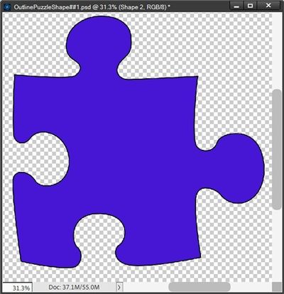
I’ve resized the window a bit so I could see more shapes at once. I then scrolled down until I found a shape that might be fun…Puzzle 4:

In the tool options area, you can now see the puzzle shape. The shape color chip is set to a nice shade of blue because my foreground color chip was already set to that. I like that well enough for what I’m about to do so I’ll leave it as is. And you can also see that I’ve selected Defined Proportions (rather than unconstrained). I did this so that the puzzle shape will stay proportional.
Note: In older versions of PSE, the options for the shape size constraints may differ from what I showed. Please refer to the user’s guide for the version you’re using if you aren’t sure which option to select.
Now I just drag out the shape to a fairly large size on my blank file:

PSE automatically (at least for me) renames Layer 2 to Shape 1. The next thing I do is Right-Click on the Shape 1 layer thumbnail and select “Simplify Layer”:

I do this because simplifying a layer turns the shape into a vector object vs. a smart object. Which means these objects are made up of lines and curves with editable attributes such as color, fill, and outline. This also allows me to increase and decrease the size of vector images to any degree and the lines will remain crisp and sharp, both on screen and in print. More simply put, this will make for a much cleaner outline. I talked about smart objects in my post about managing files sizes if you’d like a bit more information about them.
Now I’m ready to create my outline. I duplicate the Shape 1 layer & rename it Shape 2 and hide the Shape 1 layer. With the Shape 2 layer active I select Layer->Layer Style->Style Settings from the top tool bar:

PSE opens the Style Settings dialog box:

I check Stroke and PSE opens the options for defining the stroke:

The color chip defaults to black and I’m fine to leave it that way for now. I can always recolor my outline later if necessary. I set the Lighting Angle to 120 degrees, Size to 6, Position to Outside & opacity to 100% and click OK to confirm. Here is what it looks like:
Note: I used a Lighting Angle of 120 degrees purely because that’s kind of my standard lighting angle. You can leave it at the default of 90 degrees or set it to whatever suits your needs best.
Even though I zoomed in, I know it’s a bit hard to see the outline. Trust me, it’s there. Now I’m going to get rid of the fill.
With the Shape 2 layer still active I Ctrl+Click on the Shape 1 layer thumbnail. If you remember, in my post about making selections, I called this the “Layer Selection Tool”. I now see the marching ants around the puzzle piece:

Making sure that the Shape 2 layer is still active, I press the Delete key and voilà …the fill is gone:

The stroke is now on its own layer & I can cancel the selection (Esc or Ctrl+D). This outline may seem a bit too fine. But, the beauty of using a layer style is I can go in and easily change the size and/or color of that stroke until I’m completely happy with it. For now, I’m going to change the size to 15 and the color to the same shade of blue as the original puzzle piece:

If you’re working on a new file (as I) then you have the same options I discussed in my post about weaving on layouts. You can either copy the Shape 2 layer from this new file to a layout in progress or save this file as a PSD and/or as a stand-alone element (PNG) for use later. If you need a refresher on those steps please just refer back to that post.
Note: I recommend that you simplify the “outline” layer before saving it as a PNG.
I said there was more than one way to create an outline so I’ll give the other option next…
Option #2
Using the same puzzle shape as above (simplified), I Ctrl-Click on the shape layer thumbnail (Layer Selection Tool mentioned above). PSE again loads the shape as a selection and I see the marching ants around it:
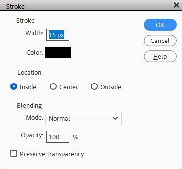
Now I create a new layer. PSE creates Layer 2 above the Shape 1 Layer which is exactly where I want it to be. Ensuring that Layer 2 is active, I go to the top tool bar & select Edit->Stroke-(Outline) Selection. PSE opens the Stroke settings dialog box:

The Color is already set to black (the same as my foreground color chip) and I’m fine with that for this demonstration. You can set your color to whatever suits your needs. I set the width to 15 px, Location to Inside. I keep the remainder of the options as the defaults and click OK to confirm. And this is what I get:

Looks familiar right? So, I then cancel the selection (Esc or Ctrl -D), hide the shape layer & voilà… a shape outline on its own layer:

Just like what happened in option 1 above. It seems like fewer steps and a bit quicker but there is a downside. Doing things this way I have no control over the width/color of the outline after creating it. So, that’s something to keep in mind before deciding which option you want to use.
Note: I know that the Edit->Stroke-(Outline) Selection feature has been available in PSE since at least as long ago as version PSE 8. If you’re using a version of PSE that doesn’t have this feature you can always use option #1 above.
Creating Image Outlines
So, I’ve shown you how to create only the outline of a custom shape. But you can also create an outline of most any image you already have in your stash. Why would you want to do this? Simple…for some of the same reasons you wanted to create only an outline of that custom shape. It can be quite fun to use just the outline of some wings or a pretty leaf.
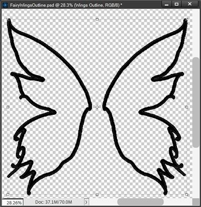
Let’s take a look at some examples. First, I’m going to start with a lovely set of wings:

This image is actually a modified version of a set of wings out of a “Fairytale Clipart Fairy Princess” pack from Creative Fabrica. The original image included what looked like a “wand” in the middle. I just wanted to use the wings so I deleted that part of the image.
I’m going to start with a blank (transparent) 12×12 file. If you’re following along you can start with a blank file any size of your choosing. I already have the wings in my Photo Bin so I can simply drag them into the blank file. They’re automatically included on their own layer. I’ve zoomed in pretty tight so you can see the fine detail on the wings’ edges:

Just as with the custom shape, I Right-Click on the wings layer thumbnail and select “Simplify Layer”. If you recall from my post about managing file sizes, most any element or paper you get from a digital scrapbooking kit will be a smart object. So just as with the custom shape, simplifying a smart object turns the image into a vector object which will make for a much cleaner outline.
And because I prefer to have the utmost flexibility with how the outline turns out, I’m going to follow the same steps I used in Option #1 above. I duplicate the wings layer, rename the duplicate layer to Wings Outline & hide the original wings layer. With the duplicate wings layer active I select Layer->Layer Style-> Style Settings from the top tool bar. I check Stroke, use the color chip default (black for me I can change it later if I choose), set the Lighting Angle to 120 degrees, Size to 10, Position to Outside & opacity to 100% and click OK to confirm. Here is what it looks like:

With the Wings Outline layer still active I Ctrl+Click on the original wings layer thumbnail to make the selection (marching ants) around the original wings. Then making sure that the Wings Outline layer is still active, I press the Delete key and voilà …only the outline remains:
And just as with the puzzle piece above, I can go in and easily change the size and/or color of that stroke until I’m completely happy with it. For now, I’m going to leave things as they are. I want to do one more thing to show you how fun this can be.
I’m going to add another layer style to zhuzh it up a bit. I’m going to use a style from “Stylin’ #303 – Wire“ by Mommyish. Before I apply this style, I want to be sure I preserve the original outline…just in case I want to change the size/color later. So, I duplicate the Wings Outline layer & hide it. With the duplicate Wings Outline layer active, I click the Styles icon at the bottom of the Layers panel:

Then I just look for (or load) the desire style set and pick the particular style I want. I ended up using the “Wire – Gold II” style from the set by Mommyish:

Now how pretty is that? I bet you’re already thinking about some fun things you can do now…right? I loved how this turned out so I cropped it to size and saved it as a PNG file so I can use those lovely wings on a layout! And I saved the working file as a PSD so I can go back in and play with some other outline size/color (or style) options at later.
I’m going to show you one more example using a doily:

The doily pictured above is from “The Bright Part Of Merry & Bright” by Idgie’s Heartsong. And I’m also going to be using a solid paper from the “Felicity” kit by Vicki Stegall:

With the paper & doily loaded into my workspace this is how it looks:

I’m using a background this time as I’ll be creating my outline using white instead of black. And just as with the wings above, I Right-Click on the doily layer thumbnail and select “Simplify Layer” and follow the same steps I used in Option #1 above.
I duplicate the doily layer, rename the duplicate layer to Doily Outline & hide the original doily layer. With the duplicate doily layer active I select Layer->Layer Style->Style Settings from the top tool bar. I check Stroke, set the color chip to white, set the Lighting Angle to 120 degrees, Size to 3, Position to Outside & opacity to 100% and click OK to confirm. Here is what it looks like:

This looks quite nice just the way it is. But I wanted specifically to show you how this “outline” of the doily can be used to give you a result that the doily itself may not provide by using a blend mode.
If I were to set the blend mode for the doily (layered over the background) to Difference here is the result:

While this doesn’t look bad…it might not be a very versatile look. Using just the outline and the same blend mode here is a different look:

Now, I can use this “beige” doily in a multitude of ways. I could (minus) the background) save it as a standalone PNG file for use in a project. Or, I could resize it, change the opacity and scatter it about the background to come up with an interesting new paper:

Definitely not something I could have done using the original doily. I mentioned that I could save this “beige” doily as a PNG. I imagine you’re wondering exactly how I could do this since it was created using a blend mode. This is where thinking outside the box comes in handy. All I had to do was merge the doily with the blue paper and then just delete the background:

It would have been easier to delete the background had it been perfectly solid but it was easy enough with just a few extra clicks. And adding a simple bevel to it will keep it from looking so flat:

I know the difference might be hard to see here but the bevel did make it look more real rather than just a “line drawing”. This won’t always work with every image you create just an outline for. But I’d encourage you to play around with blend modes and perhaps bevels to see what you can come up with.
Just one more way you can expand your supply stash without spending a penny 😉
Creating Text Outlines

I’m sure you’ve seen this kind of word art on digital layouts before. There are some great examples of outlined text in both of these sets. This is the first type of outlined text I want to cover for you.
Note: The “Halloween” word art pictured above is from “Outline Word Art Halloween” by Sahin Designs. The “seaside” word art pictured above is from “Seafoam Underwater Fantasy” by Heartstrings Scrap Art.
I’m going to start with the simplest example…a basic outline. The Halloween word art appears to have been created with the Georgia Bold font. So, that’s the font I’ll be using. And I’m going to recreate the word “pumpkin” from that set.
The first part of this is going to be exactly like what I’ve done before. I’m going to start with a blank (transparent) 12×12 file. If you’re following along you can start with a blank file any size of your choosing.
Then I select the Horizontal Type Tool:

I select the Georgia Bold font, set the size to 150 px, the Color set to black & the Tracking set to 50. I used a tracking value of 50 because I want to ensure that there’s a fair amount of space between each letter so the outline doesn’t result in letters touching each other. I then just drag out a text box of a fairly good size and type the word pumpkin:

Note: If you’re following along, you can use whatever color you choose for your word…but if you want your outline to be black you may want to use something besides black for the initial word.
Next, I’m going to duplicate the font layer (named pumpkin) & hide the original. I do this to preserve the original font…I’ll be using this original “text” layer later. Then just as with the custom shape, I Right-Click on the duplicate pumpkin layer thumbnail and select “Simplify Layer”. If you recall from above, working with a vector object will result in the cleanest outline. I’m 99.99% positive text in PSE is created as a vector object. But I also know that I cannot edit a text (type) layer without first simplifying it. Confusing right? And by edit in this case it means I can’t delete the “fill” after I add the stroke if I don’t simplify the text.
And once again, I prefer to have the utmost flexibility with how the outline turns out. So, I follow the same steps I used in Option #1 above. I don’t need to duplicate the simplified pumpkin layer as I still have the original text layer. With the simplified pumpkin layer active I select Layer->Layer Style->Style Settings from the top tool bar. I check Stroke, set the color chip to a nice autumn rust color (#954932), set the Lighting Angle to 120 degrees, Size to 6, Position to Outside & opacity to 100% and click OK to confirm. Here is what it looks like:

It might be hard for you to see the outline but it’s there. Now, I’m going to do something here that might confuse you…and I apologize in advance.
Explanation: For whatever reason, even though the text layer has been simplified, after the stoke is applied it still behaves differently than either the custom shape or the wings element when I try to delete the “fill”. The outline was “broken” in places for some of the letters. Like this:

I searched high & low for a cause/solution on the internet when I first encountered this issue years ago. Unfortunately, I could never find one. Ultimately, I just resorted to duplicating the layer with the stroke & simplifying that third layer. And all worked as expected. Gotta love technology, right?
So again, because I want to preserve the stroke settings just in case I need to go back and make changes to the size/color I duplicate the pumpkin copy 2 layer (with the stroke applied). I now have my third layer (named pumpkin copy 3) I simplify this new layer & hide the pumpkin copy 2 layer.
Now, with the pumpkin copy 3 layer still active I Ctrl+Click on the original pumpkin (text) layer thumbnail to make the selection (marching ants) around the original text:

Then making sure that the pumpkin copy 3 layer is still active, I press the Delete key and voilà …only the outline remains:

So, at this point I have the outline word art. I could add bevels or other styles to this just as I did with the wings in the last section. But I had said I was going to recreate the look of that word art in the sample above. It’s just a few more steps to make that happen. Bear with me…
In order to recreate the look of the Halloween Word Art at the top of this section, each letter of the word pumpkin needs to be on its own layer. Now you’re probably wondering why I didn’t have each letter on its own layer when I typed the text. I certainly could have done that but it would have meant having to repeat all the above steps I followed on the entire word but now for each letter. That would have been more time-consuming than what I’m going to do with the entire word.
With the pumpkin copy 3 layer still active, all I have to do is use the Marquee Tool and make a selection around the first letter:

Next, I go to the top tool bar and select Layer->New->Via Cut (Shift+Ctrl+J) based on only this selection. PSE places that first letter onto a new layer, removing it from the pumpkin copy 3 layer. I rename this new layer P1. I do this for each of the remaining letters until I have them on their own layer:
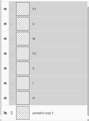
As you can see, I’ve also hidden the pumpkin copy 3 layer. All that’s left is to rearrange the letters to resemble that in the Halloween Word Art above:

I can now add any styles that choose. I’m going to apply one of PSE’s predefined bevel styles – Simple Emboss. And here’s how that looks:

I also could go on to add a metal style of some sort. But in order to preserve the bevel I just applied, I’ll need to “layer” (stack) this second style above the bevel. If you aren’t familiar with layering styles you can read more about that in my Photoshop Styles post.
In order to make applying this second style a bit easier I’m going to select all of the individual letters in the Layers Panel. I then press Ctrl+J to duplicate the entire set of layers. This duplicate set of letters is automatically selected. The first thing I want to do is clear the layer style from these selected layers. All I have to do is Right-Click on any one of the selected layers’ thumbnail and select “Clear Layer Style”. PSE removes the style from each selected layer.
Next, I again Right-Click on any one of the selected layers’ thumbnail and select “Merge Layers”. PSE creates this new “merged” layer above the original letter layers and names it P1 copy (driven by the name of the first layer in the original selection):

I can now apply the second style. I’m using a style from ”Golden Style For Photoshop” I found on Brusheezy (free). I chose the style in that set named Style 11779. And here is what the word art looks like now:

If I had merely “added” the layer style to the individual letter layers I would have lost the bevel style completely:

And, if I had not deleted the bevel style on the duplicate set of individual letter layers, I would have gotten this completely different look when I applied the gold style:

Not a bad option but I think I like the first attempt the best. I just wanted you to see how the look can vary depending on the way styles are applied.
You can experiment with different style layering methods to see which you like the best. In any case you now know how to create a very nice piece of word art that can be used either as an accent or a title!
And here’s a recent layout of mine where I used an outline word I created:

You can see more details about this layout in my gallery.
Adding A Stroke To A Feathered Oval (Vignette)

I created the above vignette using a photo from Pixabay. I created mine “manually” by making an oval selection around my picture and going to the top tool bar and clicking using Select->Feather. But there’s also a Guided edit option for a creating vignette effect that works quite nicely if you ever want to create one. Just go to Guided->Basics->Vignette Effect.
With my spring girl vignette open in my work space, I use the Ellipse Marque tool to draw a selection box around my vignette leaving just a touch of white all around. I then add a new layer above the vignette layer (Layer 1). With the new layer active (layer 2) I go to the top tool bar and select Edit->Stroke (Outline) Selection. PSE opens the Stoke settings dialog box:
I set the width to 15 px, Location to Inside, Blending Mode to Normal and Opacity to 100%. I click OK to confirm. And here’s my stroke:

To remove the white background all I have to do is select Layer 1 & Layer 2 in the Layers Panel. Then I Right-Click on either of the selected layers’ thumbnail and select “Merge Layers”. PSE creates this new “merged” layer named it Layer 3. With the layers merge I can now just use the Magic Eraser Tool to delete the white background outside the stroke:

Clearly one of the easier stoke procedures for today. The key points here are to have a good understanding of how to make a good selection. If you need some help with that, please refer back to my post about making The Right Selection.
Creating Multiple Text Strokes

The word “rainbow” shown above is a piece of word art I created. I know this isn’t strictly just the outline like what I’ve been talking about. This, on the surface appears to be just a sequence of multi-color strokes with the font still filled in. I do want to show you how to create this effect because it’s not as easy as it may seem. At least if you want to get the strokes to show up “correctly”.
As is my habit I’m going to start with a blank 12×12 file this time with a white background. If you’re following along you can start with a blank file any size of your choosing.
Then I select the Horizontal Type Tool I use the Nunito Heavy Regular with size set to 46 px, the Color set to black & the Tracking set to -50. I used a tracking value of -50 because I wanted a couple of letters touching each other. I then just drag out a text box of a fairly good size and type the word rainbow:

I’m going to be adding strokes in rainbow colors like what appears in the image above. If you’re following along you can use any colors that you like.
Just as with the outline text above, the first thing I’m going to do is duplicate the font layer (named rainbow) & hide the original. I do this merely to preserve the original font. I then Right-Click on the duplicate rainbow layer thumbnail and select “Simplify Layer”.
With the simplified rainbow copy layer active I select Layer->Layer Style->Style Settings from the top tool bar. I check Stroke, set the color chip to a magenta color (#ff00ff), set the Lighting Angle to 135 degrees, Size to 5, Position to Outside & opacity to 100% and click OK to confirm. Here is what it looks like:

Note: Be sure to remember the size value that you use for this first stroke. It will be important later.
I know in the full version of Photoshop (after 2020) people have the ability to add multiple strokes to the same layer. We don’t have that option in Photoshop Elements which actually works out a bit better. And I know you’re wondering why. Well, that’s because when you add strokes to a single layer in Photoshop, multiple strokes on the same layer can cause the edges of the strokes to start to lose some of their roundness (generating more linear type bends).
So, even if you are using full Photoshop, you’re going to want to do multiple stokes using the method I’m about to show you.
Back to my example…I duplicate the rainbow copy layer & PSE names that layer rainbow copy 2. I’m not going to make any changes to this layer. I want each subsequent stroke to be beneath the preceding stroke. Consequently, for creating the remaining strokes I will always be making changes to the rainbow copy layer.
With the rainbow copy layer active I double click the Effects icon at the far-right edge of the layer. This opens the Style Settings dialog box and all I have to do is change the size & color settings for this new stroke. I set the color chip to blue (#0000ff) & Size to 10.
Earlier I said it was important to remember the size for that first stroke? Here’s why. After duplicating the first stroke layer the new layer kept the same stroke settings which is just fine. But I do need to change the settings for the second stroke (on the rainbow copy layer). I want the second stroke to be equidistant from the first stroke so I add the value of the first stroke’s size (5) to the size value currently on the second stoke (also 5) which is how I came up with the new size value of 10 for the blue stroke. I hope that makes sense.
And here it is with the second stroke:
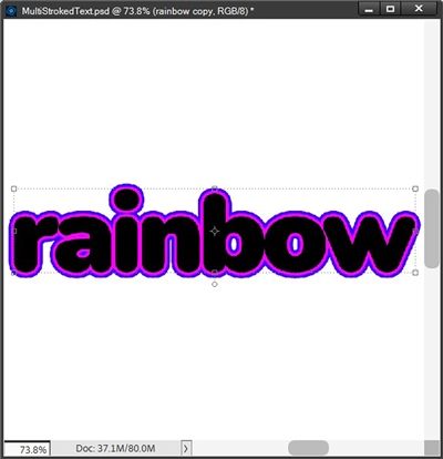
I again duplicate the rainbow copy layer & PSE names that layer rainbow copy 3. With the rainbow copy layer active I change the size & color settings for this new stroke. I set the color chip to cyan (#00ffff) & Size to 15. And here it is with the third stroke:

I’m not going to walk through the remaining colors (Green stroke (#00ff00) – Yellow stroke (#ffff00) & Red stroke (#ff0000)) individually. The key here is to always make changes to the bottom most “stroke” layer and always add the value of the first stroke’s size to all subsequent size values. The last (red) stroke’s size setting for this rainbow word will be 30. And here’s the word with all the strokes:

I’m going to do something a bit different from the example word art shown at the top of this section. This time I want the color of the font to be white. All I have to do is move the original text layer above all the stroke layers and change the font color to white:

Well, that looks more fun! I’m going to finish things off by adding a drop shadow. The easiest way to do this is to place all of my stroke layers (not the text layer) into a group and apply the drop shadow to the group. I name this group RainbowTextShapes Original.
With the group active I select Layer->Layer Style->Style Settings from the top tool bar
I check Drop Shadow and PSE opens those settings. The color chip defaults to that of my foreground color chip (white). I think I’m going to use a different shadow color than the one shown in the example above. I think I’ll be happier using the same shade of blue that I used for the second stroke layer (#0000ff). I set the Lighting Angle to 135 degrees, Size to 25, Distance 20 px & opacity to 30% and click OK to confirm. Here is what it looks like:

Additional Thoughts On Outlines

Remember, the advantage of creating the stroke using the Layer Style setting and keeping it on its own layer gives you more flexibility in editing the shape outline. You can change its color, width; apply a layer style, texture, gradient, etc.
No matter which element you’re adding a stroke to, it’s important to experiment with colors, sizes, and positions to achieve the desired effect. Additionally, being familiar with extra options, like blending modes and opacity settings, allows you to get more creative with your strokes and enhance your images.
When outlining text, it is important to allow plenty of space between the letters if you don’t want the letters’ outlines to be touching. To be on the safe side you can always set the tracking to 200.
You can add as many strokes as you like. Just be aware that depending on the size of each stroke, upwards of 7 or 8 stokes can likely start to show some distortion on the outer strokes:

Notice how the stroke becomes less & less rounded as more and more strokes are added? Not a good look.
As always, if you have any questions or want to make a suggestion about a topic you’d like me to cover, please don’t ever hesitate to “Message Me”.
Thanks for reading this week’s Tuesday Tip. If you want to stay informed about new posts, just click “Follow Me” to stay in touch. I hope you have a wonderful week!