Paper Whisperer
Before I get into the meat of this post I have a story I want to share.
Once upon a time in a shop far, far away there once was a customer who worked “magic” with paper. Seriously, all kidding aside…back when the original Your Scrapping Café was still around, we had a Cricut Expression. At the time it was one of the most innovative personal-use die-cutting machines on the market. It used cartridges – no computer or internet required. Cricut no longer sells the Expression directly as it’s been replaced by more modern technology. But the Expression is still a popular die-cutting machine that many crafters prefer.
Anyway, back to my real story. A lot of customers would come to the Café simply to use the Cricut. On one occasion a woman came in and was working on baby shower invitations. She cut several things using her sample papers just to get a design figured out before getting all the things she needed to complete the entire project.
She returned to finish the project during one of our “crops”. That day she was having a horrible time getting some of the intricate designs to cut nicely, despite the fact that the first time she had no problems. I did everything I could with the machine settings and even changed the cutting blade. I was just about to throw my hands in the air & completely give up. It was so frustrating for both of us.
That’s when another customer (a very dear friend of mine) came to the rescue. She wondered if perhaps humidity was a factor by making the paper a different texture/consistency from what it was the first time. She suggested that we take a blow dryer to the paper in an effort to reduce the moisture content. Low & behold…that corrected the issue. From that day forward she was lovingly referred to as our “Paper Whisper”.
I even designed & had a t-shirt made for her that looked like this:
When working on today’s post I thought about that story from long ago and decided to use “Paper Whisper” as the title. I also updated that old t-shirt image to what you see in the featured image at the top of this post.
Other Filters
While I may not be the original Paper Whisper, I have learned a few things about transforming digital paper. And today’s post is a continuation of working with Filters on paper. Because I explained how things look when accessing filters in a lot of detail in last week’s post about Artistic Filters, I’m going to keep things a bit simpler this week. If you didn’t catch last week’s post…you may want to refer back to that if you’re not sure about something I mention today.
I’m going to start with one of my other favorite categories of filters…Sketch.
Sketch Filters
Just a quick reminder before I get started…I use the current version of PSE – 2024. So, everything I show you was accomplished using that software. Some of my screen shots may look different than what you see on your screen depending on the version you are using.
Filters in the Sketch submenu add texture to images, often for a 3D effect. The filters also are useful for creating a fine-arts or hand-drawn look. As I mentioned in the post about Filter Basics, some filters behave differently based on the colors for the foreground & background color chips. And the Sketch filters are some of them. Many of the Sketch filters use those color chips as they redraw the image. All the Sketch filters can be applied through the Filter Gallery or through the Filter Panel.
I’m going to show you at least a few of the different filters in the Sketch category. Not all of them will work nicely with this paper so I’ll only show you the ones that will.
Bas Relief Filter
The Bas Relief filter transforms an image to appear carved in low relief and lit to accent the surface variations. Dark areas of the image take on the foreground color, light areas use the background color. You can set relief detail, smoothness & light direction.
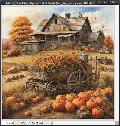
I’ve loaded the scenic paper from “The Great Pumpkin” mini kit by Bekah E Designs (no longer available) that I was using last week into a blank 12×12 file:
Note: Unless otherwise noted this is the paper I will be using for all examples in this post. And anytime the foreground/background color chips are used/changed I will routinely ensure that they are set back to the defaults as necessary.
Initially, I’m going to set my foreground/background color chips to the default of black and white (press D).
For Bas Relief the settings options are Detail, Smoothness & Light Direction. The default values for these settings are 13, 3 & Bottom respectively.
Each one of the Light Direction options (Bottom, Bottom Left, Left, Top Left, Top, Top Right, Right, & Bottom Right) can significantly change the look of the results even without changing the other settings. On this particular paper using a Light Direction of either Left or Right seemed to give the best results.
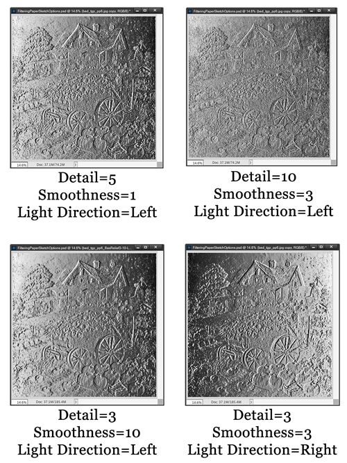
Since the lighting angle in the original paper is from the top left, unless otherwise specified, I will be using Left for the light direction in all of the examples I show you for Bas Relief. The default, minimum & maximum settings didn’t generate anything that was very attractive at all so I just played with them until I found options worth sharing:
I do like how these images remind me of those old-fashioned tin tiles we used to see a lot on ceilings:
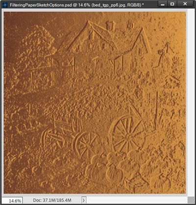
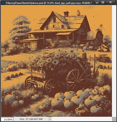
Obviously, different papers (and lighting directions) will give varying results. Changing the foreground/background color chips will also change the look. Like this:
The settings used to generate that look were Detail = 3, Smoothness = 10 & Light Direction = Left. The Foreground color chip was set to a nice orange (#e99f40) & the Background color chip was set to a darker brown (#612d20).
Chalk & Charcoal Filter
The Chalk & Charcoal filter redraws highlights and mid-tones with a solid mid-tone gray background drawn in coarse chalk. Shadow areas are replaced with black diagonal charcoal lines. The charcoal is drawn in the foreground color; the chalk, in the background color.
For Chalk & Charcoal the settings options are Charcoal Area, Chalk Area & Stroke Pressure. The default values for these settings are 6, 6 & 1.
The default & minimum settings were okay (see below) but maximum settings generated something that wasn’t very nice at all so I skipped that one. I did find some additional options worth sharing:
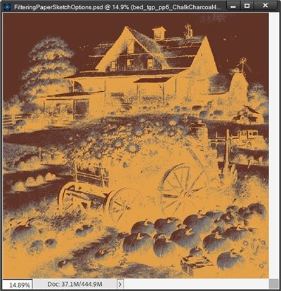
Changing the foreground/background color chips will also change the look. Like this:
The settings used to generate that look were Charcoal Area = 4, Chalk Area = 7 & Stroke Pressure = 4. The Foreground color chip was set to a darker brown (#612d20) & the Background color chip was set to a nice orange (#e99f40).
And this is what it looks like if I reverse the color chips and keep the same settings as above:
Charcoal Filter
The Charcoal filter creates a posterized, smudged effect. Major edges are boldly drawn, and mid-tones are sketched using a diagonal stroke. Charcoal is the foreground color, and the background is the color of the paper.
For Charcoal the settings options are Charcoal Thickness, Detail & Light/Dark Balance. The default values for these settings are 1, 5 & 50.
Note: The results using this filter are very similar to yet interestingly different than those for the Chalk & Charcoal filter above. The difference often is in the details so I’d encourage you to try both filters to see which one works best for your needs.
The default, minimum & maximum settings did generate some attractive results & there was one other that I really liked:
Changing the foreground/background color chips will also change the look just as it did for the Chalk & Charcoal filter. So rather than showing you what happens doing that, this time I thought I’d show you something that I haven’t shown before.
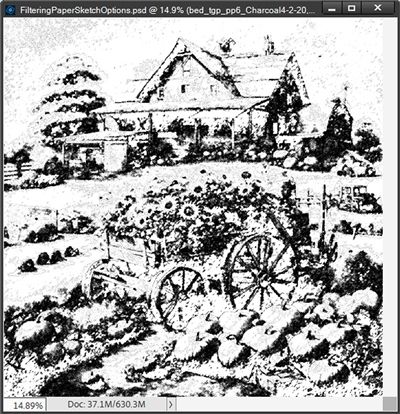
This is what it looks like if I apply the Charcoal default settings of Charcoal Thickness = 1, Detail = 5 & Light/Dark Balance =50 (confirm the filter settings by clicking OK) and then re-apply the same settings again:
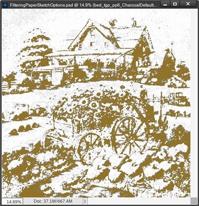
Not only can you re-apply the same filter; you can also then go on to apply a different filter over that. This is what happens if I take the above result (defaults applied twice), change my foreground color to a medium brown (#967117) and apply the Conté Crayon filter (more on that filter shortly) using its default settings:
Oh…way too many possibilities when you start applying multiple filters 😉
Comic Filter
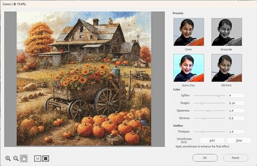
The Comic filter creates the impression that the image was hand-created by a comic artist. The final outcome can be adjusted to include the level of detailing that you need. The main controls are to change the range of colors (Soften), the number of colors reproduced (Shades), how the colors transition from one to another (steepness), and the vividness of the colors (Vibrance). In addition to this, you can adjust the thickness of the pen strokes that are used to outline shapes.
As soon as you select the Comic filter PSE opens a new window (at least for me):
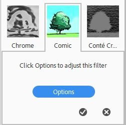
If your version of PSE does not open this window automatically your Filter Panel may look like this:
All you have to do is click the Options button and that Options window will open
For Comic there are 4 Presets: Comic (default), Grayscale, Sunny Day & Old Print. In this window you can immediately see thumbnails of possible effects for each Preset. The setting options for each preset are all the same: Color -Soften, Shades, Steepness & Vibrance. There are also settings for Outline -Thickness & Smoothness. The default values for these settings vary between the presets so I’m not going to list them individually here.
Clearly you can tell by now that with four Presets and so many options there are a lot of possibilities with this filter. Out of all the presets I was most taken with the “Old Print” Preset. So, for the purposes of brevity, I’m only going to show you examples for that option. You can certainly explore the other presets on your own.
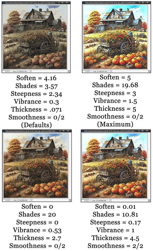
The default settings for Old Print are: Color -Soften = 4.16, Shades = 3.57, Steepness = 2.34 & Vibrance = 0.3. Outline -Thickness = .071 & Smoothness = 0/2. You adjust the Smoothness by clicking the Add button. Or you can click Clear to clear any smoothing. After playing a bit with the Old Print options, here are my results:
Please notice that for the top right example while all other settings were at the maximum, I did not add any smoothness. And for the bottom right example in addition to the other settings, I did add the maximum amount of smoothness.
Conté Crayon
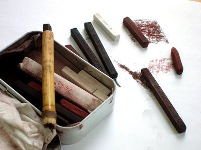
You’re probably wondering what the heck a Conté Crayon is. Well, it’s a very hard type of crayon made from graphite or charcoal mixed with a colored clay. It usually comes in black, brown or warm red and is similar to chalk but with a slightly greasy texture.
The Conté Crayon filter replicates the texture of dense dark and pure white Conté crayons on an image. The Conté Crayon filter uses the foreground color for dark areas and the background color for light areas. For a truer effect, change the foreground color to one of the common Conté Crayon colors (black, sepia – #704214, bistre grayish brown – #3D2B1F, bistre soot brown – #967117 or sanguine red – #850505) before applying the filter. For a muted effect, change the background color to white, add some of the foreground color to the white background, and then apply the filter.
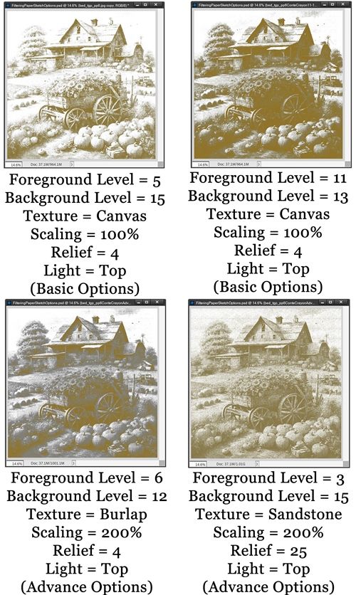
Just as with some of the filters in the Artistic category, Conté Crayon also has a button for “Advance Options”. And here too, if you do nothing with the Advance Options, be aware that PSE will use what it has set as the defaults for all of the settings in this area. Specifically, Texture will be set to Canvas with a Scaling of 100% and a relief of 4. Light will be set to Top.
For Conté Crayon the basic settings options are Foreground Level (applied to dark colors) & Background Level (applied to light colors). The default values for these settings are 11 & 7 respectively. Since I’ve already shown you so many B&W examples, I’m going to switch my Foreground color chip to one of the recommended colors…bistre soot brown – #967117. And since the lighting angle in the original paper basically became irrelevant, I will be using the default (Top) for the Light setting in all of the examples I show you for Conté Crayon.
The basic default, minimum & maximum settings didn’t generate anything that was very attractive at all so I just played with them until I found options worth sharing:
Please notice that the top two examples were created by manipulating only the settings for Foreground Level & Background Level. The bottom two examples were created also using the Advance Options.
Graphic Novel
The Graphic Novel filter creates the impression that the image was sketched for the graphic novel genre of artwork. Graphic novel artwork is restricted to shades of grey, and black and white. The adjustments you can make to the outcome include the overall amount of whites in the image (Darkness), the amount of details available in the outcome (Clean Look), the contrast levels (Contrast), and the thickness of the strokes used to define shapes and outlines.
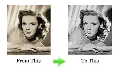
This Filter works pretty much the same way the Comic filter does in so far as it will open a new window with all the Presets & produces only B&W results regardless of your Foreground/Background color chips. Honestly, I wasn’t overly impressed with any of the Preset options even after playing around with the settings. I did find one option worth sharing using the Painted Gray Preset: Darkness = 3.63, Clean Look = 7.94, Contrast = 0.25, Thickness = 5 & Smoothness = 0/2:
Perhaps Graphic Novel just isn’t good for this paper. I do know this works much better on a photo:
The original photo is from a public domain site about Judy Garland (re-colored with a sepia tint). The Graphic Novel version of the photo was generated using the Painted Gray Preset with the default settings. Definitely much better results than the paper I’m using.
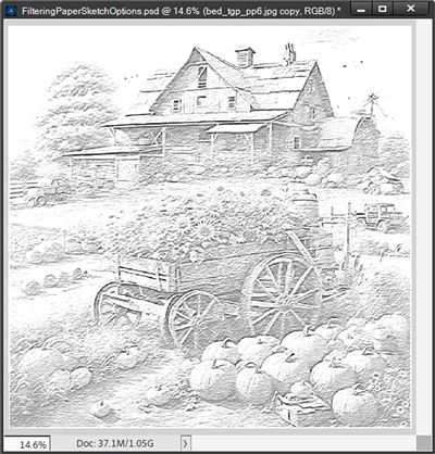
Plaster
The Plaster filter molds an image from 3D plaster, and then colorizes the result using the foreground and background color. Dark areas are raised, and light areas are recessed.
For Plaster the settings options are Image Balance, Smoothness & Light Direction. The default values for these settings are 20, 2 & Top respectively.
Since the lighting angle in the original paper is from the top left, unless otherwise specified, I will be using Top Left for the light direction in all of the examples for Plaster. I am going to change my Foreground color chip to another one of the Conté Crayon colors, bistre soot brown – #967117. Here are some of my results:
Please note that the bottom right example was created with the Foreground color chip set to a brown (#704214) and the Background color chip set to a pale gold (#FCE8B6).
I did not give you any examples using paper for the following Sketch Filters: Chrome, Graphic Pen, Halftone Pattern, Note Paper, Pen & Ink, Photocopy, Reticulation, Stamp, Torn Edges & Water Paper. Mostly because they just didn’t work well with this particular paper. That doesn’t mean you can’t get good results on paper. It just didn’t work for this one. I’d encourage you to explore the other Sketch filters with some of your paper.
Other Filter Categories
Between this post & last week’s I’ve only covered the Artistic & Sketch Filter Categories. And I didn’t even cover all the filters. Can you even imagine how long these posts could have been if I had?
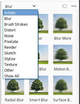
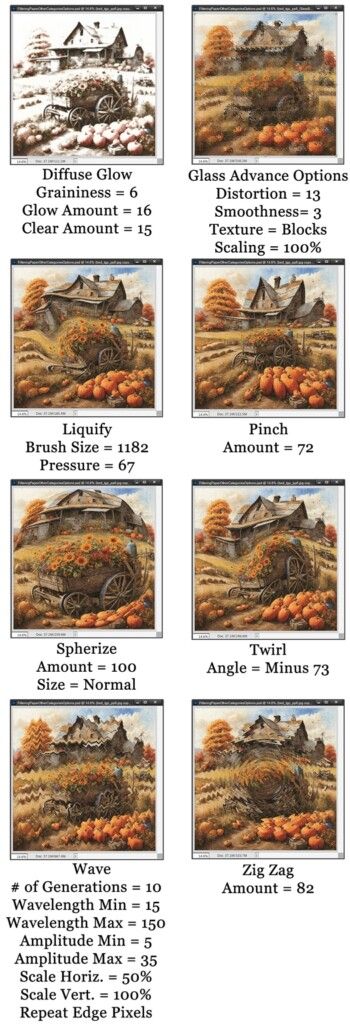
Truth be told of the remaining categories in the menu you see above…there are not that many Filters that will give (in my opinion) good results on paper. I have gone through the categories and come up with at least a few options to give you some ideas. For these categories I’ll only show you images….not a lot of other commentary:
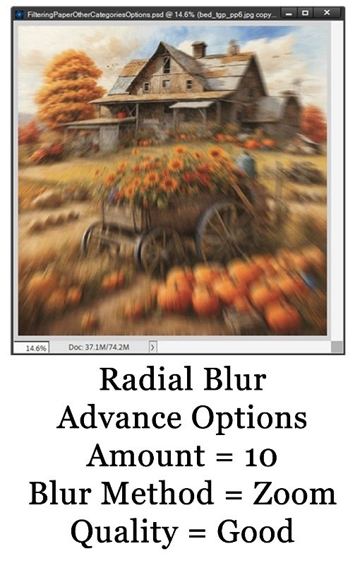
Blur Category
Distort Category
Pixelate Category
Stylize Category
Texture Category
More Tips For Filters
Remember that not all of these Filters will work great on paper. You’ll just need to give them a try and see what happens 😊
One-step filters don’t allow you to control the effect’s characteristics, while multi-step filters have a dialogue box to provide control over filter settings.
Not all filters will guarantee you quality results; you need to take your time to know which effects will bring out the best look for your image.
Reapply previous filters on the same image. Reapplying the effect means the filter will still use the previous settings to enhance your image further.
The best advice I can give you is to just spend time experimenting with the Filters that appeal to you most.
As always, if you have any questions or want to make a suggestion about a topic you’d like me to cover, please don’t ever hesitate to “Message Me”.
Thanks for reading this week’s Tuesday Tip. Be sure to check back next week for some fun tips on creating vintage paper. And if you want to stay informed about other new posts, just click “Follow Me” to stay in touch. I hope you have a wonderful week!
