Need Old Paper?
Just a quick note before I begin. For those of you who live here in the United States, I hope you had a wonderful Memorial Day holiday weekend. God Bless the USA!
Now back to the paper question. Sometimes finding the perfect vintage paper background for your project can be a daunting task. With so many options available, it can be hard to know which one is right for your project. Thankfully, there are a few tips and tricks you can use to make your own perfect vintage paper background for your project.
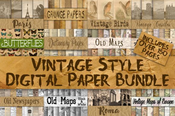
Admittedly, there are a lot of vintage paper kits available. Like these at Creative Fabrica:
But if you’re on a tight budget it may not be practical to purchase some when it’s really not that hard to make your own.
If you understand the different filters, you can create whatever your imagination can conjure. In this post, I’ll show you how to create an old paper texture perfect on its own, used as a texture overlay or combined with other overlays for a “patterned” vintage paper.
Create Old Vintage Paper
A little reminder before I start creating…I use the current version of Photoshop Elements (PSE – 2024). So, everything I show you was accomplished using that software. Some of my screen shots may look different than what you see on your screen depending on the version you are using.
PSE has some fantastic filters. You can really get creative & develop old paper effects. Textured effects such as these can add depth to your digital images, transforming a simple image into something artistic.
Today I’m going to show you how to create an old paper texture. This texture will be perfect for image backgrounds, as a photography texture or to use as a vintage paper overlay.
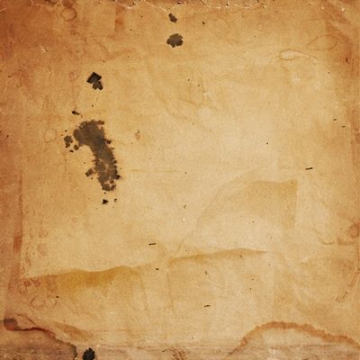
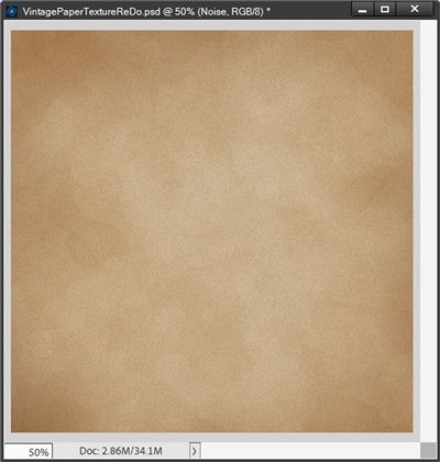
What exactly do I mean by Vintage Paper? This is a paper with texture that looks like an aged, grunge, or weathered sheet of paper like the one above. It can be used to add a retro, antique, or distressed effect to digital artwork or photographs. I’ll explain more about that paper above later.
Creating an old paper background in PSE is a great way to add a distressed look to your graphic artwork or photos. By saving the file as a PSD, I can preserve all the layers and effects, making it easy to edit and modify in the future as needed.
First let’s make a simple vintage paper texture…
Vintage Texture
I’m going to start with a new blank file (File-> New-> Blank File) but not the normal type that I use for layouts. I’m doing something very different this time. Generally speaking, every time I create a layout, I set the file to 12×12 and a resolution of 300 Pixels/Inch. That’s not the case this time.
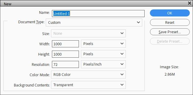
Rather than setting the resolution to 300 Pixels/Inch I’ll be using a value of 72 Pixels/Inch. This is important for creating this texture as I want it to be more “diffuse” for lack of a better word. As soon as I change the Resolution value PSE changes the Document Type to Custom. Typically, the Name is set to Untitled-1. You can rename it if you like but I’m going to leave it as is. I’m still going to set the Width & Height each to 1000 pixels. Now, this will actually result in an “image size” of roughly 14 x14. Don’t worry, we’ll take care of the “12×12 issue” much later.
Note: I’ll show you later what happens if I start this out with a Resolution set at 300 Pixels/Inch.
With the blank file created I set my foreground color chip to a medium beige color (#d3b296). I then use the paint bucket tool to fill the background layer with that solid color. I could just as easily have done this when I created the file, it’s just not my habit to do so. Anyway, this will be the basis for my old paper texture effect. I chose this shade of brown as it resembles old parchment:
Note: You can use whatever background color you feel is suitable for your needs.
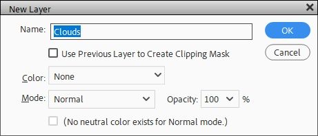
I also renamed the background layer to Base. Now I’ll create a new layer on top of the Base layer by going to the top tool bar and selecting Layer->New-> Layer. PSE opens the New Layer dialog box:
I leave all the options at the defaults & name this new layer “Clouds”. Next, I ensure that my foreground/background color chips are set to black and white (press D).
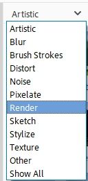
I then “open” the Filters option at the bottom of the Layers panel. The “Filters Panel” displays and the “default” filter category (at least for me) is Artistic. I’m not 100% certain if this is the PSE default. I do know that whatever Filter was used last is going to be what shows up there. I’m not going to use an artistic filter. So, I click the down arrow to the left of the word Artistic and select Render:
There aren’t too many options under this category:
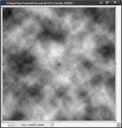
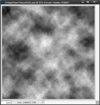
For this first texture layer, I’m going to use Clouds. Since there are no additional options for the Clouds filter, PSE will simply go ahead and run it, adding random “clouds” to the layer. And this is what happens:
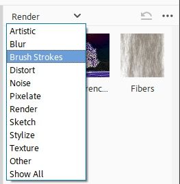
With this Clouds layer still active I’m going to immediately apply another filter on the Clouds layer. This time I’m going to use a filter from the Brush Strokes category. So, I click that down arrow to the left of the word Render at the top of the Filters Panel & select Brush Strokes:
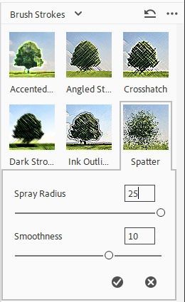
For this new texture I’m going to use Spatter:
I set the spray radius to 25 and the smoothness to 10. Here’s what it looks like now:
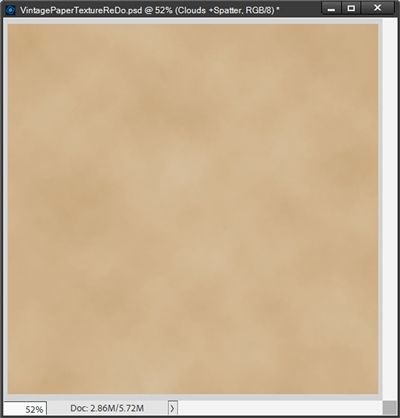
Next, I change the Blend Mode of the Clouds layer to Overlay and set the opacity level to 15%. Here’s the result:
The image is now starting to resemble old paper. But there’s not quite as much variation in the “texture” right now as I’d like so I’m going to do something to adjust that a bit. Next, I’m going to create another new layer (above the Clouds layer) just as I did before; leaving all the options at the defaults but this time I name this new layer “Clouds2”.
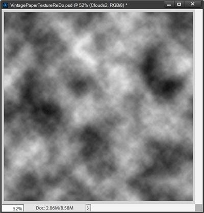
I again ensure that my foreground/background color chips are set to black and white (press D). Then I apply the Cloud filter once again (no Spatter this time). PSE generates a slightly different (random) cloud pattern for this layer:
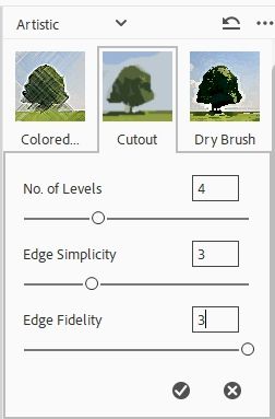
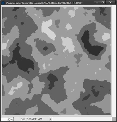
With the Clouds2 layer still active, I immediately apply the Cutout Filter (Artistic-> Cutout). I’ll use this to add some stains to the paper. I set the number of levels to 3, the edge simplicity to 4, and the edge fidelity to 3.
With the Cutout filter applied the Clouds2 layer now looks like this:
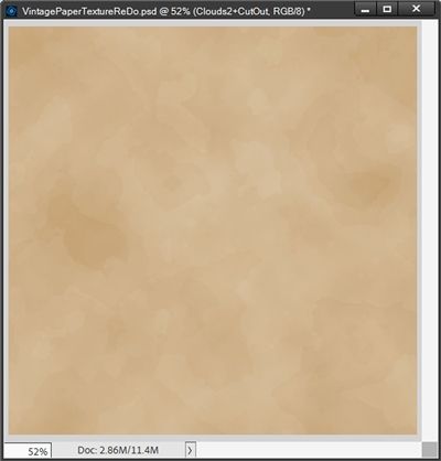
Now I’m going change the blend mode for the Clouds2 layer to Overlay, then lower the opacity of the layer, this time to somewhere between 10-15% to reduce the intensity of the stains. I’m going to lower my opacity value to 13%:
This is starting to strongly resemble the texture of old paper. The cutout effect is intended to mimic stains on the paper in the foreground. I’m pretty happy with this so far.
Note: The settings I used above are those that I prefer. You can play around with the settings if you’d like. But just know you will end up with a completely different “texture”. And that’s perfectly fine.
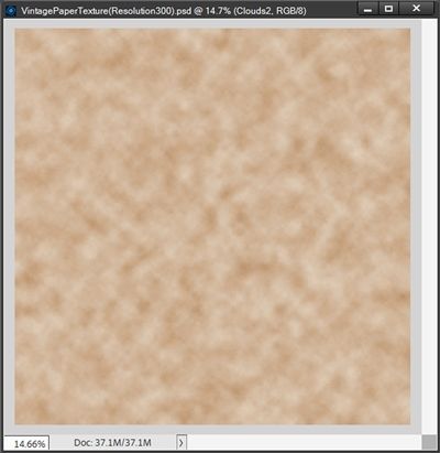
Before I go on, I did want to show you something. Earlier I said I’d show you what would happen if I did this with the file resolution set to 300 pixels/inch vs. 72. Here’s what a difference that would make:
I don’t know about you but I much prefer the version using a resolution of 72. This version at a resolution of 300 just looks “blotchy” to me.
I’m going to do a couple more things to enhance the vintage feel of this paper.
Burn The Paper Edges
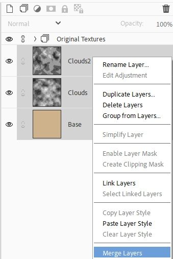
But I’ll need to merge these three layers (Base, Clouds & Clouds2) into a single layer. I know sometimes this can be kind of scary. So, if you’re hesitant to lose the individual layers (as I am) all we have to do is duplicate the existing layers and create a group from them naming the group Original Textures. If you’re not sure exactly how to do this you can refer back to my “Thread The Needle” post for how to create that “duplicate” group.
With or without creating an Original Textures group, I just select all three layers (Base, Clouds & Clouds2) in the Layers panel and Right+Click on any one of the layers’ thumbnail and select Merge Layers:
The three existing layers have now been merged into a new layer (named Clouds 2 because it was the top layer).
Now I’m going to grab the Burn Tool to darken the edges:
With the Burn Tool selected, in the options panel at the bottom of the screen I set the Range option to Midtones and Exposure to 50% (these should be the default settings):
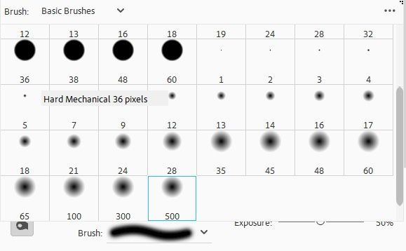
Then, I selected a large, soft-edge brush (the Burn Tool is considered a brush) at 500 pixels:
With the Range set to Midtones it really doesn’t matter what the foreground color chip is set to. The Burn tool merely darkens areas of an image regardless of the color chips. The more you brush over an area with the Burn tool, the darker it becomes.
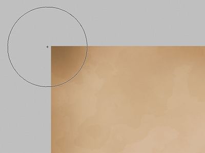
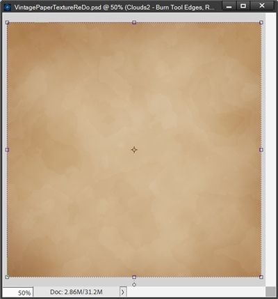
So, I just brush around the edges of the paper to darken (or “burn”) them. For best results, I keep the center of the Burn Tool’s brush cursor on the very edge of the paper and only allow the outer edges of the cursor to pass over the paper. Passing over the same area again will darken that area even more. Here, you can see how I positioned the cursor over a corner to darken it. Notice how the center of the cursor (the small target or Crosshair symbol) remains in the grey area:
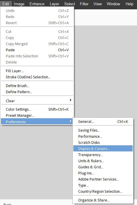
Note: If your cursor doesn’t have the Crosshair symbol in the center you can got to Edit-> Preferences-> Display & Cursors…:
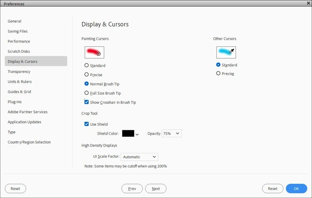
PSE will open the Display & Cursor dialog box:
Then just check the Show Crosshair in Brush Tip box and click OK. You should now see the target or Crosshair symbol in the center of your brush cursor.
And here’s my image after darkening the edges:
Add Grainy Texture
One last thing to give this paper a bit more depth.
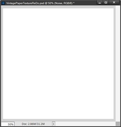
I’m going to add another new layer over the Clouds2 layer which now has the “burnt edges”. I name this new layer Noise and fill it with white:
This new layer will temporarily block our view of the lovely vintage paper I have in progress. Not to worry, the next few steps will bring it back to view in a minute.
With the Noise layer active I select the Add Noise Filter:
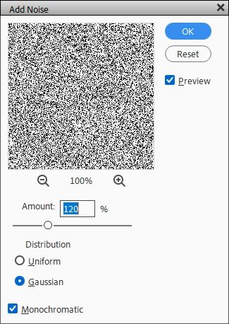
PSE opens the Add Noise filter’s dialog box. I set the Amount value to 120%, although the specific value doesn’t really matter as long as I’m adding lots of noise. I do recommend using at least 120%. I then select the Gaussian and Monochromatic options at the bottom of the dialog box:
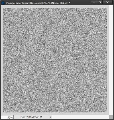
Here is the result:
I know this probably looks scary but hang in there with me. I’m going to blend this Noise layer with the Clouds2 layer to give it a grainy look. I change the blend mode of the Noise layer to Multiply and lower its opacity down to 15%. And with that, my old paper texture is complete:
Now all that’s left is to save this as a JPG file. But first, do you remember how I said at the beginning that this file would not be 12×12. Well, I need to fix that before I try using this paper in a layout.
I can do this one of two ways. Whichever way I do this the paper will ultimately look identical. The real question is, would it be necessary to preserve all the existing layers for any reason?
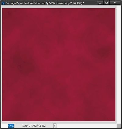
Likely not, except for one reason…did I duplicate/group the original three layers (Base, Clouds & Clouds2) before merging them into a single layer? If I did, I could go back & change the color I used for the Base layer and still use the original Clouds & Clouds 2 layers to get back to the paper before the “burnt edge” step:
Then I just have to repeat the “merge layers” & burn edges steps. I’ll still be able to also re-use the Noise layer. This could save me some time in the future if I wanted to make a different color vintage paper like that lovely red example above!
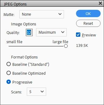
I bet you know by now that I’m going to save this first as a PSD file for that very reason. Then I save the file as a JPG (sized at the current resolution of 72 and width/height both set to 1000). PSE will open the JPEG Options dialog box:
The only setting I change in this box is the Quality. I tend to set mine to 12. But if you were to look at most any purchased digital paper, you’ll find that the designer has saved it with a quality of anywhere from 4 to 10.
Instinctively you’d think that the higher the quality, the better, right? Well, kinda! Generally speaking, we don’t tend to re-size a piece of 12×12 paper to a larger size when using it in a layout. If we’re going to re-size…it’s typically going to be smaller. So, a lower quality starting point isn’t really an issue. It’s strictly a “file size” issue.
BUT…in this particular case I already know I’m going to resize this paper because it’s not starting out at a resolution of 300 Pixels/Inch. So, I will set the Quality to 12. With the paper saved as a JPG I can then just open that new vintage paper, re-size it to a resolution of 300 and set the width/height both to 3600 (12×12) and re-save it with these new settings.
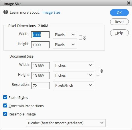
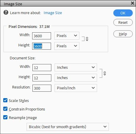
If you don’t feel a need to save all the layers then it’s a very simple matter of re-sizing (Image-> Resize-> Image Size) the “image”:
Just change the resolution to 300 and width/height both to 3600. And you’ll see the “Document Size” change to 12 x 12:
You can then save the file as a JPG and set the Quality to whatever you choose. Though I would recommend not to set it much lower than 10. But, that’s just me.
Now with that lovely “beige” vintage paper texture I created there’s more that can be done if I so choose…
Adding Designs
I can now use this vintage paper texture image and blend modes to easily create a variety of antique patterns.
So, I’ve started a new blank 12×12 file and loaded my newly created vintage paper:
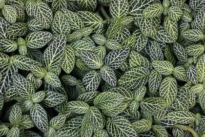
Now I’m going to use this lovely leaf photo I found at Pixabay:
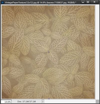
I layer the leaves above my paper, re-size it to cover the entire image and set the opacity level of the leaves to 15%. And here’s a very nice “antique” looking paper:
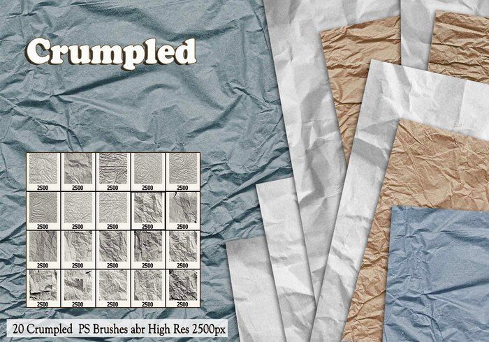
Or I could add some additional texture using a brush. I have a lovely set of crumpled paper brushes that I got for free at Brusheezy:
These brushes have a maximum size of 2500. Clearly that’s not going to span the entirety of my 12×12 vintage paper. So, I’m going to create a new blank layer above my paper. I named my new layer Crumple but it really wasn’t necessary to name it anything other than Layer 1 😉
With those brushes loaded, my foreground color chip set to black and that new blank layer active, all I have to do is select the brush tool and pick a crumple:
The brush I selected (outlined in light blue) is named Sampled Brush 11. I leave all the other settings as they are. If you’ve worked with brushes before, you know that my cursor will now be basically a “preview” of the brush I selected. I’ve yet to figure out a way to do a screen shot that captures that preview so I can’t show it to you.
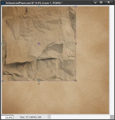
But it is a square shape brush so I line it up with the upper left corner of my paper and simply click. This is what I get:
Now because that brush is on its own layer it’s just a matter of re-sizing it to cover the entire paper:
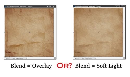
How lovely is that? But it doesn’t have to stop there. I can change the blend mode of the Crumple layer to Overlay or Soft Light:
Or I could just change the opacity of the Crumple layer. Here’s what it looks like at 60%:
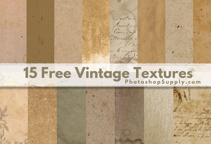
And if I didn’t have any brushes, I could just grab a vintage texture that I have from a site called Photoshop Supply:
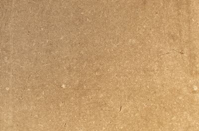
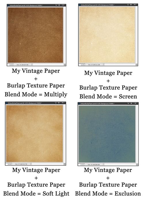
There’s a very nice texture in this pack that looks like burlap:
All I have to do is layer this texture over the vintage paper I created, re-size it to cover the entire image and play with the blend modes. Here are a couple examples of how this turned out:
WOW…that last one was a very nice surprise! You never know what a blend mode will get you 😉
And there you have it! Lots of different variations can be created with just that one old paper texture background.
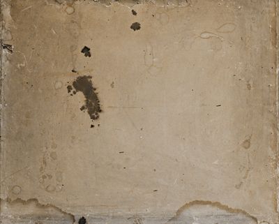
But I don’t have to stop with textures, I can take just about any other “old” looking type paper that I have and blend with my vintage paper. I’m actually going to use a paper from that same set of “textures” above. I didn’t think this one felt so much like a texture as just a grungy paper:
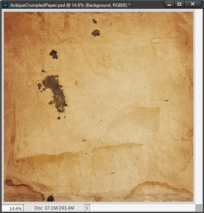
I re-sized and blended that paper (Hard Light mode) with the crumpled vintage paper from above:
I promised I’d explain the vintage paper I showed at the beginning of this post and that is exactly how I made it!
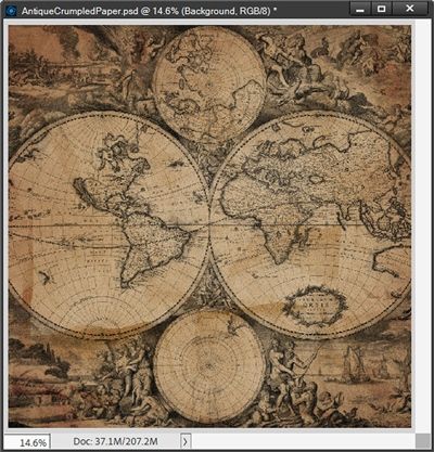
And overlays can also be used to blend with my vintage paper. I’ve got a few overlays by Janet Kemp (formerly Scott) at DigitalScrapbook.com that will work great with this paper.
First up is one of Janet’s map overlays blended (Multiply mode) with the crumpled vintage paper from above:
Next is one of Janet’s wood overlays blended (Hard Light mode) with the “plain” vintage paper from above:
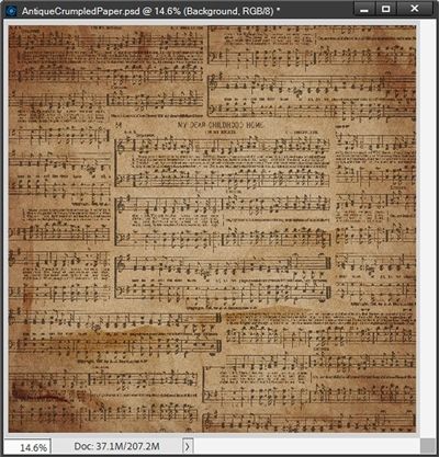
And finally, a music overlay also by Janet, blended (Linear Burn & 60% opacity) with the crumpled vintage paper from above:
That ought to give you some ideas about what you can do with whatever vintage paper texture you create!
More Tips On Vintage Paper
Creating vintage papers is one of my favorite things to do. I hope after you’ve tried this it will become a favorite of yours as well.
Apply filters in succession to build up effects. You can apply filters to individual layers or to several layers in succession to build up an effect. Choosing different blending modes in the Layers panel can enhance the effect.
The settings I used today provide you with a natural old paper texture. You can change the initial background color. Furthermore, you can change the settings of the spatter and cutout effects to give a different vintage paper texture.
When using another texture paper or overlay to blend with your new vintage paper, experiment with the layer order to see if one way looks better or at least different than the other.
Once you get the hang of it, creating papers (vintage or otherwise) can be relaxing, help jumpstart your creativity if you’re feeling stuck, and can become sort of a meditative process. Plus, it’s just plain fun.
Experiment with giving your papers a worn feel using overlays or brushes. This can make them look as if they were discovered in an old trunk long forgotten in an attic.
Most importantly…just have fun!
As always, if you have any questions or want to make a suggestion about a topic you’d like me to cover, please don’t ever hesitate to “Message Me”.
Thanks for reading this week’s Tuesday Tip. Be sure to check back next week for some fun tips on creating a pop art image. If you want to stay informed about new posts, just click “Follow Me” to stay in touch. I hope you have a wonderful week!

