Thread The Needle
Last week I posted about weaving paper in digital scrapbooking. That post got very long with all the detail I provided so I didn’t get to talk about how we can weave (intermingle) other elements.
As promised, this week I’ll cover some of the other fun things we can do with weaving on digital scrapbook layouts.
Before I begin just a quick reminder that I am using the most current version of Photoshop Elements (PSE) – 2024. Some of my screen shots may look different than what you see in your version. If you’re using an older version of PSE I cannot guarantee that everything I show will work exactly the same in your version. And If you aren’t using PSE at all, you may need to search the internet for tutorials specific to the graphics editing software you are using.
Layer Masks – The Basics

All of the weaving techniques I use are non-destructive so I don’t ever have to worry about permanently altering any of the elements involved in the process.
I’ll be using Layer Masks for all of the techniques I’m going to show you today so I wanted to cover some basics about layer masks before I get started with the first example.
There are four major things that are important to keep in mind any time you are working with a layer mask:
- The Foreground & Background Color Chips are an integral part of the process and should be set to the defaults. Just press D & PSE will set them to the default of Black & White respectively.
- Make sure that the Layer Mask (in the Layers panel) is the active layer before masking. Just double-click on the Layer Mask to ensure it is active.
- When working on a Layer Mask, black conceals (erases) & white reveals (restores).
- Pressing X will swap between the Foreground & Background Color Chips any time but is particularly handy when you are working on a Layer Mask.
When the Layer Mask is active there will be a colored box (outline) drawn around it:

In PSE 2024 that outline is blue. It can be different depending on what version of PSE you’re using.
There are many tools that can be used when working on a layer mask. The most popular is the Brush Tool. But today I’ll be using another useful tool – the Lasso Tool.
Those are the basics on layer masks so it’s time to work on the first example…
Sewing Technique

I’m going to start with a very simple sewing technique but one I’m sure you’ll find useful. I’m going to add some stitching to a flat button so it looks like it’s “sewn” over the button not just lying over the top (or under it). Why? Because in real life stitching goes through the button holes and will typically not appear over the button itself.

If you have read some of my prior posts you know I generally don’t like to create “new” elements directly on my layout. But since I’ll be using a non-destructive technique…there’s really no harm in you working on your layout if that’s more convenient for you.
For simplicity, I am going to start a new file with a blank (transparent) layer. Since I’m not certain how large the elements I’m going to use might be, I set the file size to something that should be close – 2000 x 800. I already pulled my button & stitching (each from my personal stash) into my Photo Bin so I just drag those onto the new file placing the Stitching layer above the Button layer:

Note: If you create your file sized smaller than the largest element you’ll be using, PSE should just re-size the element as you drag it into your file. If you want to be certain your new file will be large enough you can always start with a 12 x 12 file just to be safe!
With the Stitching layer active I click the Add layer mask icon in the Layers panel. Next, I set the opacity of the Stitching layer to about 60% so I can more easily see what part of the stitching might realistically be under the button rather than over it:

Tip: If you’re doing this directly on your layout it might be a good idea to hide some of the layers under your button. It will make it so much easier to see what you’re working on.
As I mentioned above, arguably the tool most often used when masking is the Brush Tool. But for this example I am going to use the Lasso Tool:
In the Tool panel for me it already shows up as the Select – Lasso Tool icon because that’s the last selection tool I used. Yours may look different but when you hover over it, PSE will still let you know which tool you’re about to select. If it’s let’s say the Polygonal Tool, you can just change it to the Lasso Tool in the options section below the work area:

By ensuring that the Add option is selected I will be able to make multiple selections at one time. This will become even more important in some of the other examples that follow below.
Note: if you accidentally make a selection during this process and catch it right away you can just “undo” (Ctrl+Z) that particular selection. If you don’t catch it right away you can switch to the Subtract option and remove it that way. If you feel like you need to start completely over just deselect all (Esc or Ctrl+D)
In this case I really only need to make two selections; around the parts of the button where I don’t want the stitching on top. I’m going to zoom in very close so I get a good view of the detail around that area of the button. I do this by positioning my cursor over the area on which I want to zoom. Then I hold the Ctrl key while using the scroll wheel on my mouse to zoom in (or out) as needed. I know not everyone may have this option so I’m going to give you a few extra tips here.
You can press Ctrl+Plus Sign to zoom in (Ctrl+ Minus Sign for out). Generally, after using this keyboard shortcut you’ll have to move your file around in the work area in order to see the area you’re working on. Here’s a handy little tip to make that easier. Hold down the spacebar to temporarily switch to the “Hand Tool”; this will allow you to click on the file and quickly move it around. When you release the space bar it will revert back to the previous tool. In this case the Lasso Tool.
Okay, so here it is zoomed in:

With the Layer Mask for the Stitching layer active (double-click on the layer mask thumbnail to be certain), I can now use my Lasso Tool to “draw” a selection around the parts of the stitching that is over the button (besides over the section between the holes). I don’t have to be overly precise I just need to be sure I grab all desired parts of the stitching:

You should be able to see the “marching ants” around the parts selected. With those marching ants I will activate the Button layer & then select Layer->New->Layer Via Copy (Ctrl+J) to place the selections of the button on its own layer.

I ensure that my color chips are set to the default (press D) because I’m going to be creating a mask next.
I now activate the Layer Mask for the Stitching layer again (double-click on the layer mask thumbnail). I then Ctrl+Click on the cut-out button sections (Layer 1) to make a selection of the cut-out parts of the button. I press Alt+Backspace to fill that selection with black. I deselect (Esc or Ctrl+D) the selection, and here’s the button with the stitching masked away:

I no longer need the button cut out layer (Layer 1) so I can delete that layer (drag it to the trash can in the Layers panel). I’m now going to set the opacity of the Stitching layer back to 100%:

See how much more realistic this looks? Now I can zoom in a bit closer to be sure I didn’t mask too much of the stitching away alongside the edges of the button. If I did, then it’s just a simple matter of switching to the Brush Tool and Background Color Chip (white) and I can just “brush” the other part of the stitching back along the edges of the button. But in my case, all looked great.
If you’re working directly on your layout now would be a good time to unhide any layers previously hidden earlier in this process.
If you’re working on a new file, I suggest adding either a new layer (filled with white or some other contrasting color) below the Button layer or simply filling the base layer with the same. It’s just a matter of personal preference. Why? Because now I’m going to add some drop shadows.
This part is easy. For both the Button & Stitching layers I can either grab one of my go-to shadow styles or I can just go to the top tool bar & select Layer->Layer Style->Style Settings to open the Style setting options dialog box.
For the Button layer I set the Lighting Angle to 120 degrees, check the Drop Shadow box, set the color chip to black, set the Size to 10 pixels, the Distance to 8 pixels, & the Opacity to 50%.
For the Stitching layer I set the Lighting Angle to 120 degrees, check the Drop Shadow box, set the color chip to black, set the Size to 4 pixels, the Distance to 2 pixels, & the Opacity to 65%.

You can play around with these settings based on your preference. If you’re working directly on your layout…you’re all finished.
If you’re working on a new file (as I) then you have the same options I discussed in last week’s post. You can either copy the Button & Stitching layers from this new file to a layout in progress or save this file as a PSD and/or as a stand-alone element (PNG) for use later. If you need a refresher on those steps please just refer back to that post. I chose to save mine as both a PSD & stand-alone element (as is shown at the top of this section).
And here are a couple more examples using this technique:

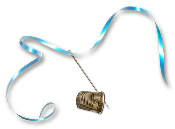
WordArt Weaving Technique

This time I’m going back to the title of last week’s post to create some weaving over word art.
I’m not going to include so many images while I go through this technique. I’ll be using some of the same steps/tools I used above. You can always scroll back up if you can’t remember a particular tool or setting.
Like last week, this is another case where I’d highly recommend not doing this directly on a layout! So, I’ve already started a new file and loaded my word art and the ribbon into the file and placed them the way I want them (ribbon above all the letters).
Note: The letters in the word art are from Kim Jensen’s “Big Rumpled Alpha”. The ribbon is just one from my personal stash.
Extra Setup Steps
Some extra explanation on the letters here. I don’t want shadows during the masking process (I talked about this in last week’s post) and I’m not going to be doing shadowing the same way as I did with the other weaving process. So, I’m setting some things up a bit differently this week.
I am working with individual letters rather than a complete piece of word art. These individual letters will make this process rougher than it needs to be. And, contrary to popular belief…sometimes I’m inclined to take the quickest, easiest route to a solution rather than the “technically correct” one. So, the next few things here will make it easier for me to apply shadows later.
I’m going to select (activate) each of the letters’ layers & duplicate the “group”. With those duplicate letters still active I then click the Create a group icon in the Layers panel to create a group and name it Individual Letters. For now, I will hide this group and move it to the bottom (below all the other letters.)
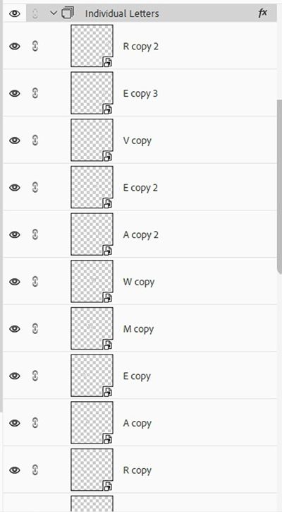
Next, I select (activate) each of the original letters’ layers. With all the letters active I Right-click->Merge Layers. I then name this layer WordArt. This WordArt layer is the one I’ll use during the weaving process.

If I left the word art as individual layers it would make the masking process so much more involved because I’d have to do each letter individually.
These extra copies of the letters will make more sense at the end of this process…trust me.
Also, this weaving is a bit more involved than what I did with the button & stitching so I am going to do something a little different. I’m going to pre-mark the areas where I’d like the ribbon to be behind the letters. These will be the areas of the ribbon that I will mask out (conceal). With so many over/under points it could get confusing if I didn’t mark these ahead of time.
I did this by creating a new blank layer (named Under Points) above the Ribbon layer. Then using a hard round brush (I could also have used the Pencil Tool) in green, I drew circles around those areas for future reference. I can hide/reveal this layer as necessary during my selection process.

For now, I’m going to hide those weaving points.
Now, Back To The Weaving
First, I set my color chips to the default (D). With the Ribbon layer active, I add the Layer Mask and reduce the opacity to 60%. I’ll hide the background layer so It’s easier to see the letters.
I select the Lasso Tool and use the same settings as above (Add to selection, Feather 0 (zero) & Anti-Aliasing checked). I zoom in and move my document to start weaving with the letter D. This is where those zoom (Ctrl+/-) & move (hold Spacebar) tips from above come in handy.
I can now use the Lasso Tool to make the selections based on the points I identified earlier. And if I need some reminders during this selection process I can just unhide that Under Points layer for a refresher!

And just like with the stitching above, I activate the WordArt Layer and create a new Layer Via Copy (Layer 1) based on only these selection points.
I then again activate the Layer mask for the Ribbon layer, Ctrl+Click on the Layer 1 thumbnail, press Alt+Backspace (fill with black) to create the masking points on the layer mask. I deselect the selections (Esc or Ctrl+D). Now the ribbon is behind the letters where I had hoped:

I no longer need the WordArt cut out layer (Layer 1) so I can delete that and set the opacity of the Ribbon layer back to 100%. Now I can zoom in a bit closer to be sure I didn’t mask too much (or too little) of the Ribbon in any areas. If so, I can just use the Brush Tool (on the layer mask) to make any necessary adjustments.
I did need to do a bit of clean up but here’s my word art with woven ribbon:

As you can see…no shadows yet. And this is where all that extra setup is going to pay off.
Since all the masking occurred on the Ribbon layer & not the WordArt layer…I can actually delete (or at least hide) the WordArt layer and Unhide the Individual Letters layer. Since the letters are all contained in that group, I can simply apply a shadow to the group rather than adding one to each letter independently. Here’s how that looks:

The ribbon is going to be a different story. If you read my post about “Out Of Bounds Frames” you know things can get tricky when applying shadows to images that have been “masked.” Even if we simplify the layer after masking is complete, shadows can still end up in places they shouldn’t. That would be the issue with the ribbon here.
So, I’ll duplicate the Ribbon layer, rename it Ribbon Shadow Layer and delete (or at least hide) the original Ribbon layer. Next, I’ll simplify the Ribbon Shadow Layer (Right-Click->Simplify). Now, I can apply a shadow to that Ribbon Shadow Layer. Yes, there are shadows where there shouldn’t be. Specifically, wherever the ribbon goes beneath a letter. Because I masked away (deleted) those parts of the ribbon, there are now edges that will receive a shadow. Those “edge” shadows are showing up on top of the letters and shadows don’t belong there.

The shadow over the D will be fine since the upper part of the ribbon is still over top of the D so I’ll leave that one alone. There are other places besides the two in the image above (over the letters W & the last R). It’s not too hard to fix this…just tedious. With the Ribbon Shadow Layer active I add a layer mask and just go in and mask away the shadows that don’t belong.
Here’s the final result:

As I’ve mentioned before you can either copy the Wordart & Ribbon layers from this new file to a layout in progress or save this file as a PSD and/or as a stand-alone element (PNG) for use later. If you need a refresher on those steps please just refer back to that post. I chose to save mine as both a PSD & stand-alone element (as is shown at the top of this section).
And here’s one more example of word art weaving:

Weaving Elements
Well, not always weaving. Sometimes I just want to put an element “inside” of another. Let’s say, maybe putting this umbrella inside the wire basket:

I know some people might just put the umbrella behind the basket and call it a day:

But, by following the same basic steps from above I can do this easily and have it look more realistic than just placing the umbrella behind the basket.
I just create a new file, pull in the umbrella & basket with the umbrella layer above the basket layer. Then just as before using the Lasso Tool I make a selection around the part of the umbrella that I want to be inside the basket.
With the basket layer active I create a new Layer Via Copy (Layer 1) from that selection. I add a Layer Mask to the umbrella layer and ensure it is active. I then Ctrl+Click on the Layer 1 thumbnail & press Alt+Backspace to create the mask from the selection. I can then hide (or delete) Layer 1 and apply shadows to the umbrella & basket. Now here’s where we are:

See what a difference taking those few extra steps made. As easy as this one is there are a couple more examples, I want to show you that might take a bit more time.
And just as above, I can either copy the umbrella & basket layers from this new file to a layout in progress or save this file as a PSD and/or as a stand-alone element (PNG) for use later.
I want to show you how easy it is to create a realistic wreath from separate elements I already have in my stash.

Again, some might put the floral wreath over top of the wood wreath and just leave some of the wood showing underneath:

It doesn’t look horrible…just not as realistic as I’d like. Weaving the floral wreath into the wooden one is going to be more like the steps I followed when weaving the ribbon into the word art. But still, pretty much the same basic steps I’ve been using.
Because this wooden wreath is fairly complex there are going to be parts of the floral wreath that I want completely beneath the wooden wreath. And there will be other parts that I’ll want to be under only certain sections of the wood. So, this is going to be a multiple phase weaving process but really no more difficult than the ribbon with the word art.
I’ll start with the floral parts I want completely beneath the wooden wreath by creating a new file, pulling in the floral wreath & wooden wreath with the floral wreath being the top layer. This time I will take the extra step to mark the areas of the floral wreath that I want to be under the wooden wreath by creating a new layer above the floral wreath and drawing circles over those areas.

Then just as before using the Lasso Tool I make selections around the floral areas that I want to be under the wooden wreath. With the wooden wreath layer active I create a new Layer Via Copy (Layer 1) from that selection. I add a Layer Mask to the floral wreath layer and ensure it is active. I then Ctrl+Click on the Layer 1 thumbnail & press Alt+Backspace to create the mask from the selection. I can then hide (or delete) Layer 1. And here it is so far:

Now, I could go in and make selections on the wood wreath that I want to be over the floral wreath and do the masking just as I have before. But this time I’m going to do things a bit differently.
Instead of making numerous selections I’m just going to go around the floral wreath kind of randomly and simply brush away parts of the flowers so the wood part shows above.
All I have to do is set my color chips to the default (D), set the opacity of the floral wreath layer to about 70% (so I can still easily see the floral parts but also see the wood), grab the Brush Tool, activate the existing layer mask on the floral wreath and simply brush away the parts I don’t want over the wood:

I didn’t get too carried away so it’s a subtle difference but I do like it better. Now here it is with the shadows:

Note: In this particular case there wasn’t a real problem with putting the shadows on both the floral and wood wreaths so no extraneous steps required. This may not always be the case. Whenever it is, just refer back to the shadowing steps for the word art & ribbon.
And just as before, I can either copy the floral wreath & wooden wreath layers from this new file to a layout in progress or save this file as a PSD and/or as a stand-alone element (PNG) for use later.
And here are a few other examples using this same technique:

Weaving Text

If you’ve ever done a search for font duos you’ve likely seen something like what’s in the image above; two fonts intertwined. Using the same selection/masking techniques I’ve already described you can achieve this text weave effect yourself.
Note: The image directly above is the “preview” image for the Modena Font Duo by Jen Wagner at Creative Market.
I’m going to be using the “Margo Font Duo” also by Jen & available at Creative Market (not for free) to create some woven text.
Generally speaking, it’s not a problem to work on text weaving in a layout. It’s typically not quite as involved as some of the other examples I’ve shown you above. And all of the techniques I’ll be showing you here are also non-destructive. But, since I don’t have a layout in progress, I’m just going to start with a blank file.
With the new blank file open, using the Margo Serif font I just type my first two words:

I did type each word separately creating a layer for each word. I may need to reposition the words so I don’t want them to be in the same text box.
Now I’m going to type my next word using the Margo Script font. I placed this new text layer above the other two words:

This doesn’t look very pretty right now but I already have some ideas about how I want the final word art to look so hang in there with me.
Next, I’m going to make some alignment changes to add interest to my word art:

I did this now because I want to be certain that I have all of the text aligned exactly how I want it before I start masking. It’s going to be very difficult to try realigning anything once I start masking.
Next, I’ll identify the points of the word “and” that I want to be beneath the other words. I did this just as I did before with the “Dreamweaver” word art above.
I created a new blank layer (named Under Points) above the text layers. Then using a hard round brush (could also use the Pencil Tool) in red, I drew circles around those areas for future reference. I can hide/reveal this layer as necessary during my selection process:

I feel like I’m pretty happy with the way this is going so far. But I don’t want to get over confident about things. In order to finish this, I do have to merge the word cinnamon with the word sugar or making selections & doing the masking would be trickier. Remember, I did the same thing with the “alpha letters” in Dreamweaver above.
So, next I’ll duplicate the Cinnamon & Sugar text layers. I will hide the original text layers and save them in case I do end up needing to make any changes. Then I simplify & merge the duplicated words together into a single layer & name this merged layer Cinnamon Sugar.
Now, with the Cinnamon Sugar layer active I can use those reference points I marked to make my selections and continue the process of masking just as I’ve done before. This is what it looks like now:

I did make two small changes when masking. I preferred that the letter “n” in the word “and” crossed over the right side of the letter “u” in “Sugar”. I also decided to have part of the letter “n” in the word “and” go beneath the cross bar in the letter “a” in the word “Sugar”. Other than that, I was happy with how it looked.
Still looks kind of plain, right? So, I’m going to add some styles. I used the PSE preset Bevel style named Simple Sharp Inner on the Cinnamon Sugar layer. Once the style was applied, I went into the style settings (double clicked the style icon on the Cinnamon Sugar layer) and changed the Lighting Angle to 120 degrees and the Size to 25 pixels.

Then I used the PSE preset Bevel style named Inner Ridge on the “and” (still text) layer. Once the style was applied, I again went into the style settings but this time only changed the Lighting Angle to 120 degrees. This is how it looks with the bevels:

This looks very nice but I want to do one more thing to zhuzh it up a bit. I want to put a shimmer from “Shimmered Vol. 1 Styles” by Studio Flergs on the word sugar. This is going to take a little extra work but I think it will be so fun.
Because the words cinnamon & sugar are merged, I will need to separate the word sugar. If I don’t, when I go to apply a style, it will be applied to both words. I only want sugar to get the shimmer. Also, if you read my post about using styles you already know if I want to “stack” styles (which is exactly what I’m about to do) I can’t just apply a second style over one I’ve already applied.
To work around both of those things, I need to duplicate the Cinnamon Sugar layer and hide the original (just for safe keeping), rename this new layer Cinnamon (trust me) and simplify it.
With the simplified Cinnamon layer active, I used the Lasso Tool to draw a selection box around just the word Sugar:

Then from the top tool bar I select Layer->New->Layer Via Cut. I named this new layer Sugar For Shimmer.
With the Sugar For Shimmer layer active I can now apply my selected shimmer style (flergs-CU-shimmerd1-4). And once again I need to make adjustments to the style settings. So, I go back to the Layers panel and open the style settings for the Sugar For Shimmer layer. I only change the Lighting Angle to 120 degrees to match the prior styles.
And if you’ve read that other post about styles you know I can also change the size (scale) of the style so it fits the size of the item being shimmered. So, I go up to the top tool bar and select Layer->Layer Style->Scale Effects. I didn’t need to change it much but I did set it to 90% versus the default of 100%. and here’s the woven text so far:

Still not quite as much sparkle as I’d hoped so I duplicated the Sugar For Shimmer layer, simplified the new layer and applied a different shimmer to this new layer. Adjusted the Lighting angle and left the scale at its default this time:

I love how this turned out. I could add some shadows here but I think I’ll let it be for now. I’ve already talked so much about shadowing; I’m sure you can handle it on your own.
So that’s the weaving for today. I hope you’ll have some fun experimenting with at least one of these weaving techniques.
Additional Tips On Sewing & Weaving

Weaving can make for very interesting and sometimes impactful elements in our layouts. Just take your time looking for the right elements that will work well for whichever weaving technique you use. Sometimes that’s the step that takes the longest 😉
When weaving text, it’s often best to limit the number of words and fonts that you use. And you don’t ever have to apply styles…that’s all up to your preference. Pairing serif & script fonts always works well. But don’t ever be afraid to weave 2 serif words together.
Once you master the selection and masking techniques…the sky’s the limit. Just use your imagination and see where it takes you.
Above all just enjoy experimenting with these different weaving techniques. My favorites are weaving elements with words and weaving text. I hope you can find a favorite…I’d love to hear what it is so post a comment below to let me know.
As always, if you have any questions or want to make a suggestion about a topic you’d like me to cover, please don’t ever hesitate to “Message Me”.
Thanks for reading this week’s Tuesday Tip. If you want to stay informed about new posts, just click “Follow Me” to stay in touch. I hope you have a wonderful week!