Blending In
Transform your photos from ordinary to amazing with the power of blending. It’s creative, easy, fun, and will make your family and friends say “Oh my!”
If you look up the meaning of the phrase “Blend in” you would find multiple definitions based on the circumstances. For example, as it relates to cooking, it means to add to a mixture or substance and mix it thoroughly.
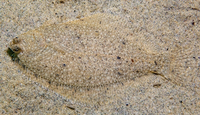
In other circumstances it means to look like one belongs with a particular group or to look like things nearby. Just as that winter flounder blends so perfectly into the sandy bottom in this photo:
And one last instance is how voices in a choir can blend in so that they become just another instrument in the band.
But what about blending in on a digital layout? Back last year I wrote a post about Blending Papers. Today I want to talk about a different aspect of blending – using photos & Blend Modes. If you’ve looked through any of the galleries on the blog, you’ve probably seen that I often blend a photo into the background or with paper.
To some this may sound perhaps just a bit challenging. But one of the joys of creating digitally is that you can just play around until you get an effect that you like. And you can always go back a step or two if you don’t like it!
Let’s give a go at blending in…
Blending Photos
Before I go further, a quick reminder. I use the current version of Photoshop Element (PSE 2024) so all of the steps that follow are accomplished using that software. Some of my screen shots may look different than what you see on your screen depending on the version you are using. If you don’t use PSE, please search the internet for other tips/tutorials specific to the graphics editing software that you use.
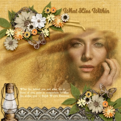
Now, let’s take a look at the image above. That’s a Creative Team layout that I did last September. It’s pretty easy to see that I blended that photo from Pixabay into the background of that layout.
I accomplished this using a mask of my own creation. But it could just as easily have been blended using a suitable mask I may have purchased. If you don’t have a mask or at least not one that would work well on your given project, please refer back to my post about creating a mask.
Using a mask to blend a photo with paper is a fairly straightforward technique. You start with your background paper, layer a mask over the paper, pull your photo in over the mask & clip it to the mask. Easy peasy…photo blended.
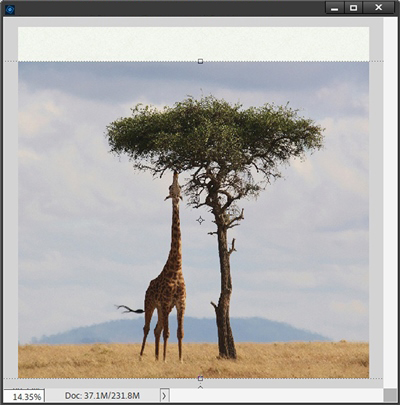
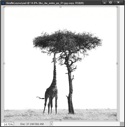
I’m going to walk you through creating a different kind of photo blending using this photo from Pixabay:
I’ve opened a new blank document and brought in a background paper and layered my photo over that:
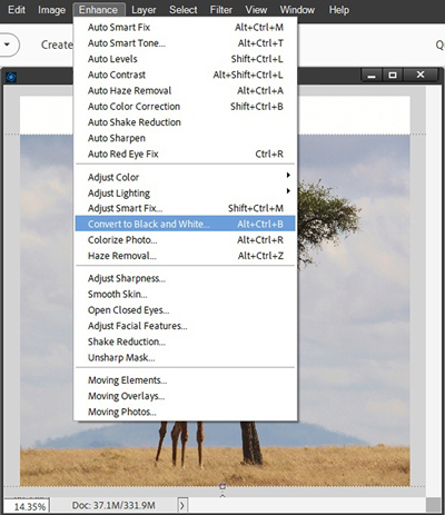
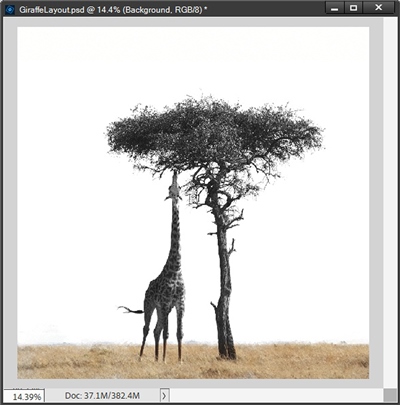
I duplicate the photo and hide the original. I already have a layout idea in mind so I want this duplicate photo to be black and white. So I go to the top tool bar and select Enhance->Convert to Black and White:
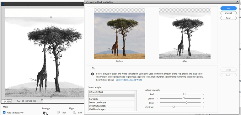
PSE opens the Convert to Black and White options panel and I select Newspaper:
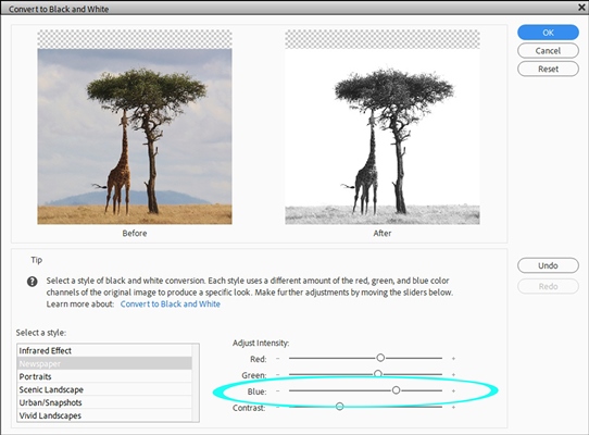
This looks okay but I don’t like how the upper edge of the sky looks. I really want that to blend better with the white background. Unfortunately, there are no “percentage” number settings for the Adjust Intensity options as we usually see on other tools. Knowing that I want to make changes to “whiten” that troublesome section of the sky that used to be blue I adjust the setting for the blue channel using the slider until I’m happy with the result:
This may sound tricky but it is pretty easy. I just played with the setting until I got a black and white photo that blends better. And here is the result:
I do miss the grassy plain at the bottom of the photo. But I can easily fix that. First I unhide the original photo and add a layer mask to the B&W version. With the layer mask active I grab one of my favorite brushes and mask away part of the B&W photo so the grass shows through:
So this was a rather rudimentary form of blending and I’m going to talk about other options next. Now I just need to add other elements for a striking page. And here is the layout that I created with this blended B&W photo:
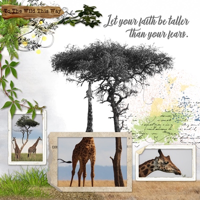
As you can see, once I started working on the layout I masked away a bit more of the B&W photo for some extra color. I also used the orginal color photo for the center frame. This was done easy enough by creating a photo “rectangle” and clipping a duplicate copy of the original color photo to that. I love how the colored portion just accentuates the B&W background even more.
You can see all the details about this layout in my 2024 Gallery.
And here are a few more examples of photos being blended into the background:
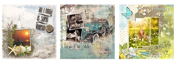
If you’d like more details about these layouts, the “Vitamin Sea” layout can be found in my 2019 Gallery. And both the “Travel In Style” & “Sunny Day” layouts can be found in my 2020 Gallery.
Using Blend Modes
Blend Modes in PSE allow you to blend the pixels of a layer with the layer directly underneath to create a new effect. You can use Blend Modes on so many different combinations of layers. Today I’m going to talk about using Blend Modes with photos.
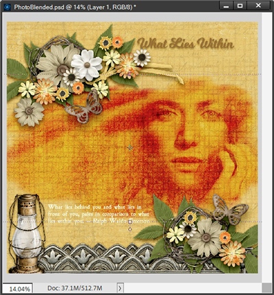
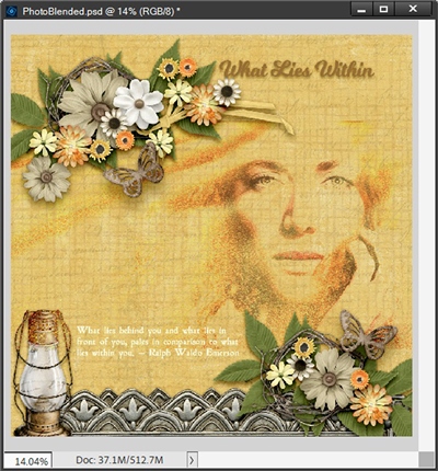
Let’s take a look again at this layout:
Originally, all I did was blend the photo into the paper using a mask. But what happens if I also change the “Blend Mode” for that photo? Let’s see what happens when I select the down arrow by the word Normal at the top of the Layers Panel:
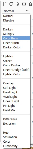
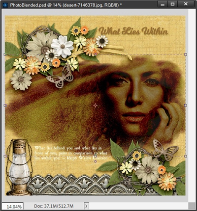
You can see all the different Blend Modes that are available in PSE. As you may have guessed, I’m going to select Color Burn. And this is what happens to that photo:
Quick clarification here; because I had clipped the photo to a mask, I have to change the Blend Mode on the mask not the photo itself. The reason for this is because of what I said earlier; Blend Modes blend the pixels of a given layer with the layer directly underneath.
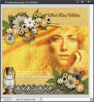
If I change the Blend Mode on the photo in this instance rather than on the mask, here is what happens:
Also, an interesting look! This actually didn’t turn out too bad…perhaps a bit dark but I wanted you to see what else can happen if you blend on the photo when it is clipped to a mask. This time I’m going to set the Blend Mode of the photo layer to Darker Color:
See all that grey around the photo? That’s the color of the mask. If I change the Blend Mode on the photo back to normal & the Blend Mode on the mask to Darker Color it still looks pretty much as when I started:
I’m going to try another combination. The Blend Mode on the mask is back to Normal and I’m going to change the Blend Mode on the photo to Lighten:
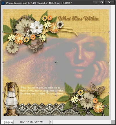
Well, that’s anything but lighter! Let’s see what happens if I switch the Blend Mode on the photo back to normal and set the Blend Mode on the mask to Lighten:
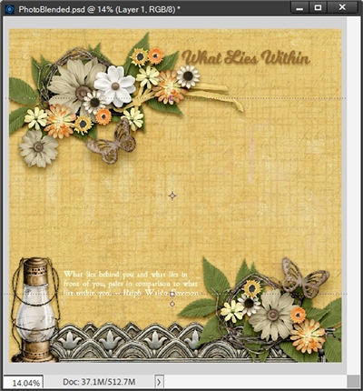
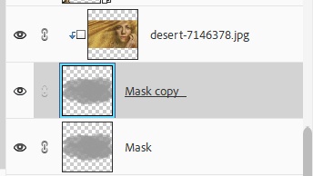
Okay…so that’s waaaaaaaaay too light. But there is a way to “fix” this. I’m going to duplicate that mask, keeping the duplicate above the original and the photo clipped to the duplicate. Just to give you a better idea…this is what that stacked combination in the Layers panel looks like:
Leaving the original mask Blend Mode set to Lighten, I then change the Blend Mode on the duplicate mask to Normal and the opacity on the duplicate mask to 30%:
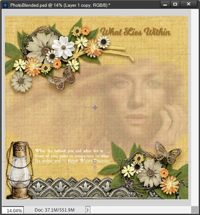
That’s a bit more like what I would have expected. When you’re working with a photo clipped to a mask, the blending combinations are virtually endless.
I have been known to play around with different Blend Modes for what seems like hours trying to decide which effect I like the best. I’m going to show you one more blending option with this same layout. This time I’ve eliminated the mask altogether. I set the Blend Mode on the photo to Pin Light and here is the result:
Well, that turned out rather nicely. After trying all the Blend Modes available, Soft Light & Pin Light were the only options that worked well (in my opinion) with this particular photo. A couple others could work but I’d really have to go in and mask parts away so as not to have the hard rectangular edges of the photo visible like this when I tried Hard Light:
If I’m going to have to mask, then I may as well go back to using the mask I originally had and just apply the Blend Mode to the mask!
And I’d encourage you to play around with different Blend Mode combinations. Especially if you’re trying to decide between blending on the mask layer vs. the photo layer.
Blending A Photo With Itself
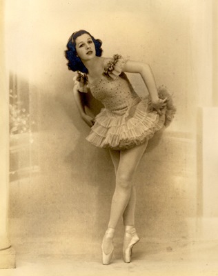
Sometimes blending a photo with itself is something I do to improve or modify the look of the photo. Take a look at the above vintage photo from Pixabay. It’s a lovely vintage photo but I’d like to add a bit of interest to it just to show you what can happen.
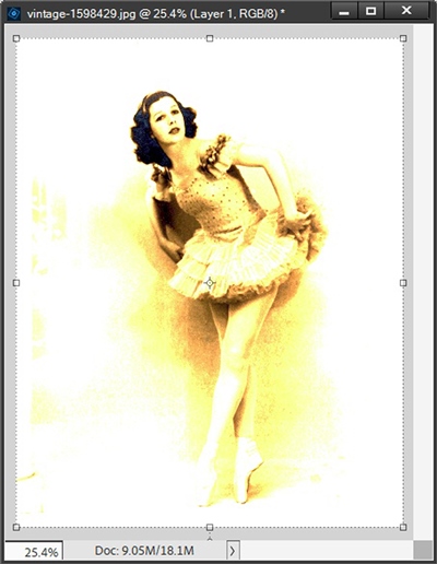
As you should already know by now, this kind of blending happens in the Layers panel. As mentioned earlier, all photos typically have only one layer. In order to blend a photo with itself I must have at least two layers to blend.
So, I have to duplicate the original photo by going to the top menu bar and selecting Layer-> Duplicate Layer. PSE opens the Duplicate Layer dialog box. I opt not to name the layer and simply click OK to confirm. You could also use Ctrl+J. The duplicate photo is automatically layered above the original.
With that duplicate photo layer active I go to the Blend Mode option and scroll through the list to find a Blend Mode that gives me an interesting effect. I liked what happened with Color Dodge:
This is nice but perhaps just a bit too “bright” So, I played with the opacity level on the duplicate photo until I ended up with an opacity level of 65% which gave me this result:
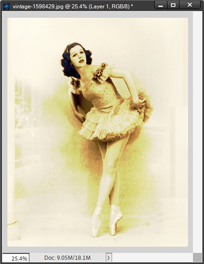
I’m not thrilled with what appears to be a border around the photo but that’s easily fixed by cropping or putting behind a frame. Either of which I can do later.
Blending Different Photos Together
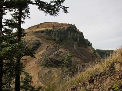
Let’s take a look now at blending two different photos together. I’m going to be using this hillside photo from my stash (not sure from where):
And I’m going to blend it with this lovely seaside photo from Pixabay:
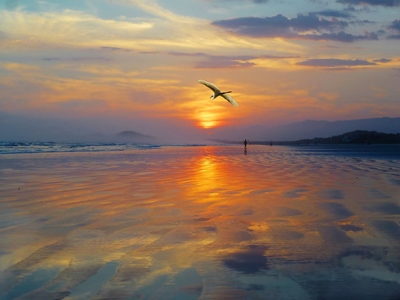
I layer the seaside photo over the hillside. With the seaside photo layer active, I set the Blend Mode to Darken & resize the seaside photo so the Great Heron shows. Here is my result:
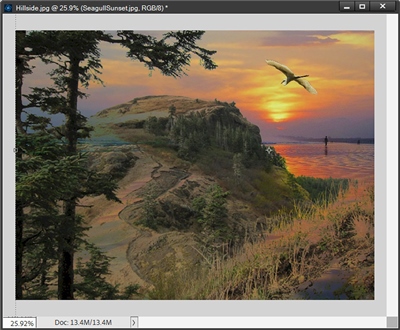
Now, not all photos will blend well together. You’ll just have to play around with some of yours to see what you can come up with. I just thought it was important to show you what can be accomplished by blending two different photos.
Blending Photos With Textures
Now that you know a little more about Blend Modes, I want to share one last combination. It’s so much fun to play around blending photos with textures. I’m going to use that same seaside photo from above and blend it with this piece of textured paper from “Inner Peace” by BenthaiCreations (now retired).
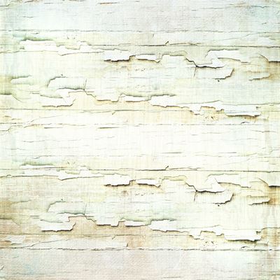
I layer the seaside photo above the textured paper. With the seaside layer active, I set the Blend Mode to Multiply and this is the result:
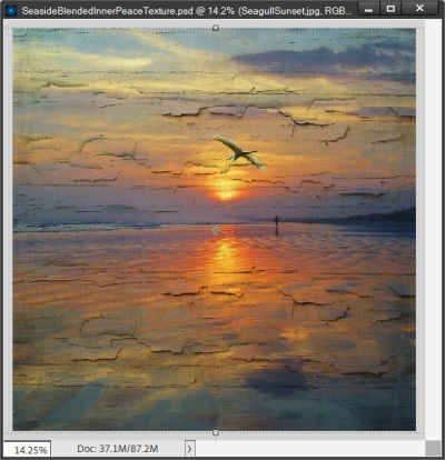
I have to admit…I absolutely love how this turned out. I’d encourage you to experiment with blending a photo & a texture. Soon you’ll be adding a bit of texture to your artistic photos or using them to make a bold statement. And of course, they’re perfect for anything vintage. You can also try layering the texture above the photo. This can sometimes but not always result in different effects.
If you need to resize the texture to fit the photo, be sure to do so. It’s not as important to keep a texture perfectly proportional as it is for regular photos .
As I said above, not all photos will blend well with other photos. The same is true with textures. You’ll just have to play around with some of yours to see what effects you can achieve.
Additional Thoughts On Blending In
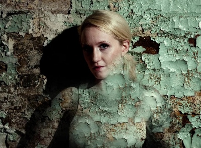
Great blending starts with great photos that make an emotional connection with the viewer.
In real life, cracks and crackle usually mean one thing — age (think antique glazed porcelain), but in blending, they’re the bomb! I LOVE the effects I get from cracks and crackle.
If you like the effect when you blend but it has made your photo “disappear” too much, perhaps duplicate the photo, put the top layer on “normal” mode and reduce the opacity and/or use a soft brush to partially erase it.
And don’t forget, blend modes work on elements too! I’ll try to do a quick post about that for you next week. So, stay tuned for that.
As always, if you have any questions or want to make a suggestion about a topic you’d like me to cover, please don’t ever hesitate to “Message Me”.
Thanks for reading this week’s Tuesday Tip. If you want to stay informed about new posts, just click “Follow Me” to stay in touch. I hope you have a wonderful week!