
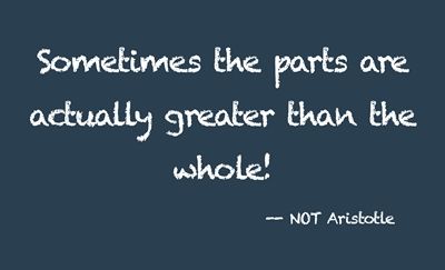
Off Script
I can’t tell you how many times I’ve been working on a layout with a very specific theme and thought I had the perfect kit. Then low and behold, even with all the fabulous word art included, I can’t seem to find what I need.
Nothing said I had to stick with only that one kit. I just usually tend to do that since it saves time trying to find bits and pieces from other kits that will coordinate nicely with my “perfect” kit.
Recently I went a little “off-script” with one of my layouts. Well actually, I tend to do that a lot 😉 It’s kind of fun to deviate from the predictable or expected course. I decided I was going to take whatever word art I could find in the kit and make it work.
Now if you read my “Just Part Of An Element” and/or the “Freeze Text” post, you know I’m not above creating my own word art. But I challenged myself to use what I had in the kit.
It took some time for me to stop looking at the whole and concentrate on only the parts. It kind of started to remind me about how I work on a ransom note. And that made it so much easier! But it also took me down a completely different path.
You may remember my “Cut-Out Twist” post back in July when I showed you how to create a ransom note style alphabet. That old typography style that was crafted from cut-out magazine and newspaper letters. The cut-out letters, often varying in typefaces, lent a peculiar disjointed aesthetic to the message.
And that’s when I went a bit rogue…
Ransom Style
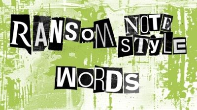
Similar to the ransom alphabet, I started looking at all the word art I had at hand and started to see ways to use just the pieces I needed. And today I’ll show you how I moved away from “the whole”!
Before I get started here’s a quick reminder, I use Photoshop Elements (PSE) 2024. If you use a different version, some of my screen shots may not look the same as what you see on your screen.
I was working on a Halloween layout a bit early this year. Mostly because I was thinking about my oldest grandson’s upcoming 9th birthday on Halloween. Halloween has always been my favorite “holiday” and it’s now also extra special that it’s my grandson’s birthday.
Anyway, back to the layout. I was using a collection, “Spooky Season” by ET Designs. As I mentioned, I ran into a bit of a problem with the word art. Not that it was bad…I just wanted to use some of the word art in a different order or format.
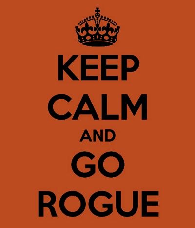
The funny thing about “going rogue” is that it’s not all that difficult if you know how to use the tools available in PSE. Sometimes it still amazes me how easy it is to accomplish what I’ve envisioned in my head.
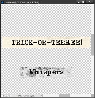
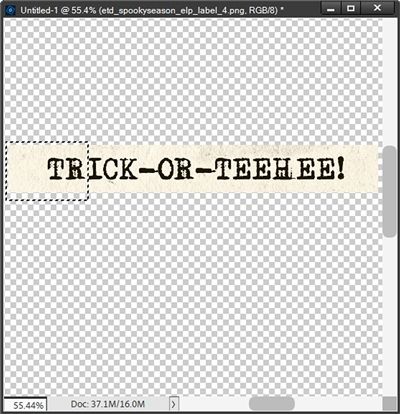
Here’s a look at some of the word art I found in the kit:
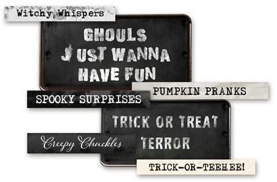
Like I said, there wasn’t a thing wrong with it…I just wanted it to read differently. All I had to do was cut the pieces out that I wanted. If you read my “Just Part Of An Element” and/or the “Freeze Text” post (mentioned above) you should already know how easy it is to cut apart a piece of word art.
I just grab the Rectangular Marquee tool, make a selection around the part(s) I want and create a new layer. I can then use just the part(s) I cut out.
But even after doing that, there were a couple of specific words I still wanted to change; Whispers to Whisper, and TEEHEE to TREAT. And I’ll now show you how easy that was.
I open a blank 12×12 file in PSE and I drag the two different word art pieces into the file:
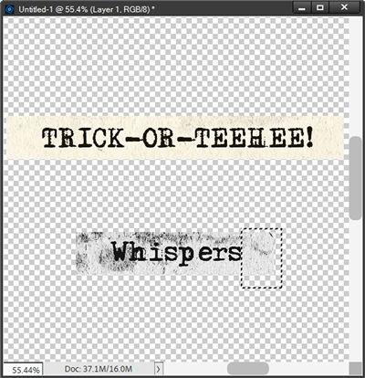
I already cut Whispers apart from the piece you saw in the sample word art shown above. All I have to do is get rid of the “s” at the end. But I want to be careful to keep the spacing between the “r” and the end of the strip the same.
To do that I make a selection of the blank part of the strip beyond the “s”:
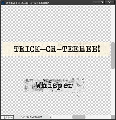
With that selection made I press Shift+Ctrl+J to cut that section out. PSE places that cut out section on its own layer (Layer 1 for me). I then just nudge that cut section to the left until it comes right up to the edge of the “r”:
I merge those two layers together and copy the merged layer to my layout. I then delete that Whisper strip since I was done with that one.
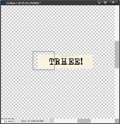
The word TRICK has already been cut apart from the other word strip so now all I really need is the “TEEHEE!” piece. Again, all I need to do is make a selection of that section of the strip ensuring I capture all of the first “T”:
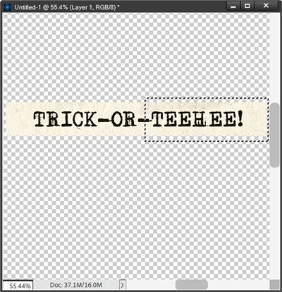
You can probably see that I got a bit of the hyphen in that selection. But don’t worry, I’ll take care of that in a minute. For now, I’m just going to press Shift+Ctrl+J to cut that section out.
PSE again places this cut out section on its own layer (Layer 1 for me – remember the other Layer 1 from Whisper is gone). This time around I’m not going to move the cut out section.
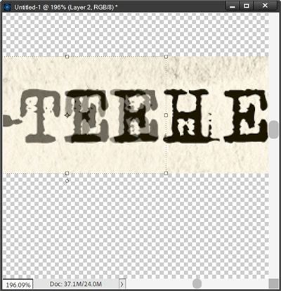
Just as with the word Whisper, I want to be careful to keep the spacing between the “T” and what will be the beginning of the new strip the same. So, with the original word strip layer active, I make a selection starting at the beginning of the word strip ensuring I capture both the “T” and the “R”:
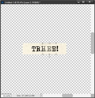
Once again, I press Shift+Ctrl+J to cut that section out. PSE again places this cut out section on its own layer (Layer 2 for me). I then move Layer 2 above Layer 1 in the layers panel, change the opacity of that layer to about 40% and nudge it to the right until the “T” lines up as close as possible to matching the first “E” in TEEHEE:
I zoomed in really close so you could see the alignment of the “T”. I then reset the Opacity of Layer 2 to 100% and zoom back out so you can see the result:
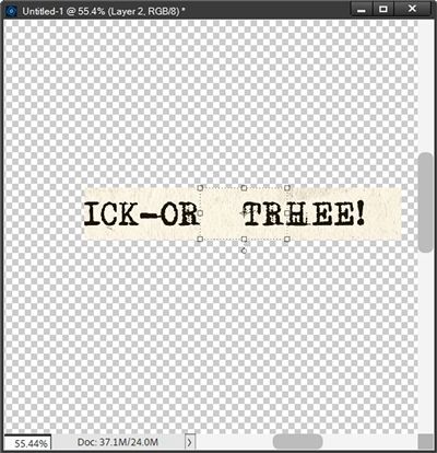
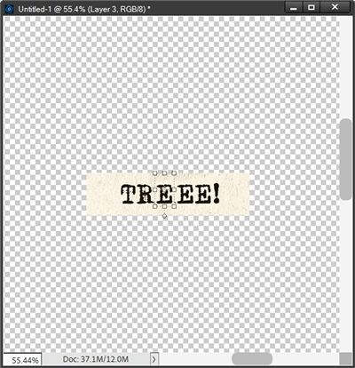
I know this looks ridiculous right now…trust me, this will all make sense in a bit. With the original word strip active I’m now going to make a selection of what remains (ICK-OR) and delete it:
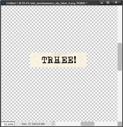
I can now merge Layer 1, Layer 2 and the remainder of the original word strip together. Clearly that doesn’t spell TREAT…right?!?
There are a couple ways I can fix this. I’m going to keep it super simple and show you the quickest way.
First, I’m going to make a selection around the beginning of this new word strip ensuring that I capture the entire letter “T”:
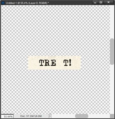
This time, I’m going to press Ctrl-J to create a new layer from this section NOT cut it out. Then I change the opacity of that new layer to about 40% and nudge it to the right until the “T” lines up as close as possible to matching the “E” at the end:
I’m going to hide this new layer for just a minute and make the other portion of the strip the active layer. I then make a selection around one letter “E” and create a new layer from that selection. I then nudge that new “E” to the left until it covers the letter “H”:
I know…this still looks silly but I’m almost done. I’m going to move the hidden layer (with the ending “T”) below the “E” layer I just created. Then I’m going to reset the Opacity of that hidden layer back to 100% and unhide it:
I now have a place for the letter “A”. I happen to know that the Adler font was used to create this particular word strip. So, all I have to do now is add that letter to the word strip:
Note: I know the font that was used because I found a match on the internet. If you don’t know how to do that, just refer back to my “What’s That Font” post for tips on how to do that.
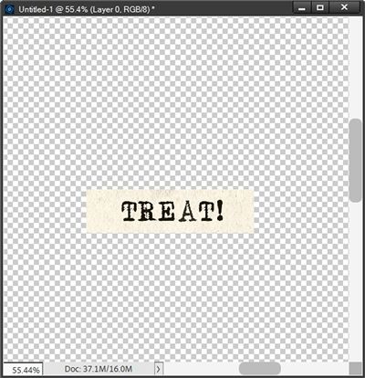
And now I have the word “TREAT!” Next, I just merge all those layers together and can either save this new word as a PNG file for future use or simply copy it to my layout.
And here’s how my completed “rogue” word art looks on my Halloween layout:
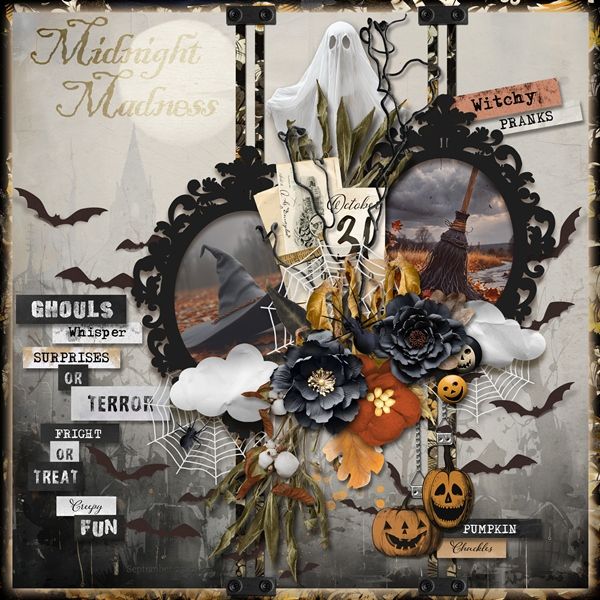
Note: If you’d like more details about this layout, you can find it in my 2025 Gallery. Though, I’ll be honest…I did end up using a different version of the word treat on my actual layout 😉
Now go off script and enjoy cutting up some word art!
Extra Tips

This technique can work just as well with stamped/transparent word out. It’s still just a matter of choosing the pieces that you want to use.
Think out of the box the next time you find word art that isn’t quite as perfect as you’d like.
We all cut & paste from time to time, why not with word art 😉
When you run into a word that needs a letter you can’t find in the existing word art, try to find the font on the internet and type it yourself.
If you can’t find the exact font consider going a bit more rogue and just create your own new piece of word art using a similar font and a paper that works well with what you already have!
One more thought for you. Don’t be afraid of silly ideas. – Paul Arden
Thanks for reading this week’s Tuesday Tip. Remember, if you have any suggestions or questions please don’t hesitate to “Message Me“. Check back next week for a tip about letter boards. Click “Follow Me” to stay in touch. I hope you have a wonderful week!
