
Tiny Warp
Back in October of 2024 I did a series of posts about Glows in Photoshop Elements (PSE) which included my “Just Glowing” post. That particular post was all about how to draw attention to text using an outer glow.
Today I want to show you another way to more subtly make your text (or element) stand out using a micro warp.
A Little Twist
This technique comes in handy when you want text or an embellishment to stand out but not too much.
To apply this tiny warp isn’t as complicated as some things. Especially if you’re using PSE 2022 or later. I’m going to be using the Warp tool. And a quick reminder…I use PSE 2024. If you use a different version, some of my screen shots may look different than what you see on your screen.
As is my normal custom, I’m going to start with a new 12×12 file. I’ll pull in a nice background paper:
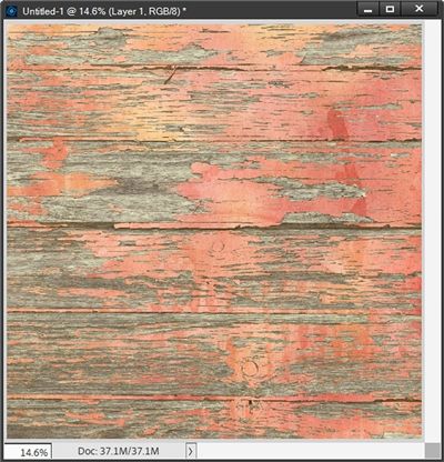
Note: While demonstrating today’s technique I’ll be using products from “Reflections” by Cindy Ritter Designs.
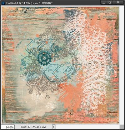
I already have a layout design in mind so I’m going to bring in some other background elements to zhuzh up the background for my page:

Then I bring in a nice, flat gear element:

The color of this gear could ultimately make it look lost on that part of the background. So, I should add a shadow. But I also don’t want this gear to be lifted too far off the page…I just want it to show up a tiny bit more on that background.
I’m going to start by creating a very subtle shadow on its own layer. If you don’t know how to do that please refer back to my “Stitching Realism” post where I described how to do that.
I create my shadow in black and set the lighting angle to 120 degrees, the Size to 2px, the Distance to 1px and the Opacity to 35%. Once the shadow is created, I set the Blend Mode to Linear Burn:
I know you can’t really see the shadow at this size. But even if I zoomed in super close you likely still wouldn’t be able to see it. The shadow is barely visible, it is very subtle which is exactly what I was going for.
Now let me show you how to make it stand out a little more without being super noticeable.
I am going to zoom in pretty close at this point so you can see what I do. With the shadow layer active I go to the top tool bar and select Image->Transform->Warp:
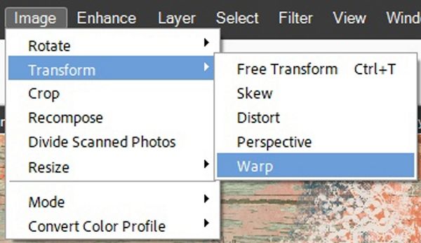
PSE places a grid around the shadow:
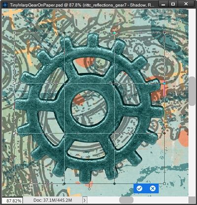
All I have to do is Click and hold any one of the little anchor points on the grid and gently drag that teeny-tiny dot to very slightly warp my shadow. All the while paying attention to the slight change of location of the anchor points and the slight warping of the grid lines. And I can click and drag on multiple anchor points if I like.
When I’m happy with the look of the warped shadow, I just click the check mark to confirm the warp. And here’s the result:

I know it’s likely really hard for you to see the shadow as well as I can. Part of the problem is there’s a very dark (almost black) edge around parts of that gear. But trust me, in the end this tiny warp on the shadow does make a difference.
Note: Since the warp tool wasn’t available in PSE until version 2022, a lot of you may not yet have access to that. If that’s the case for you, I shared an alternate way to create a warped shadow using a PSE Filter. This too was in that “Stitching Realism” post I mentioned above.
And I thought I’d share with you my final layout which I submitted as part of a Creative Team:

You can see more details about this layout in my 2025 CT Gallery.
And that’s it! With a shadow on its own layer this subtle warp was pretty simple. I hope you’ll play around with applying a tiny warp to your drop shadow to see a subtle improvement to your text or image.
More Warp Tips

Don’t ever feel like you have to rely on “canned” drop shadows. It’s way too easy to make your own.
Don’t get too carried away with the warping of your shadow. If you go too far it may lose the subtle lift that this post is all about.
Don’t forget to play with Blend Modes and Opacity levels on the shadow layer. A blend using Linear Bun may no work on all backgrounds.
I didn’t show you this technique on text today. But that doesn’t mean you can’t use all of the same steps to apply a tiny warp to your text.
Remember…a shadow doesn’t have to be huge to make an impact. As they say, sometimes less is more 😊
Thanks for reading this week’s Tuesday Tip. Remember, if you have any suggestions or questions please don’t hesitate to “Message Me“. Check back next week with another tip about a different clipping masks! Click “Follow Me” to stay in touch. I hope you have a wonderful week!
