3D Title Tip
Here it is the end of the first month of 2025. I still can’t believe how January has flown by. And if you read last week’s post you already know that as we age, our brains tend to process time differently, often making it feel like time is moving faster. Science or not…it doesn’t make it feel any better that life seems to be passing by so quickly. 😉
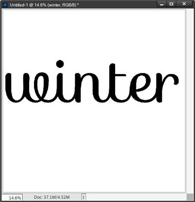
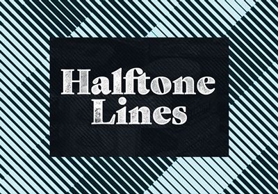
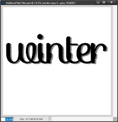
And in the spirit of being quick…I have a fun little tip for you today. I’m going to tell you about a playful halftone effect that will give an interesting 3D look to your next “weighty” title like the one in the image above.
Note: The featured image at the top of this post is a layout I created using products from “Silver Frost” by ET Designs. For more details you can find it in my 2025 Gallery.
Halftone Filter

Back in May of 2024 I did a series of posts about Filters in Photoshop Elements (PSE) starting with my “Not That Filter” post. During that series I didn’t go into a whole lot of detail about the Halftone Pattern Filter because it didn’t really apply to the paper & elements with which I was working at the time.
Today I’m going to show you how to use that filter to jazz up a title. This technique works best on fairly large titles using a chunky display fonts…specifically script fonts. Here is a list of some good ones to get you started:
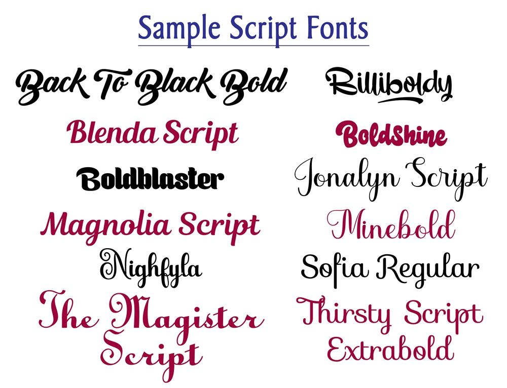
Note: If you Right-Click on the image above and open it in a new tab you can see those fonts at a larger size.
These fonts can all be found at one of my go-to font sites, 1001Fonts.
Before I get started just a quick reminder that I use PSE 2024. If you use a different version, some of my screen shots may look different than what you see on your screen.
Full disclosure: I know I said this was going to be a quick tip. And trust me, it really doesn’t take long to create this effect. But the post will seem lengthy simply due to all the images I’ve included for illustrative purposes.
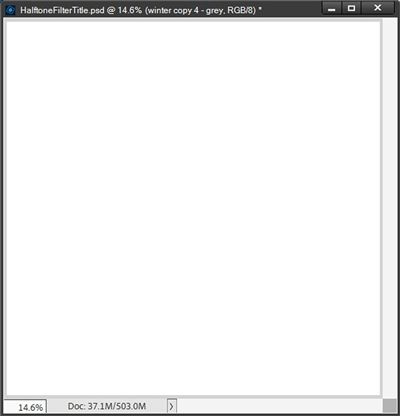
I’m going to create a new 12×12 file with a white background:
I then ensure that the foreground/background color chips are set to the default of black and white (press D).
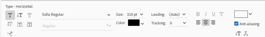
Then I select the Horizontal Type tool. I’m using the Sofia Regular font from the list above and I select that font in the Horizontal Type tool options. Then I set the font size to 310 pt, the Leading to Auto and the Tracking to 0 (zero).
I then double-check that the font Color chip is set to black, select the Center text option and check the Anti-aliasing box:
Note: Because this is going to be a title, I wanted to start out making it fairly large. It’ll be easy enough to make it smaller later.
Next, I place my cursor in about the center of the page and click once:
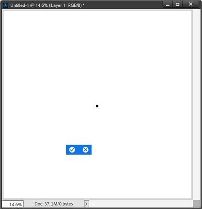
Right now, all you see is that black dot near the center of the page. That’s because I didn’t draw a text box. There’s really no need to create a text box if I’m only typing one word.
At this point all I have to do is type my title:
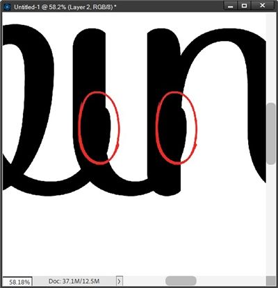
At first glance this looks pretty good. But this is a script font and I need to ensure that the letters are all correctly joined. So, I zoom in fairly close and I can see that the letters are not seamlessly connected:
If you look closely, you can see the spot where the “tail” of the letter w meets the letter i, the connection is not smooth. This slight disconnect is the same for all the letters in the word. So, I need to adjust the tracking to fix this.
Note: You should always check the Tracking value when using a script font. Improper tracking of letters can be more noticeable when using a large word.
Since I want the letters to be closer together, I need to use a negative number for the Tracking value. I can either do this incrementally starting with minus 1 or I can select a value from the Tracking dropdown by clicking the down arrow to the right of the value:
It is important that I don’t make this Tracking value too large. I don’t want the letters to end up overlapping like this:
My general approach to changing the Tracking value is to start with the options in the dropdown. If I end up with a value that is either slightly too high (or low) I can then go in and adjust it manually. I went with a Tracking value of minus 5:
Now you can see that the letters above are seamlessly connected. And here’s a look at the entire word:
I know at this zoomed out size it doesn’t really look that different. Given how slight the disconnect was you’re probably wondering if that tiny difference would really affect the final outcome. But trust me, sometimes even the smallest disconnect can make a big difference. I’ll show you later what could have happened if I didn’t adjust the tracking appropriately.
Now for the fun part…
Faux 3D Layer
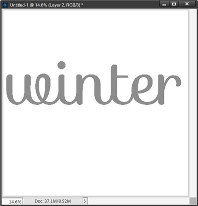
With my title all set and connected properly, I duplicate the text layer (Ctrl+J) and rename the new layer Halftone Winter.
Now, because the PSE Halftone Filter that I’m about to use works with the tones of an image, it won’t work with the colors black or white. So, I need to change the color of the text in the Halftone Winter layer to a medium gray (#8e8e8e):
Next, I move the Halftone Winter layer beneath the original text layer. With the Halftone Winter Layer active I select the move tool. Then I use the down arrow and right arrow keys to move the “grey” layer down and out from behind the black layer – almost like a shadow.
I need to be very careful that there isn’t a gap between the letters of the black & grey layers so it looks something like this:
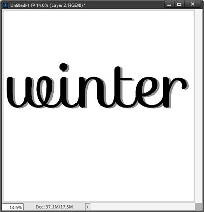
The trick here is to make it appear as one single piece of word art…not two separate words. If I was using a thicker font, I might be able to move the grey layer farther away from the black layer, creating a more pronounced 3D look. But this font will still work quite nicely.
Next, I’m going to create a diagonal halftone effect. To make this work properly I first have to align my word art (both layers) diagonally.
So, with both the original text layer and the Halftone Winter layer active, I press Ctrl-T to open the Transform tool. I set the Angle to minus 45 degrees and ensure that the Constrain Proportions box is checked:
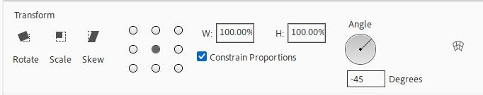
Note: The angle of the rotation is what will determine the angle of the diagonal “halftone” when I apply the filter.
My word art now looks like this:

Applying The Filter
In case you’re not familiar with how PSE filters work I want you to be aware that some filters use the foreground and background colors. Specifically, the Halftone Pattern Filter which I’ll be using today.
I now ensure that the Halftone Winter layer is the only active layer and that my foreground/background color chips are set to the defaults (press D). These color chips will determine the color of the “halftone” lines I’m about to create.
Note: If you’re following along, you can use a color other than black if you’d like. Just click on the Foreground color chip and choose whichever color you prefer and click OK. Then click on the Background color chip and choose a contrasting color and click OK. Just be aware, if you change the background color to anything other than white, your halftone pattern will look very different from what I’m doing. That doesn’t mean you can’t do that. It just won’t look the same as what I’ll be showing you.
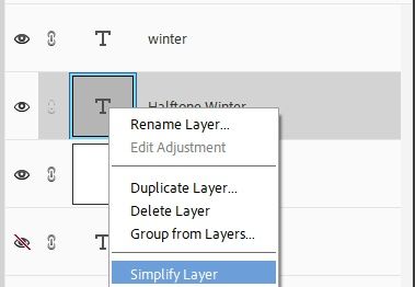
Back to the task at hand. Before I go further, I need to simplify the Halftone Winter layer. Why, you ask? As I’ve mentioned before, PSE won’t let me apply a filter to text because it is a vector-based image (similar to a Smart Object). So, I Right-Click on the Halftone Winter layer’s thumbnail and click Simplify Layer:
Note: If you want more information about Smart Objects, you can refer back to my post about Managing File Sizes.
Next, I go to the top tool bar and select Filter->Filter Gallery:
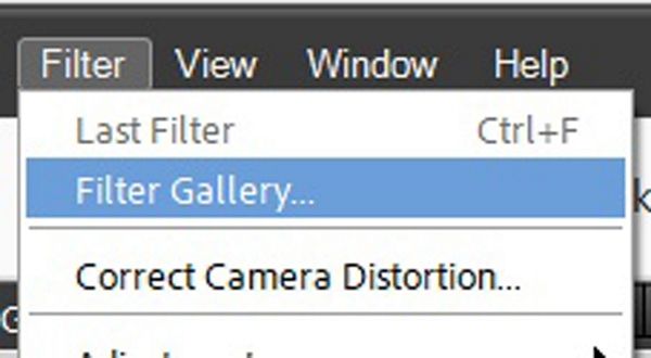
Note: If you see more than one Filter Gallery from the tool bar selection, always click the second one. If you click the top one it will apply the last filter used.
PSE opens the Filter Gallery:
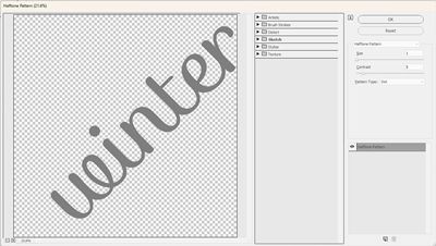
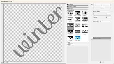
With the Filter Gallery open I click the triangle/arrow to the left of the Sketch category (this opens the options in this category) and I select the Halftone Pattern option:
Then I set the Pattern Type to Line, the Size to 5 and the Contrast to the maximum of 50:
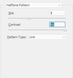
Note: If you want the lines to be closer together use a lower Size value. Conversely, if you want the lines to be farther apart use a higher Size value. If you want the lines to be “fuzzy” lower the Contrast value.
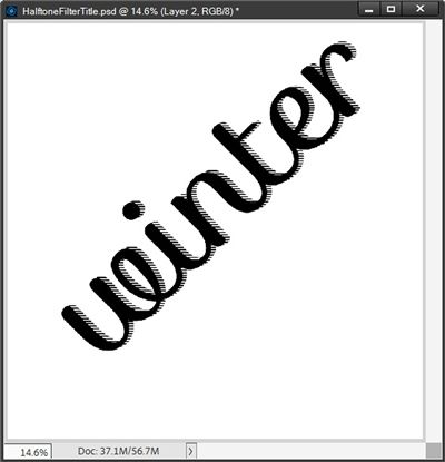
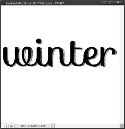
I then click Ok to apply the filter and this is what my title looks like now:
Next, I want to reset the angle of my word art. To do that I’m going to ensure that once again both the original text layer and the Halftone Winter layer are active. Then I press Ctrl-T to open the Transform tool. If you remember, when I first rotated the word art, I used an Angle setting of minus 45. So, to return the word art to its original horizontal orientation I’ll set the Angle to 45 degrees:
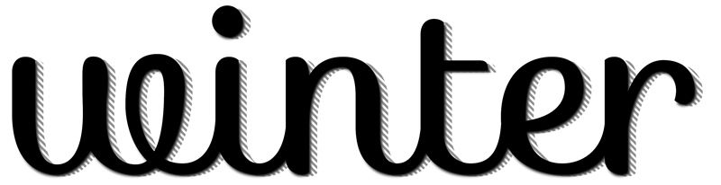
And there’s my word art with a diagonal halftone effect. I am going to save this first as a PSD file. That will make sense here in just a bit. But I am also going to hide/remove the white background layer, crop the image to size and save it as a PNG file for use later:

That concludes the basic steps to create this effect. But there are a few other things I want to share.
Remember back in the beginning I mentioned that even though I was making this title fairly large I could make it smaller. Well, that’s true but if I pull that final word art (PNG) into a layout and resize it significantly, I might see a decrease in the size/prominence of the diagonal lines. That will be driven completely by how much smaller I need to make it.
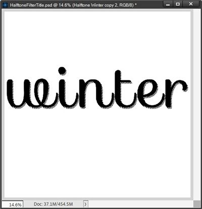
Let’s take a look. If I bring the original word art into a 12×12 file, duplicate the word art and resize the duplicate by 50% this is what happens:

Even with this small image you should be able to see how less crisp or even noticeable the halftone effect is on the smaller version.
This is why I almost always save word art like this as a PSD file. That way I can avoid significant degradation.
I merely duplicate the word art layers in my PSD file and resize the duplicates to whatever size I desire and just save the smaller word art as a PNG file. This tends to keep any degradation (fuzziness) to a minimum. But truth be told, the smaller the word art is the less prominent the effect will be regardless of how it is made smaller.
I would encourage you to try doing it both ways to see which works best for your title.
Next, I want to offer some ideas about how to enhance the 3D effect before saving the word art as a PNG. I can apply a shadow to the original text layer:
This definitely increases the 3D look a bit. Using a slight PSE simple Emboss bevel (Lighting Angle set to 120 degrees and Size set to 20) could also do the same thing.
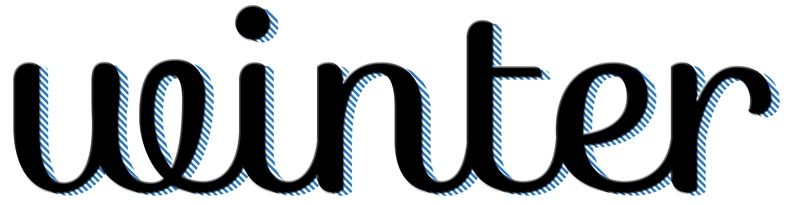
And there’s another trick to help boost the effect. I’m going to redo the Halftone Pattern using a different foreground color – a bright blue (#2e80d8):
One more thing before I let you go, I did promise to show you what happens if your script text letters aren’t properly connected. I went back and spaced my letters apart so they were not touching at all and this is what happens:
And this is what happens if the letters are overlapping:
Not a good look with either one of those. I know I exaggerated the disconnect. But I wanted you to see what can happen if the script letters are not properly connected.
I hope you have fun playing with this faux 3D effect.
Extra Tips

One important note. Unless you intentionally use a different background color when you create the diagonal Halftone Pattern, the color between the lines will be white. If you don’t want the white between the lines (making the background beneath visible) all you have to do is delete the white on the “halftone” layer before saving the word art as a PNG.
If you want a color different than white between your halftone lines just be sure to set your Background color chip to the color that you desire prior to applying the filter.
Script fonts tend to work best with this technique. But you can also use nice bold/chunky “print” (serif or sans serif) fonts like these (also from 1001Fonts):
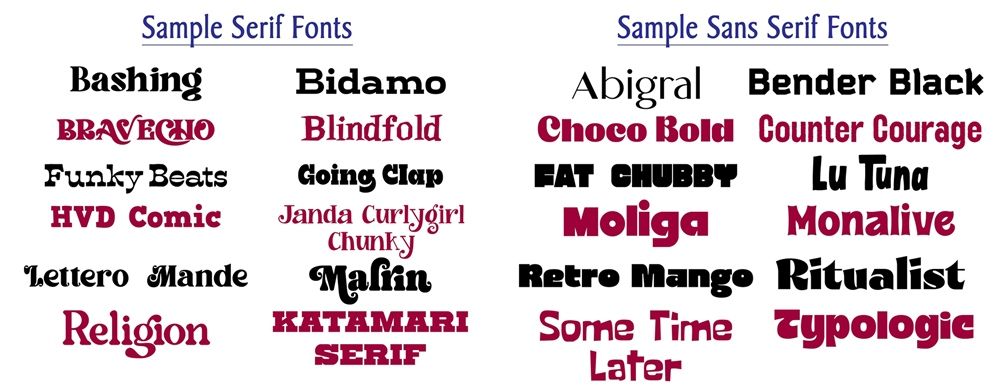
Note: Again, if you Right-Click on the image above and open it in a new tab you can see those fonts at a slightly larger size.
You don’t always have to create your initial text in black. You can choose any color that works well with your layout.
When using a super bold print font I recommend that you don’t push the halftone layer out too far unless you change the tracking for the word so that there is more space between each letter.
Other than that…just have fun experimenting with different colors for the halftone and changing the contrast to vary the crispness of the lines.
Thanks for reading this week’s Tuesday Tip. Remember, if you have any suggestions or questions please don’t hesitate to “Message Me“. Check back next week with another tip about warping! Click “Follow Me” to stay in touch. I hope you have a wonderful week!