
Unique Frames
In last week’s post about “Journal Frames” I showed you how to use a “store bought” journal frame and add your journaling.
If you read that post you know I wasn’t “over the moon” about using a pre-made journal frame and made a lot of adjustments.
So, today I want to show you how to create your own journal frame with supplies you likely already have on hand. Well, at least most of them 😉
Custom Journal Frames
Creating your own journal frame should be at least a little easier than dealing with a pre-made journal frame like the ones I used last week. Most importantly you’ll be starting with your own blank frame!
Before I get started, just a quick reminder that I use Photoshop Elements (PSE) 2024. If you use an older (or newer) version, some of my screen shots may look different than what you see on your screen.
I’m going to use a frame from this set of Digital Frames I found on Creative Fabrica some time back:

I’ll be using the silver oval frame that’s sort of in the middle of that image above (behind the heart frames). You can use any frame you have in your stash of supplies.
And if for some strange reason you don’t have any frame with which to work, you can try looking for some free ones at these sites:
There are also some nice frames available at Etsy and they seem to be reasonably priced.
I know you’re going to be shocked when I tell you that I’m just going to open my chosen frame in PSE. This is something I very rarely do but I want to work on this frame at its original size:

But the very first thing I do whenever I choose to work this way is immediately save the file as a PSD using a name that makes sense based on the project. In this case I named the file FramedJournaling. This way I know I don’t have to worry about messing up the original frame.
I already have a layout in progress that I want to use this with so I’m going to start by adding a dark navy (#293251) oval for the background. I do this using the Ellipse tool with the Color chip set to the blue value I already mentioned and the “shape” is set to Unconstrained.
I don’t need to check the “From Center” box this time because I don’t have to make this a precise shape since it will be behind the frame. And once again, I just click and draw (drag out) my oval shape so it’s just smaller than the outer edge of the frame:

I move that oval beneath the frame in the Layers Panel and it looks like this:

Just as I did last week, I’m going to create a duplicate of that oval shape, re-color it and resize it, leaving enough space between the inside edge of the frame so that my journaling doesn’t look cramped:

Now, I can add my text. I’m going to use this quote as my journaling: “We are told to let our light shine, and if it does, we won’t need to tell anybody it does. Lighthouses don’t fire cannons to call attention to their shining – they just shine! – D. L. Moody”
I double-click on the grey oval layer’s thumbnail to ensure it is “active” – like I would trying to ensure a layer mask is “active”. Just as what happened last week, PSE thinks I want to change the color of the shape and will open the color picker. I just click Cancel to close that.
I select the Horizontal type tool, choose my font – Poiret One Regular from 1001 Free Fonts, set the Color to black for now, the Size to 39 and the Tracking to minus 25.
Then I position my cursor inside the grey oval near the top until I see the cursor change to the “tool cursor” (an I-Beam inside a circle). I have to be very careful to ensure that I don’t see an I-Beam with a curvy line underneath. That would actually place my text around the outside of the oval.
Once I’m certain I have the correct cursor, I can insert my text. And it conforms to the grey oval’s shape:

In order to get the “author’s” name into the frame I reduced the font size on just that line to 24.
Once I’m certain that the text looks exactly the way I’d hoped I can hide (or even delete) the grey oval layer and change the font color to what will work on the blue oval and fit my layout. I used a beige color (#f1e9d8). And here’s my final (well almost) framed journaling:

I’m guessing you may be thinking that I’m done and that this was truly a lot easier than what we did last week. Well, yes & no. This definitely was a lot easier. But I’m not done yet…
Creating A Charm
Do you remember last week I said I wanted to share a couple little twists that I think could make this framed journaling look a bit nicer? Well, this is how I’m, going to do that.
First, I want this to ultimately look like a charm. I want it to hang from a piece of twine in my layout. For that to happen I probably need to add a bail to the top of that frame. I know now you’re wondering what the heck is a bail?
A bail is simply the hole or loop at the top of a charm, allowing it to be attached to a necklace, bracelet or in my case…the twine! So, I want to add a bail to the top of my frame. All I have to do is search my stash for a silver charm from which I can “steal” a bail.
Thankfully, I have a set of number charms (from where or by whom I am not sure) that should fit the bill. For no particular reason I grabbed the number 3:

I just pull that into my PSE file:

I know that looks funny sitting in the middle of my journaling. And I’m sure you can tell that it doesn’t exactly match the color of the frame. But I think I can make it work.
The first thing I’m going to do is move that charm to the top of the frame and reposition the charm’s layer beneath the blue oval’s layer in the Layers Panel:

That’s clearly too small so I’ll make that big enough that a piece of twine will fit through the opening:

That looks about right. And right now, I think that bail matches the frame well enough that I’m not going to fool with it. I know you’re likely shocked to hear that since I’m generally fairly fussy. But I have to remind myself that this frame, as it sits here, is a lot larger than it will be in my layout. And with a piece of twine running through, I can’t imagine that little bail will look as if it wasn’t always there!
Now for some cleanup. I want to make this part of the original charm a permanent part of the frame. So, I need to bring the charm’s layer up underneath the frame’s layer so I can connect the two:

Clearly, I need to do some cleanup. But this is going to be easy. With the charm layer active, all I have to do is make a selection using the Rectangular Marquee tool:

Then I just press the Delete key and the “3” is gone:

To keep from getting confused I’m going to rename the charm’s layer to “Bail”. Next, I’m going to duplicate the frame and bail layers and hide the originals. This is just in case I need to make adjustments to the bail’s size later.
Then, with the duplicate layers both active, I merge the frame with the bail. This will be important later when I apply my shadow. If I didn’t merge these layers I’d end up with a shadow in places over the bail where it doesn’t belong!
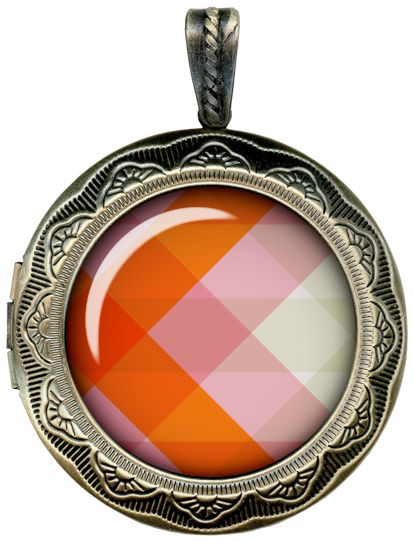
My frame now looks like a charm, sort of. Most often I think of charms such as this as having a glass “cover” over what is within the frame. Something like this:
So, I want to show you how to do that next. This is a totally optional step. If you aren’t interested in adding a “cover” you can skip ahead.
Creating A Glass Cover
Looking at the sample charm above, it looks as though there is a shadow around the inside of the frame. This too is something that can be considered optional. Rather than applying one now, I’m going to wait until I get the glass cover in place.
Note: If you have a glass effect layer style that you are already familiar with, please feel free to skip this section.
To create the glass cover I’m going to need another oval shape. I’m just going to duplicate the blue background oval and move the duplicate layer above my text (directly below the frame layer) in the Layers Panel. But I am going to resize it so it is just a bit larger than the open area of the frame…not much larger at all. And I re-color it to black and changed the layer name to “Black Glass Oval”:

You should be able to see the bounding box around that black oval. This gives you an idea of how small I made that black oval.
I could have left the oval blue, re-colored it to a light grey (#dae0e1) or even white. This “glass” technique can work on either blue, black, grey or white. It just would require different “blending”.
With the black oval layer active, I’m going to apply a standard PSE Glass Buttons Layer Style by clicking on the Styles icon at the bottom of the Layers Panel.
PSE opens the Styles panel and displays whatever styles were last used (Bevels for me). I click on the down arrow to the right of the style name and scroll down the list until I find Glass Buttons:

PSE then opens the Glass Buttons style displaying all the options available:

I select the Translucent Glass style (far right option in the next to last row). The default settings for this option are as follows: Inner Glow Size 88px & Opacity 75%, Bevel Size 146, Direction Up and Lighting Angle 90 degrees. And this is the initial result:

You can change all of these settings to fit your needs. But I’ll caution you not to mess with the glow settings too much!
I thought the size of the “shine” was a bit too large, so I changed the Bevel Size to 80 so it wasn’t such a drastic glare. You can experiment with the amount of bevel to achieve the shine that suits your project best. Here’s how mine ended up:

The last thing I have to do is set the Blend Mode on this black oval to Screen. If you read my “Unique Mask” post back in February, you know that anytime the Blend Mode is set to Screen, the blending cancels out anything that is black. After changing the blending only the “beveled” glow remained and my framed journaling looks like this:

Now just a bit ago I mentioned that I could use other colors as the fill color for the oval during this process. I’ll just explain (no pictures) the differences I have found using some colors.
If I keep blue (or whatever original background color was used) as the fill color of the shape, I can use the same settings for the Translucent Glass Button style but set the Blend Mode to Lighten. This will generally result in an effect that is nearly identical to using black.
When using white I can use the same settings for the Translucent Glass Button style but set the Blend Mode to Darken. This seemed to produce nearly identical results to using black with a Blend Mode of Screen. Though it did appear to have a slight effect on the crispness and brightness of the “shine”. But that could just have been my old eyes playing tricks on me 😉
When using a light grey (#dae0e1) I can again use the same settings for the Translucent Glass Button style but set the Blend Mode to Darken. At first glance this too seemed to produce nearly identical results to using black with a Blend Mode of Screen. However, this time I did notice that the color of the text became lighter. Not by much but it was noticeable. So, that would be something to watch for if you try using grey.
From my experience I tend to go with a black fill when using the Translucent Glass Button style. I’ve found that this often times gives a much nicer glass effect than using grey, white or the same color as the background. But you can play around with all of the options and decide for yourself which seems to work better for you.
If you don’t want to mess with all these different options and settings there is a free Glass Effect Style from Brusheezy that does make it go a bit quicker:

Note: If you’re following along and plan to use this style, please be sure to install it before proceeding.
When I use this style from WebTreats, the shape needs to be the same size as the original background. So, I just duplicated the original blue oval and moved the duplicate above my text (directly below the frame layer) in the Layers Panel.
I’ve found that using just about any color as the fill will give nearly identical results. So, I leave mine set to blue but I did rename the layer to “Blue Glass Oval”. If you want to play it safe, I’d recommend using a bright light blue (#8eebf5), light grey (#dae0e1) or white.
Before I apply the style, I need to blur the edges of the oval. I go to the top tool bar and select Filter->Blur->Gaussian Blur. I then set the blur Radius to 60px:

You might be able to see that blurred edge peeking out behind the frame. Don’t panic. That will go away in the next step.
With the edges blurred I click on the Styles icon at the bottom of the Layers Panel.
PSE opens the Styles panel and displays whatever styles were last used (Glass Buttons for me). I click on the down arrow to the right of the style name and scroll down almost to the bottom of the list until I find webtreatsetc-glass-layer-styles:

PSE then opens the “glass” style displaying all the options available:

As you can see, I have selected WebtreatsETC 2 The middle style). This sets a bevel of 17 and a lighting angle of 90 degrees and here is the result:

I didn’t feel the need to change a thing. This is a different look than I got from the glass button style but I think it produces an acceptable result. I can change the lighting angle later if I need to but I think it’s going to be fine.
You can play with the angle to fit your needs but I would very highly encourage you to not mess with the bevel too much!
One last optional step…
Inner Frame Shadow
As I mentioned earlier, I’m not certain that a shadow on the inside of the frame is necessary but I want you to see how it effects the look. More importantly, I want you to know how to properly create it.
I’m going to go back to the version of my “charm” that was made with a black oval and the PSE Glass Button – Translucent Glass style:
As far as I know, contrary to many tutorials/tips that say to use an inner glow, there’s truly only one easy way to create this inner shadow.
First and foremost, it must be on its own layer. If you need tips on how to do that, I would normally refer you back to my “Stitching Realism” post from August of 2024. But I am going to be doing things a bit different this time so I will walk you through the process.
I’m going to start by hiding all layers and go back to the original frame without the bail:

I know you’re likely confused by this but it might make a bit more sense shortly.
I then make a duplicate copy of the original frame layer and name it Frame Shadow and move it below the frame with the bail in the Layers Panel (which is still hidden).
Then I re-color this duplicate frame using a nearly black color (#0c0c0c).

Next, I’m going to apply a Gaussian blur with the blur Radius set to 40px:

I then unhide the layer that contains the frame with the bail:

Notice that there’s no shadow around the bail on the frame? I saved myself a bit of cleanup by not using that frame! I know that’s such a tiny section but sometimes every little bit of time saved can help!
Right now, I need (or rather want) to go in and get rid of the shadow around the outside of my frame. If you read last week’s post you may remember I said it was perhaps better to apply the “final” shadow when I use the charm on a layout. So that’s why I want to eliminate the outer shadow.
I can do this one of a few ways but honestly, the easiest way is to just use the eraser tool with a hard round brush set to a size of about 150px and go all around the outer edge of the frame and remove the shadow:

Now it’s time to see how this looks when I bring all the other pertinent layers back:

Because my background is so dark, that inner shadow is barely perceptible even at full size. This is why I wasn’t inclined to fool with this. But let’s take a peek at how this looks on a different color background:

Well, that shadow really shows up now, right? But it also dulls the “shine” of the glass cover. So, I’m going to move that shadow layer beneath my “glass” layer:

That’s better! And the beauty of this is if I want that shadow to be darker, I can just duplicate the layer and adjust the opacity if it ends up too dark.
If you choose to add an inner shadow to your frame you can play around with the amount of blur (that controls the size of the shadow) and the intensity to see what fits your project best.
For me and my charm, I think I’ll forego the inner shadow. At least this time 😊
One thing about using square or rectangular shaped frames as a charm. Sometimes rather than a bail you may want to attach a “picture hanger” instead. If you have straight chain, string, twine or wire along with some kind of fastener (brads, binder clips or other hardware) it’s a great way to create your own hanger.
Here are a few examples:

Oh, and I almost forgot. Here’s my charm on my layout:

For more details about this layout, you can find it in my 2025 Gallery.
That’s all until next week. Happy journal charm making!
A Few More Tips

Check your stash of scrapping supplies for decorative frames. Any size or shape will work. And you don’t always have to use fancy frames. Even a nice paper frame can work to showcase your journaling.
When turning your frame into a charm, again just check your stash of supplies for other charms you may already have. Those will be your best source to find that pesky bail that belongs at the top.
If you have difficulty finding a charm in your stash or free ones online (FAVPng is a good source) that have the desired bail…please don’t hesitate to Message Me. I am certainly willing to try hooking you up with a solution!
With a bail attached to your frame think about adding a chain (if you have some). You could also add a length of twine, string or even ribbon and include a knot or bow that appears to attach it to the bail.
Now that you know how to create not only your own unique journal frames but also your own charms, don’t stop there! Just think of all the charms you can make that don’t have journaling in them! Let your creativity soar! Here’s an idea:

Or this…

Remember your imagination is your only limitation when creating!

Other than that…just have fun working on different ways to work your journaling (or charms) into your layout!
Thanks for reading this week’s Tuesday Tip. Remember, if you have any suggestions or questions please don’t hesitate to “Message Me“. Check back next week for a tip about Patterned Vellum! Click “Follow Me” to stay in touch. I hope you have a wonderful week!
