
Journal Frames
Journaling in our digital layouts is often a hit or miss issue for a lot of us. If you’ve read my “Tell Your Story” post from back in March of 2023, you already know how I feel about journaling. I readily admit that I truly was not a good story teller in my early days of scrapping.
These days I occasionally find myself looking at a layout and having trouble finding just the right spot to easily add text and still have it show up nicely. This next technique I’m about to share is a great way to work little bits of journaling into your layout.
Framing Words

Okay, so that image above might seem a bit extreme for “little” journaling. But if made at an appropriate size this actually could work on a layout.
What I really had in mind to cover with you today is on a much smaller scale and meant more for what I call “tidbit” journaling. This is actually a great way to work your short journaling into a cluster.
One of the things that inspired this post was a set of “Vintage Journal Frames” by Wetfish Designs:

It was funny when I saw these because I don’t recall anyone ever creating a standalone set of such frames. They were on sale so I thought I’d pick them up and play around with them a bit.
Note: Reminder, I use Photoshop Elements (PSE) 2024. If you use an older (or newer) version, some of my screen shots may look different than what you see on your screen.
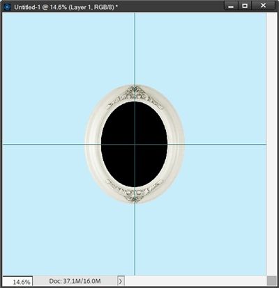
They are quite nice but perhaps not as versatile as some might like. Some of the frames have backgrounds that may not be conducive to journaling. For example, I really like one frame in particular and I pulled it into a 12×12 PSE file with a nice soft blue (#c7edfb) background:

You can see that this frame is fairly large and could take up more space in a layout than some might like. But, it’s a great size in which to type some journaling. And certainly, it can be resized.
For me the first drawback was the background. I personally think it’s a bit dark…but that’s just me. I kept reminding myself that I’m used to creating my own journal frames so having one like this is different for me.
The background could be adjusted any number of ways. Such as creating an oval the exact size required and just changing the color, or clipping a piece of paper to it that suits my current project better. Creating the perfect oval is actually the hardest part about making these adjustments.
Note: Keep in mind, when I pulled this journal frame into my file, by default PSE placed it in the center of the file. This is important for the next step. If you’re following along and your frame isn’t in the center, please center it now.
I’m going to use the Ellipse Tool to create an oval. But in an attempt to make this as easy as possible I’m first going to create some “guide lines” in my file so I can identify the exact center. I do this by going to the top tool bar and selecting View->New Guide:

PSE opens the New Guide dialog box:

For me the default Orientation selection is vertical. This means that the first line I draw will be from top to bottom. The default Position (again for me) is zero. If I left it at that PSE will place the Guide at the left edge of my file.
That certainly won’t do me much good. Since this is a 12×12 file I want this vertical guide to be in the center (half the distance between the left to right edges) which would be 6 inches. So, I set the Position to 6 and click OK to confirm:

PSE drew this line using whatever the color is set to in the General Preferences for Guides and Grids within PSE:

I have my Grid color currently set to a deep aqua color (#1c7676). If you’re following along your Guide color may be different which is fine.
Now repeat the process for the Horizontal Orientation, again using a Position of 6:

With both guides in place I ensure that the journal frame layer is active and I select the Ellipse tool:

For me the settings are exactly what is shown in the image above. Just in case you can’t see the image the settings are: Color chip set to black (uses the Foreground color chip value), the “shape” set to Unconstained, the From Center box is checked and the “Create new shape layer” box is selected (this cannot be changed).
Note: If you’re using a version of PSE that does not include the “From Center” option then drawing your oval will be a little trickier. But it is still possible
I’m going to keep the color black, it’s easy enough to change it later. I zoomed in really close so I can position my cursor (should be the cross hairs cursor) at the exact point where the guides intersect:

Note: I changed the color of my cursor to red so you could more easily see it in the image above!
Then I just click and draw (drag out) my oval shape:
That doesn’t look too bad, if I must say so myself. And even if it’s not 100% perfect, I can tweak the size if necessary!
I can now remove those guides so they’re not a distraction as I move forward. I do this by going to the top tool bar and selecting View->Clear Guides. And now I can get on with altering that background.
Modify The Background
As I said earlier, I can now make this oval any color that suits my current project or clip a different paper to it. Another option is to pull in (or create) a piece of vellum and use that shape to create a vellum oval.
Note: if you read my “See-Thru Titles” post, you already know how to do this.
And that’s exactly what I did:

Putting a piece of vellum over that original background makes this pre-made journal frame a little easier to use for journaling. At least in my opinion.
There’s another thing I can do with that black oval I created earlier. I can actually use this oval to delete that original background altogether. First, I’m going hide the vellum oval. Then I duplicate the journal frame layer and hide the original just as a precaution. Next, I hide that black oval, move it beneath the duplicate journal frame layer and make the duplicate journal frame layer active. Then I press Ctrl-Click on the black oval’s thumbnail in the Layers Panel:

You should be able to see the marching ants in the image above. Now, ensuring that the duplicate journal frame is still active I just press the delete key. And here is the result:

One last option. Instead of deleting that background the way I did above, I could have created a New Layer Via Cut (Shift+Ctrl+J) using that selection. With that background on its own layer, I now have a world of other possibilities to alter that background.
For example, I could add a Hue/Saturation Adjustment Layer. If you read my “More Glowing” post you already know about using that adjustment. But I will walk you through it very quickly.
With the background cut-out layer active I go to the top tool bar and select Layer->New Adjustment Layer->Hue/Saturation. PSE opens the New Layer dialog box. I accept the default name, check the “Use Previous Layer to Create Clipping Mask” box and click OK to confirm.
PSE then opens the Hue/Saturation options box. The first thing I do here is check the “Colorize” box. Then I can just play with the sliders for Hue, Saturation and Lightness until I get the look I want.
I ultimately landed on a Hue setting of 82, a Saturation setting of 25 and a Lightness setting of +48. This resulted in a background that now looks like this:

So, as I said at the beginning of this section, there are lots of alteration options if you have a pre-made journal frame!
You can use this technique to alter just about any pre-made frame that already has a background. Once you have your frame with a good background all you have to do is add your journaling text.
Adding The Journaling
Now I can concentrate on adding my journaling. First things first, I want to ensure that my text conforms to the shape of the inner part of the frame. I know it’s not that difficult to just type multiple lines of text that fit within the space. But I much prefer typing my text “inside” a predefined space. So I’m going to show you how to do that.
In my “Stitches Con’t” post back in July of 2024 I talked about making custom shapes for use with the Type tool. In that post I was typing outside the custom shape. But the basic process is still the same when typing text inside a shape.
The easiest thing for me to do is to duplicate the black oval I created above, change the color (so as not to confuse it with the black oval), move it above the Hue/Saturation adjustment layer and resize it so that it isn’t filling the entire space inside the frame. I want to leave enough space between the inside edge of the frame and the new oval so that my journaling doesn’t look cramped:

I do want to make you aware of one thing to always watch when doing this. Sometimes, in PSE when altering either a drawn ellipse or rectangle, PSE doesn’t always maintain the “flag” indicating the image is a shape. Most often this can happen if you’ve created an oval/rectangle and re-colored it after the fact or for whatever reason simplified the layer. You can always recognize a true “shape” in the layers panel by a little icon in the lower right corner of the thumbnail:

You should be able see the odd looking square on the lower right corner of the grey oval’s thumbnail (highlighted by the red box) in the layers panel. This is the “shape icon”. Always remember to look for this icon anytime you are going to type text “inside” a shape! If you don’t see that icon, you’ll need to start over by recreating the shape.
Note: You can also combine multiple shapes of varying sizes to create a unique shape when filling an irregular shaped space anytime you want to confine your text to that shape. For more tips on creating a unique shape please refer back to my “Stitches Cont’d” post.
I double-click on the grey oval layer’s thumbnail to ensure it is “active” – like I would when trying to ensure a layer mask is “active”. For some reason, if I don’t do this PSE doesn’t always recognize that I’m going to use this shape to guide my text. When I double-click on the grey oval layer’s thumbnail, PSE thinks I want to change the color of the shape and will open the color picker. I just click Cancel to close that.
Now, I select the Horizontal type tool, choose my font – Baramond Bold Italic from FFonts, set the Color to a very deep burgundy (#6d3b49), the Size to 24, the Leading to 29 and the Tracking to zero:

Then I position my cursor inside the grey oval near the top until I see the cursor change to what many refer to as a “tool cursor” (an I-Beam inside a circle). I have to be very careful to ensure that I don’t see the text on a shape cursor (an I-Beam with a curvy line underneath). That would actually place my text around the outside of the oval.
Once I’m certain I have the correct cursor, I can insert my text. I used this quote as my journaling: “May is the month where the earth wears a crown of flowers, adorning every corner with vibrant hues.”:

Once I’m certain that the text looks exactly the way I’d hoped I can hide (or even delete) the grey oval layer and change the font color if necessary. And here’s my final framed journaling (zoomed in a bit):

This turned out rather nice after tweaking the “store bought” journal frame. I could add a shadow to the frame but that is better left for when I incorporate this into a layout.
Now, I could go on to remove any hidden/unnecessary layers (including the blue background), crop this to size and save it as a PNG file. But since I don’t have a layout in progress, I’d rather just save it as a PSD file in case I need to make any changes later.
I won’t remove any layers (except maybe the blue background), but I will crop this to an appropriate size before saving it as a PSD file. And I’ll give it a meaningful name so I remember what this file is. Something like “FramingWords-MayFlowers” might be fairly descriptive.
I also wanted to show you how to create your own unique journal frame from scratch. But I didn’t want to cram that into this week’s tip & risk overwhelming you. There are a couple little twists that I think make it look so much nicer. Again, that’s just my opinion 😉 So hang in there until next week to learn about creating your own custom journal frames.
In the meantime…happy “framed” journaling!
Extra Tips

Using frames to showcase your journaling is a great way to bring attention to those small journal notes that might otherwise be lost on a page!
Sometimes when there’s just a tiny bit of journaling, a frame makes a nice place holder.
When using smaller frames be sure to use a small, simple, very readable font. Sometimes a plain sans serif font like Arial, Helvetica, Falling Sky, Futura, Open Sans, Roboto, Raleway or Verdana will work the best.
I would highly discourage the use of any “messy” typewriter fonts. These could become very difficult to read when made smaller.
Remember to think outside the box! We don’t always need to be confined to using just text boxes 😉
Experiment with using custom shapes to confine your journaling to a unique shape.
Other than that…just have fun working on different ways to work your journaling into your layout!
Thanks for reading this week’s Tuesday Tip. Remember, if you have any suggestions or questions please don’t hesitate to “Message Me“. Check back next week for tips on creating custom journal frames! Click “Follow Me” to stay in touch. I hope you have a wonderful week!
