
See-Thru Title
Several weeks ago, in my “Spiked Title” post I showed you how to create an interesting effect using the Distort Filter in Photoshop Elements (PSE). Today I’m going to share another fun tip that won’t involve any PSE Filters. This time I’ll be using vellum.
I’m guessing by now you must be thinking I’ve been on kind of a title kick lately. Well, there’s a bit of truth to that. I have been looking for new (or renewed) ways to create interesting titles for my layouts. Part of me wonders if this is another facet of how my Word Of The Year is influencing my life?!?
That may sound silly but you gotta wonder…right?
If you don’t already know what my Word Of The Year is…check out my “One Word 2025” post!
Anyway, as much fun as this technique is, there don’t seem to be that many vellum alphabet sets around these days. So, I thought I’d show you how to achieve the effect by creating your title in a different way.
Note: The featured image above was created using products from “En Pointe” by Alexis Design Studio (retired) and the following fonts: Isle Headline & Jalisco Script. Both are available at dafont.com.
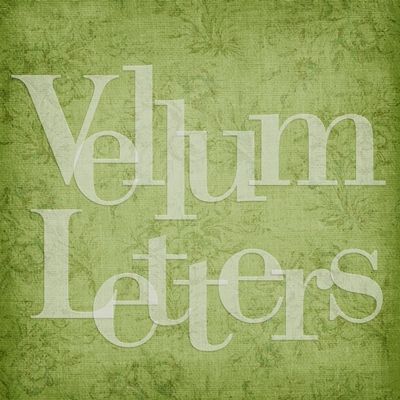
Vellum Letters

This is another technique that works best on larger titles. And I already mentioned that there aren’t a lot of vellum alphas on the market these days…at least not sold as a single set. If you have a nice alphabet set that you’d really like to use for this technique there’s a really easy way to turn it into a vellum set (or at least the letters that you need 😉).
Before I get started just a quick reminder that I use PSE 2024. If you use a different version, some of my screen shots may look different than what you see on your screen.
Now, to do this I will still need a piece of vellum paper, or even just a “scrap” of vellum. But I do want to be sure that it’s mostly solid. By that I mean no particular design like dots, flowers, trees, stripes or the like. Wrinkled vellum can work as long as it’s not too distracting. Now, if a vellum with a particular design fits with your project, then feel free to use it. You’ll just need to decide if the pattern is small enough to show up nicely on your letters.
I have this nice scrap of vellum from “Good Old Days” by Jessica Dunn of The Curio Pantry:

Note: I put a dark blue base beneath it so you would be able to see it better against the white background of my blog.
If you don’t have any vellum at all you can skip the rest of this section by clicking here. Or…you could just make a sheet of your own by creating a 12×12 (or whatever size you like) blank file and filling the layer with a very pale shade of just about any color. Then set the Opacity to about 75%. You can certainly go lower than 75% making it more transparent. But I would highly recommend not going any higher than 75%. Then be sure to save it as PNG file. If you save it as a JPG…you’ll lose the transparency!
Note: Grey shades are the most popular but the vellum scrap above actually has a greenish tint to it (#eff2ea). So, feel free to experiment with colors other than grey.
I created a 12×12 file with a background layer in the same color I used under the vellum scrap above (#0f5163). Then I pick an alpha that I like. For this demonstration I’m using these letters from the alphabet that came in “Just For Today” by Alexis Design Studio (retired):

Now I drag my scrap of vellum into the file (above the letters) and resize it so it just covers all of the letters (not much larger):

With the vellum layer active I Ctrl+Click on the thumbnail in the Layers Panel for the first letter (H) to make a selection around that letter:
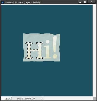
Then I create a layer from that selection (Ctrl+J) and temporarily hide the original vellum and letter layers:

I now have a lovely vellum letter! All I have to do is repeat the process for the remaining characters:

That wasn’t so hard now, was it? But what if you have neither a nice alpha or vellum? That’s what the rest of this post is all about!
Using Fonts For Vellum Letters
Since this technique works better on larger titles, it’s best to use a rather “bold” font (serif or Sans Serif are fine). I really don’t think a script font would be a good idea for this technique but you’re welcome to give it a try. A lot would depend on whether or not you want any of your letters to overlap.
I’m going to create a new 12×12 file with a white background. I then ensure that the foreground color chip is set to a medium grey (#89877a).
Then I select the Horizontal Type tool. I’m using the Isle Headline Bold font (from dafont.com) and I select that font in the Horizontal Type tool options. Then I set the font size to something around 170 pt, the Leading to Auto and the Tracking to 0 (zero). I also double-check that the font Color chip is set to the same color I used for my Foreground color chip. For this step, it doesn’t matter what setting I use for the alignment since it’s only one letter:

Next, I place my cursor in about the center of the page and click once:

Note: If you’re following along you can use the font size that will work best for your project…it doesn’t have to be as large as 170 pt.
Right now, all you see is that black dot near the center of the page. That’s because I didn’t draw a text box. There’s really no need to create a text box if I’m only typing one letter.
At this point all I have to do is type my title’s first letter and click the check mark to confirm:

Now, I can do one of two things. I can either duplicate this text layer and change the W to the next letter in my title. Or, I could just use the Horizontal Type tool (with the same settings as above) and create the next letter. Either way will work.
I’m going to duplicate the W layer (Ctrl+J). I then just double click on the thumbnail for that duplicate layer in the Layers Panel and type my second letter (e):

Now, I’m going to show you a little trick that some of you may not know (or have forgotten). With the Horizontal Type tool still “active” (I haven’t clicked the check mark to confirm yet) I click and hold the CTRL key. This temporarily activates the Move tool:

Do you see the bounding box? It’s around the new letter (e). While still holding the Ctrl key, I can now drag this new letter to wherever I want it to be:

That only saves one extra step. But if you have a lot of letters…that one step can add up 😉 You’re welcome!
I can now click the check mark to confirm and I have my second letter typed and in the desired position.
Then I just repeat this process until I complete my word:

I know…this doesn’t look like vellum, does it? I’m about to fix that. I change the Opacity for each of the text layers in the Layers Panel to 60%:

Now that looks better…you can see how the letters are overlapping each other. At this point I could change the order of the letters in the Layers Panel if I want to switch things up a bit. I’m not sure it will make a huge difference since the letters are all the same color.
But if I were to make the letters each a different color…it would change how the layers “interact”. That’s something to play around with later 😉
Now I’ll finish the title by adding the rest of my text:

The remainder of the text was written using the Aisling Regular font from Creative Fabrica. And I did have to move the vellum word. But that’s the finished title. All I really need to do now is add a shadow to the vellum letters.
Vellum Shadows

Now, adding a shadow to vellum can be a bit tricky because it is semi-transparent. Some designer-created shadow styles include a shadow for acrylic which can sometimes work on vellum. But if you don’t have a set of styles with that option, you’re left with creating your own shadow.
But you have to be very careful about how you create that shadow. If your shadow is too dark or too large it will take away from the transparency of the letter. The ideal way to add the shadow will be to create the shadow on its own layer. If you need tips on how to do that please refer back to my “Stitching Realism” post from August of 2024.
When I create my shadow layer, I use the same medium grey color (#89877a) I used when creating the original letter. With the shadow layer beneath the original letter I position it so that it is consistent with a 45-degree Lighting Angle. I’m doing this because this title is going into a layout that’s already using that angle.
Note: If you’re following along you can use whatever Lighting Angle that fits your project.
I’m going to zoom in fairly close so you can see how this looks. Clearly you can see that the shadow has made the vellum layer way too dark and I’ve lost the transparency completely:
So, how can I fix this? It’s easier than you think.
I just need to remove the part of the shadow that is directly underneath the actual letter. So, with the shadow layer active (and simplified) I Ctrl+Click on the thumbnail in the Layers Panel for the original letter:

You should be able to see how the selection does not include the shadow! With the shadow layer still active I press the Delete key and all that is left of the shadow is what extended beyond the edges of the original letter and the transparency of the vellum has returned:

To finish the shadow, I’m going to add a Gaussian Blur with a Radius of 5 pixels. This softens & lightens the shadow giving it a more realistic look:

With the shadow finished, I activate both the letter layer and the shadow layer then link those layers together in the Layers panel. This way if I have to reposition the letter on the background, the shadow will automatically move with the letter.
I can now repeat this process for each of the remaining letters. And here’s the finished title:

You may be thinking that this shadow is barely noticeable. And you are correct. It shouldn’t be too visible. Vellum is flat so there should be minimal distance between the vellum and the background paper. Therefore, the shadow should be minimal.
I could also have chosen to add a vellum style to the letters giving them some texture but it really wouldn’t be necessary.

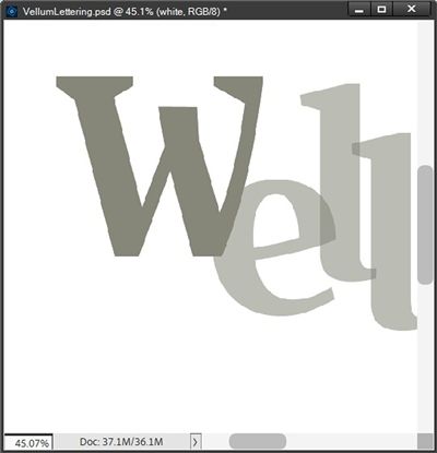
Before I let you go, I did want to show you one other thing. Remember earlier I said that the order of the letters in the Layers Panel likely wouldn’t make a huge difference since the letters are all the same color? Well now let’s take a look at how changing the color of the individual vellum letters can make a difference in how things look if I reorder them in the Layers Panel.
Again, I zoomed in fairly close so you can get a better view. This is how the word “Well” looks with each letter colored differently. And the letters in the Layers Panel are organized from top to bottom starting with the last letter (l):

You should be able to see the color variances where the letters overlap. The intersection between the first two letters (W & e) results in a darker green than the second letter (e). The intersection between the second and third letters (e & l) results in sort of an orange color. And the intersection between the third and fourth letters (l & l) results in an even brighter orange color.
If I move the second letter (e) beneath the first letter (W) in the Layers Panel and the last letter (l) moved beneath the third letter (l), the color variances are slightly different:

The change might not be strikingly noticeable in this instance. But the color variances are different between how the first two letters and the last two letters look now. So, if your letters are different colors, the order within the Layers Panel does make a difference. If all your letters are the same color the order really doesn’t seem to matter.
Oh, and earlier I mentioned I’d be using the title I created above in a layout…well here it is:

You can see the details about this layout in my 2025 Gallery.
I hope you have fun playing with your vellum letters.
More Tips

Remember the font you use for the vellum letters should be a rather bold “chunky” font to get the most out of this technique.
In general, it’s safe to say that starting with some shade of medium grey for the text will work. Especially since it can easily be re-colored if necessary.
If you need to create letters’ shadows on their own layers, be sure to link the shadow layer to the letter layer in the Layers Panel.
If your letter’s shadow is on its own layer and you decide to re-order the letter in the Layers Panel, be sure to move that shadow layer as well. Just because they’re linked doesn’t mean the shadow layer will automatically move.
The color and opacity of the vellum letters you create can vary based on the background upon which the title will be layered. If you’re using a dark background, you want the letters to be fairly light (less opaque). Conversely, if you’re using a light background, the letters should be darker (more opaque).
Always be sure to set the opacity of the letter’s layer to nothing higher than around 75%. Again, this will depend on the background you’re using. But generally speaking, if you go above 75% there won’t be much transparency at all.
If you do have any vellum layer styles in your scrapping arsenal, I’d encourage you to play with them to see what other affects you can achieve.
Other than that…just have fun experimenting with different colors for the individual vellum letters.
Thanks for reading this week’s Tuesday Tip. Remember, if you have any suggestions or questions please don’t hesitate to “Message Me“. Check back next week for a tip about missing fonts! Click “Follow Me” to stay in touch. I hope you have a wonderful week!
