
More Blurring
In last week’s post I talked about how to frame or highlight a “busy” photo’s subject, keep the original photo, but blur out all the distracting parts. That post got a bit too long so I decided to show you the rest of the story today.
Let’s take a look at some other ways to focus on your “star”.
Focus & Blur Part 2
There’s nothing that says you have to frame a section of your photo to highlight it. Today’s method takes a touch more effort since it involves making a selection in your photo. But if you have read my post about “Making The Right Selection” you should be able to accomplish this without too much trouble.
I’m going to show you how to achieve this effect using some of the same blur steps that I used last week. This time there will be no frame and I’ll make a selection around the portion of the photo that I want to highlight.
Quick reminder…I use PSE 2024. If you use a different version, some of my screen shots may look different than what you see on your screen.
I start by simply pulling a photo into either a blank (or white) 12×12 file in PSE or just opening the photo directly in PSE. Again, working only with the photo is not my preferred method but you can do that…just be sure you have a duplicate copy of the original photo saved somewhere safe.
I’ll show you the basic steps kind of quickly. I’ll be using this photo of a cute girl on a boardwalk from Pixabay:

This may not be the best photo from a lighting perspective. But it is such a fun photo with all the bubbles floating around that little girl. This is a great photo on which to use the Focus and Blur Effect because I can make that little girl and some of the bubbles stand out so much more than they do in the original.
I pull the photo into a 12×12 file with a white background:

Before doing anything else I duplicate this photo and hide the original. With the duplicate photo layer active I start to make a selection around the girl.
Since I use PSE 2024, I have the ability to make a selection of a subject:
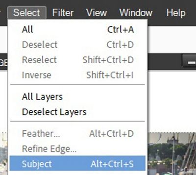
When I choose this option, I end up with this:

You should be able to see the marching ants around “subjects” other than the little girl. But this gives me a great starting point. All I have to do now is clean up and finish the selection.
Note: If you’re working with a version of PSE that does not allow you to select a subject just use whatever selection technique that works best for you.
Next, I grab the selection brush tool. Then using a hard round brush and the Add/Subtract options for the tool, I can refine my selection. I get rid of the extraneous people, clean up the selection around the little girl and add some of the bubbles to the selection:

I made these adjustments in what I call a non-fussy approach. I don’t have to be 100% precise with this because it is not going to end up as a standalone image. It will ultimately be over top of the blurred background so any “imperfections” in the selection should be barely noticeable.
That selection looks pretty good. So, I create a new layer using this selection (Ctrl+J) and temporarily hide the duplicate photo:

I do this mainly so I can be certain that I’m happy with the selection. I know that out of context, this portion of the photo may look odd. But I’m fairly certain this will do the trick.
I unhide the duplicate photo layer and make it the active layer. Then just as I did in last week’s post, I go to the top tool bar and select Filter->Blur->Gaussian Blur:

PSE then opens the Gaussian Blur dialog box:
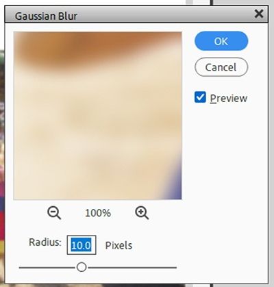
The Radius value is set to 10 pixels (at least for me). For most photos using this technique I like a Radius of 15-20 pixels. But every photo is different so feel free to experiment until you’re happy with the amount of blur on your particular photo. With this photo I ended up using a Radius value of 30 pixels:

Wow…what a difference this makes. I’m pretty happy with how well the girl stands out now. Could I have selected a few more bubbles…perhaps. I could also go on to add the brightness adjustment layer that I spoke of last week. For now, I’ll leave things as they are.
Note: If you want to add that brightness adjustment please refer back to the “Blur Distractions” post for all the details.
I think this is enough to give you an idea of how this technique can help you showcase your subject in a different way.
But here’s another example photo already focused & blurred that may give you an even better look at how this technique can work:

And here are a couple other examples with the foreground blurred rather than the background:

See how the foreground waves have been blurred? This tends to draw the focus more on the ship than on those waves.

In this photo even with the foreground hands only slightly blurred, the focus tends to be more on the girl’s face than her hands.
There probably aren’t too many times when you would want to do this…but some photos can really lend themselves to a foreground blur.
There’s one final option I want to show you that can be done using either last week’s frame option or today’s no frame option.
Change The Background Photo
Yup…I’m going to show you how changing the color of the background photo can add yet another intriguing way to highlight your subject.
This time I’m using a photo of my own:

Before I go on, I want to provide just a little background on this ship as it is very precious to me for many reasons. Most notably, back in 1997 I was on a business trip to Boston Massachusetts. As providence would have it, I was in Boston when the USS Constitution sailed on July 21, 1997, for the first time in 116 years. The ship sailed to celebrate the 200th anniversary of its maiden voyage. And I was on a “lobster boat” in Boston harbor to watch this epic sail!
The photo shown above is not from that trip but is from the historic sailing of the USS Constitution commemorating the 1812 battle with HMS Guerriere. It was the Constitution’s most famous victory which led to her nickname, “Old Ironsides”. I wasn’t on a “lobster boat” that time. But was happy to get pictures of the event nonetheless.
Okay so that’s your history lesson for the day. Now moving on…
I start by simply pulling my photo into a 12×12 file in PSE with a white background. I want to highlight the USS Constitution so I make a selection (again using the non-fussy approach I mentioned above) around only that portion of the photo:

Sadly, I couldn’t get rid of all the extraneous boats but that’s okay. I created a new layer using that selection (Ctrl-J). I then duplicated the original photo, re-colored the duplicate using Colorize (Ctrl-U) with a light sepia tone for my foreground color chip (#97826d.) I then blurred that re-colored photo using the same steps as above this time using a Radius value of 25 pixels:

I’m pretty happy with the way this turned out. Well sort of. I do want to mention one thing specifically on this particular photo.
Remember earlier I mentioned that using the non-fussy approach to making the “cut-out” is fine; typically, being over top of a blurred background any “imperfections” should be barely noticeable. Well, that isn’t always the case.
After seeing how the USS Constitution looked over top of the blurred harbor, I felt that the edges of the ship looked too “harsh” or crisp. Most often when we make a selection of an image we want those crisp edges. Perhaps not so much when that selected portion is layered over a blurry background. In my experience, this is not a common problem. But there’s always the exception 😉
In cases like this, I add a layer mask to the cut-out selection. Then using a soft round brush at a low opacity I soften the edges so they blend better into the blurred background. And I definitely need to do that with this photo.
After making that adjustment, I removed the white background, cropped it to size and saved it as JPG file for use in a layout I’ve been working on.
That may not have been the best example of a “colored” background. So, I’m just going to quickly show you a variation using a different photo of mine. This is the original:

And here it is after converting the background to B&W (Alt+Ctrl+B) and using the Scenic Landscape Style setting. I then applied a blur with a radius of only 6 pixels:
As much as I love lighthouses, I really wanted the sailboat to be the star of this photo. This technique allowed me to highlight the sailboat but still let the Round Island Light in Mackinac Michigan remain fairly visible. And with this photo I didn’t have to mask the edges of the sailboat.
Now, earlier I said that the “blurred” photo of the USS Constitution was going to end up in a layout…well here it is:

You can see more details about this layout in my 2025 Gallery.
I hope you’ll take the time to try at least one of these other alternates for Blurring out distractions and Focusing on the subject.
More Tips

Some photos just don’t lend themselves to making a good clean selection of your subject. These are the photos that may be better suited for the Focus and Frame option.
After seeing your “selected” subject over the blurred background you may need to add a layer mask to the cut-out selection and brush the edges so they blend better into the blurred background.
As I mentioned last week…when blurring your background photo be careful that you don’t blur it too much. You really don’t want to end up with a muddy mess behind your focal point 😉
When choosing to re-color the background of your original photo first set your foreground color chip to something close to the color you’d like to end up with. Then often times the best way to effect the change is to use the Adjust Hue/Saturation Tool (Ctrl+U) and check the Colorize option in the dialog box. You can then play with the various sliders until you get the look you like the best.
Don’t be afraid to experiment with adding a “brightness” adjustment (see last week’s post) to your blurred photo. Again, be careful not to go too light or too dark as this could affect how your focus shifts.
If you use the “brightness” adjustment, feel free to play with the Blend Mode. Typically, the blend of Soft Light works best. But as I’ve said before, every photo is different so feel free to experiment.
Thanks for reading this week’s Tuesday Tip. Remember, if you have any suggestions or questions please don’t hesitate to “Message Me“. Check back next week for a tip about another fun title trick. Click “Follow Me” to stay in touch. I hope you have a wonderful week!
