Recolor Anything
So last week I didn’t really give you a new technique…just a simple way to bypass some Text Hijinks. This week I’m going to make up for that. But things may not exactly be on the simple side. Hopefully it will be worth it for you. I’m going to give you some pointers about how to recolor anything.
I’ve written multiple posts that talked about using the Hue/Saturation Adjustment layer to recolor things. One of my first technique posts was “Enhancing Your Stash” back on February 12, 2023. In that post I dealt exclusively with using the Hue/Saturation sliders (Ctrl+U) and Colorize option. Admittedly, using the Hue/Saturation layer (sliders) is not the easiest method.
There are several other coloring methods that will give you a whole new world of possibilities for recoloring just about anything from paper to complex elements. And I will give you a heads-up now, this is going to turn into one of those multi-post topics. Trust me, you’ll thank me later 😊
But before I jump into the tips, I want to take a moment to explain some basics about color in general…
Color Theory
When it comes to color and the idea of recoloring something digitally, it’s important to remember that all colors come in many tones & shades. For example, the “Pure Blue” color chip in Photoshop Elements (PSE) corresponds to the hex code #0000ff. When a color is fully saturated it is considered true or pure and designated as a Hue.
Believe it or not, there are only seven other pure colors: Red #ff0000, Green #00ff00, White #ffffff, Black #000000, Cyan #00fff, Magenta #ff00ff, and Yellow #ffff00. Do you notice a theme here. Other than black and white, all of the other pure colors are made up of the varying values of black and white. This supports the famous quote: “Black is the absence of all color. White is the presence of all colors.”
Not to complicate things, scientifically, there are more than eight color hues. “100% pure” color hues refer to colors at their maximum intensity or saturation, without any added white (tints), black (shades), or gray (tones). These are generally considered the fundamental colors found on a standard color wheel:
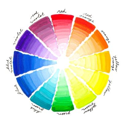
The most common, widely recognized 100% pure color hues are: Primary Colors (3): Red, Yellow, Blue. Secondary Colors (3): Green, Orange, Violet. Tertiary Colors (6): Yellow-Orange, Red-Orange, Red-Violet, Blue-Violet, Blue-Green, Yellow-Green.
Together, these 12 colors represent the most vibrant, vivid, and strong version of a color. Scientifically, these are often associated with the colors of the solar spectrum (the rainbow), where the color cannot be broken down any further.
Clearly, pure colors/hues are not the only colors available to us. We can lighten (add white) the shade of a pure color, which is called the Tint (also referred to as tinting). We can also darken (add black) a pure color, which is called the Shade (also referred to as shading). By adding grey to a pure color creates a different Tone.
Okay, now that I’ve made your eyes roll into the back of your head with all the science it’s time to move on…
Color Application
Because colors can come in many hues, tints, shades, and tones recoloring something will be easier if we remember the differences.
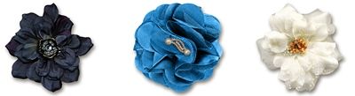
Let’s say I need to recolor a flower to a light pink color. Which of the flowers above do you think is going to be easier to turn into light pink. The dark flower, the medium flower or the light flower? Which one do you think would be the most difficult to turn light pink?
If you thought the light flower would be the easiest to turn light pink, and that the dark flower would be the most difficult, then you would be correct. So that means it’s best to start with an element that is already closer in tint or shade to the color you are trying to achieve.
Unfortunately, having an element that is close in tint or shade is not always an option. But that doesn’t mean I can’t change the color of something with a more drastic change in color. Just know that recoloring something isn’t an exact science. What works one time might not work the next. And in a few cases, an element or paper just may not be suitable for changing.
Now that you know a bit more about the basics of color theory, it’s time to dive in…
Coloring Methods
At the top of this post, I mentioned using the Hue/Saturation layers. Some early posts, “Paper Whisperer” and “Fun With Filters” dealt with using filters to recolor elements and paper. In a more recent post, “Masks & Wands” I talked about selecting patterns in paper and recoloring them. There are more ways than you can imagine to recolor things. And some can get a bit complicated.
With this “series” of posts about recoloring, my goal is to provide you with some of my favorite methods for recoloring both paper and elements. And hopefully, these methods will set you up for the best possible outcome when recoloring.
One of the easiest things to recolor is a solid piece of paper. I know, you’re sitting there going “Well, of course that’s easy…duh!” I can remember thinking the same thing when I first started with digital scrapbooking. But it’s not always as easy as using the Paint Bucket tool!
Blend Mode Coloring
I’m going to start with solid paper because it’s so easy to mess this up if I don’t do it the “proper” way. Not all digital solid paper is the same. Some have textures, and some of those textures are very subtle. But I never want to lose them. That’s when using a solid fill layer and a blend mode makes all the difference. Let’s take a look.
Just a quick reminder; I use PSE 2024. If you use a different version, some of my screen shots may look different from what you see on your screen.
Here’s a lightly textured yellow paper I created that I’ve opened in PSE:
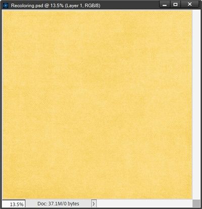
Note: If you’d like to follow along exactly, you can click here and this yellow paper will be automatically downloaded for you.
Recoloring Paper
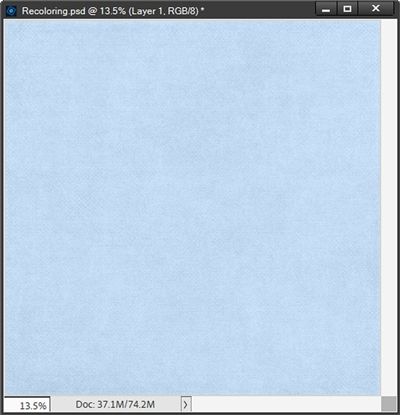
I want to change this to a lovely shade of light blue (#89a5c3) so that it coordinates with a spring cluster I’ve created. I set my Foreground color chip to that blue color.
I duplicate the yellow paper and hide the original just so I don’t accidentally overwrite the original paper. With the duplicate yellow paper layer active, I click on the Create new fill or adjustment layer icon in the Layers Panel (the circle that is half back & half white).
Note: Alternately, I could go to the top tool bar and select Layer->New Fill Layer->Solid Color. This is my preferred option when I know I’ll need to clip the solid fill layer to the object being recolored. By using this option, I will have the ability to force PSE to use the previous layer to create a clipping mask.
Using the Layers Panel option, PSE opens the fill/adjustment layer options dialog box.
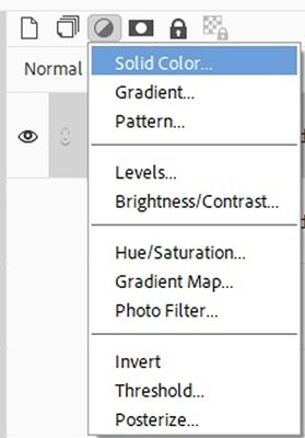
I select solid color and PSE opens the Color Picker dialog box. At this point it is already pre-filled with the color I used for my Foreground color chip. So, I go ahead and click okay.
Now in the layers panel, I change the Blend Mode of the solid color fill layer to Color:
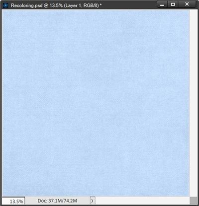
You should be able to see that the yellow color is now blue, but the texture from the original paper still comes through. This is exactly what I wanted. The Blend Mode of Color allows me to change the color of the paper, but keep its texture. So much easier than trying to use the Hue/Saturation adjustment!
I can now save this blue paper as a JPG with a unique name and use it to finish my spring cluster. To do that, I open my spring cluster:
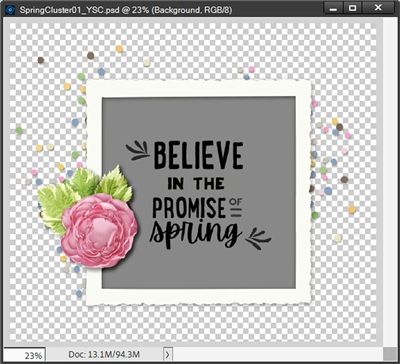
Note: If you’d like to follow along exactly, you can click here and this spring cluster will be automatically downloaded for you.
With the grey clipping mask layer beneath the word art active, I pull in my recently saved blue paper and clip it to the mask:
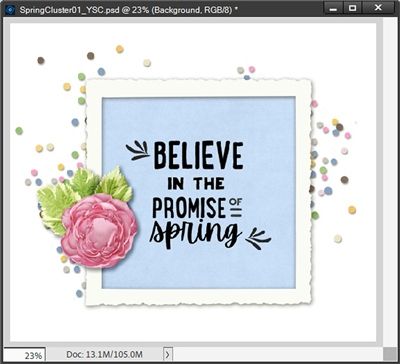
Note: I included a white background so you could see the confetti with the blue color that I used for the paper. I also re-sized (rather than cutting down) the blue paper so it was no bigger than the clipping mask. I did this because I wanted more of the texture to show.
After removing the white background, I saved this finished cluster as a PNG file.
With that cluster complete, I want to show you a couple more things to better explain the Blend Mode recoloring method.
I’ve shown you that changing a light-yellow paper to a light blue was really easy. But what happens if I want to make that light-yellow paper a dark blue? Let’s check this out.
I’m going to go back to the duplicate copy of my yellow paper:
This time I’m going to add a Solid Color fill layer using a dark blue color (#1D364f). When I set the Blend Mode to Color, I end up with a paper that looks eerily similar to my first example:
I know it looks identical but it’s not. And I will admit you’d have to place the two papers side-by-side to see the difference. So why did this happen?
This happens because the Color Blend Mode keeps the hue of the color I used, but it also retains the tint or shade of the layer beneath it. So, if I start with a light-colored paper, I’m always going to end up with a light-colored paper regardless of how dark a color I pick.
And if you remember, I warned about this back in the “color theory” discussion at the beginning: it’s best to start with an element that is already closer in tint or shade to the color you are trying to achieve.
In order to get a dark blue paper using a solid fill layer set to the dark blue color (#1D364f) I tried to use above; I’d need to blend it over a dark paper like this red one:
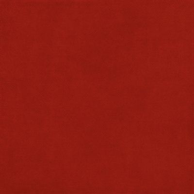
Doing that I would end up with this:
What all of this means is that while the Color Blend Mode recoloring method is fast and easy, it does have a few limitations. I plan to give you some more options in an upcoming post to increase the range of colors you can recolor to work around this.
But for now, I want to give you an example of recoloring a simple flower using this method.
Recoloring Simple Flowers
I have this basic flower (no complicated center) that I created some time ago:
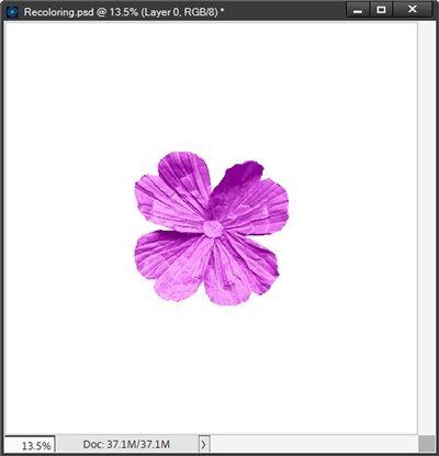
Note: If you’d like to follow along exactly, you can click here and this fuchsia flower will be automatically downloaded for you.
And I want to change that fuchsia color to a blue, all I have to do is create a solid fill layer (using that same darker blue (#1d364f) that I tried to use above on the yellow paper) and clip it to the flower.
Note: This is exactly one of the times I go to the top tool bar and select Layer->New Fill Layer->Solid Color since I know I’ll need to clip the solid fill layer to the object being recolored. When PSE opens the New Layer dialog box, I check the Use Previous Layer to Create Clipping Mask box and the fill layer is created and clipped simultaneously.
Then I change the Blend Mode to Color just as I did with the paper:
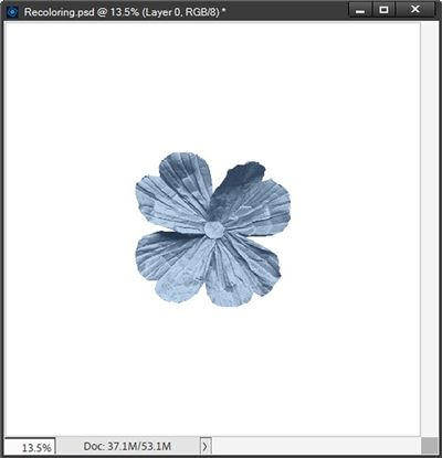
And just as with the paper, this Blend Mode method works almost like magic!
When creating the solid fill layer, if I’m not looking for any one color specifically, I can just “scroll” through the color picker values:
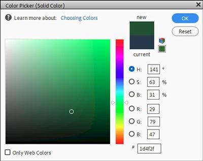
Can you see the two white arrows on each side of the color column? The trick here is that I can click and drag these white arrows up and down to change the color of the flower. By doing this, I will be keeping the same amount of tint, shade or saturation as the original.
And did you notice the white circle outline in the main color panel? As I scroll though the color column using the arrows, the placement of that circle never changes. That’s how I know that the amount of tint, shade and saturation are not changing. That dark green above results in this:
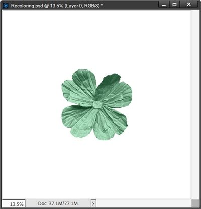
This allows me to quickly recolor this flower without having to hunt for the perfect shade or tint of a different color. And while I’m not limited to using only the colors in this column, these colors are the ones that will work best with the Color Blend Mode.
If I were to start clicking willy-nilly inside the main color panel in different color ranges, I can end up with some less-than-optimal results:
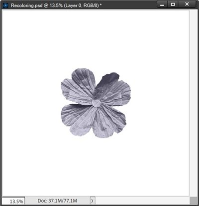
Not sure I’d have much use for a grey flower. But who knows?!? The solid fill layer (blended over the fuchsia flower) that generated this grey flower was set to a charcoal plum color (#343245).
I know this simple flower was super easy to recolor. Mostly because I didn’t have to deal with a “center”. That’s when things can get tricky. But thankfully, some centers are easier to deal with than others.
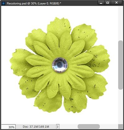
Let’s take a look at another flower I’ve created:
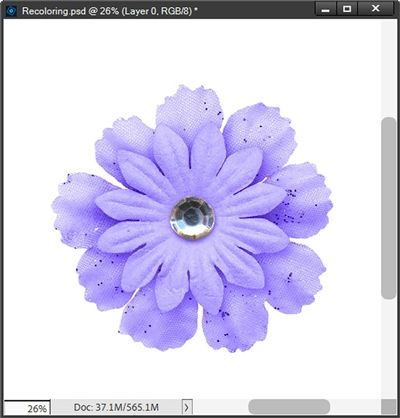
Note: If you’d like to follow along exactly, you can click here and this lavender flower will be automatically downloaded for you.
Even though this is a multi-layered flower, it is simple in the fact that it’s all one color (excluding the gem in the center). Because the gem is virtually a single color of its own, all I have to do is isolate the center and recolor the flower the same way I did above.
The best option for isolating that gem will be to use the Elliptical Marquee tool. So, I grab that tool and in the Tool options I click on the New selection icon, set the Feather to zero px, the Aspect to Normal and check Anti-aliasing.
One thing I need to be careful about is that I select only the gem and not it’s shadow. So, I’m going to zoom in to about 75% so I can better see the selection outline. Then while holding down the Shift key, I click and drag a selection around the gem:
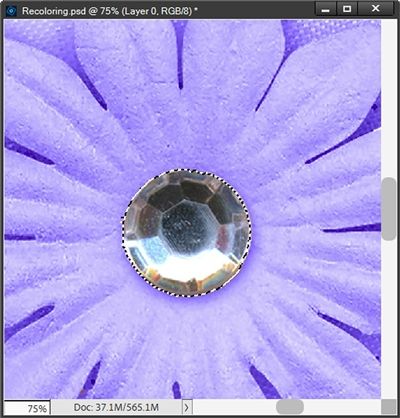
You should be able to see that the selection is around only the gem…no shadow. This is very important because if I include the shadow in the selection, the shadow will still have a lavender cast to it and I definitely don’t want that.
This selection looks pretty good so I simply press Ctrl+J to copy this selection to a new layer. I rename the new layer Gem Center. Then with the flower layer active, I create a solid fill layer with an olive-yellow color (#9ca112), clip it to the flower and change the Blend Mode to Color just as I did with the prior flower. Then I zoomed back out so you can see the entire flower:
One last “simple” recolor. On some (relatively rare) occasions I run into a flower with a center of the same hue/shade, such as this:
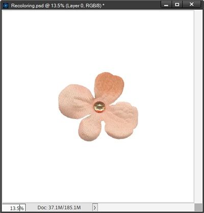
Sorry, I cannot provide a download for this flower. It is from my stash and I have absolutely no idea from where or by whom. I am almost certain I do not have a commercial license for it.
In cases like this it’s as simple as what I did with the very first flower above. With the flower layer active, I create a solid fill layer with an ashy blue-green color (#416b6e), clip it to the flower and change the Blend Mode to Color:
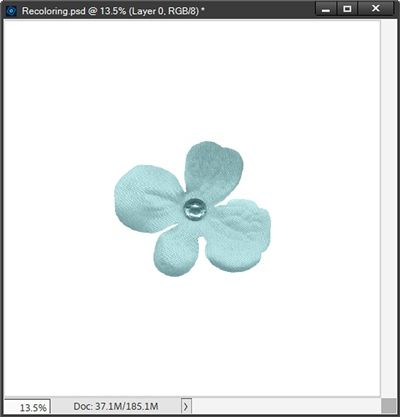
Generally speaking, if the flower and the center are of similar hue/shade, it’ll be a cinch to recolor it using this method.
There’s so much more to cover. But I’ve already made this longer than I’d hoped. That’s what I get for including the color theory “lesson”. But I thought it was important for you to have a good understanding of the differences between hues, tints, shades and tones. They all play a part in proper recoloring.
And as I mentioned at the very beginning, this likely would to turn into a multi-post topic.
Check back next week for tips on how best to recolor a not so simple paper or flower using this Color Blend Mode.
Today’s Tips

The Blend Mode recoloring method keeps any texture but changes the color.
The Blend Mode method works best when you use a similar tint or shade of the new color that you need. If you’re trying to create a light color whenever possible, start with a light-colored item. If you need a medium color, start with a medium-colored item. And if you need a dark color, start with a dark-colored item.
When recoloring, especially using the Color Blend Mode method it’s very important to have a good understanding of the differences between hues, tints, shades and tones. They all play an integral part in proper recoloring.
Don’t forget to use the arrows along the color column within the solid fill Color Picker to find the best colors for recoloring while keeping the same amount of tint, shade or saturation.
The Color Blend Mode Recoloring Method works best on items that have only one or two colors and the colors or parts are easily selected.
When you want to recolor something that has two colors (or parts), in most cases, you’ll need to isolate one of the two parts (preferably the smaller of the two) using the appropriate selection tool. Then create a new layer from that selection. You can then recolor either one or both parts independently.
Using the Blend Mode method, changing any color to white is virtually impossible. But in a future post I will discuss other recoloring options that will work.
Anytime you recolor an item it may be advisable to save the file as a PSD creating a template that can be used over and over again. This comes in handy especially if it’s a solid color paper or a frequently used element (button, flower, brad, etc.). And it’s a good idea to keep all of your recoloring templates in a special folder on your system so they are easy to find.
And here’s a creative thought for the day: Color is the place where our brain and the universe meet. – Paul Klee
Thanks for reading this week’s Tuesday Tip. Remember, if you have any suggestions or questions please don’t hesitate to “Message Me“. Check back next week for additional tips about recoloring. Click “Follow Me” to stay in touch. I hope you have a wonderful week!