
See-Thru Title Update
A couple weeks ago in my “See-Thru Title” post, I showed you how to create an interesting title using vellum letters. Well, I forgot to show you one other thing you can do to make those vellum letters pop a bit more. It actually may have been best that I did forget at that time. I think that post got a bit lengthy with all the steps I demonstrated. I know…no surprise there heh?
Anyway, today we’ll look at one final (and oh so optional) way to highlight those see-thru letters…
Outline Vellum

The image above was created using paper & elements from “En Pointe” by Alexis Design Studio (retired).
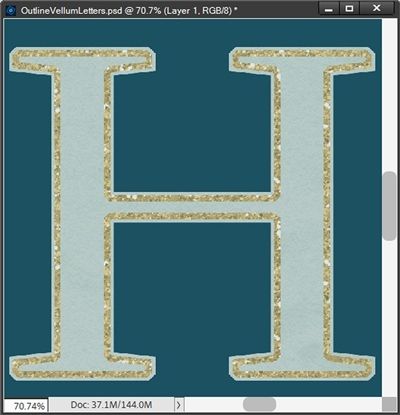
To make this quick, I’m just going to go back to the first set of vellum letters I created two weeks ago:

Just a refresher…those letters were created using a nice scrap of vellum from “Good Old Days” by Jessica Dunn of The Curio Pantry and the letters from the alphabet that came in “Just For Today” by Alexis Design Studio (retired).
Note: Reminder, I use PSE 2024. If you use an older version, some of my screen shots may look different than what you see on your screen.
I’ll begin by pressing Ctrl-Click on the first letter’s (H) thumbnail in the Layers Panel. PSE creates a selection around the letter. Since I want my “outline” to actually be inside the edge of the vellum letter I’m going to modify the selection.
If you read my “Going Slowly” post about modifying a selection you should already know how to do this. But I’ll run through it briefly here.
With the current selection of the letter made, all I have to do is go to the top tool bar and click Select->Modify->Contract. I then set the Contract by value to 6 pixels. And here’s how the selection looks:

You should be able to see that the vellum extends beyond the marching ants. Now I can create my “outline”. If you read my “Stroking Shapes & Stuff” post you should already know how to do this. But I’ll also run through this quickly for you right now.
I am going to want this outline on its own layer. This will make more sense to you in just a bit.
With the current letter/selection layer still active, I create a new blank layer. PSE creates this new layer directly above the letter layer which is exactly where I want it to be. I rename the new layer “H Inner Outline”. Ensuring that the new layer is now active AND that the selection is also active (present), I go to the top tool bar & select Edit->Stroke-(Outline) Selection.
PSE opens the Stroke settings dialog box. The color chip defaults to black (at least for me). I want to use a goldish color so I set the color chip to #eebb4d. Truthfully, any color at this point would be fine. I can always re-color my outline later if necessary.
I then set the Size to 12, Position to Inside, Opacity to 100%, the Blending Mode to Normal and I ensure that the Preserve Transparency box is NOT checked. I Click OK to confirm. And here is what that inner outline looks like:

I know…that H looks slightly yellow now. Well, it’s not really the letter that changed color. For some reason when PSE created the stroke there is a very pale yellow “fill” within the outlined area. I have absolutely no explanation at all for why this happened. Trust me I’ve played with this issue six ways to Sunday (as they say) and I can’t figure out why or how to prevent it.
I did read one AI generated response to a search I made which provided this: “When creating an “inner stroke” in Photoshop Elements, the selected area might appear filled with a lighter version of the stroke color because of the “Anti-Aliasing” setting, which softens the edges of the stroke by blending the stroke color with the underlying pixels, essentially creating a subtle gradient effect within the selection area.” First off, there is no Anti-Aliasing setting when creating a stroke (at least not in PSE 2024). Second there was no information on how to prevent this from happening. Thanks for nothing, AI.
I guess it’s just another one of PSE’s “undocumented features” 😉
No problem. I do know how to fix it. I clear the current selection and ensure that the H Inner Outline layer is still active. I then Ctlr+Click on that layer’s thumbnail in the Layers Panel:

You should be able to see that only the outline has been selected. So, I go to the top tool bar and click Select->Inverse and press the Delete key. I clear the selection and now I have just the outline:

That’s better. Now I have a vellum letter with a nice inner outline. All I have to do is repeat the process for the remaining characters:

This outline adds just a little bit of “highlight” to the vellum letter. I think this a nice touch that helps draw attention to this semi-transparent word art. This would be especially effective if you had light vellum over a light background.
Glam The Outline
I can go one step further with this outline by adding a glitter style. I’m going to be using a glitter style from “Homespun” by Aimee Harrison to the first letter (H). The glitter I selected was named “aimeehomespun_glitters04”:

I need to change the scale on this style so the glitter looks less chunky. So, I go to the top tool bar and select Layer->Layer Style->Scale Effects. PSE opens the Scale Layer Effect dialog box and I set the Scale to 50%:
That looks much better. I could now add just the tiniest bit of a shadow to that outline to give it a little boost. All I have to do is double-click on the Effects Icon to the far right of the layer in the Layers Panel. PSE opens the Style Settings Dialog box.
You may or may not be aware that the majority of designers will use the PSE standard Lighting Angle of 90 degrees for most of their styles. That being said, this is now also an opportunity for me to change that. Most of my layouts are made using a Lighting Angle of 120 degrees so I make that change first. You can use whatever Lighting Angle that fits your project.
Then I click the Drop Shadow box and set the color chip to a dark grey (#504c4c). PSE almost always defaults this color chip to black (at least for me) and I find using black (even at lower opacities) can be a bit stark.
Next, I set the Size to 4 pixels, the Distance to 2 pixels, the Opacity to 40% and I click OK to confirm:

This adds just a bit of lift to the glitter. The reason I do this is glitter is not flat. I want there to be that little bit of lift to give the glitter more dimension over the vellum. Which is how glitter would look in “real life” when sprinkled over paper!
Now, all I have to do is copy this modified layer style to the other characters:

And there’s my glammed-up vellum word art!
I hope you’ll have fun experimenting with adding an outline to your vellum letters.
More Tips

You can use any color you choose for your outline. And in most cases, if you’re going to add a glitter style to your outline…it doesn’t really matter what color you use.
Be sure to experiment with the number of pixels you use when contracting the selection. This will determine how close to or far away from the edge of the vellum your outline will be placed.
Also play with the size of your stroke when creating your outline. The thing you want to avoid is that your outline is so large it ends up filling in portions of a letter.
You do not have to create your outline inside the vellum. You can just as easily create the outline on the outer edge. It’s as simple as not contracting the selection and using Outside Instead of inside when creating the stroke.
You can also try using a standard PSE Bevel of Simple Emboss with a size of 1 pixel. This too will give that outline a slight lift off the vellum. It’s typically a bit more lift than a shadow might give. But it’s still an interesting option.
Don’t forget to play around with Blend Modes on your outline layer. You might be surprised at the effect you get. Some of the modes can result in a “whiteish” outline while the Luminosity mode tends to result in a color that mimics the same shade the vellum appears to take on when placed over top of the background which is also an interesting effect.
Blend Modes seem to have absolutely no effect on your outline layer if you have applied a glitter style to it.
Beyond that…just have fun experimenting with different colors and styles for your vellum letter outlines.
Thanks for reading this week’s Tuesday Tip. Remember, if you have any suggestions or questions please don’t hesitate to “Message Me“. Check back next week for a tip about using glyphs! Click “Follow Me” to stay in touch. I hope you have a wonderful week!
