What Fonts Go Together?
I know…I know! I’ve written a lot of posts about Fonts. My guess is that right now you think I’m beating the proverbial dead horse. Am I right? 😉 I have just one more font topic that I hope you’ll find helpful.
Let’s get real for just a second here. Most scrapbookers are font hoarders (present company included). And most of us will use more than one font on a given layout. Sadly, too many of us likely don’t pay enough attention to what fonts ideally “go together”.
Different fonts can be used to draw attention, lead the eye around the page, or even form the foundation of a title. And as I mentioned in my post about fonts & eyebrows, many fonts have distinct moods or personalities—serious, casual, playful, elegant. You want to make sure the moods of your font choices match not only the theme of your layout but that they don’t elicit conflicting feelings or impressions.
What exactly is a good font pairing? This is a difficult question to answer. But I’ll give you some basic tips that just might help you answer that question…
Font Pairings
Bad Pairings
I should probably start with an easier question – what are bad font pairings? Here’s a simple analogy. There is nothing more refreshing than brushing your teeth and then taking a sip of fresh orange juice. Right? Wrong. If you think that’s okay, I’m not at all sure what else to say.
The same goes for anyone who thinks it’s okay to pair any blackletter typeface with a script in any design. If you think that’s an acceptable combination, stop doing what you’re doing and keep reading.
In design, there truly are no “real” rules. There are endless color combinations, element placement options, and font pairing possibilities. But just because there are an infinite number of good possibilities doesn’t mean that bad ideas don’t exist.
You’d think that as long as you pair fonts that look similar, you’d be safe. Just the opposite. Combining fonts that are extremely similar, but just slightly different can cause conflict and confusion.
Fonts that share no relationship at all are not great either. Things that look random and haphazard tend to evoke a feeling of discord and should probably be avoided. That is unless it’s the effect you’re going for – perhaps on a “wrestling” layout. Font pairs that have nothing in common typically won’t translate into one, coherent feeling for the reader.
And I know I’ve said this before but it bears repeating. Too many fonts is a bad thing.
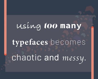
We all know there are thousands of fonts from which to choose when looking for a few that go well together. Now isn’t a great time to be indecisive. Rule of thumb is to pair no more than three fonts for your project.
While many projects benefit from sticking to this rule, it’s not one set in stone. There are plenty of elaborate designs that use more than three, but there is such a thing as overdoing it. If you go beyond three fonts, be sure that they work in harmony, not in chaos.
Good Pairings
For most of us, choosing good font pairings can be more than just a little challenging, and finding the perfect match can seem quite elusive with so many fonts from which to choose. It’s not just the pairing of the fonts that is hard. You also have to decide whether they are used in Titles, Sub-titles, Journaling, captions and so on.
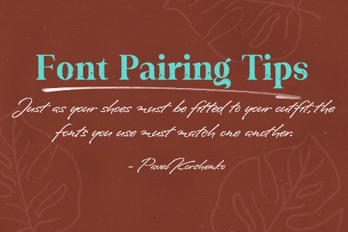
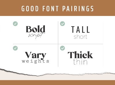
Good font combinations tend to be fonts that share certain similarities, but contrast in some specific way. A common way to combine fonts is to use fonts in the same family, or created by the same designer. Sometimes designers release font pairs which make it easy for us (i.e., Cherston, Righton & Parliament).
Regardless, a font should always enhance the message (or vibe) you are trying to convey; and pairing up fonts with different personalities will catch people’s attention.
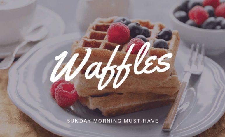
For example, Yellowtail, a cursive font, suits the fun and casual content of the Waffles graphic above. Raleway was used for the subtitle to create some balance.
Tips For Pairing
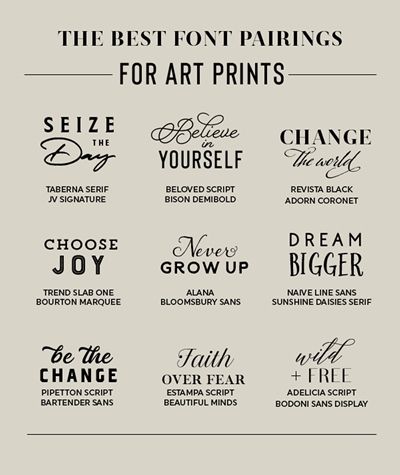
Note: All of the fonts used in the image above (with the exception of Naïve Line Sans) can be found free at various font sites. Just search for the font name and you should be able to find it free. Additionally, there is a reasonably good free alternative for Naïve Lans Sans – Comfortaa Thin at WhatFontIs.com if you’d like to check that one.
Finding your perfect font match is not impossible. Just observe a few guidelines as follows:
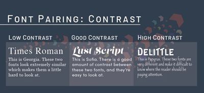
- Contrast Serif fonts with a Sans Serif Font. Serif Fonts have small decorative lines or embellishments at the ends of characters, while Sans Serif fonts do not include the decorative lines. A classic example of a Serif font is Times Roman and an example of a Sans Serif font is Helvetica.
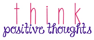
- Title vs Journaling Font. Preferably choose a Sans Serif or Display title and a Serif Font for the journaling text. This pairing works because there is high contrast. It’s also a good match between classic and modern. Start with your preferred title then pair it with a few journaling fonts to see what works best.
- Think about the personality of the font. Consider the mood you wish to achieve. If it’s a formal occasion or invitation, then flourish-y, fancy fonts will work. But they might not work for a school theme where you want to make impact. Instead, choose a bold font.
- Check you have all the elements. Before choosing a font, check that all the letters and characters you wish to use, come with that font, as well as your preferred language.
- Check for legibility. Look at your font choices from different distances and in different sizes. Are they legible and easy to read when used alone and when paired together?
- Be inspired by what works. Look at different font combinations that you see on other layouts or in articles you’ve read. Designers have carefully chosen these combinations, so you know they already work!
- Choose the right font for the right background. Choose a simple, minimalistic, bold font if you are going to be adding it to a busy background (or over an image). If you have a plain background, then by all means, add some flourish.
- Use Filters and Blur. If you need to make your font pop, then use filters over your image. Or blur the background. These are powerful strategies for working with a detailed background image.
- Don’t use too many fonts. Using just two fonts is the ideal number. Three is typically the maximum most “designers” recommend. If you must use more than two fonts, then consider choosing two of them from within the same font family.
- Experiment with font weight. You can use the same font, but in a different font weight. This adds the “effect” of an extra font. You could even experiment with using 3 different font weights of the same font (i.e., light, regular, bold).
Simple Examples Of Contrasting Fonts
I love Kimberly Geswein’s fonts. I’m nearly certain that you should be able to find all of them at DaFont.com. Below you’ll find some examples of great pairing ideas using some of her fonts.
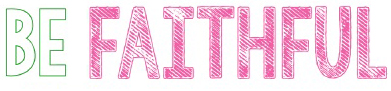
Pairing all CAPS with a script font

Fonts used in this example are: KG The Fighter & KG Part Of Me.
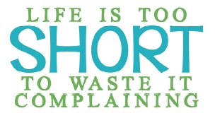
Pair skinny fonts with chunky ones
Fonts used in this example are: KG The Last Time & KG I Need A Font.
Pair fancy fonts with simple fonts
Fonts used in this example are: KG Call Me Maybe & Janda Happy Day.
Pair the lowercase with the Capitals of one font
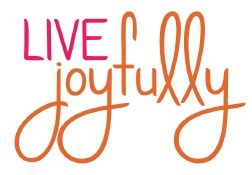
Font used in this example is: KG Ways To Say Goodbye.
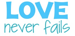
Pair different but similar styles
Fonts used in this example are: KG Let Her Go Outline & KG Tangled Up In You.
Pair wide & narrow fonts
Fonts used in this example are: KG Eyes Wide Open & KG Something To Believe In.
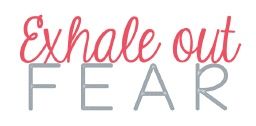
Pair tall & short fonts
Fonts used in this example are: KG No Regrets Solid & KG Behind These Hazel Eyes.
You can find many more font pairing examples on the internet. I’ve really only touched on the tip of the iceberg for you here.
Single Most Important Tip About Font Pairings
Don’t go crazy with a dozen different fonts on one layout. There needs to be some unifying quality to them and they need to suit their purpose. A good rule of thumb is to keep them to about 3. No more than 5.
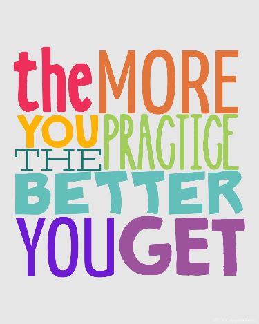
As I’ve said so many time… PRACTICE – PRACTICE – PRACTICE! This is the only way to develop that “design eye” that lets you move from novice methodic-style to intuitive, flying-by-the-seat-of-your-pants creativity. Consciously look at font combinations everywhere. Magazine layouts, product labels, memes on Facebook, Pinterest boards…the possibilities are endless. See what combinations you find pleasing and which you find jarring. Over time, you’ll find you’re not quite so indecisive about which fonts go together like milk and cookies and which are more like chalk and cheese. Whatever you do, please don’t let font pairing paralyze you.
And, if you have any questions or need a bit of help finding a particular font, please don’t hesitate to “Message Me” for some assistance.
Thanks for reading yet another Tuesday Tip about fonts. If you don’t want to miss the next post, just click “Follow Me” to stay in touch. And as always…“Happy Scrapping!”