Fonts Are Like Eyebrows
Did you know that everything you see creates an emotional response? How and where you see it also adds to that emotional response. This psychological response to imagery is a powerful tool in conveying your message. You can design memorable pages with these details in mind! And one of the most important details? Fonts!
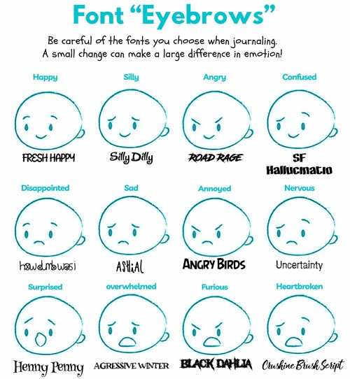
We have to be careful about our font choices. Why? Because they add expression/emotion to our page. And just like eyebrows, they can be thin, thick, straight or curly. They’re not something that people immediately spot but if you don’t take care of them, people can notice. And if you didn’t have them at all, then it might look very strange.
Step #11: How Fonts Evoke Feelings
It’s time to face facts. Fonts are one of the most essential tools in a crafter’s repertoire. The font(s) you choose can play a crucial role in the message you want to convey and are up there as one of the most important visual elements that you must consider.
It’s so much more than just words on a page.
Color psychology is something that most people are familiar with. I talked about it a bit in my prior post on Selecting Layout Colors. I explained that our behavior and mood are affected by what color is in front of us. Red is powerful, blue is calming, yellow is optimistic, green shows health.
Well, it’s the same with fonts. The psychological associations we make when seeing different typography inspire different ideas and emotions.

The feeling that certain fonts evoke is often inherent. We are genetically programed to view and feel a certain way when exposed to visual stimulus. It’s why a long sandy beach makes you feel calm and relaxed whereas a dark windy forest makes you feel on edge. Typography is being subconsciously analyzed by the brain and associations are pulled without us even noticing.
The Psychology Of Fonts
In 2006, the Software Usability Research Laboratory at Wichita State University conducted a survey to see if certain fonts are tied to certain emotions. From their survey, which was completed by 500 people, participants assigned personalities and emotions to each font as shown below.

The results revealed that serif fonts were viewed as stable/mature, script fonts were seen as feminine/casual and modern fonts were seen as masculine/assertive. The emotional ties that people place on different typography provide interesting insights into how people view what we write.
Because human beings are more engaged with visual content than written content, the appearance of the text is often more important in determining perception and memorability than the written content itself. By changing the style of a font, choosing a more emotional font or a powerful font, you can make the reader feel and respond differently.
Different Font Styles Have Different Impacts
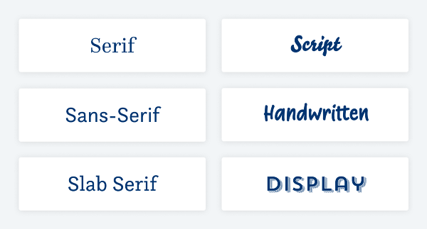
As mentioned in my “Fonts & Alphabets” post a couple weeks ago, there are thousands of fonts and typefaces existing in the world. You can refer back to that post for more information about the 6 basic styles I discussed. Today I’m going to talk about how these different styles evoke different feelings.

Serif Fonts
Serif fonts like Book Antigua, Rockwell & Times New Roman, often evoke these emotions: stability, formality, traditional, authoritative, respectable, sophisticated, classic, expensive. They work great for both headings & long reading text (journaling).
Sans-Serif Fonts
Sans serif fonts like Arial, Century Gothic, Veranda & Myriad Pro often evoke these emotions: simplicity, straightforwardness, chic, modern, clean, minimal, versatile. They also work well for both headings & journaling.
When using sans-serif fonts think about not using a “too geometric” font for long journaling paragraphs. Things might start to “run together”. Also bear in mind, that sans-serif fonts in digital design are the more popular choice, and sometimes it’s a good idea to swim against the stream to make your project stand out.
Slab Serif Fonts
Slab serif fonts can be very modern or more traditional (i.e., “Retro Bold” or “Clarendon“, respectively). This style of font often evokes these emotions: techno, confidence, clunky, wild-west, solid. They work best for headings. I would seriously discourage you from using them for journaling.
Script Fonts
Whether intricate or casual, script fonts will usually stand out as more unique and obviously personalized than a serif or sans serif font. They often evoke these emotions: feminine, creative, personal, delicate, relaxed, artistic, sentimental, romantic. They work best for headings or word art. Typically, they are not a good fit for journaling. They can work if it’s a simple script. But I caution you to be very careful, especially if your journaling is lengthy.
Generally speaking, for your digital project script fonts might only work well for display text. That’s what they are made for. So set them in larger sizes and only use them for a headline, a drop cap or a very short leader.
Handwritten Fonts
Handwritten fonts often evoke these emotions: human, approachable, natural, friendly, authentic, down-to-earth. They typically work best for headings or word art. I suggest you use them very sparingly for long journaling. They can work but not if the font size gets too small.
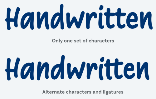
A big caveat for this category – a good handwritten font is rare. Pick a font that has plenty of alternate characters, so not every repeating letter within a word looks the same. Look at the sample below. Notice how both “ts” in the first word are identical but not in the second word.

This kind of thing happens naturally in our handwriting. This might seem like a subtle thing, but our brains actually detect that something is off. Because the whole point of using these fonts is to make it seem authentic, and then you destroy it by making it obvious that it’s not. The example above was done using “Supermarker” by Liebe (not free). A free font providing similar variations would be “Be Cool Regular”. And watch for a future post about turning your own handwriting into a font!
Display Fonts
Display fonts come in all shapes and sizes, AND can be any of the types listed above. Rather than any specific attributes, a display font is almost always inappropriate for use in smaller paragraphs or longer pieces of text. For this reason, display fonts should be used VERY sparingly and for impact! Display fonts often evoke these emotions: retro, thematic, quirky, friendly, unique, expressive, trendy, exciting, fun. They work best only for headings or word art. Generally speaking, they are very bad for journaling.
How To Choose The Right Font
Well, this is the potential million-dollar question. And often, there isn’t a definitive answer. Although there is always a wrong answer.
Let’s go back to the eyebrow analogy. When you meet someone for the first time, what’s the first thing you notice? Their eyes? Their nose? Their hair? Maybe their rippling biceps 😉? When first making someone’s acquaintance, you rarely notice their eyebrows. That is unless the person in front of you looks like this fella:

Then you can’t stop staring. Well, this is a lot like a font. If you choose the right font, it’s often overlooked (in a good way) but if you select the wrong font, it can have a really negative effect on your message.
Words are never just words. Even beyond what they say, they carry a message. The meaning of the words is one thing. The way they look — and the emotions that style evokes — can be something else altogether!
Some of this is art. Some of it is science and, more specifically, psychology. If you can learn all the nuances and how subtle messages are transmitted you will be able to tap into this whole new way of thinking. You really can create emotion with something as simple as a font! And your page and messaging will only become that much stronger.
While there’s no “right way”, one-size-fits-all, cookie-cutter model for selecting fonts, having an idea of how your font makes people feel is essential when sharing your story. Ensuring that the emotions the font evokes are consistent with your page’s message can make all the difference for how this memory of yours will make them feel.
Important Tips About Font Selections
Don’t waste time overthinking whether a font belongs to this or that category. In today’s digital world, type designers mix and blend influences from all over the place. Things are not linear and a rigid categorization will not work (if it ever has). Better to think about what mood a font creates and for what sort of text it fits best.
Let me explain a bit further. The lighter the font the more pleasant the reader’s experience. Chosen correctly, the font should visually captivate and invite one to continue reading. Specifically, when we talk about long journaling text. Look below at the same text in two different fonts and with different letter spacing.

You can straight away tell which one would be more suitable for longer pieces of content. The font you choose can either improve the readability or completely destroy it. If the letters are too crowded or too spaced out your text could be very difficult to read.
Find your own “font language”, and take the attributes you connect to these categories with a grain of salt. Font styles all have their own appeal in any given situation, and you will have to decide if it truly fits the project and circumstances, or not. My advice here is to pick something you like and that fits your project. Going by your “taste” is absolutely okay. Go with your gut feeling, have fun and don’t be too dogmatic about it.
Plain & simple don’t overlook the effect your font(s) can have. But don’t overthink it either. Please do take time deciding on your font choices. They can have an impact…make sure it’s the right one! But as I mentioned in my “Fonts & Alphabets” post…please don’t use too many different font styles on one page.
Thanks for stopping by for another edition of my Tutorial Tuesday series. If you like what you’ve been reading click “Follow Me” to stay updated for more on what you can do with all these fonts…
