Well Thought Out Color Schemes Are Crucial!
I’ve talked a lot about color in the last two Tuesday posts (re-coloring elements & re-coloring paper). But one of the most challenging parts of scrapbooking is selecting and using papers that coordinate well with your photos and make some kind of impact. When you start a layout, how do you choose the colors you will be using? Do you look for the overall color of the photos? Do you look for accents in the photos? Do you just choose a kit with a similar theme as the photos, no matter what the colors are?
There are many ways to pick colors, and it will most often depend on your style of scrapping, your style of creating, and maybe the purpose of your scrapbook page. We usually prefer certain colors depending on the environment in which we live, the weather, and the amount of light reflected from different objects, and sometimes we remain interested in one color for a long time or lose interest in another color.
Most psychologists believe that our brain interprets colors with reason, and therefore each color affects us differently. Here are the top eleven colors & how they affect people.
- Red is the color of power. It gets people’s attention and it holds it. It is associated with aggressiveness and desire. Red can sometimes feel angry or evil yet may also symbolize love.
- Blue is the most popular favorite color among people. It is a more relaxed color and evokes feelings of peace, harmony, tranquility & trust. This color calms the mind and relieves mental/physical fatigue, activates creativity and increases the feeling of security and self-confidence.
- Pink is most often associated with romance; expressing acceptance, flirtatiousness, femininity and euphoria However, it is also an attention grabber often showing excitement & boldness.
- Yellow is a powerful color, but it can also be the most “conflicted” hue. Yellow can command attention & express warning (caution tape). Yet it can just as likely express confidence joy, optimism and friendship.
- Green is warm and inviting, eliciting a pleasing feeling. But it also denotes health, nature, goodwill & thoughts of wealth.
- Purple represents mystery, spirituality, as well as royalty. It conveys a touch of elegance, prestige authority or seniority. Due to purple’s deep roots in royalty, it can be used to express individuality.
- Gold is likewise elegant and prestigious, but adds an element of power purple can’t match. Using gold in combination with purple or green often symbolizes wealth and pedigree.
- Orange is energy, warmth, and enthusiasm and possesses powerful attention-getting properties.
- Brown, an earthy tone, is known as a comfort color, causing feelings of relaxation.
- Black is a highly versatile color. It can be modern or traditional, exciting or relaxing, powerful and mysterious. Used as a contrasting color, black most often adds drama to whatever mood you want to cast.
- White symbolizes purity, birth, and innocence. Being bare and bright, white has a very clean feeling.
Color can seem like a small detail, but it is proven by psychologists as a highly influential part of how we view things. Take time to think about how you express yourself with the colors you choose, changing the color scheme for a layout could have a huge effect on how you see it!
Step #7 Selecting Colors for Your Layout
Working hard on a layout and ending up with a result that seems to be “missing” something, is an awful feeling. While other issues can cause that feeling, color choice is often one to consider. A well thought out color palette can help outline the theme of a page, attract attention to precise items, or detract away from mistakes. Poorly chosen color schemes, on the other hand, can cause your page to look out of sync, gaudy or mismatched.
There are so many things that go into picking colors for a layout. I generally use my photo(s) as a guide for color picking. I know some people rely totally on using a color wheel when matching colors to their photo(s). That can get kind of tricky for beginners or people who just don’t understand how to use a color wheel.
Other ways include basing your color scheme on: the theme of your photo(s); selecting a predominate color from your photo(s); choosing an overall color that suits all of your photos; sometimes it’s just as simple as working with your favorite colors.
I’ll cover lots of options in this post but I do want to start with the trickiest one first…
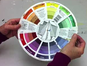
The Color Wheel
For the most part, when I scrapbook, I select the photo(s) that I want to use on my layout, and then base my color scheme around the hues in the photo(s). For example, the color of someone’s shirt in the photo, or something in the setting, such as the wrapping paper on a present, may inspire the entire color scheme of my layout.
Occasionally I can struggle with this, and I know many others that have too. Fortunately, I found a FREE online tool that I can turn to if I need some inspiration, and that’s what I’m going to talk about now.
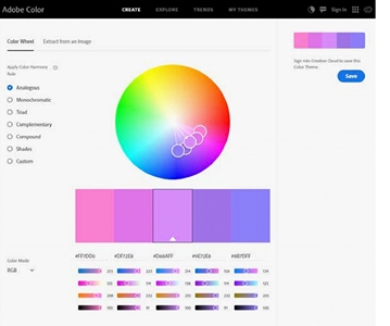
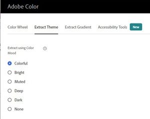
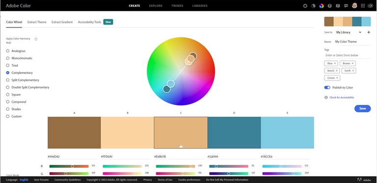
Sometimes it might not be obvious what colors would work best, and that’s when I turn to this tool from Adobe. It’s called Adobe Color (the home page is pictured above). I’ve been using it off & on for a couple years and it can be helpful!
To see what colors might work well for a given photo, I click on “Extract Theme” on the top left side navigation. This then takes me to a screen where I can upload a photo. With my photo uploaded I now see a menu of Color “Moods” on the left side of the screen. These mood selections will drive the color “themes” that the Color Wheel will display for the photo. The “Colorful” mood is selected by default.
Colorful Theme
I uploaded a random picture (I’m not sure from where), and took a couple screenshots to share with you, so that you can see this tool in action. In this particular photo, this little guy is standing in front of a flower bed, and although I would love to use the purples and reds of the flower blossoms as the color scheme in a layout, I’m concerned that it would look too “girly” for this handsome boy!
Keeping the default Colorful option, this is what it showed:

And yes, it suggested just what I would have loved. But too many pinks and purples! If he was a little girl, it would be perfect, but I’m afraid this one just isn’t going to work.
I could move any one (or all) of the little color dots around the photo if I wanted to control what “the wheel” is using. But, typically it’s best to let the wheel do its thing. If you do want to move the dots, just position your cursor over the one you want to move and drag it to a different spot in the photo.
I was going to step you through each one of the mood options but that would make this another really long post. Instead, I’m just going to show you what I landed on after trying all of the moods…
Dark Color Theme
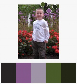
I think we have a winner with this “mood”! The lavender/grey color works nicely with the flowers, but it doesn’t seem too feminine, especially when combined with the dark greens and charcoal gray. And I’m not going to use the purple (at least I don’t think so)!
Now all I have to do is go through my paper stash and see if I have solids & patterns that fit this color scheme (I’m pretty sure I do!).
I hope this quick exposure to the Color Wheel wasn’t too overwhelming for you. I tried to keep it pretty simple. It is a handy little tool (and FREE) if you’re struggling with color selections. I encourage you to at least give it a try. If you are confused or have any questions about using the color wheel just “Message Me” and I’ll gladly try to help.
Choosing Colors By Themes
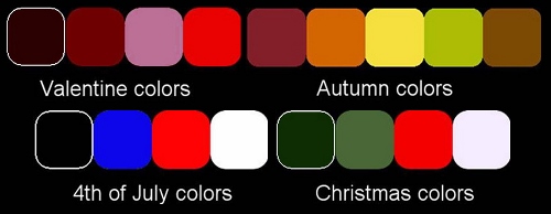
This is kind of an obvious way to choose colors for a layout. If you are working with a Valentine’s Day photo, chances are you will be going for reds, pinks, maybe black & white. If you’re working on a layout about a fall vacation, you might be drawn to greens, golds & oranges. Of course, it is not a strict rule, far from it, but many themes tend to generate an automatic “color imagery”.
Choosing Colors From A Photo
This also sounds obvious. When you have a photo that you want to use in a layout, it’s generally just reflex to use the colors directly from the photo. You might want to find a major color of the photo, but you might also want to merely focus on a specific detail.
As an example, in this photo, I could use the general bluish color that was made from a blend of the blue of the sky and the grey of the sand for the background.
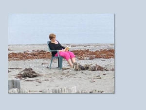
Since much of the photo is close in color to what was picked for a background, it definitely does not make the photo stand out. Of course, this is not meant to be a complete layout. Although, using such a “bland” color for a background does leave me with lots of options when adding complimentary or contrasting embellishments.
If, on the other hand, I wanted to try some of the other colors from the photo to create a background, I could use the turquoise from the chair, the dark blue from the shirt, the bright pink from the pants, or maybe the brown from the seaweeds.
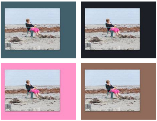
Which one is better? You tell me. A lot will depend on what else I add to the layout. Perhaps a patterned paper with shades of all these colors. Maybe adding mats, ribbons, brads, paper piecing, etc. that compliment/contrast the chosen “primary” color.
Choose A Predominant Color Among Multiple Photos
If you want to create a multi-photo layout, focusing on the specific colors of only one photo might not give such a cohesive look. Put your photos together, side by side. Do you see some repeat colors? Do you see a consistent color across all the photos? Do you see a focus subject in all the photos? It could be the shirt of one person in all the photos; it could be the color of the pool, the beach, or… the lobster! Do you see a repeat color in those three pictures?

I think, in this case, I would choose the blue of the wall, which is repeated in all the photos but it is fair to think that reds and/or oranges will definitely be colors in the layout. Whether it is as a main color or an accent, I don’t think I could scrap these photos without some reds & oranges! What do you think? You can see how color picking can often be a very personal & subjective process.
Choose A Color By Mood
There are times when you might not really want or need to pick a color directly from the photos you want to use. Perhaps the mood and story are more important than the photo itself. Maybe you want to use a calm mood, a sad one, a happy one, even a crazy feel. This might dictate what kind of colors you will use, whether they are bright or pastel, vibrant or neutral, rich or muted. A sleeping baby will probably require a soft color, while children at the park will need something brighter. A child will probably look “happier” in a bright cheerful colored layout, while an older person would fit better in a softer environment. Just be sure that whatever mood you pick it doesn’t clash with your photos.
And if you still end up choosing a color from the photo, you can also adjust the saturation to convey the mood. This also works whenever the color itself seems to be a bad match with the general feel of the layout.
Choose No Color
Black and white layouts can give a very elegant look to a scrapbook layout, and would definitely give much focus to a color photo. See how this photo looks a bit lost in the pink background, even though the pink is taken directly from the picture. I didn’t think a white background would be a good option. I guess the pink does match the photo, but not really the mood for it. In contrast, see how it seems to jump off the page with a solid black environment?
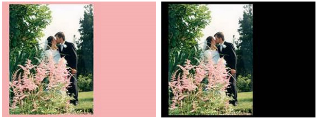
Using “no color” does not mean you will use nothing other than black and white. Of course, you can still add a touch of color, but you could stick with “no color” and ultimately end up with a gorgeous montage.
Choose Your Favorite Colors
Some scrapbookers have their own favorite colors, or types of colors. I tend to gravitate toward seaside or beach colors. Whether you are regularly attracted to bright vivid colors, or pastel colors, or neutral ones, it is quite okay to follow your own preferences. After all, you are scrapping for pleasure, right?
And if you’re anything like me my favorite colors tend to be pretty prevalent in my supplies. Sometimes I look at a photo and already have a specific kit in mind. And there’s nothing wrong with going in that direction.
Use the colors you tend to gravitate towards…the ones that please you. There is no hard and fast rule against it. Even if a particular photo might usually be associated with a particular type of color palette, you can be bold, you can be different, you can be a total “rule-breaker” and still create an amazing layout. If for no other reason than the fact that you did NOT follow the expected color choice.
Choosing a color scheme for a layout is more about a general plan for colors. You will probably want to use variations of the same color, in lighter or darker version. You should also consider adding a touch of a totally complimentary or contrasting color here and there. This will either tend to break up the monotony of a main color or it will accent details of the photos that might have been too bold/bright to be a major part of the layout.
Choosing Complimentary Colors
In order to choose some complimentary colors, you can use various tools but the most useful would be the color wheel. Just go back to the Adobe Color site I talked about in the beginning of this post.
I’m not going to go into all the details about how to use this feature. There are some amazing tutorials out there detailing how to use the Adobe Color Wheel. I’d encourage you to check those out if you want more information. Just search for “Adobe Color Wheel Tutorial”…at least a few should pop up straight away.
Most Important Color Picking Tips!
Give the color wheel a spin. If you try the online site and find you like it, there are also “hard copy” color wheels available at most craft stores.
If you’re not really into all the technical “correctness” of picking colors. That’s fine too. Unless you’re a graphic artist…just pick what looks good to you!
Anytime you have a kit that you REALLY want to use but the colors are not the best for the photo, try making your photo sepia-toned or black & white. I can’t tell you how many times I’ve done this. And you could also try “colorizing” the photo (the same way you can alter an element) to fit the kit…that too can result in some interesting options.
Most importantly, don’t get frustrated or give up. The more you create the more comfortable you’ll get picking colors for your pages.
If you like what you’ve been reading, please click “Follow Me” so you’ll easily stay updated for Step #8…