Using Word Bits
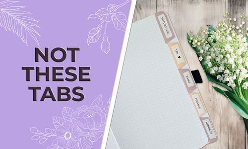
Last week in my post about Trapped White Space I mentioned that this week I’d be talking about tabbed journaling. I can only imagine that you’re seeing something in your head that’s similar to the featured image above and wondering how this is going to work. It will work because I’m not using those kinds of tabs. I’ll be creating word bits.
Back in May of 2023, I wrote a post about using only parts of an element by piecing sections out using the Rectangular Marque Tool. In that post I also talked about creating word bits with that same tool. Today I’m going to show you a different approach to creating word bits (tabs) for your journaling.
And now you’re also wondering what the distinction is between word bits and tabbed journaling. In a nutshell, word bits are typically decorative elements used to enhance a design, while tabbed journaling is just another technique used for writing and organizing longer stories.
And to confuse things just a bit more…traditional (paper) scrappers refer to tabbed journaling as a method of recording longer, more personal written stories by tucking (hiding) them behind other decorative elements with tabs or inside pockets (tabbed or labeled).
Before I get to the “tabs”, a quick reminder for you. I use Photoshop Elements (PSE) 2024. If you use a different version, some of my screen shots may look different from what you see on your screen.
Tabbed Journaling

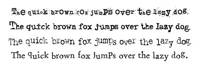
This technique works best with a “clean”, un-fussy, serif or sans serif font. It also helps if the font stays in a reasonably straight line when typing. This will make sense shortly.
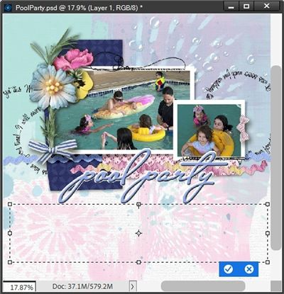
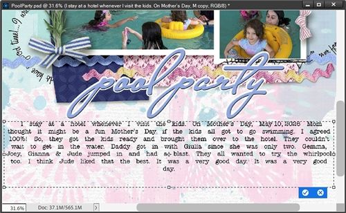
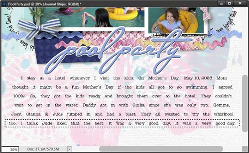
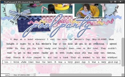
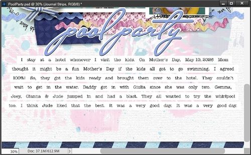
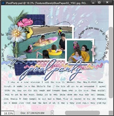
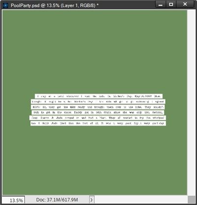
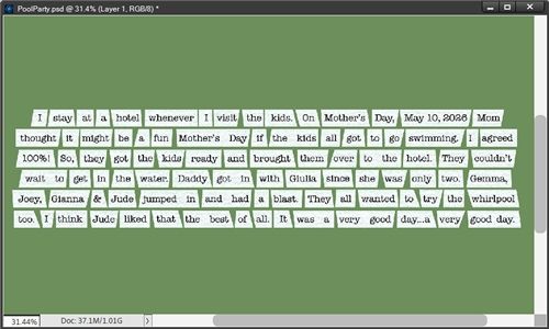
Journaling is generally one of the last things that we tackle on a scrapbook page. So, when I use this technique, I typically have a nearly completed page (like the one directly above) and I know exactly where and how much space is needed for the journaling. Knowing those two things is critical for this to work out perfectly the first time around.
With that information I can do one of two things; I can either open a blank 12×12 file in PSE (with or without a colored background). Or, I can simply open the layout I have in progress. I’ll start by opening the layout shown directly above.
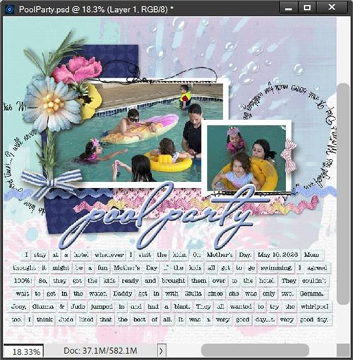
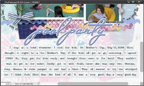
You should be able to see that there’s a pretty good chunk of space near the bottom of that page. That’s exactly where I’ll be working today. For the bulk of this post, I will be zoomed in on that section of the layout as I create the tabs/word bits (I’ll be using those two terms interchangeably throughout).
Creating The Word Bits
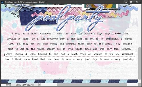
If you’ve read the above mentioned 2023 post where I talked about word bits, the image directly above may look familiar to you. This is pretty much the same look I’ll be going for today but just in a different manner. Either way, having a good handle on how to use the Rectangular Marquee tool will make this easy.
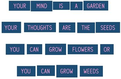
Today’s technique has a few more steps than the one from 2023. But in the long run, it’s worth the extra effort when working with lots of text. I’ll be showing you how to go from this:
To something like this:
Note: If this is your first time converting a paragraph of journaling into word bits, I’d recommend using only a couple sentences for your first attempt 😊 Trust me, it’ll go quicker for you!
As I said, I’ll be working on my existing layout. Feel free to open a new 12×12 file if you don’t have a layout in progress. You can leave the background blank or use a color. Just don’t use white for the background.
Add The Journaling
I start with ensuring my color chips are set to the defaults (Press D). For now, I’ll click on the top most layer in the Layers Panel to activate it. My text layer should be fine above that layer. But I can always move it later if necessary.
I grab the Horizontal Type tool. In the Tool Options, I open the Font Picker and choose a clean journaling font. I’ll be using American Typewriter Regular. I set the Size to 12 pts, the Leading to Auto, the Tracking to 0, the color chip is already black and I click on the Center Align icon.
Note: You can use whichever alignment works best for the position of your journaling.
I hold down the Shift key and click and drag a large text box:
Note: Holding down the Shift key while clicking and dragging keeps this new text box from interfering with other type layers on the file.
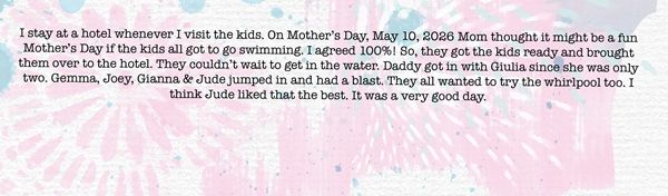
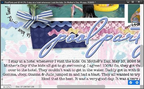
I then type (or copy) my journaling into my text box. I generally always type my journaling in a Microsoft Word document before adding it to a layout. That usually will catch spelling errors that PSE won’t. If the text box isn’t big enough, I can resize it as necessary. Then I click the checkmark to confirm:
I’m still going to thoroughly spellcheck the journaling again and look for missing or extra words. At this point it’s very important to ensure there aren’t any errors. If I find them later, I’ll just have to start all over from the beginning ☹
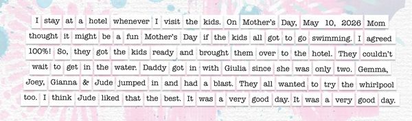
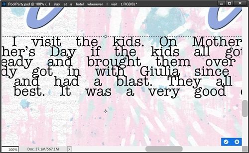
Now, earlier I mentioned that font choice is important. One of the most important things to watch for with this technique is that the letters/words run in a straight line when typing. It’s also important that the font being used doesn’t have letters that are “wonky”, cattywampus, distressed (inky) or jumbled. Things will go so much easier if the typed journaling is clean and uniform rather than trying to work with journaling that looks like this:
Spacing For Word Bits
In the Layers Panel, I double click the thumbnail of the text layer to open/highlight all the text. I then press Ctrl+Home to place my cursor at the very beginning of the first word. Next, I press the Space bar thrice to add three additional spaces before the word.
You won’t notice much of a spacing change on this first word. But that will become more noticeable moving forward. I’ll press Ctrl+Right Arrow to place my cursor at the beginning of the next word so I can add three additional spaces before that word:

This time it’s pretty easy to see the extra spacing. And I’m just going to continue using Ctrl+Right Arrow and the Space bar to add three additional spaces between each word of my journaling. I just have to be careful not to add spaces between words and punctuation marks! When using Ctrl+Right Arrow, it will stop between a word and a period or other punction marks (other than the apostrophe). I just Ctrl+Right again to move past the mark.
Note: I generally keep dates (words & numbers) as a single unit so I typically won’t add extra spaces between words/numbers in those cases. You can space your dates however you choose. I also choose to keep the ampersand as a single unit.
If I run out of room in the text box, I click on the bounding box handles to make the text box bigger and continue adding spaces.
VERY IMPORTANT NOTE HERE: I DO NOT commit the change at this point.
Set Final Width
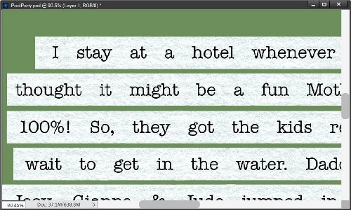
Here is how my journaling looks now with the added spacing:
Well, that’s not a good look with that last word all by it’s lonesome on the last line! No worries. All I have to do is click and drag one of the side bounding box handles to make the text box wider or thinner. The goal here is get the lines to be more even in length, like this:
VERY IMPORTANT NOTE HERE: I still DO NOT commit the change at this point.
Add Extra Leading
I press Ctrl-A to highlight all of the text. In the Tool options I reduce the value of the Leading until the lines of text are touching, but not Overlapping:
I ended up setting the Leading to 8.5 pt. While the majority of the letters are not overlapping, in instances where a lowercase letter with a “tail” (i.e. g) is above a capital letter or other tall lowercase letter (i.e. k) there is some overlap. But that shouldn’t present a problem in the end.
Now I need to increase the leading to a multiple of that current low setting. Generally speaking, it’s a good idea to multiply the Leading value by three and enter the new number into that field. With all of the text highlighted (press Ctrl-A) I set the Leading to 25.5 which is 8.5 x 3. I zoom back out to see how it looks:
Some of my journaling is missing. Not a problem, all I have to do is click and drag the middle bottom bounding box handle to make the text box taller. The goal here is get all of the lines visible:
That looks better. I can now click the checkmark to commit the changes.
Strips For Word Bits
With the text layer active, I hold down the Ctrl key and click the Create a new layer icon in the Layers Panel. PSE creates the new layer (Layer 1 for me) and places it below the text layer. And that’s exactly where I need it to be. I immediately rename the layer to Journal Strips. Next, I ensure that my color chips are still set to the defaults (Press D).
Note: In the next few steps, I’ll be using the Background color chip (currently set to white). If you’re working on a layout (or other file) with a predominantly white background you will want to change the color of your Background color chip. Any color will be fine. Perhaps pick a color that coordinates with your layout.
I grab the Rectangular Marquee tool. In the Tool options I click the New Selection icon. Set the Feather to 0 and the Aspect to Normal. On the file I click and drag a selection outline around the longest line of text. For me, that happens to be the very last line:
The key here is to make the selection longer than the line of text to leave extra room at the beginning and the end of the line. And I can’t make the selection too high. I want it to be just tall enough to cover all of the words.
I press Ctrl+Backspace to fill the selection with the background color of white:
VERY IMPORTANT NOTE HERE: I DO NOT cancel the selection.
I still have the Rectangular Marquee tool active. On the file all I have to do is click inside the selection outline and drag it to the next longest line of type. I can also just use the appropriate Arrow key to nudge it into place:
The height of the selection is fine but the ends are just a bit too long. This is easy to fix. All I have to do is Right-Click inside the selection. PSE opens a dialog box and I select Transform Selection:
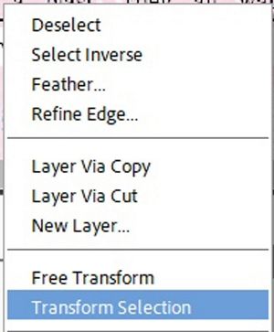
PSE places a bounding box around the selection and I can now click and drag the sides inward until they have approximately the same extra space at each end as I used on the first line. Then I can click the checkmark to commit the transformation. The selection still remains.
Again, I press Ctrl+Backspace to fill the selection with the background color of white:

Then I just need to repeat that process for the remaining lines until each line of text has a white strip behind it:
At this point I can now cancel the selection (Esc or press D). Now it’s time to split the strips into bits…
Split Strips For Words
Before I start splitting strips, I’m going to preserve the original text and strips in their current state. I do this out of an abundance of caution in the event I happen to find any mistakes later.

I go to the Layers Panel and click on both the text and Journal Strips layers to select them. I duplicate these layers (press Ctrl-J). The duplicate layers become the active layers. With those layers still selected I immediately click on the Create a new group icon in the Layers Panel.
PSE creates the new group (Group 1 for me). I rename the group to Backup Text & Strips, hide the group and move the group so it is below the original Journal Strips layer in the Layers Panel.
Note: I highly recommend taking this precaution. Once you move on to splitting the strips making any modifications to text will get super tricky. If you are confident things are good as they are, you can forgo this precautionary measure. Just remember, it’s easy enough to delete that “backup” group at the end if it’s no longer needed.
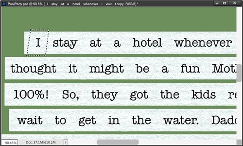
With the Journal Strips layer and the Rectangular Marquee tool still active, on the file I click and drag a short, thin selection between the first two words of the first line:

The key here is to ensure the thin selection is centered roughly between the words and extends slightly beyond the top and bottom edges of the tab. If necessary, I can use Ctrl-T to transform the selection.
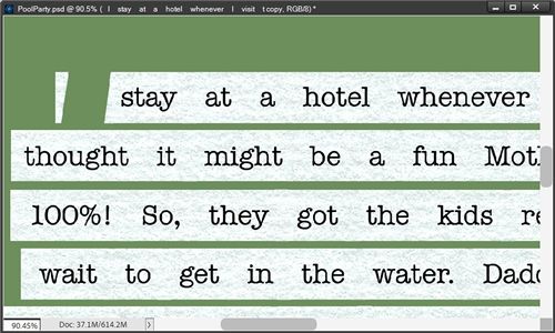
Now I press the Backspace key to delete that part of the strip. Again, I DO NOT cancel the selection:
And here’s the tedious part. I need to repeat this process for each word bit! Remember back in the beginning when I said if this was your first attempt…keep it short? This is why. But, once you get the hang of things, it goes fairly quickly.
With the Rectangular Marquee tool still active I can just click inside the selection and drag (or “arrow”) it between the next two words. I then just keep repeating that process until all the strips are split:
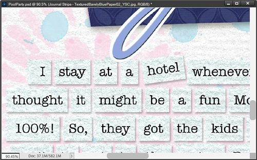
So, now it looks more like word bits. There’s still a bit more to do but some of it is optional.
Clip Paper To Journal Strips
This part is absolutely optional. If you’re perfectly happy with the color you used when creating the Journal Strips layer, feel free to skip this. I am going to change mine because there’s already so much white around those word bits.
In my stash I have this lovely textured paper that is barely blue:
I pull that into my layout and clip it to the Journal Strips layer:
That really helps the word bits show up a bit better. To keep things tidy I “cut” that paper down to only what is needed by doing something I’ve talked about routinely since my “It’s All About The Size” post in July of 2023. If you aren’t familiar with that, I’ll run through the steps quickly.
With the paper layer active I Ctrl-Click on the thumbnail of the Journal Strips layer. PSE creates a selection around all the word bits. I then click the Add layer mask icon in the Layers Panel and PSE adds a mask to the paper layer. I then simplify the paper layer (PSE sometimes requires me to do this twice to get rid of the mask).
I no longer really need the paper layer separate from the Journal Strips layer so I can merge those two layers together. Since the paper layer was the top layer, the new merged layer is now the same name as the paper used. I then just add Journal Strips to the beginning of that layer’s name so it doesn’t get confusing.
Merge Text To Bits
PSE requires that any text must first be simplified before merging it with any other standard pixel layer(s). So, I need to do that before I can merge it with the Journal Strips layer.
I’m going to execute the merge a little differently this time. With the simplified text layer active, I right-click somewhere right of the layer’s name and PSE displays a drop down and I select Merge Down. This way I retain the name of the Journal Strips layer.
Now I can add a shadow. I click on the Journal Strips layer in the Layers Panel. I then go to the top tool bar and select Layer->Layer Style->Style Settings. In the dialog box, I click on Drop Shadow to reveal the settings.
PSE has the color chip set to black. If you’ve been following me for a while you know I’m not a big fan of using pure black for shadows 😉 So, I change that to a medium dark grey (#575757). I then set the Lighting Angle to 120, the Size to 7, the Distance to 7, and the Opacity to 40. I press OK to confirm:
Note: Feel free to use whatever shadow settings are appropriate for your project.
Now that really helps those word bits stand out! Technically, I’m finished creating the “tabbed” journaling. However, there is one final optional thing I could do…
Transform The Word Bits
This can actually be achieved one of two ways. First, I’ll walk you through the steps using the version of the word bits you see above.
In the Layers Panel, the Journal Strips layer should still be active. I once again grab the Rectangular Marquee tool. The settings should still be set to what I used in the beginning.
On the file I click and drag a selection outline around one tab, two tabs, or even an entire line of tabs (including the shadows). I do need to make sure not to select parts of other tabs that I do not want to transform (including other shadows). I’m, going to keep things simple just to give you an idea. I draw my selection around just one word in the top line of my text:

I then press Ctrl-T to initiate the Free Transform tool whereby PSE places a normal bounding box around the selection. I can then press the Arrow keys to move the selected word bit up, down or sideways. If I want to rotate the word bit, I just hover my cursor over a corner of the bounding box until I see the double-headed arrow. I can then click and drag to rotate. When I’m happy with the transformation, I click the checkmark to confirm and cancel the selection (Esc or Ctrl-D):
I can go on to repeat this with any other word bits as I like. Doing this can add interest and variety to the “tabbed” journaling.
The alternate option will require using the “backup” version of the Journal Strips and text that I saved earlier. And to keep this from getting too confusing I’m going to be using a plain green background while showing you how to use this alternate method:
What you see in the image above is the “group” I created containing the duplicate copies of the plain white journal strips and the text. I placed it in the center of the file just for convenience.
Note: If you’re going to try this using the backup you created feel free to leave it in whatever position works for you.
The first thing I’m going to do is ungroup the layers. Then I’m going to pull in the same barely blue paper I used for the earlier examples and clip it to the Journal Strips layer.
And just as I did before, I “cut” that paper down to only what is needed and merge it with the Journal Strips layer. I’m also going to merge the simplified text with this new merged Journal Strip layer. I’ll zoom in now so you can see things better:
This time I’m not going to go through and create blank spaces between each word like I did earlier. Instead, I’m going to be using the Polygonal Lasso Tool to cut sections out of the strips for each of the words. This will give me the opportunity to use different shapes for the word bits.
In the tool options I click on the New selection icon, set the Feather to zero and check the Anti-aliasing box. Then I just draw a selection around the first word in whatever shape comes to mind. I hold down the Shift key if I want to drag a straight line.
Because there’s already plenty of space between each strip I don’t have to be too careful making my selection along the top and bottom. The main thing is going to be how I deal with the space between words. Here’s my first selection:
Can you see how I left enough space on the strip between the first two words? That’s going to be important moving forward. There needs to still be space enough for me to cut some off of the front of the next word when I finish this word.
I then press Shift+Ctrl+J to cut that word out of the strip and create a new layer from that first selection. I then hide the new layer and immediately rename it to reflect the name of the word I just cut out. In this case the new layer is named as a capital I:
Don’t be concerned about the little section that remains that will go away later. I activate the merged journal strip layer again and make my next selection:

Then I press Shift+Ctrl+J to cut that word out and hide the new layer:

I just keep repeating the process until I’ve cut all the words (single or groups) out of the strips. This is not quite as tedious as cutting the blank space in the original method. But it will still take some patience and time. But I think it’s worth it. And here’s what’s left after I cut out all the words:

Well, that’s not very pretty! But as soon as I hide that merged journal strip layer and unhide all the new layers, I get this:
This is now my final opportunity to look for any changes in spacing if I see that some words are too close together. Since they’re all individual pieces…I can just move them to add more space. I’m pleased with how this turned out at this point.
Now, I could go on and change the angle of some of those bits just by selecting one and rotating it. But if I’m working with a sizable paragraph such as this, I tend not to combine rotating with the different shapes. It can start to get a bit too busy and can actually draw attention away from the journaling.
So, I’m going to keep it as is. Now I can select all of the individual word bit layers and merge them together, add my drop shadow and reveal (or place) it on my layout:
And nothing says you have to do anything to transform your word bits. It’s perfectly fine to leave them as plain rectangles in a straight line as you saw before I added these options. As always, the choice is yours to make!
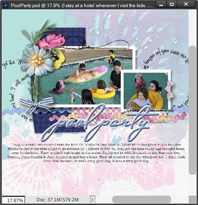
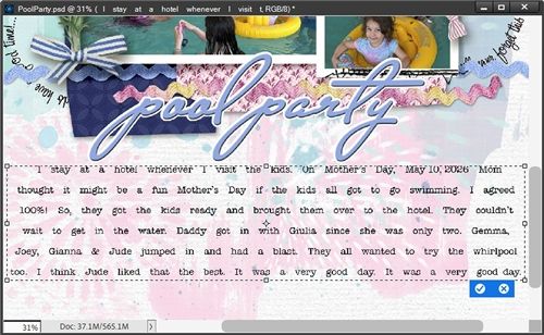
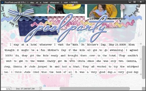
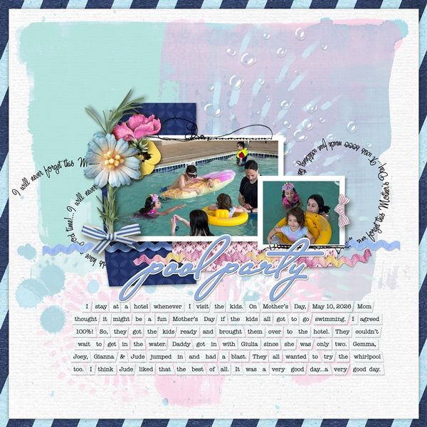
And here’s my finished layout:
And here’s another layout showing you a different way to arrange the word bits:
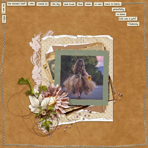
If you’d like to see more details, both of these layouts are available in my 2026 gallery! The title of first layout is “Pool Party”. The second layout’s title is “The Autumn Leaf”.
Word Bit Tips

When creating word bits such as these I have a few recommendations; don’t use a script (or other fancy/funky) font, use a dark font on a light paper or a light font on a dark paper.
Don’t worry about getting the journal strip sizes exactly the same. Adding some variation (when spacing allows) will just increase the charm of it all.
Some typewriter fonts are perfect for this technique. There are at least a few others that should be avoided: Baltimore Typewriter Small Caps, Junko Typewriter and Retro Typewriter could all be problematic.
Before actually typing your journaling in a text box, it might be a good idea to type it on a completely different type of document (i.e., Microsoft Word) that will do some spellchecking for you. You can skip that if you like, just be sure to do a thorough spellcheck on your journaling; look it over for missing or extra words. Reading the typed paragraph slowly and out loud will usually help spot errors.
Both the Rectangular Marquee and Polygonal Lasso tools are integral in successfully creating various types of word bits (tabs).
Things can get tricky when you’re adjusting the leading of your text so that the letters in a line touch but do not overlap those in the next line. Sometimes you may see a few letters that do overlap while the majority are touching just right. Go with the leading value that works with the majority and ignore the few overlaps. Generally, it will all work out in the end.
You can play around with the number of spaces you leave between words I tend to go with a total of four spaces between each word. You can go lower or higher depending on the font and how much “paper” you want on either side of each word.
The same goes for the Leading value. The font size typically drives this. If you want your “tabs” to be taller than what I showed you today…just use a higher leading multiplier.
Don’t be afraid to tilt some of your word bits at different angles. I do recommend that you don’t rotate all of your words! But that’s just me. If you’re going for a silly, whimsical or comedic look…go for it! Afterall, it’s your layout.
Be sure to zoom in fairly close when you’re creating the blank spaces between words on the journal strips. This is the best way to be sure you have the space a good size and centered between the words.
Don’t worry if some tabs end up looking different than others. The word bits don’t have to be identical. With this technique it’s kind of the point to not look perfect.
Above all else, take your time…remember patience is a virtue. If you need to take a break…do it. The worst thing you could do would be to hurry through this and then be devastated if you find a mistake!
There is no wrong way to make pretty things. — Anonymous
Thanks for reading this week’s Tuesday Tip. Remember, if you have any suggestions or questions please don’t hesitate to “Message Me“. Check back next week for extra tips on recoloring paper. Click “Follow Me” to stay in touch. I hope you have a wonderful week!
