Are There Rules?
Before I get to the rules, I promised to keep you updated. Grandbaby #5 arrived on the 26th. A beautiful little girl. Mom & baby are home and doing well. Now on with the rules…
Whether you’re a traditional or digital scrapper, if you’ve read “About The Café” then you know how I feel about rules in scrapbooking. While I try to stay away from the concept of scrapbooking “rules”, there are some basic tips you can use when designing pages that will help add designer oomph without keeping your scrapbook layouts in the box, so to speak.
I mean, we want to feel creative, we want the process to be relaxing. But sometimes looking at an empty sheet of paper can be a little intimidating, am I right? So, if you remember these designing tips it can help get you started and keep your layout pleasing to the eye.
But in terms of the final outcome, you really can’t do it wrong. There really are no errors. It’s really your choice — your creative world.
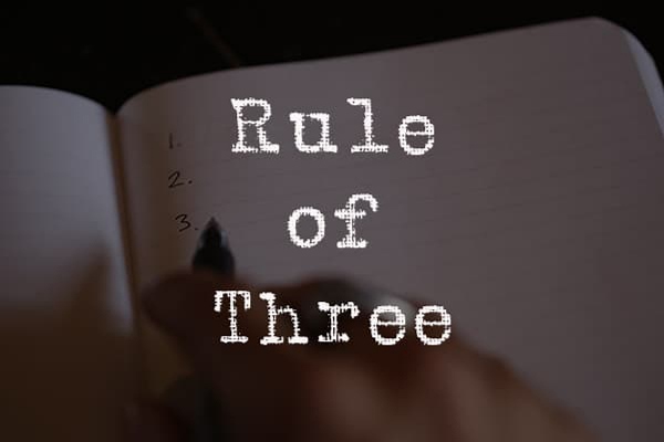
The 3 Threes
Digging a little deeper, one quickly realizes, that there truly are no formal scrapbooking rules like ones we see with formal games such as basketball. But maybe there are some good rules or at least guidelines to consider. Such as the right kind of products & software to use.
In everyday terms of survival, the rule of threes consists of the following:
- You can survive three minutes without breathable air (oxygen), or in icy water.
- You can survive three days without drinkable water.
- You can survive three weeks without food.
Plays, typically, have a three-act structure. Every film or story is divided into three parts — the beginning, middle, and end. In charts, three bullet points drive home the message more effectively than two or four.
In writing or speaking — any ideas, thoughts, events, characters or sentences that are presented in threes are more effective and memorable.
All of these examples illustrate why it is called the Rule of Three.
Today I’m going to talk about a different set of threes.
Rule Of Three #1 – Three Colors
I love color as much as anyone else, but sometimes we can get a little carried away with color, or we don’t know how to use it to the best advantage. So, when designing pages, you want to remember that colors are generally most pleasing in threes. Sometimes referred to as the triadic color scheme.
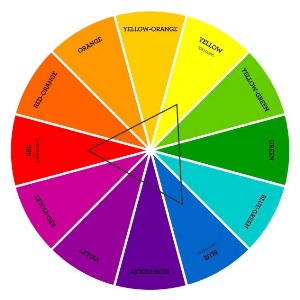
This all makes more sense if you look at a simple color wheel (like the one above). A triadic color scheme is a lot easier to understand than it may sound. Triadic color combinations make use of three colors. This time, instead of being next to (complementary) or opposite (contrasting) each other, triadic colors are three colors that are equally spaced around the color wheel; the main color, a good secondary color, and an accent color.
Note: There is some confusion with the use of the terms complementary & contrasting when you look up information about the color wheel. Just know that colors directly across from one another on the color wheel provide high contrast. Colors that are adjacent to each other on the color wheel are harmonizing (sometimes considered complementary).
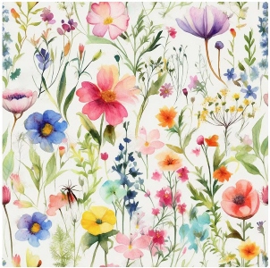
Using a triadic color scheme doesn’t mean if a pattern paper comes with flowers in multiple different colors that you can’t use it. Such as this paper available from DigiSalesStudio on Etsy:
Floral or otherwise, the pattern paper will generally have an overall color that sticks out (usually the background color), so you would use that as one color. A brightly colored patterned paper may have a few main colors that you can pull from to pick the secondary and accent colors for the layout.
If you aren’t sure if the colors you are choosing are equally spaced around the color wheel, connect the three of them with a line — simply tracing them with your finger will do. If the shape you outline is a triangle with sides of equal length, then your colors are triadic.
Another way to use this would be to start with a color you know you want to use, like blue, and then draw a triangle to determine which other two colors to combine with it. We know from drawing a triangle that yellow and red complete the color triad.
Neutrals generally don’t count in the rule of threes. Neutrals tend to blend in rather than standing out as an additional color, so don’t count neutrals in your three main colors unless you want to. For instance, your layout might be black, white and red – in that case, even though black and white are neutral colors, in that instance they are acting as your main color and secondary color, with red as the accent.
Rule Of Three # 2 – Page Thirds
Sometimes you have a beautiful photo and you want to put it right in the middle, which isn’t a bad strategy. However, the viewer’s eye is going to land right in the middle of the page on that photo and it’s going to sit there. So, whatever is happening on the rest of the page is going to be out of focus and extraneous, in a sense.
Designers overcome this with the rule of thirds. Essentially, you want to imagine two vertical lines dividing your background into thirds, and two horizontal lines dividing the page into thirds, leaving you with four intersections. It should look like this:
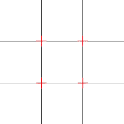
If you’d like to play around using that grid, the image above is a PNG file and can be immediately downloaded by clicking on it. The downloaded file will be full-size (3600×3600).
Placing important design elements on the intersections of the horizontal and vertical lines (red plus signs), sometimes called “power points”, will help create balance and movement and ultimately result in a more polished, cohesive composition. This is the same trick photographers use to add visual interest to a photo…why we often see photo subjects slightly off center.
You can then build the remaining elements of the layout around it. Placing these other elements on the rest of the intersections creates a “z” formation that keeps the eye moving and adds visual interest to the layout.
The rule of Page Thirds is the most well-known design composition tool for a reason. It’s simple but profoundly effective and can help improve the overall look and feel of your designs by:
- Adding balance and complexity without being overwhelming or confusing.
- Discouraging you from simply locating your focal point smack in the middle of your page.
- Creating a sense of direction within your composition by helping to direct the eye where you want it to go.
Again, this is not a hard and fast rule. But it is worth considering the next time you work on a layout.
Rule Of Three #3 – Three Embellishments
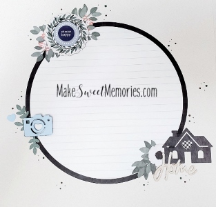
OK, so don’t get too literal with this rule. I do NOT mean you can only use three embellishments on a page, or that you must use three. Essentially, this rule again is about eye movement. What you want to do is create three points of interest on your layout to keep the viewer’s eye moving; this is often done in a triangle, but doesn’t necessarily have to be. Also, in this case embellishment “clusters” that are popular now a days count as “1”. You can see three clusters in the image above.
Typically, designers will also use this rule with color. Let’s go back to the idea of a black, white, and red layout I mentioned above. Let’s say you have a beautiful picture of a girl in a black and white dress with a red flower in her hair. You find scrapbook papers in black and white, but you want to pop that red. So, you might add red lettering in your title, and then some red embellishment flowers somewhere else on the page. As the viewer looks at the page, their eyes will naturally be drawn to the title, the red flower in the girl’s hair, and the red flower embellishment, thus creating “movement”.
Some Extra Tips About The 3 Threes
Take a look at some of your layouts and see how many of the three rules of three you’ve already been using…perhaps even without intention. Then try designing your next new layout concentrating on the “threes” and see what you think!
Just keep in mind though, you are the boss of your scrapbook pages, so nobody can tell you what to do. These are just design principles that have, over time, been shown to be effective and are used by designers, photographers, and yes, even scrapbookers.
Place focal points on or near power points. Align elements along the vertical lines and horizontal axis. Think the letter ‘L’ in any direction.
Remember that the most popular, eye-catching power point is the top-left intersection. With this in mind, it might be a good idea to place critical information or your primary focus element on this power point. Following this, the remaining most attention-grabbing power points are (in order) the bottom left, the top right, and lastly the bottom right.
And, if you have any questions, need a bit of help, or want to a make suggestion about future topics you’d like me to cover please don’t hesitate to “Message Me”.
Thanks for reading this week’s Tuesday Tip. If you want to stay informed about new posts, just click “Follow Me” to stay in touch. I hope you have a wonderful week!