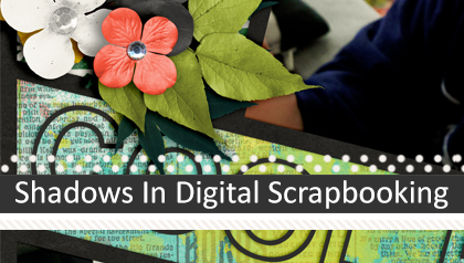
Don’t Let Your Pages Look Flat
Good shadowing is perhaps the most important element in digital scrapbooking. If you want your digital layouts to have the same dimensional look as paper layouts, proper shadowing is key. If you are new to digital scrapbooking, I hope to give you some basic pointers to get you started. I also hope that you “seasoned” scrappers will pick up a few new tips here or there.
Over the years more than a handful of people have asked me how I get the shadows to look so realistic on my digital scrapbook pages. This almost always catches me off guard because I feel like my shadowing could use some improvement. I catch myself constantly looking for tips on how to adjust what I’m doing. It’s that old nasty Type A personality trait of looking for perfectionism. Regardless, I still just feel that I’m falling short.
The fact of the matter is, though, I have no magic formula for shadowing an element. It always depends on the colors, where it’s located on the page, what’s near it, what the element is made of, etc.
Why Is Shadowing So Important?
As a beginning digital scrapbooker, I didn’t initially understand or place enough value on using shadows. Actually, I was quite intimidated by them and rarely used them. And when I did, too often I used them incorrectly. If only I’d known then what I know now.
I look back at those pages and realize that I shouldn’t have been so scared. And I definitely should have been more educated about shadows. Shadows add great polish and oomph to digital pages. If you misuse them or don’t use them, your layouts will look flat and somewhat dull or even somehow “off.”
Let’s take a look at two examples to see why shadowing is so important.
Here is one of my recent layouts with all of the shadowing stripped off:
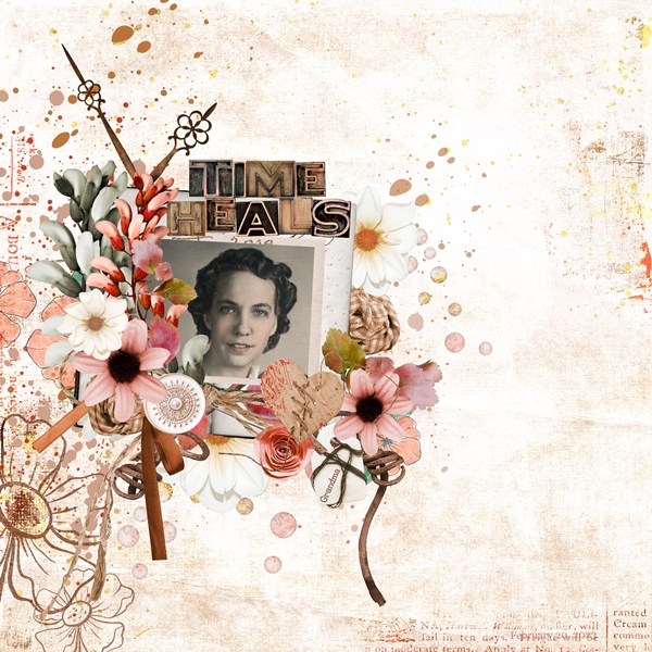
Here is the exact same layout with all of the original shadows:
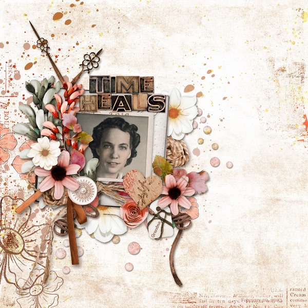
Do you see the difference? The first layout has no depth or even realism; it’s too one-dimensional. Conversely, the elements in the second layout seem to pop off the page. They look as if you could reach out and touch them! This is why shadowing is so important and also so fun. It is amazing to watch your layout come to life with just the click of a button!
The Basics
First & foremost, if I’m not using a set of shadow styles made by a designer, I always use the basic Drop Shadows layer style that comes with Photoshop Elements (PSE) as a starting point when creating a shadow “from scratch”. I just pick one of the PSE styles and make adjustments to the setting to fit my needs. If you don’t use PSE, I’m fairly certain that your graphics editor has a similar feature. Just search for tips/tutorials on the internet specific to whatever package you are using.
I’m going to start by giving you a brief explanation of the parts of the Drop Shadow Dialog box in PSE. This is a great way to get started learning about shadows!
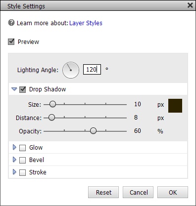
Lighting Angle: The angle is based on what direction your light source is coming from. This will determine the direction the shadow will fall when the Distance is set to anything higher than 0 pixels. If the Distance is set to 0, the shadow will spread equally around the layer’s contents. The default lighting angle is +120 degrees. This is what I typically use but you can select the angle as you wish, just keep it consistent for all shadows on your page. More on the proper lighting angles below.
Color Box: Located to the right of the Size is where you can select the color of the shadow. The default color is black (#000000). When creating a shadow style from “scratch” I tend to use a dark grey (#696258) because that is what I learned during one of my first PSE classes on shadows. Some scrapbookers use the color of the layer underneath and then just darken it considerably. I find it easier to just stick with a shade of grey. But that doesn’t mean grey always works. If you have a dark background, you’ll need to adjust the color so it shows up properly on the background.
Size: This is how big or small the drop shadow will be on each side of the object. This determines the “blur” (sharpness or blend) of your shadow edges. You can play around with this to see how it affects the look of your shadow. If you bring your size down to zero, the edges will be sharp and hard. Alternately, increasing the size softens the edges of the shadow.
Distance: This determines how far “up” from the page you want your element to appear. This will vary according to the element. When shadowing paper, your distance will be a small number. When shadowing a bulkier item like a flower or ribbon, your distance would be a greater number. And again, if the Distance is set to 0, the shadow will spread equally around the layer’s contents.
Opacity: This is how dark or light your shadow will appear on your layout. This will vary greatly depending on many things. For one thing, the type of element you’re shadowing will usually dictate the opacity you will choose. The paper behind the element you are shadowing will also affect how dark the shadow appears. The key to opacity is to play with the slider until it looks good to you.
I know…you’re likely thinking, “How in the world will I know how to adjust those settings?” I’ll try to give you some help. Here is a list of the settings I generally use on some common elements:
- Flat Paper/photos: Color= #696258, Size= 10, Distance= 10 & Opacity: 70%
- Stacked Paper/photos: Color= #696258, Size= 27, Distance= 10 & Opacity: 65%
- Buttons: Color= #696258, Size= 10, Distance= 5 & Opacity: 58%
- Flat Ribbons: Color= #696258, Size= 10, Distance= 5 & Opacity: 58%
- Curly Ribbons: Color= #696258, Size= 57, Distance= 35 & Opacity: 84%
- Small Flat Flowers: Color= #696258, Size= 24, Distance= 16 & Opacity: 85%
- Large Flat Flowers: Color= #696258, Size= 46, Distance= 20 & Opacity: 85%
- Stacked Flowers: Color= #696258, Size= 50, Distance= 40 & Opacity: 70%
- Small Flat Foliage: Color= #696258, Size= 25, Distance= 20 & Opacity: 80%
- Large Flat Foliage: Color= #696258, Size= 60, Distance= 40 & Opacity: 78%
- Stacked Foliage: Color= #696258, Size= 87, Distance= 67 & Opacity: 70%
- Staples: Color= #696258, Size= 14, Distance= 14 & Opacity: 58%
- Stitches: Color= #696258, Size= 7, Distance= 4 & Opacity: 65%
- Lace: Color= #696258, Size= 13, Distance= 7 & Opacity: 38%
Again, these are just average settings. Depending on the number of “layered” elements or the color of the background, I may need to increase the distance, size and/or opacity for certain shadows. The key here really is to imagine how it would look in real life.
Shadows & Lighting In Photos
Lighting is a big thing. Especially if your layout has photos where a light source and/or shadows are obvious within the photo. Look at where the light is coming from in your photos. You’ll want to match that lighting angle for all of the dimensional elements on your page when creating the shadows.
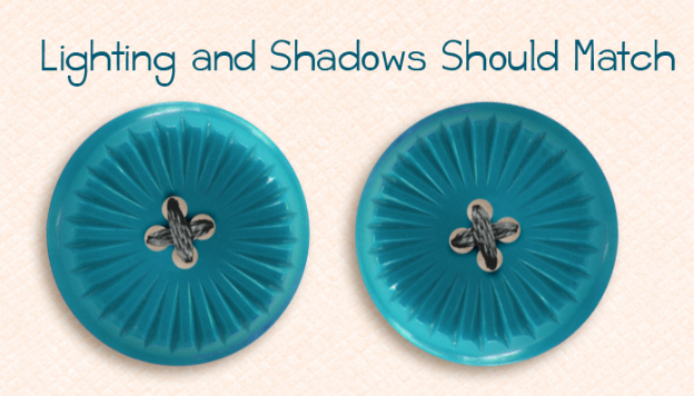
For example, above are two buttons, both use the same shadow setting. See how the one on the left has a light source coming from the upper right? That creates a shadow to the lower left. This typically will be a 45-degree angle.
Now look at the button on the right. The shadow is still facing the same direction, but the lighting on the button is coming from the bottom left. This makes the shadowing look funny…oddly unnatural.
For that button on the right, you would want to use a -145-degree angle for the shadow to match the lighting angle. Look at the difference now…
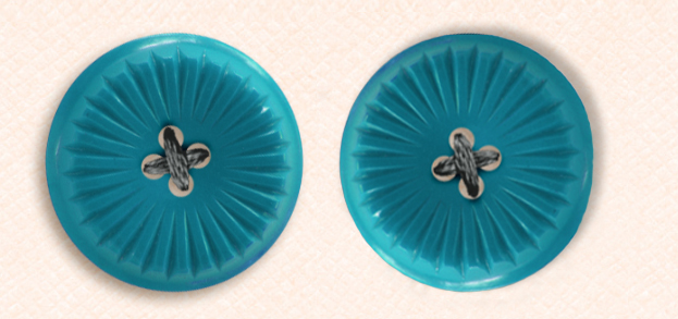
I know there are a lot of people who would likely never notice this “error”. But you might be surprised at just how many might. So, please do try to match your shadows to your element’s lighting angle.
But that’s not the only thing to watch. Some designers provide elements (specifically clusters) that already have shadows applied. Anytime you use a pre-shadowed element you need to match the angle of that shadow. And in my opinion, the angle of pre-shadowed elements typically would “trump” lighting angles in photos. The reason I say this is because removing pre-existing shadows is, at best, a tedious, painstaking process for some & all but impossible for others. So go with that pre-defined angle because you want all of your elements’ shadows to have the same angle or it will just look bad.
Lastly, you need to be careful when applying some styles (i.e., bevels, strokes, glows, etc.,). Especially if you are using styles that come with PSE which tend to default to a 90-degree lighting angle. If you’ve already applied shadows to other elements on your layout, it’s easy enough to go in and adjust the lighting angle on any other styles to ensure they match your shadows.
Shadows The Easy Way
Shadowing is an art, and I will admit it’s an art that I far from excel at, that’s why I love using shadow layer styles! Shadow layer styles are shadow settings that have been set up for you. A set of them might include different styles for paper, buttons, stitching, and other scrapbook page elements.
If you’d like to have shadows at one “click of a button”, feel free to check out any one (or all) of these drop shadow styles:
- Scrapping With Liz Shadow Styles (free – you’ll need to scroll part way down her page)
- Sheila Reid Shadow Styles (free)
- Fiddle-Dee-Dee Designs Shadow Styles -> for purchase
- One Little Bird Shadows -> for purchase
They do make shadowing a breeze!
Shadowing Tips and Tricks
Once you get comfortable with basic drop shadows and using styles, take some time and poke around the internet. There is a lot to learn about warping and smudging shadows to make them more realistic. Below I’ve included several tips and tricks for you to think about as you dive deeper into the world of digital shadows.
- When working with a layer that is on a lighter colored layer, you might want to try lightening up the color of your shadow.
- You can select multiple layers in your Layers palette and click on a shadow style to apply the style to all of the layers at once.
- Also, you can right click on a layer, copy the layer style then select another layer (or multiple layers) and paste it on to that layer.
- Not everything needs a shadow. For instance, paint and ink splatters and text do not need a shadow. There is one exception as I mentioned in my “Journaling” post. Sometimes it is okay to add a shadow to text! Especially, if it’s a title.
- Keep the size of the shadow proportional for the size of the object.
- The bigger the space between the object and its shadow, the lighter the shadow will be (the shadow for a piece of paper placed directly on top of another paper will be darker and less opaque than a button, flowers or most notably…a butterfly).
- When you print your layouts, the shadows are not going to be as noticeable. You may want to do a test print before ordering a bunch of layouts; just to be sure you are happy with the end result printed.
Shadows On Separate Layers
Have you ever run across a template where some of the elements’ shadows are on separate layers? Have you had trouble figuring out why or even how to do that? Well, I have a tip for you. It’s not as difficult as you might think.
And for those of you who use PSE and can’t easily put your shadow on its own layer make sure you check out this video tutorial from Fiddle-Dee-Dee Designs. This is how I learned to separate a shadow from and element. It’s easy to follow and such a valuable addition to your shadowing arsenal.
Why do we want/need a shadow on its own layer? Having a shadow on its own layer allows you to manipulate the shadow. And now you’re saying, “And why would I want to do that?”. Read on…
In reality we know that nothing lies perfectly flat on paper and our shadows won’t always be perfectly uniform, especially with elements like strings and ribbons. With string/ribbon and other “curly” elements, shadows can run deeper in some areas and thinner in others. For realism, portions of the shadow should also vary based on that.
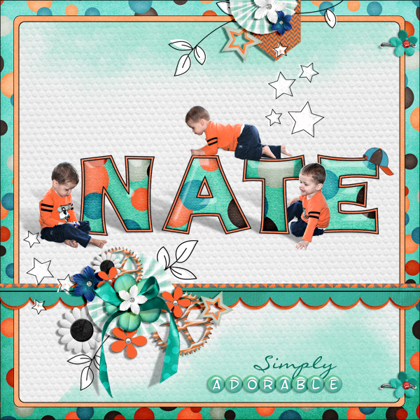
And I’m sure you’ve seen those frames/cards with corners that appear to be curling with shadows that make it look as though they’re actually “lifting” off the page. Also, take notice of the children in the image at the beginning of this section. There are actually realistic looking shadows “on the floor”…not just around the edge of the figures. Well, for all of these cases…as far as I’m aware, the only way to accomplish that is when your shadow is on its own layer.
I’m not going to provide detail on how to achieve any of these effects. Just know that it will require a shadow to be on its own layer. There are way too many online tutorials out there that address them so please search for those on the internet. Try searching for “Curled Edges Technique” or “Casting Shadows Technique”.
I hope all my tips give you more insight on how to work with your digital shadows. And as always, if you feel lost or confused please don’t hesitate to ”Message Me”. I’ll do whatever I can to help.
Single Most Important Tip About Shadows
Just remember, you have to like your shadows, and everyone has their own taste. While I might offer some tips, I am no expert. 😊 These are just some of my tips and tricks about using shadows, and how to make them your own!
As with all the other things I’ve talked about in prior posts…the more you work with shadows the more comfortable you’ll be when creating and using them.
Thanks for stopping by the blog for another edition of the Tuesday Tip series. If you want to see what’s in store next week click “Follow Me” to stay in touch. And as always…“Happy Scrapping!”