Dash Of Color
First of all…I hope you’ve recovered from Thanksgiving, Black Friday & Cyber Monday! Now today I want to give you something to help take your mind off the fact that Christmas is less than 4 weeks away. But just one quick Christmas reminder – let’s all not forget about the true meaning of Christmas as we go through the next few weeks…

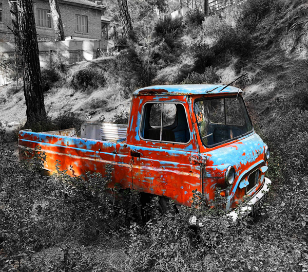
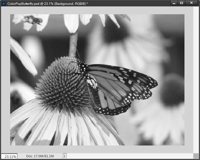
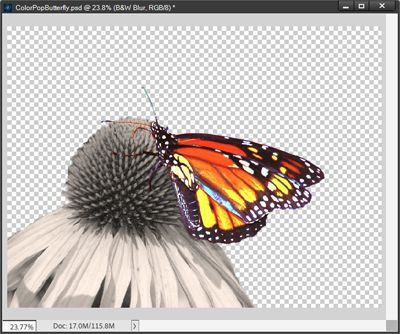
Now, on to today’s tip. Have you ever seen a photo that was black and white except for one object, which is in full color? It’s a popular effect, and there are a number of ways to achieve it. The featured image above is a great example.
Using color pop effects in your photos is a brilliant idea to make them stand out from the rest. Be it a scenic shot or eye-catching subject, color pop effects are fun and give you an advantage when trying to add a dash of color to your photo.
Color Popping
Color popping is a digital effect in which part of an image is shown in color while the rest is in grey or dull monochrome. It’s a simple but effective way to make your subject pop to create an effect that is pleasing to the eye.
Please remember that I use Photoshop Elements (PSE) so all of the steps that follow were accomplished using PSE. The same method will work in Photoshop or most other graphics editing software that features adjustment layers.
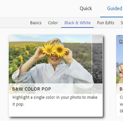
There are several ways you can accomplish the color pop effect in PSE. One is to use the Guided feature in PSE called B&W Color Pop:
As with most of the Guided options in PSE, there is a bit of a learning curve. And I also find that I have more flexibility and control if I do this manually. So that’s what I’m going to do today. I’ll show you how to create a black-and-white photo with a dash of color using masking & adjustment layers. Let’s get started…
Convert To Black & White
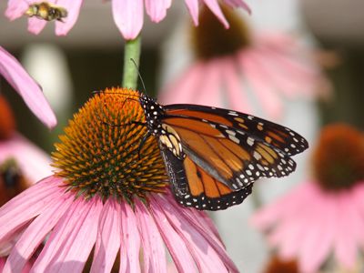
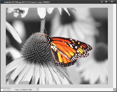
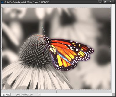
I’m going to be using this butterfly photo I found on Pixabay:
I just pull this photo into PSE. By now you also are probably aware that I always try to edit photos in a non-destructive way. So, the first thing I’ll do is make a duplicate copy of the photo, name it B&W (the name will make sense in a minute) & hide the original.
Next, I’m going to use the Magnetic Lasso tool to select only the butterfly. My first go around was pretty good but I did have to switch to the Brush selection tool to clean up the selection a bit. Here’s what I ended up with:

I know it might be hard to see them but the “marching ants” show the butterfly as selected. I really didn’t need to select the antennae & legs as they were basically black. But you also know I can tend to be a bit finicky. So, you probably aren’t too surprised that I did include them in the selection 😉
Now I create a new layer via copy from the selection and name it Butterfly. For now, I’m going to hide this new Butterfly layer.
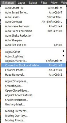
Then with the B&W layer active in the layers panel I select “Enhance-> Convert to Black and White from the top tool bar:
PSE opens the Convert to Black and White options panel.

There are several preset “styles” for the conversion. I opted for Scenic landscape. You can experiment with the various options and the Intensity adjustment sliders to achieve the look you desire. The key is to keep the contrast levels in the B&W version as close as possible to those in the original photo. Here is my B&W photo:
Now the name of this layer makes sense, right? Next, I unhide the Butterfly layer to see how it looks on the B&W background:

Pop The Colors
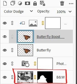
I’m a little disappointed in how the butterfly looks…almost dull against the B&W background. So, I duplicate the Butterfly layer and name the new layer Butterfly Boost. I then change the Blend Mode on the Butterfly Boost layer to Color Dodge and this is the result:
I’m happier with this but I want to “amp” it up just a bit more with an adjustment layer.
This is a totally optional step. If you’re happy with how your color image shows up…you can skip this step altogether. If you want to give it a try, here’s what I did…
With the Butterfly Boost layer active in the layers panel, I select Layer->New Adjustment Layer->Gradient Map from the top tool bar:

PSE opens the New Layer options box:

There is a default name filled in for the layer & I leave it as is. But I do check the “Use Previous Layer to Create Clipping Mask” box. This tells PSE to apply this gradient layer only to the Butterfly Boost layer. I leave all the other defaults as is and click OK. PSE then opens the Gradient Map box:
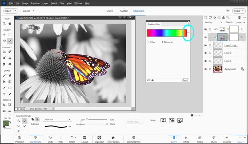
I click the down arrow on the right side of that gradient map bar & PSE then opens the Gradient Default options box:
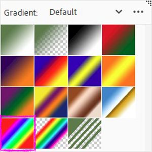
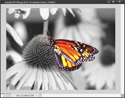
I opted to just stick with the default gradient. Depending on the colors in your photo you can select different gradient options by clicking the down arrow to the right of the word Default. For me, Default looks like it will work out just fine. Then I selected the “Spectrum” option at the bottom left (highlighted in bright pink). And this is the result:

Don’t panic…I know this looks garish but I’m going to fix it. First, I change the Blend Mode of the Gradient adjustment layer to Overlay. Then I set the opacity to 60% and here is the “adjusted” butterfly:
I know it may seem like a subtle difference. But I feel like this made the colors & highlights in the butterfly pop so much more. I’m happy with how this looks so far. But now I think the B&W background might need some work.
Warm Up The Background
Again, this is a totally optional step. If you’re happy with the tone of your background…you can skip this step altogether. If you want to adjust the color tone, here’s what I did…
I think the B&W background looks a bit too “cool”…too blueish if you know what I mean. I want to warm up that background just a bit so it fits better with the warm colors in the butterfly. I’m going to do this using another adjustment layer.
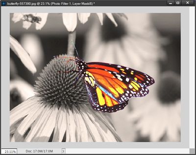
With the B&W layer active in the layers panel I once again select Layer->New Adjustment Layer. But this time I select Photo Filter (instead of Gradient Map) from the top tool bar:

Just as before, there is a default name filled in for the layer & I leave it as is. This time there is no need to check the “Use Previous Layer to Create Clipping Mask” box as this Photo Filter layer will only apply to the B&W layer. I leave all the other defaults as is and click OK. PSE then opens the Photo Filter options box:

In my case, PSE has the Warming Filter (85) as the default. There are several other filter options, lucky for me this one did the trick. You can experiment with the various Filter options, Color chip/setting and the Density adjustment slider to achieve the look you desire. I just left everything at the default and here is my “warmed up” background:
I like this much better. But I think I want the background flowers to be less prevalent.
Focus On The Foreground
This too is a totally optional step. If you’re happy with the look of your background…you can skip this step entirely. If you want to add more focus to the foreground, here’s what I did…
I really want to concentrate the focus of this “new” photo onto the foreground cone flower & butterfly by “muting” the remainder of the B&W background in some fashion.
First, I’m going to duplicate the B&W layer and name the new layer B&W Darker. I move this new “darker” layer below the B&W layer and hide it for the time being.
With the B&W layer active in the layers panel I once again use the Magnetic Lasso tool and the Brush selection tool to select everything in the photo except the foreground cone flower & the butterfly. Here’s what I ended up with:
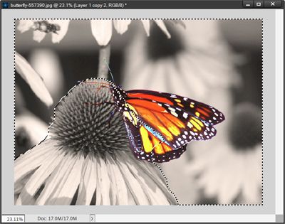
I know it might be hard to see them but the “marching ants” show everything but the cone flower & the butterfly as being selected. The key to making this selection is to ensure you go all around the perimeter of the entire portion of the background that will be darkened.
If you need a reminder on how to make this kind of selection refer back to my Torn Papers post. Within that post there is the section labeled “Tearing Papers”; you’ll find a tip there on how to ensure a good selection.
Now, back to the butterfly picture…
Ensuring that the B&W layer is still active, I click the “Add layer mask” icon in the Layers Panel. This tells PSE to use only the selected area as the mask. The layer mask on the B&W layer now looks like this:
Remember that in masking, black means hide. This means the only parts of the B&W layer that are now visible are the foreground cone flower & Butterfly. This is what the work area looks like with the B&W Darker layer hidden:
Next, I unhide the B&W Darker layer. With the B&W Darker layer active in the layers panel I once again select Layer->New Adjustment Layer from the top tool bar. For this step I then select Levels:
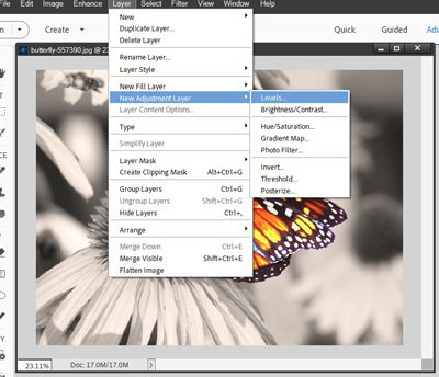
As in the prior step using an adjustment layer, I leave all the other defaults as is and click OK. There’s no need to check the “create a clipping mask” option as this levels adjustment will be applied only to the B&W Darker layer. PSE then opens the Levels options box:

The only thing I need to do is change the Output Level settings. Since I’m darkening the background, I can either grab the right most (white) slider and move it to the left until I reach the desired darkness or just type in a new value to replace the existing value (255). You can experiment with the Output Levels to achieve the look you desire. I ended up using a new value of 132.
With that levels adjustment finished, I found that parts of my foreground selection need to be touched up a bit. So I just double-clicked on the layer mask on the B&W layer and made all necessary adjustments to the mask using a simple round brush. And here is the result:

Now the foreground really pops. I’m really happy with this darkened background.
Now if you don’t care much for darkening the background there’s an alternative to using a Levels adjustment layer. If you’ve already tried the levels option simply hide the adjustment layer and try this instead…
I know the background flowers are already somewhat out of focus. But blurring them a bit more should tend to make the foreground selection pop an extra bit. With the B&W Darker layer active in the Layer’s Panel I simply select Filter->Blur->Gaussian Blur from the top tool bar:
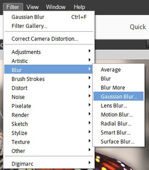
PSE opens the Gaussian Blur options box:
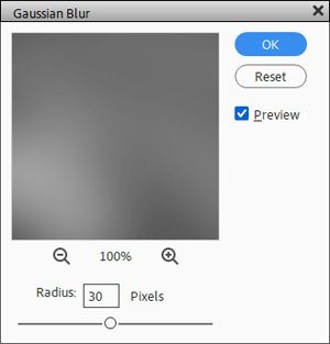
All I have to do is adjust the size of the Radius either by moving the slider or entering a value for the Pixels. You can experiment with the Radius setting to achieve the look you desire. As you can see, I ended up using 30. And here’s the result:
I do like this version too. It’s a more subtle change to the background than the darkened version. It’s certainly a matter of personal preference when deciding which background “muting” option to use. I saved the photo both ways so I can decide later which one to use.
Some Extra Tips About Color Popping
Don’t sell yourself short. It’s always a good idea to try new things. Worst case scenario…you can always undo (CTRL+Z) your way out of it.
Play with popping a single color wherever it occurs in the photo. This can sometimes give some very unexpected and fun results. While reds are the most eye-catching shades, other primary shades such as blue, green, and their secondary colors such as orange and yellow stand out the most when “popping” colors.
If you have a photo with multiple “subjects” try popping one color/part on each subject for an interesting effect…

While it is the most popular way to go, don’t feel like your background always has to be black & white. You can also use a sepia toned (or other color) background if that suits the photo better.
Experiment with multiple layers & different blend modes to get varying results on the selection that you’re trying to “pop”.
A quick alternative to the detailed steps provided above is to simply duplicate your photo, convert the new (top) layer to B&W (or other color) and then simply “mask away” everything you want to “Color Pop” from the bottom (color) layer of the photo. The easiest way to mask away is to select only the portion(s) of the B&W photo you want to pop and click the “Add layer mask” icon in the Layers Panel.
And, if you have any questions, need a bit of help, or want to a make suggestion about future topics you’d like me to cover please don’t hesitate to “Message Me”.
Thanks for reading this week’s Tuesday Tip. If you want to stay informed about new posts, just click “Follow Me” to stay in touch. I hope you have a wonderful week!