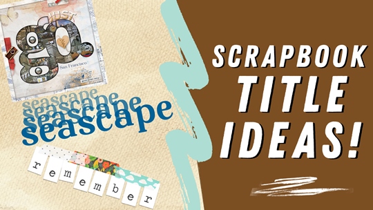
Eye-Catching Titles
I follow Digital Scrapper. You can read a bit more about them on my Resources page. Recently they’ve been showcasing some great “free” tips in newsletters from their series on creating titles. In case you don’t follow Digital Scrapper, I thought I’d share some of their free tips with you…
Create Titles That Wow
As I already mentioned, some of the title tips you are about to see have been featured in Digital Scrapper newsletters. I have however, been using most of these techniques myself for at least a few years. And just so no one thinks I’m violating any kind of copyright issue, I did reach out to Jen White before I put this post together.
Note: The above layout is one I created in 2022. For more details about this layout, you can find it in my 2022 Personal Gallery.
It’s always fun to look at a scrapbook page that has an eye-catching title. With those pages it’s most often the title that draws you in. There are so many ways to create great titles. Let’s take a look at a few…
Banner Titles
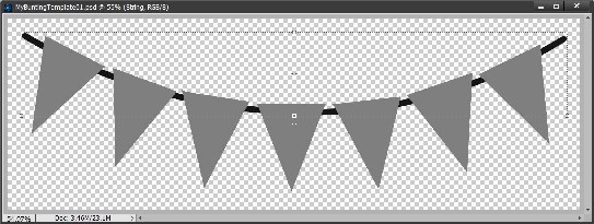
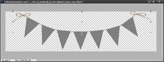
It’s kind of funny what people think of when you say “banner”. To some this means something different than to others. Here’s an example. Both of the images below are considered banners.
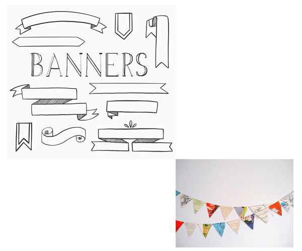
Which version did you think of? A lot of people consider the bottom-right example to be a bunting. Either way you can use any one of these types of things to create a banner title. But the one I want to concentrate on today is the “bunting” style banner.
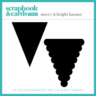
Chances are you have at least a few banners of this style in your scrapping arsenal. If not, over at Scrapbook & Cards Today there’s a great free resource for two quick bunting/banner (or sometimes called pennant) shapes that can be used to create your own banner:
Once you’ve got a shape all you need is a string. Again, you very likely have a string somewhere in your supplies that will work. If not, you can just “draw” a string in the shape you prefer and then apply a nice string style (more on that in a minute) to make it look more like real string instead of just a line. And if you’re not too good at drawing on your computer I’m fairly certain you can find some string at shops or on the internet.
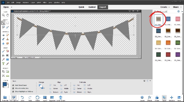
But just in case, I want to show you how I “color” a hand drawn string with a Photoshop style. Here’s my banner template all ready to go with one of the shapes above and a “drawn” string:
I have styles from “String Photoshop Styles” by Karen Schulz (now retired). This style set has 12 different colors & I picked a neutral shade:
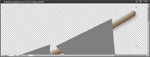
It might be a bit hard to see the string texture so here’s a zoom-in on the string:
I like this well enough but I’m actually going to use a string from “One Stop Bunting Shop Bundle – Baker’s Twine Bunting Strings” by Janet Kemp at Digital Scrapbooking.com (formerly Pixel Scrapper).
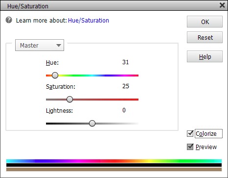
That twine is actually grey (no color) so it’s easy enough to re-color it to suit my preference. Just as with the style I used above, I’m going to go with a neutral shade (#c1ae99). All I have to do is set my foreground color chip to the desired shade & select Enhance -> Adjust Color -> Hue/Saturation and click the Colorize box:
Here’s how it looks with the new string in that color:
Now the rest is pretty much up to you. You can either color the individual banner “flags” or clip paper(s) to them. Then just add your title text either by using alpha files or creating text boxes.
Some pointers on banner text: Each character used on the banner should be on its own layer in the Layers panel. Use uppercase or lowercase print-style letters. I highly recommend that you NOT use script-style letters. Rotate each letter to align with the flag’s orientation.
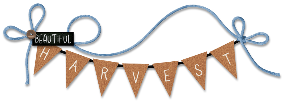
Here’s my finished banner title:
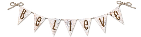
I used a paper from “Be Kind To Yourself” by The Nifty Pixel for the flags. The font used is 1000 Wishes Origami Regular. I applied a slight upward bevel (5 pixels – Lighting angle 120) to the letters. I also applied shadows to the string & flags.
And here’s how I used it in a layout:
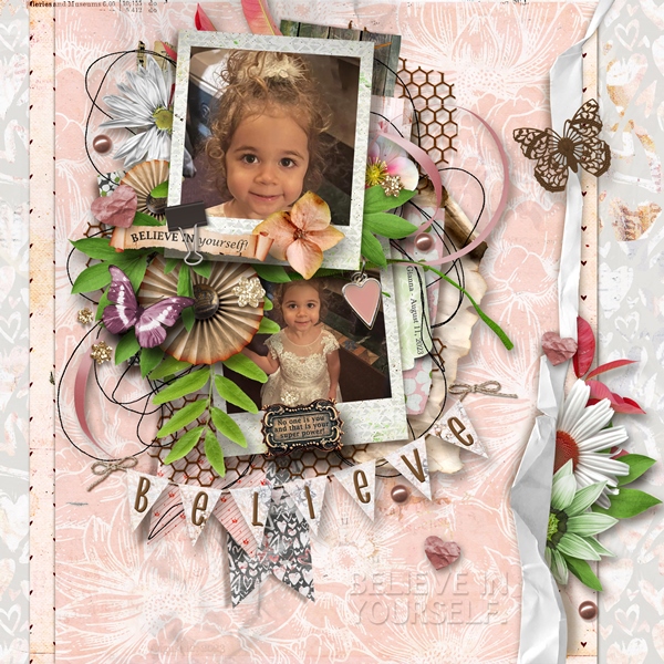
You can see more details about this layout in my 2023 Personal Gallery.
To give you a little more inspiration, here’s another “banner” title that I made recently & it doesn’t even include a string 😊:

The “flags” are just simple rectangle shapes. The washi tapes are from my personal stash (by whom or from where is unknown). The font used is Traveling Typewriter Regular.
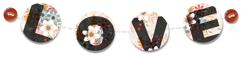
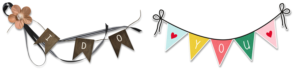
And here are a few more samples that I picked up from the Digital Scrapper newsletter:
Staggered Stacked Titles

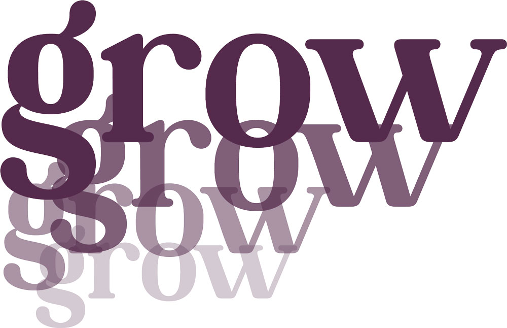
I love this title style. It always makes me think of an echo. And it’s so eye-catching! This is super easy to achieve. All you have to do is duplicate and stagger your title using a smaller size and lower opacity. The font used for this example is Brilors Regular. Starting color was a medium blue (#016096).
And here is another sample from the Digital Scrapper newsletter:
No special techniques or steps required so there’s no excuse not to give this one a try!
Ransom Note Titles

The alpha featured in the above image was created by Weeds & Flowers. It’s pretty old & I can’t find a link for it anymore so I’m assuming it is retired. But not to worry, there are lots of fun Ransom Note alphas out there. One great resource for Ransom Note Alphas is Creative Fabrica. Just search for Ransom and see what pops up.
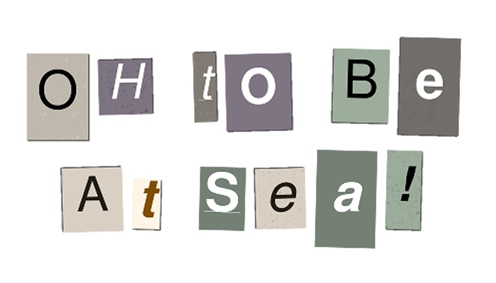
There’s also a great online tool that will let you create a ransom title – The Ransomizer. It allows you to change colors, typeface, textures & so much more. Once you create your “ransom note” you can download it. That file will be in PNG format with a resolution of 75 pixels per inch (easily resized with little to no degradation). Be sure to check that out…it’s quite fun! Here’s a sample of one I created:
Ransom titles are inspired by the look of a stereotypical ransom note in which the message is made with letters or even words cut from a magazine or newspaper so that the author’s handwriting cannot be identified.
On scrapbook layouts, they can represent fun, random occurrences and even scavenger hunts. There’s really no special technique here. Just having a “ransom” alpha and playing around with the format of your title.
I love doing this but I certainly need to do it more. I’d forgotten how fun this can be!
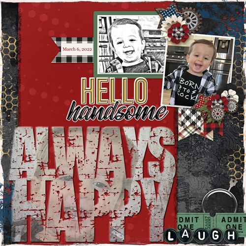
Big Word Titles

Last one for today. Try filling your page using a small word that forms a title with a big impact. Not much can be more eye-catching than a title that fills the page. You might even have a template or two that will help you create this effect.
The above layout is one I recently created. You can see all the details about this layout in my 2023 Personal Gallery.
This too doesn’t have to involve any special techniques or steps. It just depends on how complicated you want to go. My layout took a bit of finagling but that was mostly because I put the photo collage behind the big word.
Depending on your layout, capital letters in a print font are best. Clearly, I didn’t go that route so just experiment with yours. Using short words, abbreviations, or an acronym will make things easier. And don’t be afraid to try a negative Tracking value to get the word to fit better on the page.
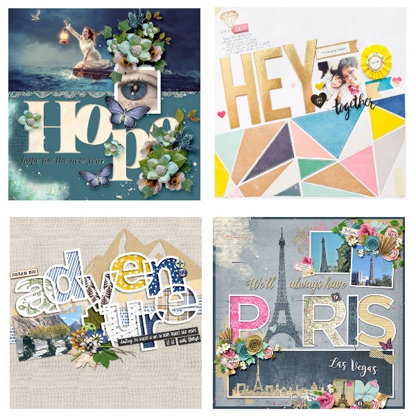
Here are several other examples of layouts I found on the internet to help give you some ideas.
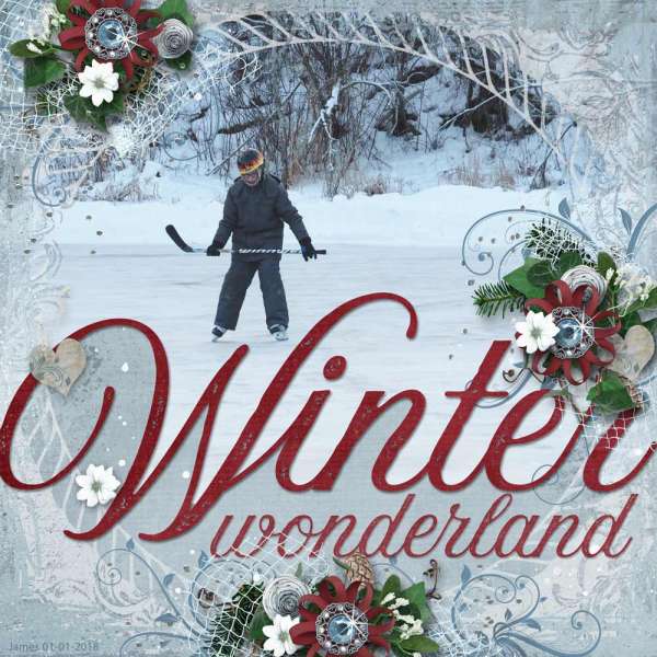
And one last somewhat dramatic big word effect…
Some Important Tips For Big Titles
Try thinking outside the box when you make a banner title! Don’t limit yourself to traditional banner shapes and angles.
Include some embellishments to help dress up that big word. Have fun with it!
Don’t be afraid to make your title the focal point. Allowing the title to take center stage means the picture is supporting the story and doesn’t need to take center stage.
As usual, if you have any questions or need a bit of help, please don’t hesitate to “Message Me” for some assistance.
Thanks for reading this week’s Tuesday Tip. If you want to stay informed about next week’s post, just click “Follow Me” to get an update. I hope you have a wonderful week!